Advanced Color Grading for a Timeless Film Look in Lightroom
Advanced Color Grading for a Timeless Film Look in Lightroom
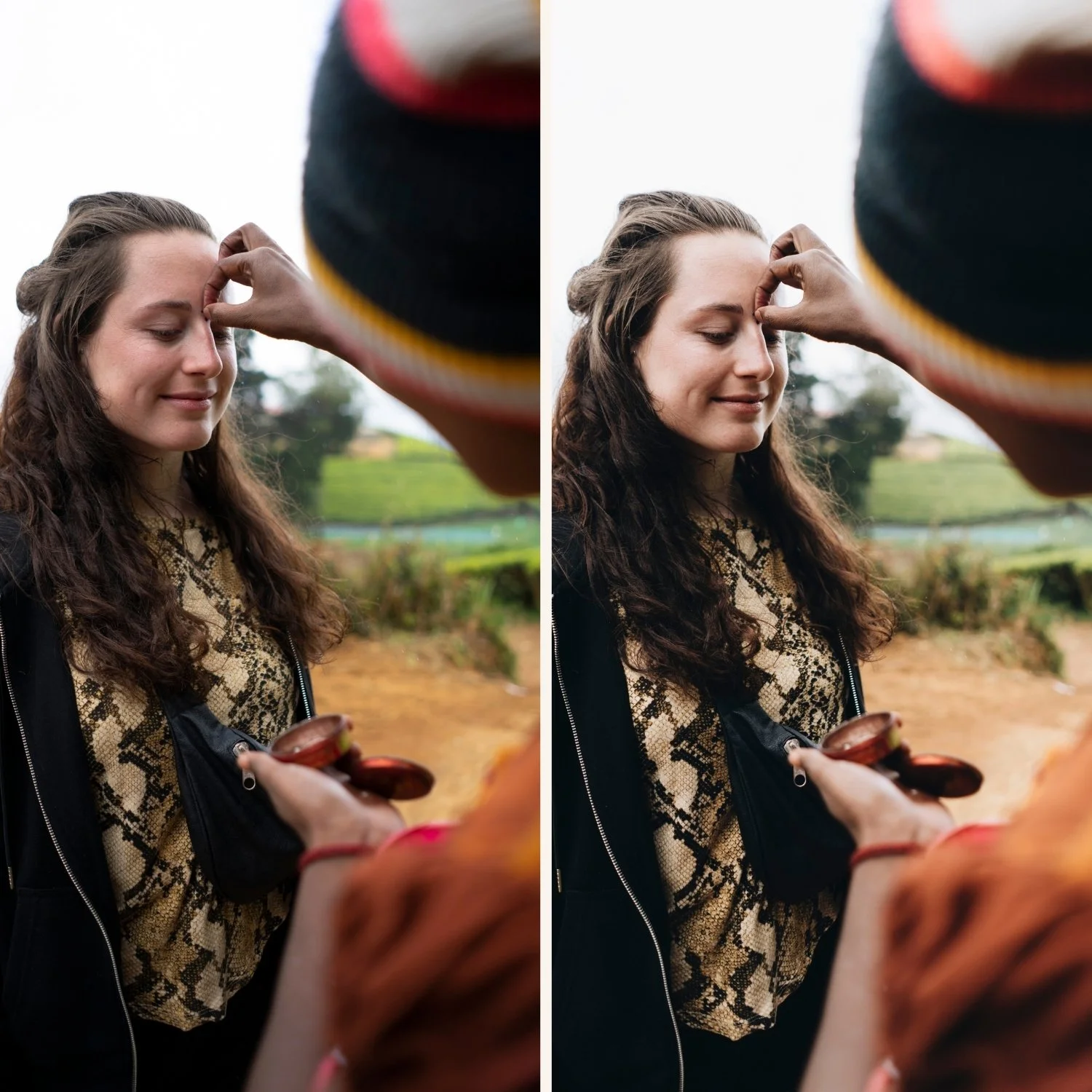
Most photographers who want the film look approach Color Grading as a final warmth adjustment. Push the Highlights slightly warm, maybe add a touch of warmth to the Midtones, and call it done. This produces a result that looks warmer than before, but it does not produce the specific dimensional warmth of film photography — the quality where warmth feels like it is part of the light rather than applied on top of the image.
Understanding how to use the Color Grading panel at a more sophisticated level is what separates film editing that feels considered from film editing that feels like a filter.
What Color Grading Actually Does
The Color Grading panel in Lightroom separates the tonal range into Shadows, Midtones, and Highlights and allows you to apply a specific color hue and saturation to each range independently. This is different from global white balance adjustment, which shifts the entire image simultaneously. Color Grading affects only the tonal range you specify. A Highlight color grading that adds golden warmth to bright areas does not affect shadows. A Shadow grading that adds cool depth does not contaminate highlights or skin tones.
This separation is what allows film aesthetics to have warmth in the highlights, relative neutrality in the midtones, and subtle cool depth in the shadows simultaneously — which is the actual tonal behavior of warm outdoor film photography rather than a globally warm image.
Placing Warmth in the Right Range
The most important principle in Color Grading for film aesthetics is that warmth belongs in the highlights, not in the global white balance or midtones. Here is why.
Warm afternoon light, golden hour, and the warm ambient of outdoor photography primarily affect the brightest parts of the scene — the highlights on skin, the sky, the warmest surfaces. Shadows in outdoor photography are often cooler because they are lit by diffuse skylight rather than direct sun. This is the specific quality that makes film photography of outdoor subjects feel warm and dimensional simultaneously — the warmth is in the light, the shadows have depth.
When photographers push Temperature globally, they warm shadows and highlights equally, which removes this dimensional quality. When they use Highlight Color Grading to add warmth specifically to bright areas, the shadow range remains relatively unaffected and the dimensional quality is preserved.
For film aesthetics, set Highlight Hue to 40-50 (in the golden-amber range) and Saturation to 5-12. Start with Saturation at 5 and increase only if the warmth is insufficient after checking skin tones. Midtone Color Grading should remain at low Saturation (2-5 maximum) or completely neutral for most film aesthetics.
Shadow Color Grading — The Most Misused Control
Shadow Color Grading is where the most damaging mistakes in film aesthetic editing occur. Pushing Shadow Hue toward cyan and Shadow Saturation high creates the heavy teal shadow look that reads as the dated teal-and-orange aesthetic rather than film photography. Yet shadow color grading, used correctly, is one of the most powerful tools for creating the dimensional depth of film.
Film shadows are not neutral grey. Depending on the film stock, they have subtle warmth (from the film base), slight cool depth (from the diffuse skylight of outdoor conditions), or a specific color bias (from the chemistry of each emulsion). The key word is subtle.
For most film aesthetics, Shadow Color Grading should be used in one of two ways. The first is near-neutral with very slight warm bias: Hue 25-35, Saturation 2-5. This adds the subtle amber warmth in dark areas that some warm film stocks have without being identifiable as color grading. The second is near-neutral with very slight cool bias: Hue 200-220, Saturation 2-6. This adds subtle depth in shadows without creating visible teal. Both of these are calibrated to be felt rather than seen.
What does not work is Shadow Saturation above 10-12 in any direction. At these levels, the color grading becomes visible as a treatment rather than as a quality of the image.
Blending and Balance Controls
The Color Grading panel includes Blending and Balance sliders that control how the Shadows, Midtones, and Highlights ranges overlap with each other. Most film editing workflows benefit from understanding these.
Blending controls how smoothly the three ranges transition into each other. At 50 (default), they blend smoothly. At 0, they have hard boundaries. At 100, they overlap more. For film editing, Blending at 50-65 produces the most natural transitions. Lower Blending settings can create banding in skin tones where the tonal range shifts between color grading zones.
Balance shifts which tonal range the Midtones zone covers. Negative Balance pushes the Midtones coverage toward the Shadows range, which can be useful for applying warmth to a slightly wider tonal range than standard Highlights alone. For film aesthetics that want warmth in both the upper midtones and highlights, a Balance of -10 to -25 extends the Highlight warmth into the upper midtone range naturally.
Global Color Grading and the Bleed Issue
A specific issue with Color Grading in complex edits is color bleed — where a strong Shadows or Highlights grading starts affecting the tonal range it is not supposed to. Strong Shadows grading can bleed into lower midtones, shifting skin tones in ways that are not visible at the panel level but are visible in the actual photograph.
To check for this, apply Color Grading, then view your photograph at 100% zoom on a skin area in the lower-mid tonal range. If the skin in that area has developed a noticeable color cast that matches your shadow grading, reduce Shadow Saturation and increase Blending.
FAQ
Is Color Grading better than adjusting white balance for film warmth?
For the dimensional warmth of film photography, yes. Color Grading places warmth in specific tonal ranges rather than shifting the entire image simultaneously. The highlight warmth sits in bright areas, skin tones remain natural in the midtones, shadows retain relative neutrality. White balance adjustment warms everything equally and removes this dimensional quality.
Why does my Color Grading look different at different preset strengths?
Color Grading adjustments scale proportionally with preset strength. At 80% strength, the Color Grading Saturation is effectively 80% of the value set. If you calibrate Color Grading at full strength and then reduce the preset, the warmth reduces proportionally, which may require recalibration.
Can I save Color Grading settings as a separate preset?
Yes. In the preset panel, you can create a preset that includes only the Color Grading settings, allowing you to apply them independently of other adjustments. This is useful for experimenting with different Color Grading on the same base edit.
How do I know if my Shadow Saturation is too high?
Two tests: check whether shadows in the photograph have a visibly identifiable color cast rather than natural depth, and check whether skin in darker areas of the image has shifted in hue from skin in brighter areas.
Apply advanced Color Grading to your own photos:
Download the free Analog Film preset and examine the Color Grading panel settings as a reference point for how this technique is applied in a calibrated preset.
For a complete collection built on advanced Color Grading principles, the Vesper Archive uses this layered approach across eight calibrated warm film looks. The Essence Archive applies the same principles to heritage film aesthetics with warm, skin-first Color Grading.