Cinematic but Natural Editing Style Guide
Cinematic but Natural Editing Style Guide
The word "cinematic" is used so broadly in photography editing that it has almost lost meaning. It has been applied to heavy teal shadows, crushed blacks, high contrast punch, artificial matte looks, and every other aggressive treatment that makes a photograph look like it has been through heavy post-production. None of these are what cinematic actually means in the context of professional color grading. Real cinema color grading is restrained, precise, and always subordinate to the story being told. The color should enhance the image without the viewer noticing that the color has been changed.
Cinematic but natural is the correct goal for most photography that references film aesthetics. Not dramatic and obviously processed. Not flat and undifferentiated. Intentional, dimensional, and natural-looking at the same time. This combination is achievable in Lightroom, and the process is more systematic than creative.
The Five Properties That Define the Look
Cinematic natural editing is built on five technical properties that work together. Soft highlight roll-off produces the creamy, luminous quality that film photography has in bright areas, preventing the harsh clipping that makes digital photographs feel sterile. Layered contrast adds tonal depth without the punchy, aggressive quality of global contrast adjustment. Restrained saturation keeps color present and dimensional without the neon vivid quality of unmodified digital rendering. Skin-first color balance ensures that faces and skin look natural and warm rather than over-processed. And consistency across a gallery creates the sense of a unified visual identity rather than a collection of individually optimized photographs.
Each of these properties requires specific adjustments, and understanding what each one does technically is what allows you to achieve the look reliably rather than occasionally.
Exposure and the Tonal Foundation
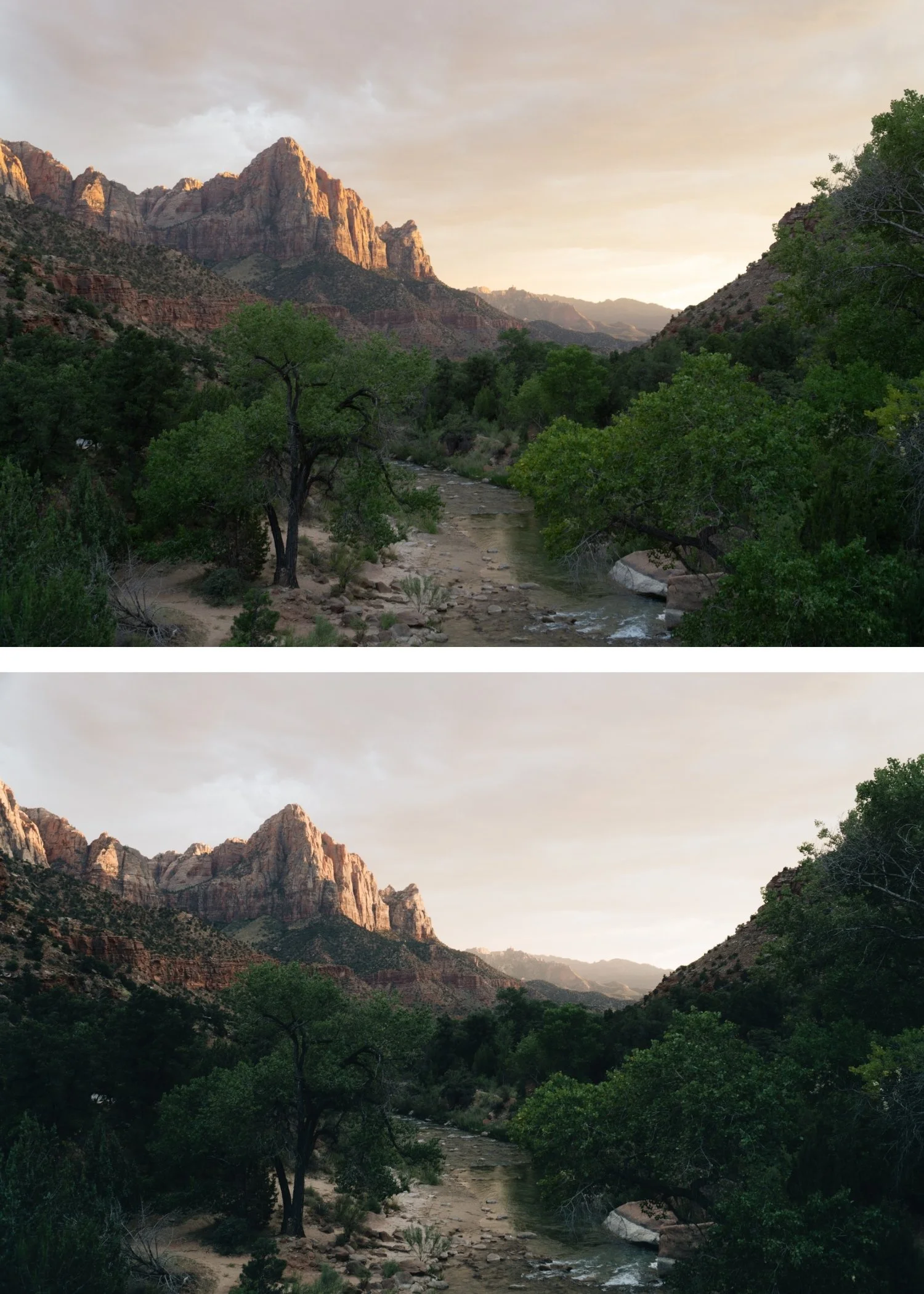
Before any stylistic adjustments, the exposure needs to be calibrated correctly. The complete exposure and tonal foundation workflow is covered in How to Create a Natural Film Look in Lightroom. The cinematic natural look depends on having the right amount of highlight detail, and this is set at the exposure stage rather than recovered in post. Pull Highlights to -15 through -40 depending on how bright the scene is. Reduce Whites by -5 to -20 to prevent the very brightest areas from clipping. Keep Shadows in the -5 to -25 range, which preserves shadow depth rather than lifting the shadow floor into a flat, grey quality.
The goal of this stage is an image that feels open and breathable with controlled highlights, not an image that looks correct. The stylistic work happens after the tonal foundation is in place.
Contrast Structure: Where the Cinematic Quality Lives
The most important technical difference between cinematic and digital is in the contrast structure. Digital contrast is global and aggressive, applied through the Contrast slider or a steep S-curve that pushes highlights up and shadows down simultaneously. This creates punch and separation, but the tonal transitions between values become steep and harsh. Film contrast is layered because it results from the non-linear response of film emulsion to light at different intensities.
To approximate this in Lightroom, reduce global Contrast to 0 or slightly negative (-5 to -15) and rebuild the separation using a soft Tone Curve. The curve should have a gentle lift in the upper midtones and a gentle compression in the lower midtones, with the highlight point pulled down slightly to create the soft roll-off. The shadow point should be raised slightly rather than anchored at pure black. This curve produces the dimensional depth of film contrast without the harshness of the slider.
A critical mistake is using multiple contrast sources simultaneously: the Contrast slider, heavy Clarity, steep Tone Curve, and Dehaze stacked on top of each other. Each adds its own form of edge definition and tonal aggression. The cinematic natural look uses one primary contrast source, which is the Tone Curve, and keeps all others at or near 0.
Color: Restraint as the Defining Quality
The color philosophy of cinematic natural editing is restraint. Not flat or desaturated, but measured. The specific channels that need attention are the ones where digital camera rendering is most vivid.
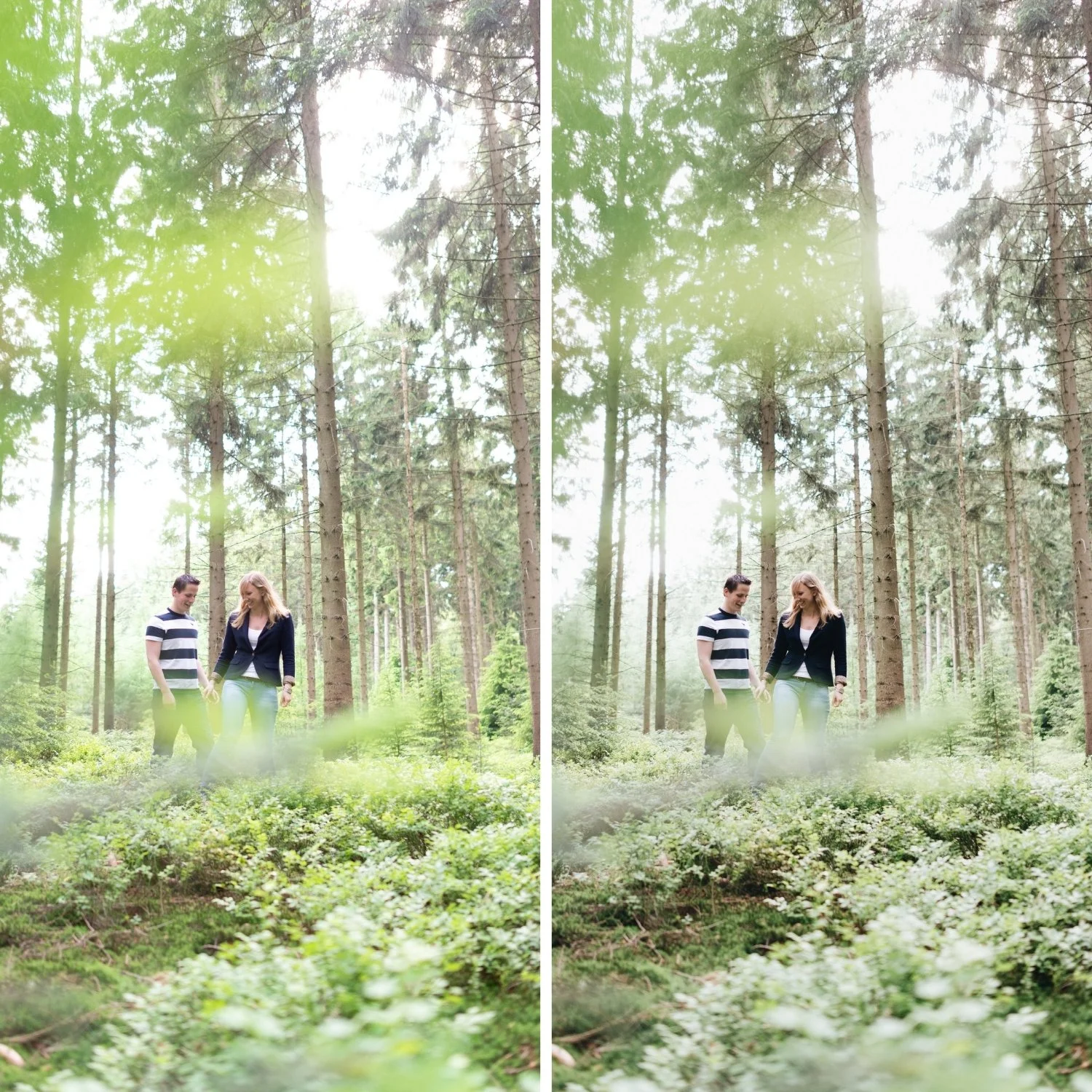
Green is the most important: reduce Green Saturation by -10 to -25 and shift Green Hue slightly toward yellow. This principle is equally important for travel photography, which How to Create a Timeless Travel Aestheticcovers specifically for outdoor and varied-light conditions. This changes how outdoor environments, vegetation, and foliage read from digitally vivid to organically present. It is the single adjustment that most reliably makes photography feel less processed.
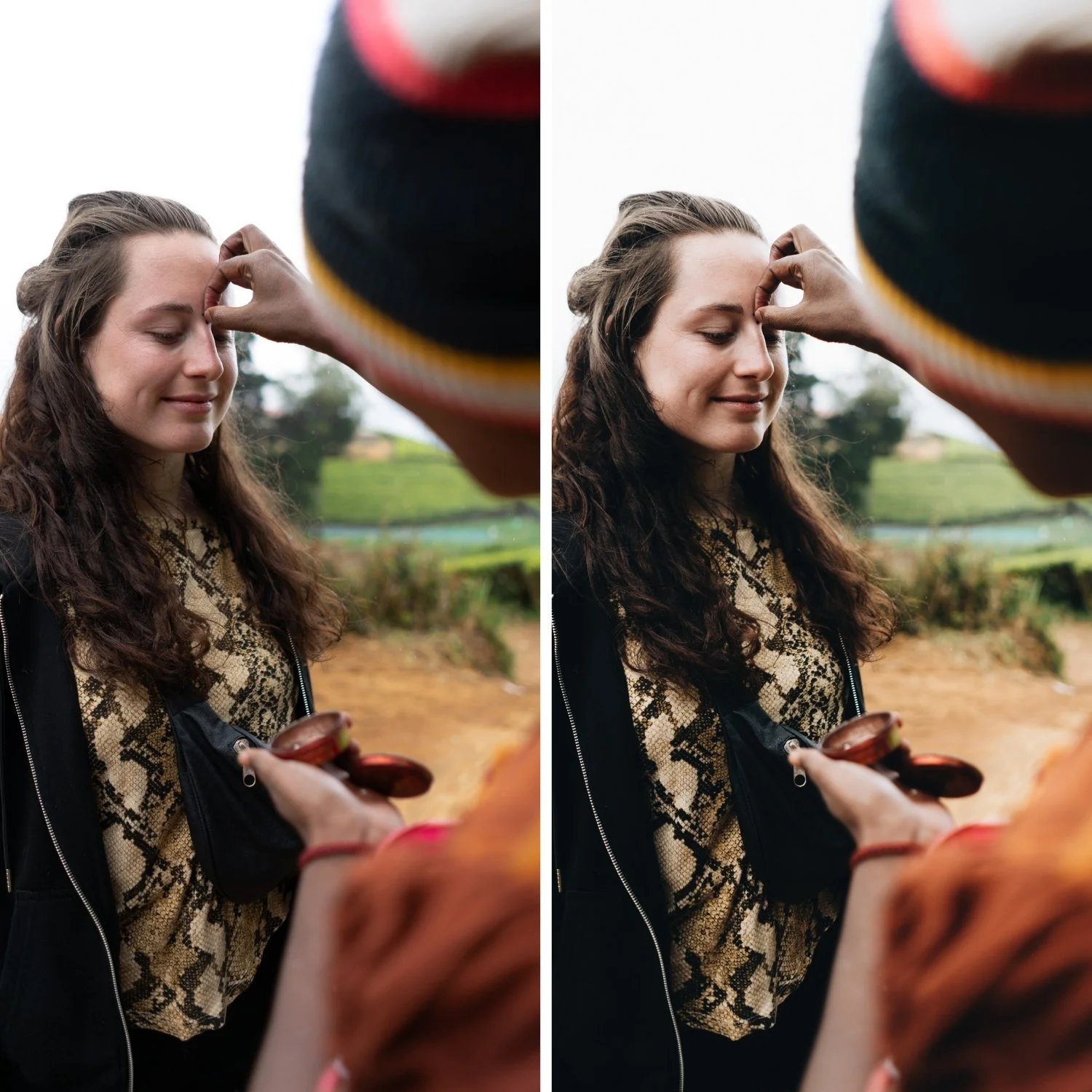
Orange controls skin tones. Reduce Orange Saturation by -5 to -20 and increase Orange Luminance by +5 to +15. This keeps skin warm and dimensional without the burnt quality that makes portraits look over-edited.
Blue controls skies and water. Reducing Blue Saturation by -5 to -20 prevents the electric sky quality that dates travel and outdoor photography. The skies should look like they were photographed in good light, not like they have been color-corrected for impact.
Color Grading adds the subtle depth that makes the look feel genuinely cinematic rather than just correctly adjusted. Push Highlight Hue to 35-50 with Saturation at 5-10. This places warmth in the highlights specifically, referencing the quality of warm film photography. Shadow grading should be kept very close to neutral with minimal Saturation if any. The color separation should be subtle enough that a viewer would not identify it as a stylistic choice. For photographers who want to understand what over-applied color separation looks like and how to modernize it, Why Teal and Orange Looks Dated is a useful companion to this guide.
Clarity and Grain: The Finishing Layer
Cinematic natural editing has a softness in the midtone detail structure that digital photography lacks. Clarity adds midtone contrast and edge definition. Keeping it at -5 to +5 depending on the subject removes the crispness that makes images read as digital. For portrait work, -5 to -15 is appropriate. For street and architecture, closer to 0.
Grain completes the integration. Film grain has a specific character: fine, slightly organic, and variable in a way that Lightroom can approximate well at moderate settings. Amount at 15-25, Size at 20-30, Roughness at 40-60 adds textural quality that unifies the image and reinforces the film character. Grain should be present but not visible as a separate element. If someone notices the grain before they notice the photograph, it is too strong.
Consistency as a Visual Identity
A single well-edited photograph is a demonstration. A gallery of consistently well-edited photographs is an identity. The cinematic natural look becomes a visual identity when the same tonal philosophy, the same contrast structure, and the same color restraint are applied consistently across every photograph in a body of work. Viewers experience the edit as the photographer's visual perspective rather than as a filter that was applied. The editing becomes invisible in the right way.
FAQ
What is the difference between cinematic and film look?
They overlap significantly but are not identical. Film look refers specifically to the properties of analog film photography: lifted blacks, soft highlights, organic color, grain. Cinematic is broader and refers to the visual intentionality and tonal depth of cinema color grading, which can be applied without strictly following film emulsion properties.
Why does my cinematic edit still look digital?
The most common causes are unaddressed digital qualities: Contrast slider still pushing punch, Green Saturation still too vivid, Clarity adding midtone crispness. Work through each systematically. If the image looks good individually but the gallery looks inconsistent, white balance discipline across images is the issue.
Does cinematic editing require a specific subject matter?
No. The tonal philosophy applies across genres. For skin-specific calibration within this framework, How to Keep Skin Tones Natural in Film-Style Edits covers the Orange channel approach in detail. The tonal philosophy of cinematic natural editing applies to travel, portrait, lifestyle, street, and architectural photography. The specific adjustments (highlight protection, skin tone handling, color restraint) need to be calibrated differently for each genre, but the underlying approach is the same.
Try a calibrated cinematic base on your own photos:
Download the free Analog Film preset and test the cinematic natural approach with adjustments to Exposure and White Balance only.
For a complete analog system built around this cinematic natural philosophy across multiple lighting conditions, explore the Vesper Archive.