Editorial Film Lightroom Preset — Complete Guide (2026)
Editorial Film Lightroom Preset — Complete Guide (2026)
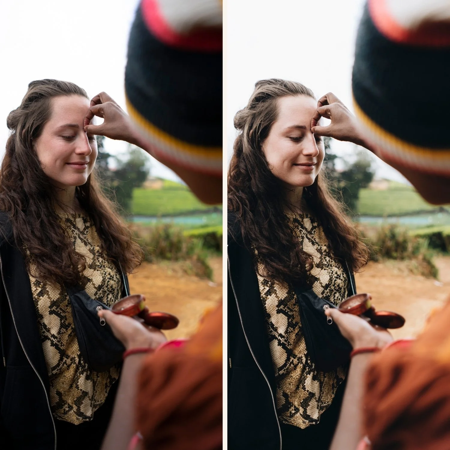
Editorial photography editing has a bold, deliberate quality that separates it from every other editing aesthetic. The color choices are intentional. The tonal structure is distinctive. The overall look immediately communicates a specific creative vision rather than a naturalistic rendering of the scene.
Cross-processed film photography was the origin of the editorial color look — developing color film in the wrong chemical process created unpredictable, distinctive color shifts that became synonymous with high-end fashion and editorial photography in the 1990s and 2000s.
This guide covers how to create the editorial film look in Lightroom and which presets deliver the most authentic results.
What makes the editorial film look?
Distinctive color shifts. Not naturalistic color. Shadows and highlights with different, unexpected color temperatures. Greens that shift toward cyan. Blues that deepen unusually. A specific color character that is recognizable rather than neutral.
Bold tonal structure. More contrast than standard film presets. Clear separation between light and dark areas with a deliberate visual hierarchy.
Unique color palette. Not warm. Not cool. Specifically editorial — a palette that reads as a creative choice rather than a lighting condition.
High production quality. Editorial editing feels refined and deliberate. Not casual, not nostalgic, not trendy. A quality that references professional photography made with specific creative intent.
Strong visual identity. The defining characteristic — editorial presets create an immediately recognizable visual identity. Two photos from the same editorial session should look unmistakably related.
Exact settings for editorial film
Basic panel:
Exposure: 0 to +0.3
Contrast: +5 to +20
Highlights: -20 to -35
Shadows: +10 to +20
Whites: -10 to -20
Blacks: 0 to +10
Presence:
Clarity: 0 to +10 (slight positive for editorial sharpness)
Vibrance: -10 to -15
Saturation: -5 to -10
Color Grading — the defining section:
Shadows: cool blue-teal (hue 195-215, saturation 20-30) OR warm amber (hue 20-40, saturation 20-30) — choose one direction
Highlights: opposite of shadows — warm if shadows are cool, cool if shadows are warm
Midtones: slight push toward one direction
HSL — Hue:
Green: shift toward cyan (-5 to -10) — cross-processed green characteristic
Blue: shift toward cyan (+5 to +10)
HSL — Saturation:
Green: -10 to -15
Blue: +5 to +10 (slightly enhanced editorial blue)
Red: -5 to -10
Tone Curve:
Moderate S-curve — more contrast than film presets
Slightly lifted black point
Effects:
Grain Amount: 15-20
Size: 22-28
Roughness: 40-50
Editorial film vs cinematic vs moody
Editorial film is defined by color character — distinctive, unexpected color shifts that create a visual identity. The bold color is the point.
Cinematic is defined by tonal drama — high contrast, split-tone color grading, visual weight. The tonal structure is the point.
Moody is defined by atmosphere — controlled shadows, warm color, depth. The emotional quality is the point.
Editorial film creates a visual identity. Cinematic creates drama. Moody creates atmosphere. For cinematic: Cinematic Lightroom Preset Guide. For moody: Moody Film Preset Guide
Best photography for editorial film editing
Fashion and editorial portrait photography. The natural home of the editorial film aesthetic. Cross-processed color references the visual language of fashion photography.
Travel photography with a distinctive editorial edge. Travel content that wants to stand out from standard warm film travel editing.
Architecture and urban photography. The distinctive color shifts create visual interest in architectural photography beyond standard documentary rendering.
Creative and artistic photography. Any photography where visual identity matters more than naturalistic rendering.
The Quartz Archive
The Quartz Archive (Q-Series) is built around cross-processed editorial film color — ten presets covering the full range from subtle editorial character to bold experimental expression.
Q1 — Clean Cross: Subtle, accessible. Best starting point.
Q2 — Cool Editorial: Refined and modern.
Q3 — Bold Shift: Strong cross-processed character.
Q4 — Warm Cross: Warm editorial quality.
Q5 — Deep Cinematic: Rich and cinematic editorial.
Q6 — Cool Moody: Cool atmospheric editorial.
Q7 — Vibrant Bold: Maximum color boldness.
Q8 — Soft Faded: Gentle editorial fade.
Q9 — High Contrast: Maximum contrast and character.
Q10 — Experimental: Most distinctive and bold.
$2.70 per preset. Ten editorial variations.
EXPLORE THE QUARTZ ARCHIVE — $27
Free editorial starting point
The free A6 preset is a clean neutral base. After applying: add cool Color Grading to shadows (hue 200, saturation 20), warm Color Grading to highlights (hue 40, saturation 15), and shift Green Hue toward cyan (-8). That creates the foundation of the editorial cross-processed look.
FAQ
What is editorial film editing in Lightroom?
Editorial film editing uses cross-processed color shifts, distinctive tonal structure, and a bold visual character that creates an immediately recognizable aesthetic. It references the look of high-end fashion and editorial photography shot on cross-processed film.
Is editorial film the same as cinematic?
No. Editorial film is about distinctive color character — unexpected color shifts that create visual identity. Cinematic is about tonal drama — high contrast and split-tone grading. They overlap but serve different aesthetics.
Does editorial film work for portrait photography?
Yes for editorial portraits where the visual identity is the priority. Less suitable for natural, flattering portrait work where skin tone accuracy matters more than aesthetic distinctiveness.