Fuji Film Style Lightroom Presets
Fuji Film Style Lightroom Presets
The Fuji film aesthetic is one of the most requested looks in photography editing and one of the most frequently misexecuted. Photographers describe it as clean, airy, and light without quite being able to explain what that means technically. The result is attempts that go too far toward matte flatness, or not far enough and remain digitally clean without the film character. Understanding what Fuji film photography actually looks like at a technical level produces a much clearer path to the result.
Fujifilm color photography has a specific visual character that comes from the specific spectral sensitivity of Fujifilm emulsions. The greens are characteristically fresh and slightly warm rather than vivid and blue-shifted. The skin tones are neutral and natural rather than aggressively warm. The highlights are luminous and soft rather than crisply bright. The overall color palette is restrained and considered rather than bold and saturated. This is not the same as low-saturation photography, which is simply muted. Fuji-inspired color has a specific quality in each channel that produces the look as a combination of properties.
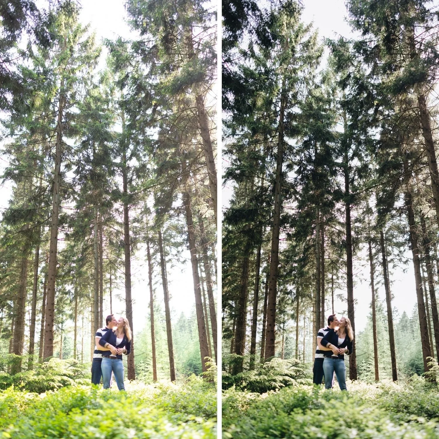
What Fuji Film Style Actually Means
The most important distinction in understanding the Fuji film aesthetic is the difference between airy and flat. Photographs that are simply underexposed and desaturated are flat. Photographs with genuine Fuji-inspired quality are bright and open without being flat, with controlled highlights that feel luminous rather than blown and shadows that have depth rather than being lifted into grey.
The four properties that define the Fuji film look are: soft highlight roll-off that keeps bright areas present and luminous rather than clipping or going flat, controlled green rendering where foliage and outdoor environments have a fresh, slightly warm quality rather than the vivid blue-green of digital cameras, natural skin tones that are warm but not pushed and maintain their quality across varied lighting conditions, and gentle contrast structure that adds tonal dimension without the punchy digital quality of global contrast adjustment.
Exposure and Highlight Management
Bright, controlled exposure is the foundation of the Fuji film look. The image should feel open and luminous rather than dark or compressed. Exposure should be set on the brighter side of the range, and Highlights should be reduced to protect the bright areas from clipping while keeping them present.
Highlights: negative 20 to negative 40. This creates the specific range in which the highlight roll-off adjustment in the Tone Curve has material to work with. Highlights reduced too little produce clipped whites. Highlights reduced too aggressively produce a flat, grey quality in the brightest areas that removes the luminous character of the Fuji look.
Whites: negative 5 to negative 20. Shadows: negative 5 to negative 20, keeping the shadow depth present rather than lifting it. Blacks: 0 to negative 10. The overall tonal structure should feel open and breathing in the bright range while maintaining genuine shadow depth.
Green Channel: The Signature Quality
Greens are where Fuji-inspired editing is most distinctive and most often wrong. Digital cameras render outdoor vegetation with a blue-green quality and high saturation that reads as vivid and artificial. Fuji film rendered greens with a slightly warm, fresh quality that feels more natural and organic.
Green Saturation: negative 10 to negative 25 depending on how much vegetation appears in the photograph and how vivid the starting file is. Green Hue: shift slightly toward yellow, by 4 to 8 points. This combined adjustment moves outdoor greens from the digital neon-vivid quality toward the fresh, slightly warm quality that characterizes Fuji film photography. It is the single most impactful adjustment in producing the Fuji-inspired look because the green channel is the largest visible giveaway of digital processing.
Yellow Saturation reduction of negative 5 to negative 15 addresses the foliage-adjacent yellow tones that can become vivid alongside the green channel in outdoor photography. The combination of Green and Yellow adjustments produces the specific outdoor color quality that photographers describe as fresh and natural.
Skin Tones: Warm but Not Pushed
Fuji-inspired skin tone rendering is warm and natural rather than aggressively warm. The goal is skin that looks healthy and present without the orange quality that over-applied warmth produces.
Orange Saturation: negative 5 to negative 15. Orange Luminance: positive 5 to positive 12. This standard combination keeps skin warm and dimensionally present without pushing into orange. Red Saturation: negative 5 to negative 10 to control the warmth in the reddest skin areas without removing warmth from the overall palette.
White balance should be set to slightly warm of neutral, around 5,000 to 5,300K for outdoor daylight, and Tint at positive 4 to positive 8 toward magenta to counteract the slight green cast that outdoor diffuse light often has. The warm white balance combined with the managed Orange channel produces the Fuji-inspired skin quality.
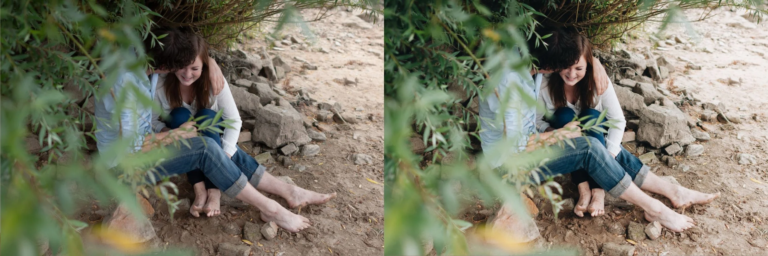
Tone Curve for the Soft Roll-Off
The Tone Curve is where the specific highlight roll-off quality that defines Fuji-inspired photography is created. The standard film curve applies here: shadow point lifted to output 15 to 18, a gentle midtone S-curve with modest upper-midtone lift and lower-midtone compression, and the highlight point pulled down to output 225 to 230.
The highlight point adjustment is the critical step for the Fuji look specifically. Moving the top-right anchor point down from maximum to output 225 creates a gradual compression in the brightest values that produces the luminous, creamy highlight quality rather than the abrupt clipping of digital photography. This is the technical source of the "soft highlights" that photographers recognize as characteristically Fuji.
Color Grading and Final Calibration
Color Grading should be restrained for the Fuji aesthetic. Highlight Hue in the 40 to 50 range at Saturation 5 to 8 adds very subtle warmth to the brightest areas. More than this crosses from Fuji-inspired subtlety into an obviously warm filtered look. Shadow Color Grading should be near neutral, with at most a very slight cool direction at Saturation 2 to 4.
Clarity: 0 to negative 8. The Fuji aesthetic should feel slightly soft in the midtone detail range rather than crisply sharp. Grain: Amount 10 to 18, Size 18 to 26, Roughness 45 to 55. The Fuji aesthetic uses relatively fine, subtle grain rather than the more prominent grain of documentary or moody photography.
FAQ
Why does my Fuji-inspired edit look too matte?
Usually because Blacks have been lifted too aggressively or global Contrast has been reduced without being rebuilt through the Tone Curve. Matte editing compresses the tonal range. Fuji-inspired editing has genuine tonal depth alongside the bright, airy quality.
Can I achieve the Fuji look on a non-Fuji camera?
Yes completely. The Fuji film look is an aesthetic that comes from the editing calibration rather than from the camera. Sony, Canon, Nikon, and phone camera files all produce the Fuji-inspired result with the same adjustments, potentially with minor per-camera calibration differences in the Green channel.
Why do my greens still look neon even after reducing Green Saturation?
Check that the Hue shift toward yellow was applied alongside the Saturation reduction. Reducing Saturation alone without the Hue shift often produces muted greens that still have a blue-green quality. The Hue shift toward yellow is what moves them toward the fresh, organic quality.
Try a clean airy film base on your own photographs:
Download the free Analog Film preset and apply the Green channel adjustments and Tone Curve highlight protection described above to understand how the Fuji-inspired quality differs from standard warm film editing.
For clean, light, airy film collections, the Bright and Clean Archive covers the bright clean direction and the Essence Archivecovers the warm film direction. TheStudio Archive includes both at $89.
