Understanding Color Curves for Film Editing in Lightroom
Understanding Color Curves for Film Editing in Lightroom
The Tone Curve is the most important single tool in film aesthetic editing. It controls contrast, tonal range, shadow depth, highlight behavior, and the dimensional quality that makes film photography feel different from digital. Most photographers use it cautiously — adding a gentle S-curve and hoping for the best. Understanding what the curve is actually doing, and why specific shapes produce specific results, makes film editing faster and more reliable.
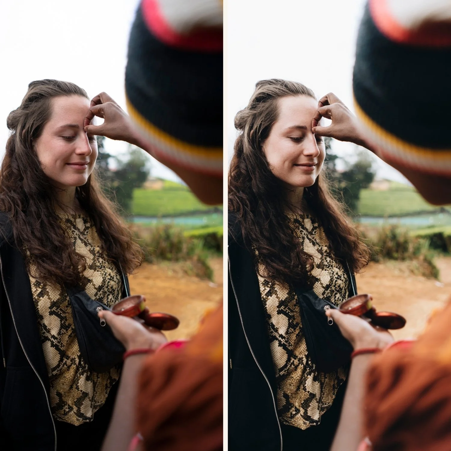
What the Tone Curve Is Doing
The Tone Curve maps input tonal values to output tonal values. The horizontal axis represents the input value (the tonal value of the original photograph). The vertical axis represents the output value (the tonal value after the curve is applied). A straight diagonal line from bottom-left to top-right means no change — every input value maps to the same output value.
When you add a control point and drag it up, you are telling Lightroom to map that input value to a higher output value. The pixel becomes brighter. When you drag it down, the pixel becomes darker. The curve shape between control points creates smooth transitions between the adjusted values.
For film editing, the specific interest is in what happens at the extreme ends of the curve — the shadow point (bottom-left) and the highlight point (top-right) — and in how the overall shape of the curve creates contrast through the midtone range.
The Shadow Point: Where the Film Look Starts
The bottom-left point of the Tone Curve represents the darkest tonal values in the image — pure black. In the default Lightroom Tone Curve, this point is anchored at the very bottom: input 0 maps to output 0. Pure black stays pure black.
Film photography does not produce pure black. Film base density — the physical substrate of the film — has an inherent opacity that prevents the darkest exposed areas from producing zero output density. This creates a shadow floor: the darkest values in film images are still slightly grey rather than pure black.
To replicate this in Lightroom, lift the bottom-left control point upward. Move it from output 0 to output 10-20. This maps pure black to a slightly lifted dark grey, which is the visual equivalent of film's shadow floor. The shadows retain depth but do not go absent. This is the single most recognizable quality of the film look and one of the most neglected in film preset editing.
This is different from lifting the Blacks slider in the Basic panel. The Blacks slider affects the darkest range of the image and can produce a flat, muddy quality when pushed too high. The Tone Curve shadow point adjustment is more targeted and preserves the depth of the shadow range while only lifting the absolute floor.
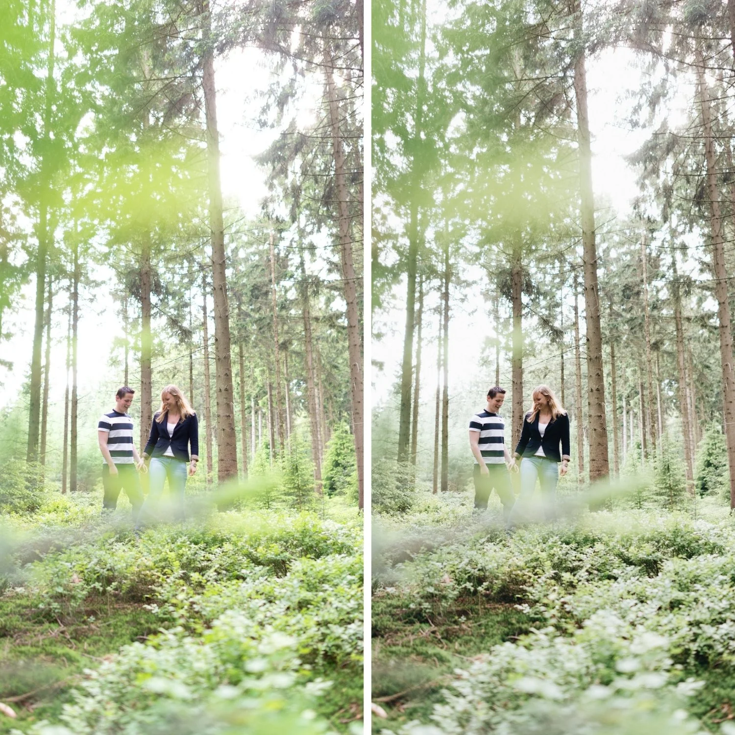
The Highlight Point: Film's Creamy Compression
The top-right point of the Tone Curve represents the brightest tonal values. In the default position, input 255 maps to output 255 — pure white stays pure white.
Film photography compresses highlights gradually rather than clipping abruptly. As exposure increases toward the maximum density of the film, the tonal transitions become softer and more compressed. Highlights do not disappear into blank white — they become luminous and slightly compressed, retaining detail and texture.
To replicate this, pull the top-right control point slightly down and slightly left. Instead of the point sitting at maximum output, it maps to a slightly lower output value. This prevents the brightest values from hitting pure white and creates the gradual compression that produces the creamy highlight quality of film photography.
The Whites slider in the Basic panel also affects highlights, but it works globally rather than with the precision of the curve. For best results, use both: reduce Whites in the Basic panel to -10 to -20 to protect highlights, then use the Tone Curve highlight point to create the specific compression shape.
The S-Curve and Midtone Contrast
The classic film S-curve adds contrast through the midtone range by lifting upper midtones and compressing lower midtones simultaneously. This creates the dimensional quality that distinguishes film contrast from digital contrast.
The key is how gentle the curve is. The S-curve that produces film contrast is barely visible as an S-shape. Two small control points, each displaced only slightly from the straight diagonal line. A gentle upward displacement in the upper midtones (around input 180-200) and a gentle downward displacement in the lower midtones (around input 60-80).
A steep S-curve produces digital-looking punch. If the two control points are displaced far from the diagonal, the contrast reads as harsh and manufactured. The goal is the feel of film contrast — dimensional and layered — not the visual impact of heavy contrast.
The RGB Curves for Color Toning
Below the main Tone Curve in Lightroom, the Red, Green, and Blue individual channel curves allow color toning through curve adjustments. This is an advanced technique but produces more nuanced color results than the Color Grading panel alone.
The most useful application for film aesthetics is a slight S-curve in the Blue channel: lift the shadow end of the Blue curve slightly and lower the highlight end slightly. This adds subtle coolness in the shadows and reduces the blue in highlights simultaneously, approximating the warm highlight and subtle cool shadow behavior of many warm film stocks.
A slight lift in the Red channel shadow point adds warmth to dark areas — the amber quality of warm film shadows. Combined with the Blue channel adjustment, this produces dimensional warm-cool behavior that feels more film-like than Color Grading alone.
FAQ
Should I use the Parametric Curve or the Point Curve?
The Point Curve gives more precise control and is better for film editing. The Parametric Curve (the sliders at the bottom) adjusts predefined tonal ranges but cannot replicate the specific shadow floor and highlight compression of the Point Curve.
How do I avoid posterization from aggressive curve adjustments?
Posterization — where smooth tonal transitions break into visible banding — is caused by stretching tonal ranges too far. Keeping individual curve adjustments gentle (no more than 15-20 points of displacement per control point) prevents this in almost all cases.
Does the Tone Curve affect grain differently than the Contrast slider?
Yes. The Contrast slider applies contrast before grain is evaluated. The Tone Curve works the same way in terms of processing order. The difference is that Tone Curve contrast is more locally targeted than the global Contrast slider, which means grain integrates more naturally into a curve-based contrast structure.
Can I create a preset that only contains the Tone Curve settings?
Yes. When creating a preset, select only the Tone Curve checkbox. This allows you to apply the film Tone Curve to photos that already have their own color and exposure settings without changing anything else.
See the Tone Curve applied in a calibrated film preset:
Download the free Analog Film preset and open the Tone Curve panel after applying it to see how the shadow floor, highlight compression, and gentle S-curve work together.
For a complete collection built on this Tone Curve philosophy across varied film aesthetics, explore the Analog Film Archiveor the Vesper Archive.
