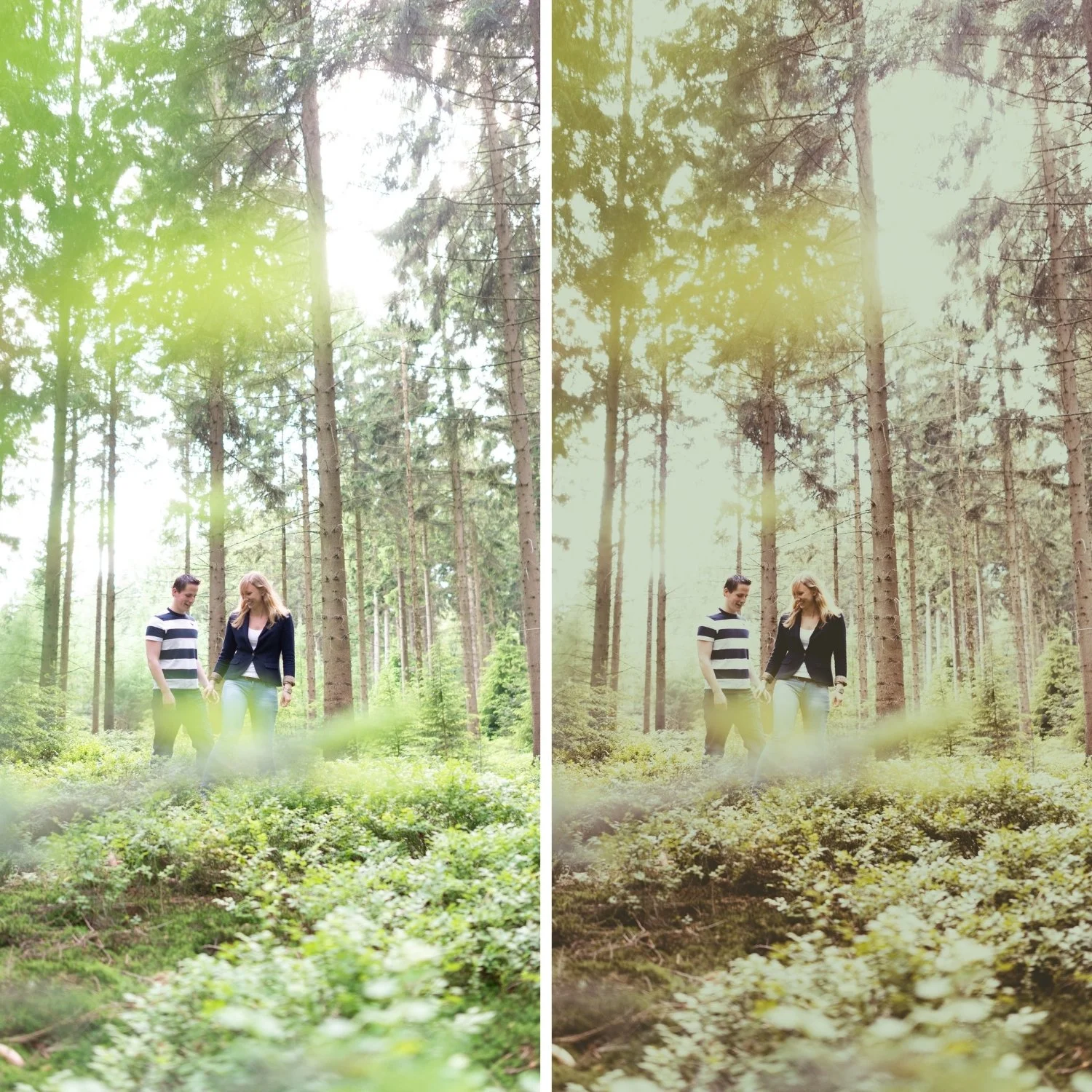
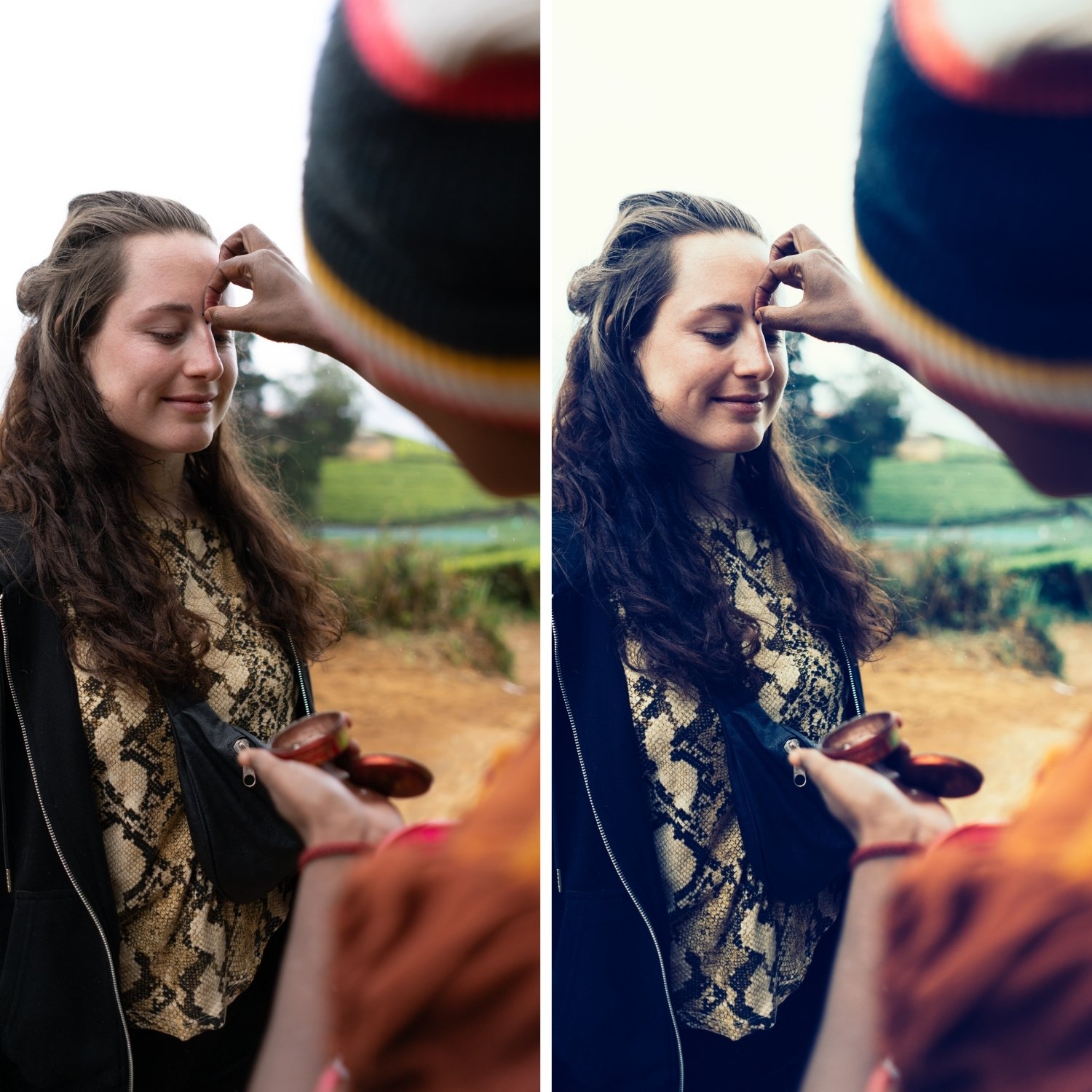
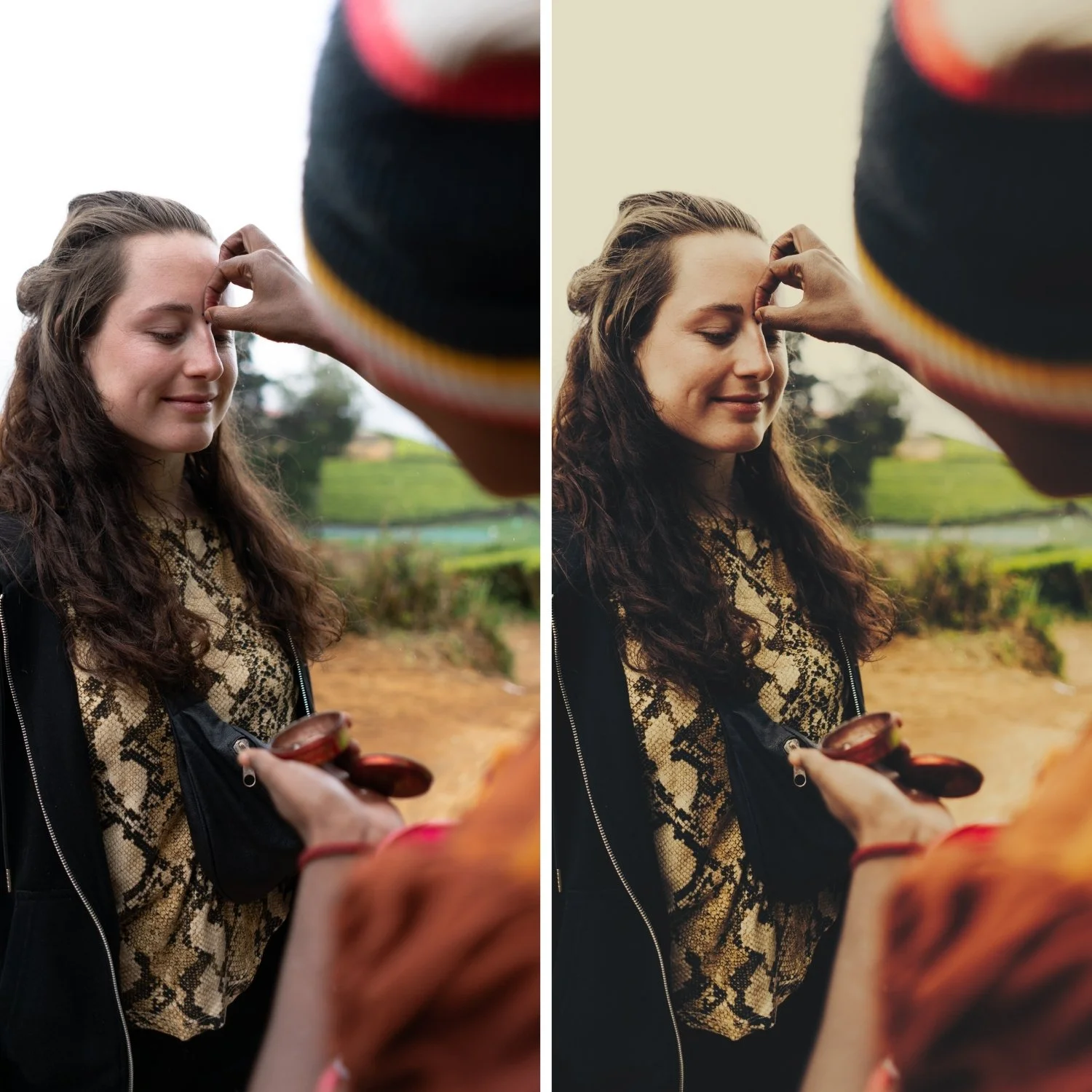
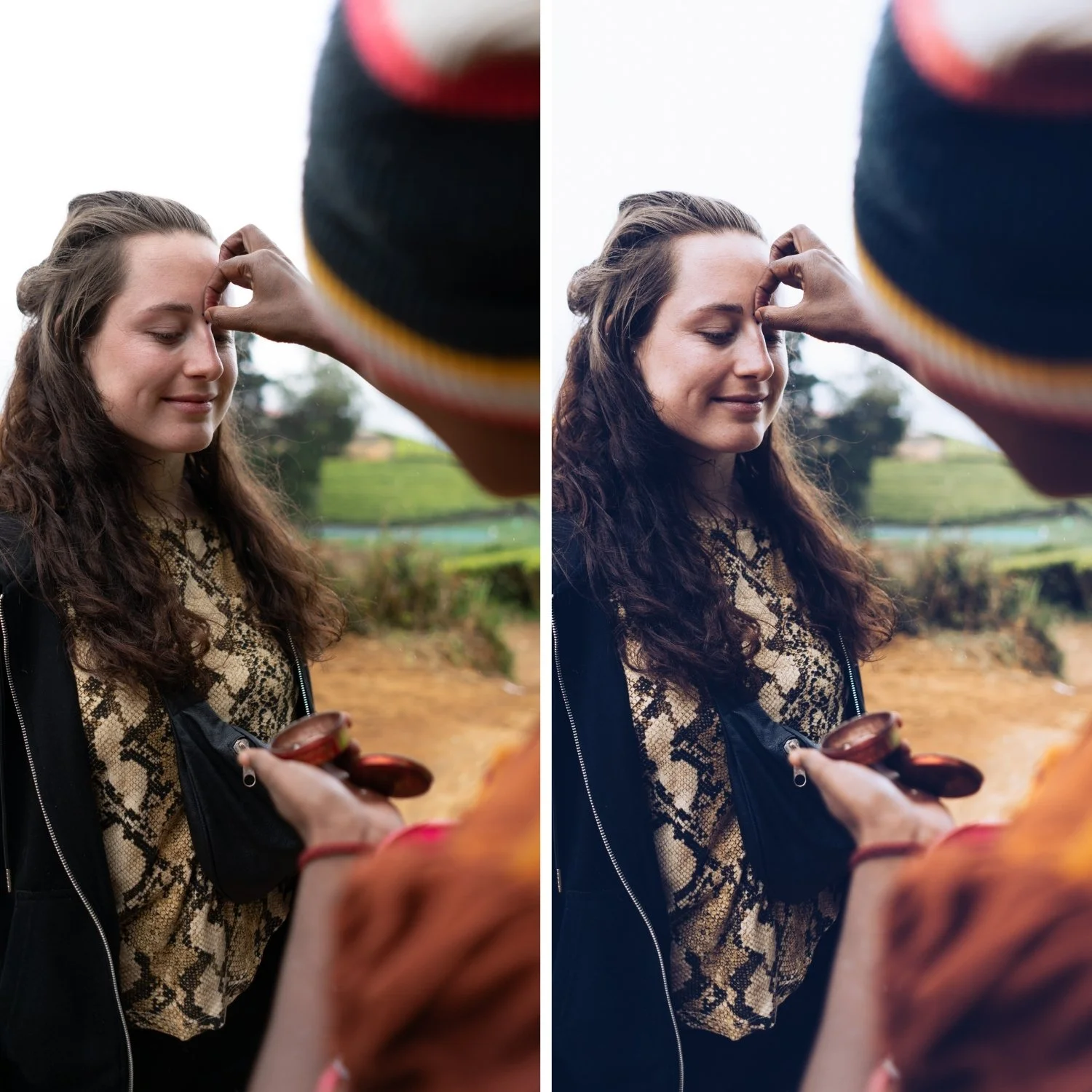
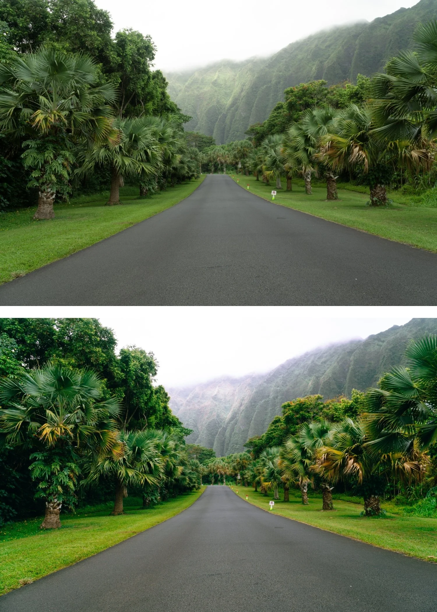
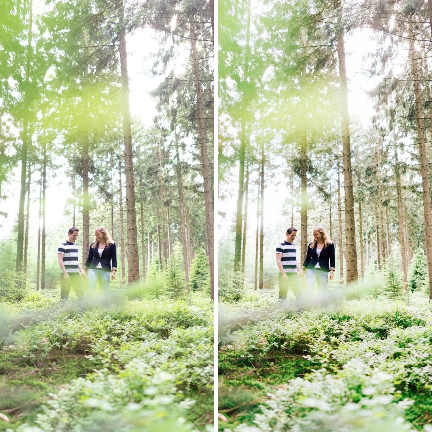
Image 1 of 4
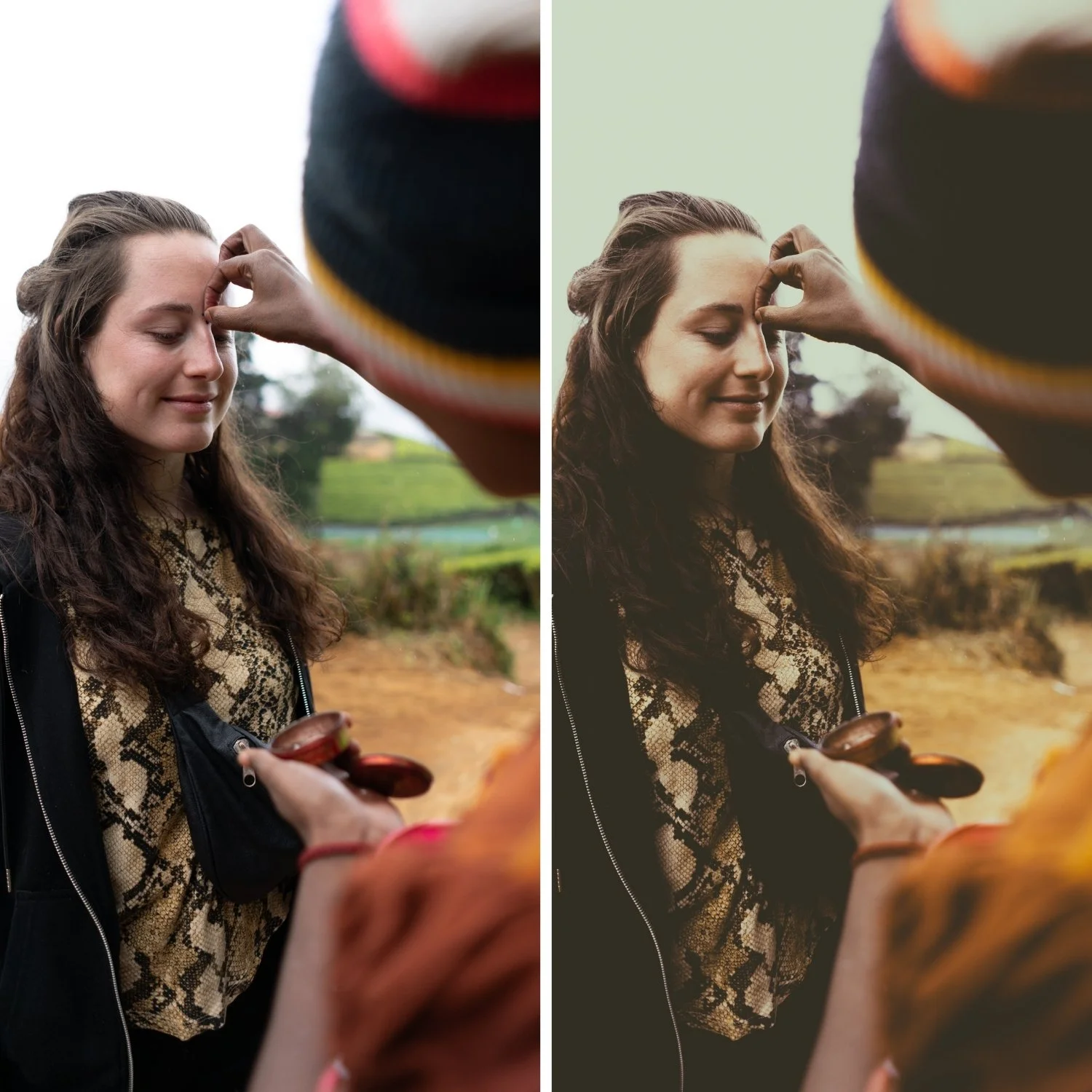
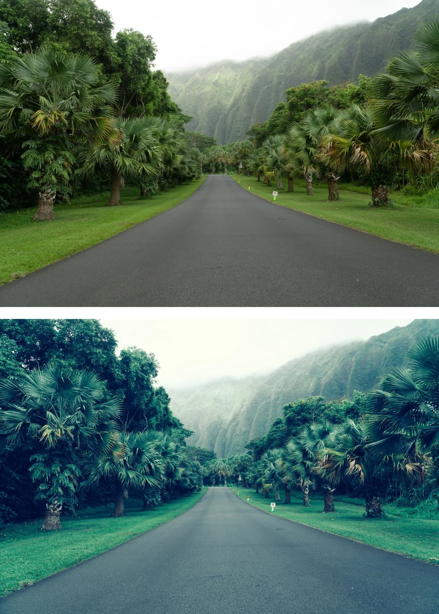
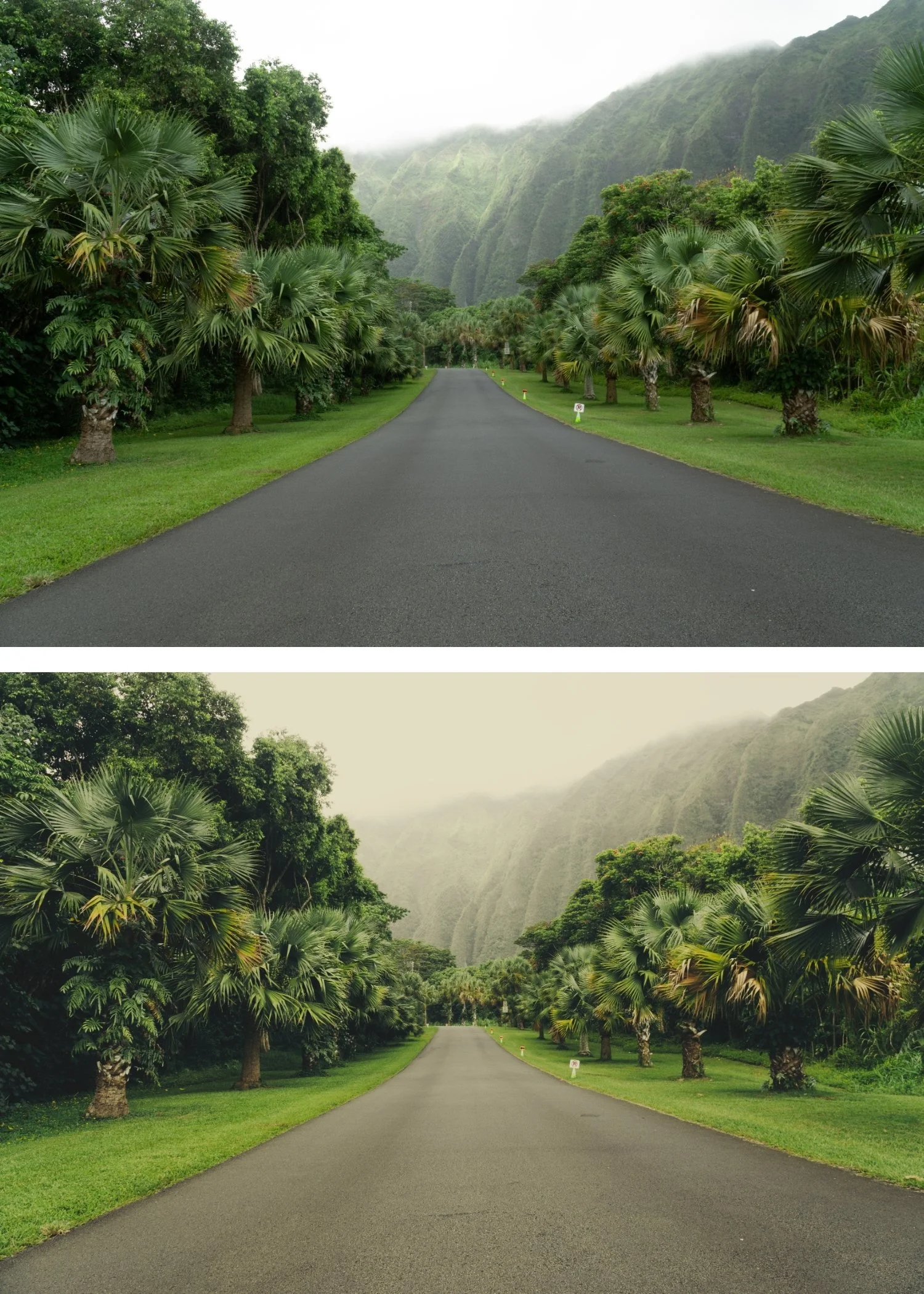
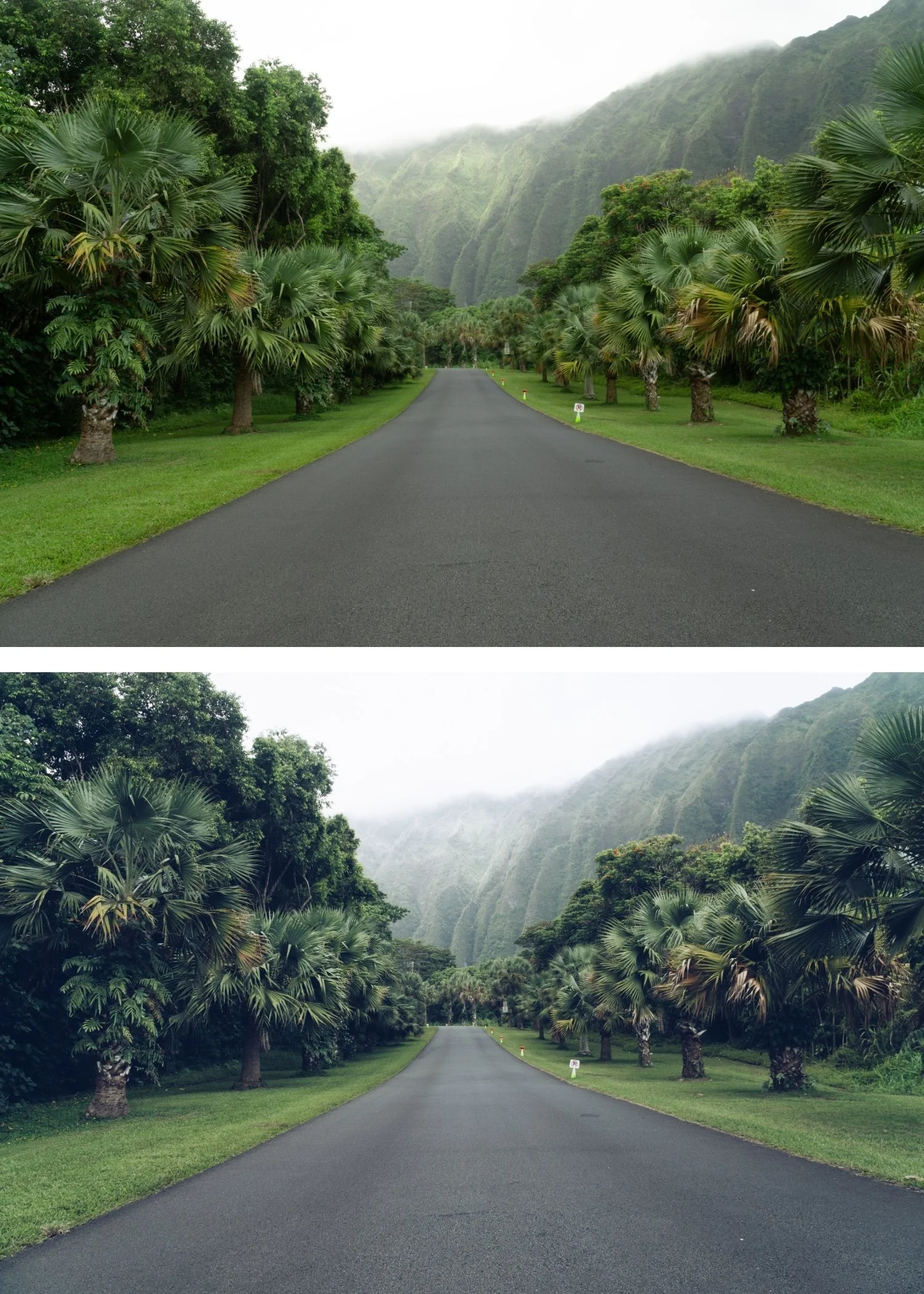
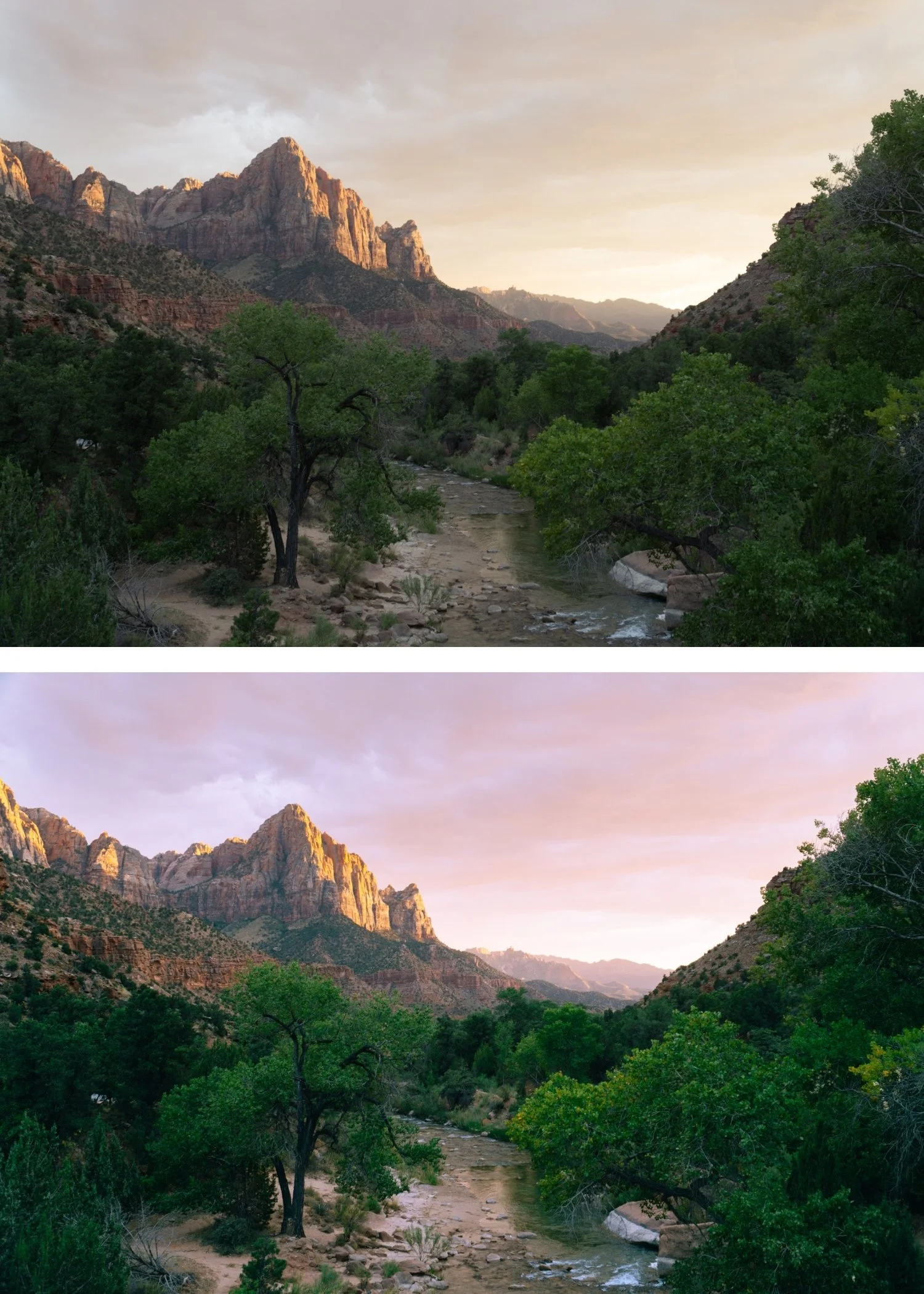
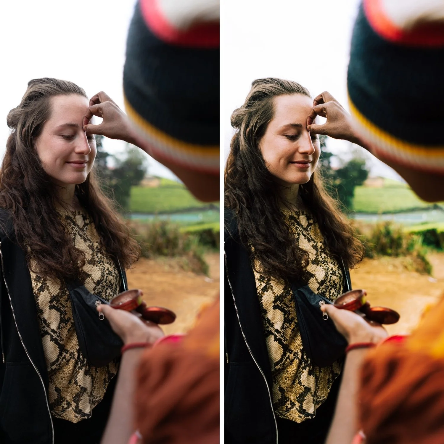
 Image 2 of 4
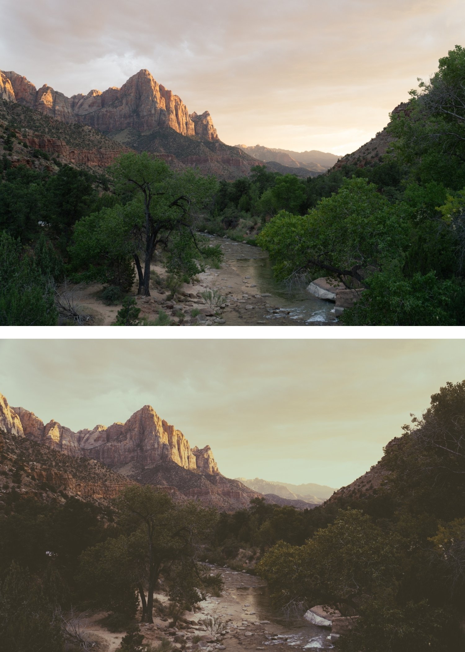
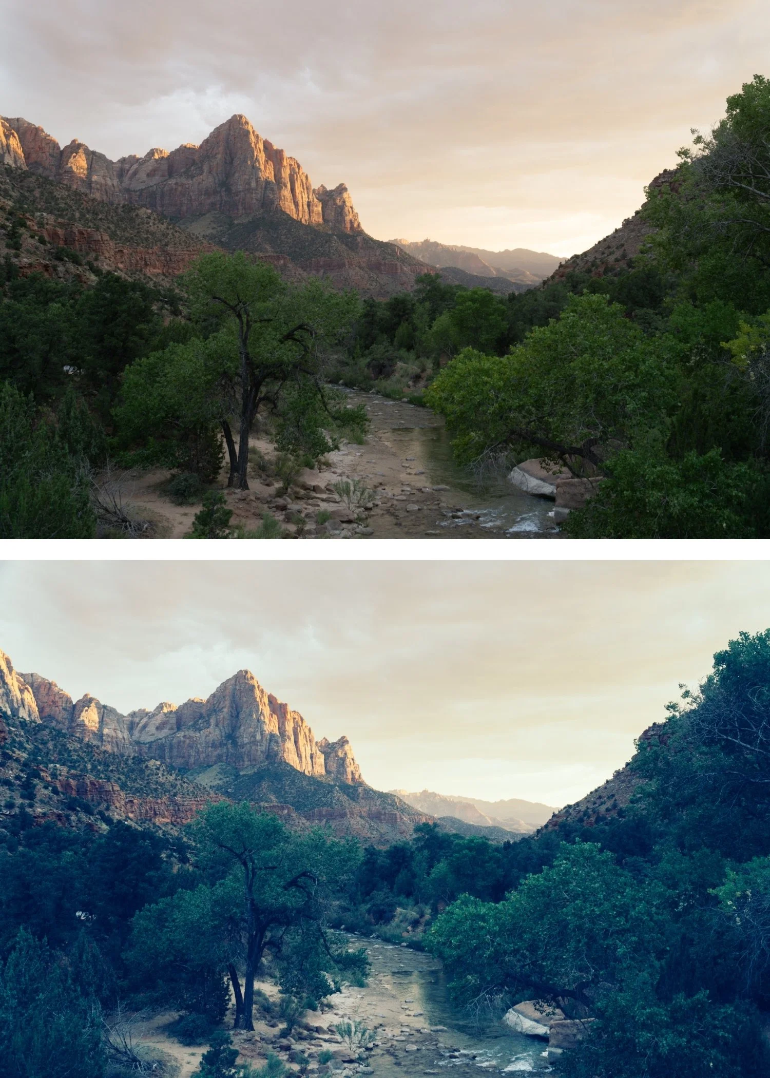
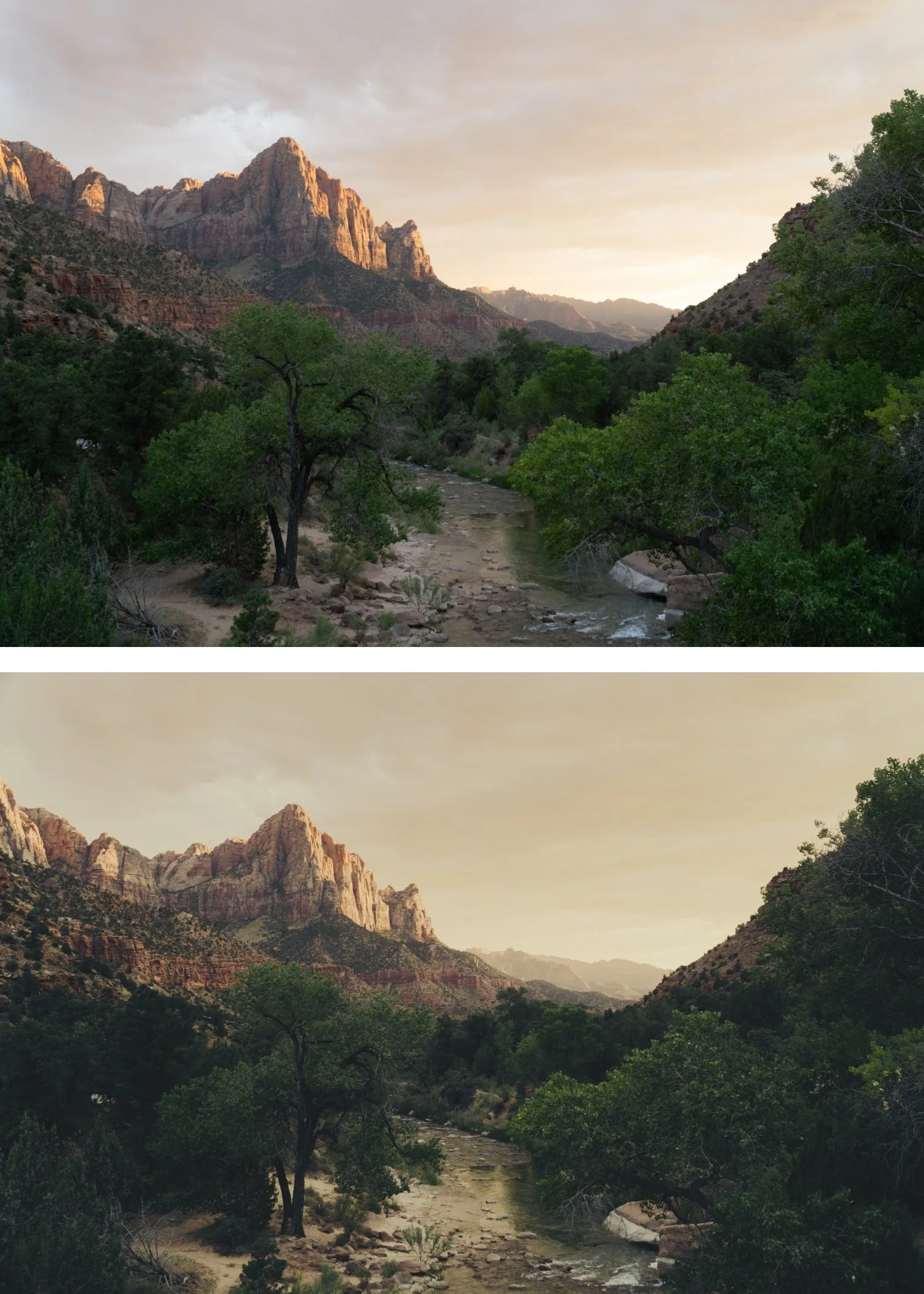
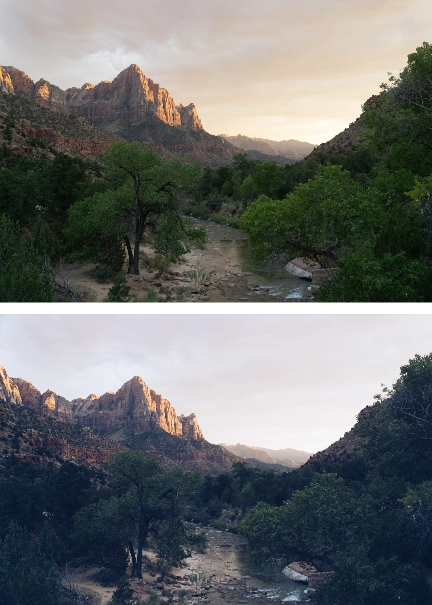
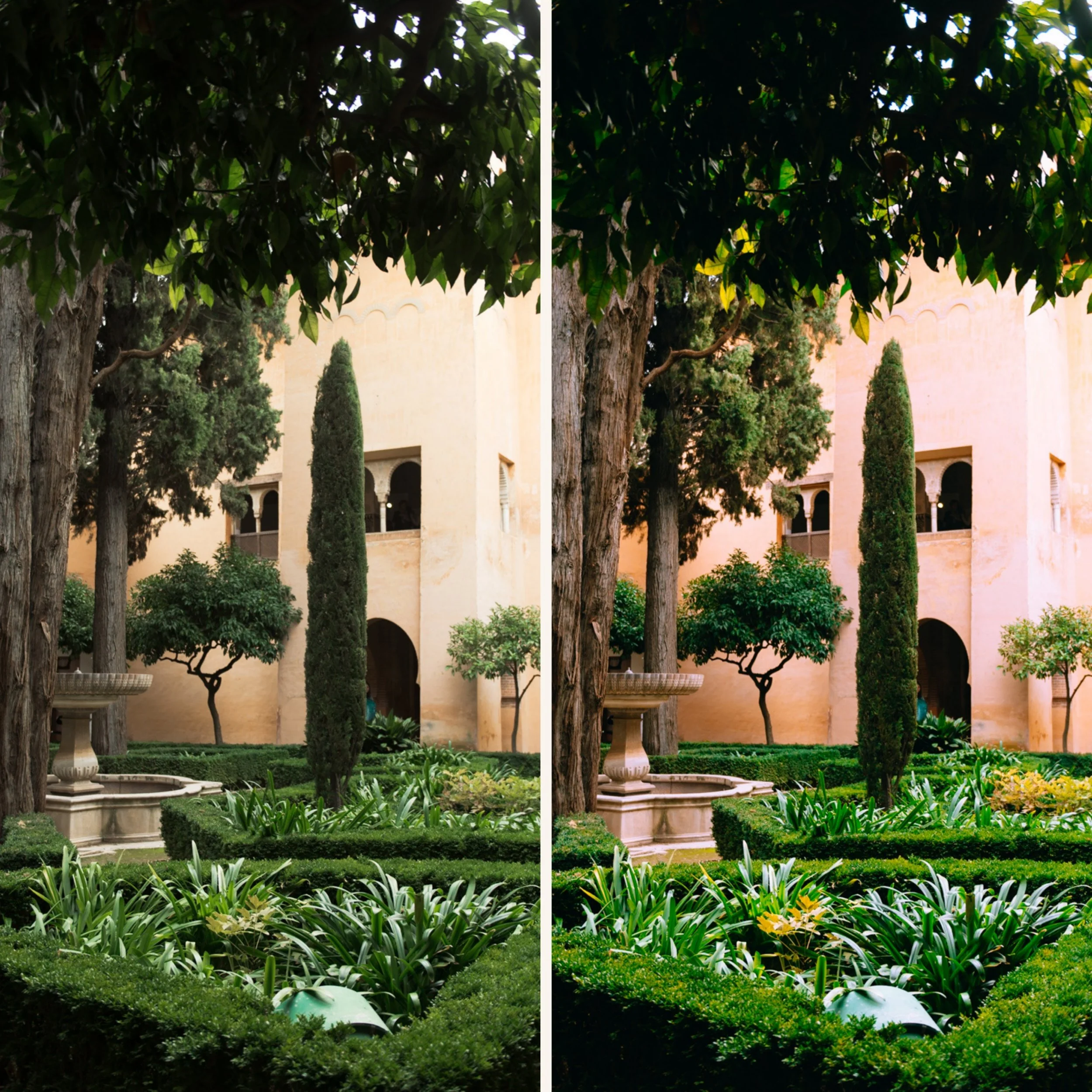
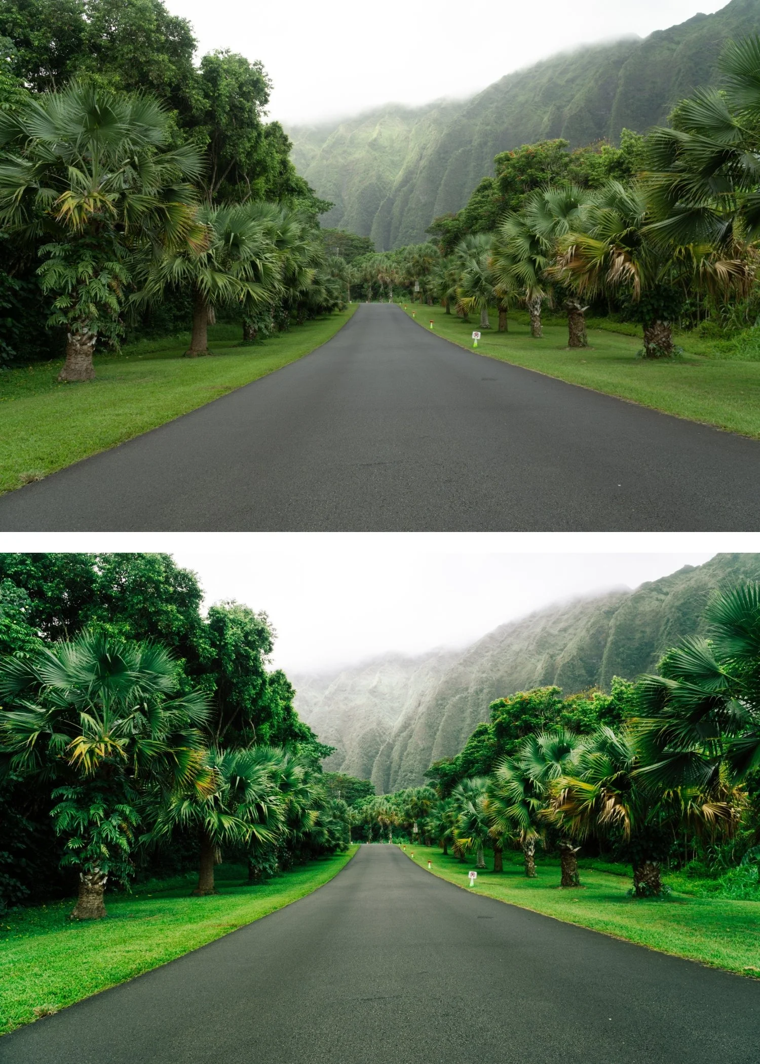
 Image 3 of 4
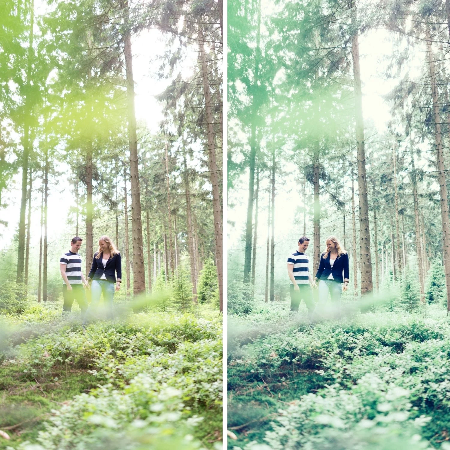
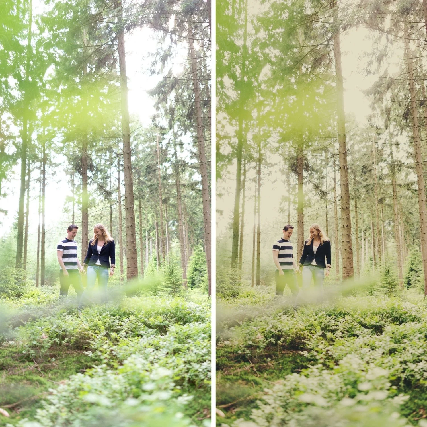
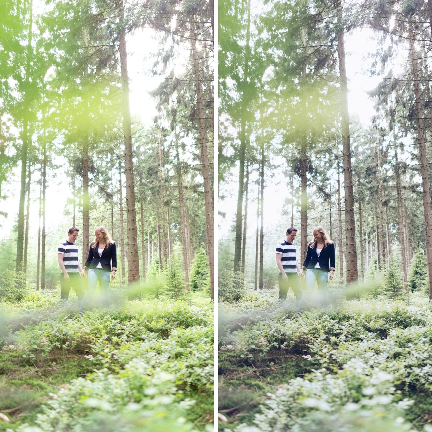
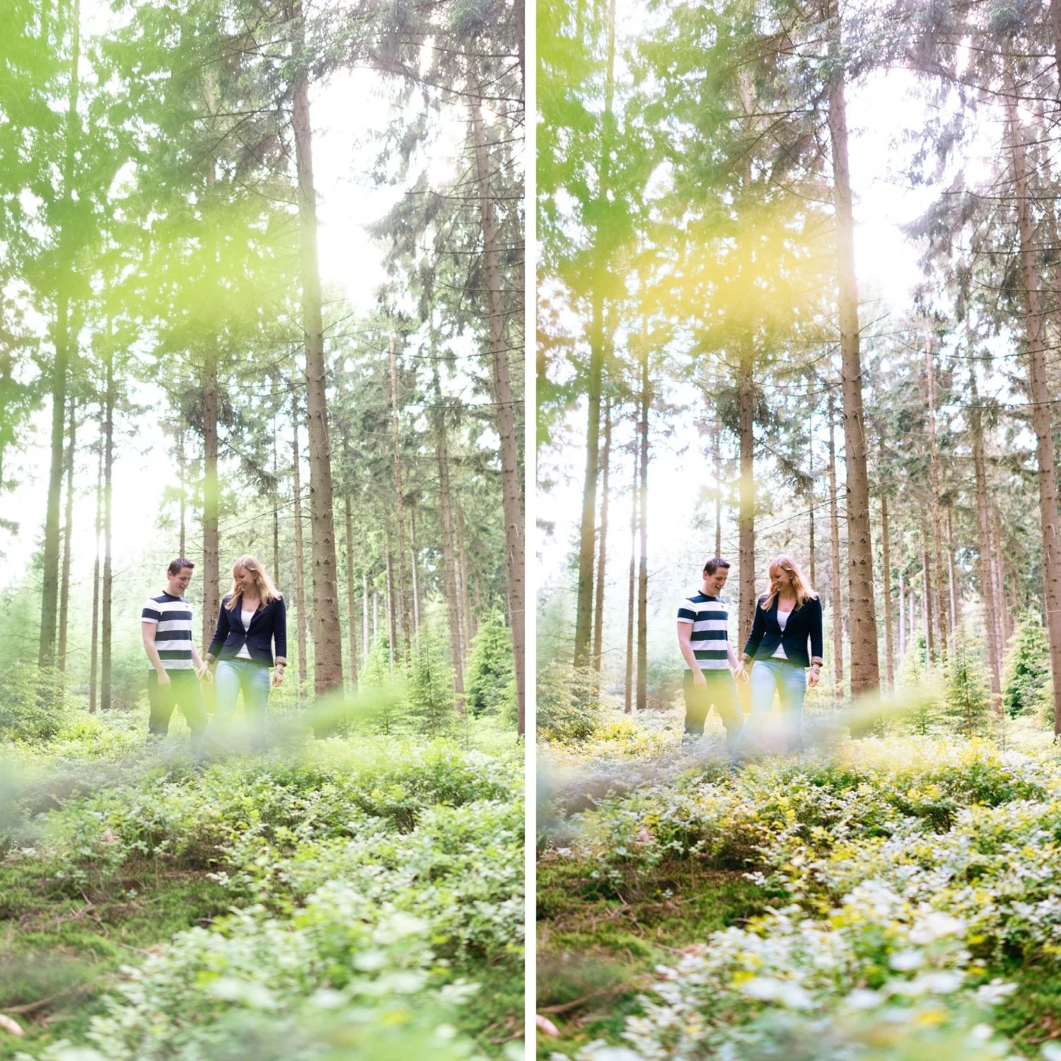
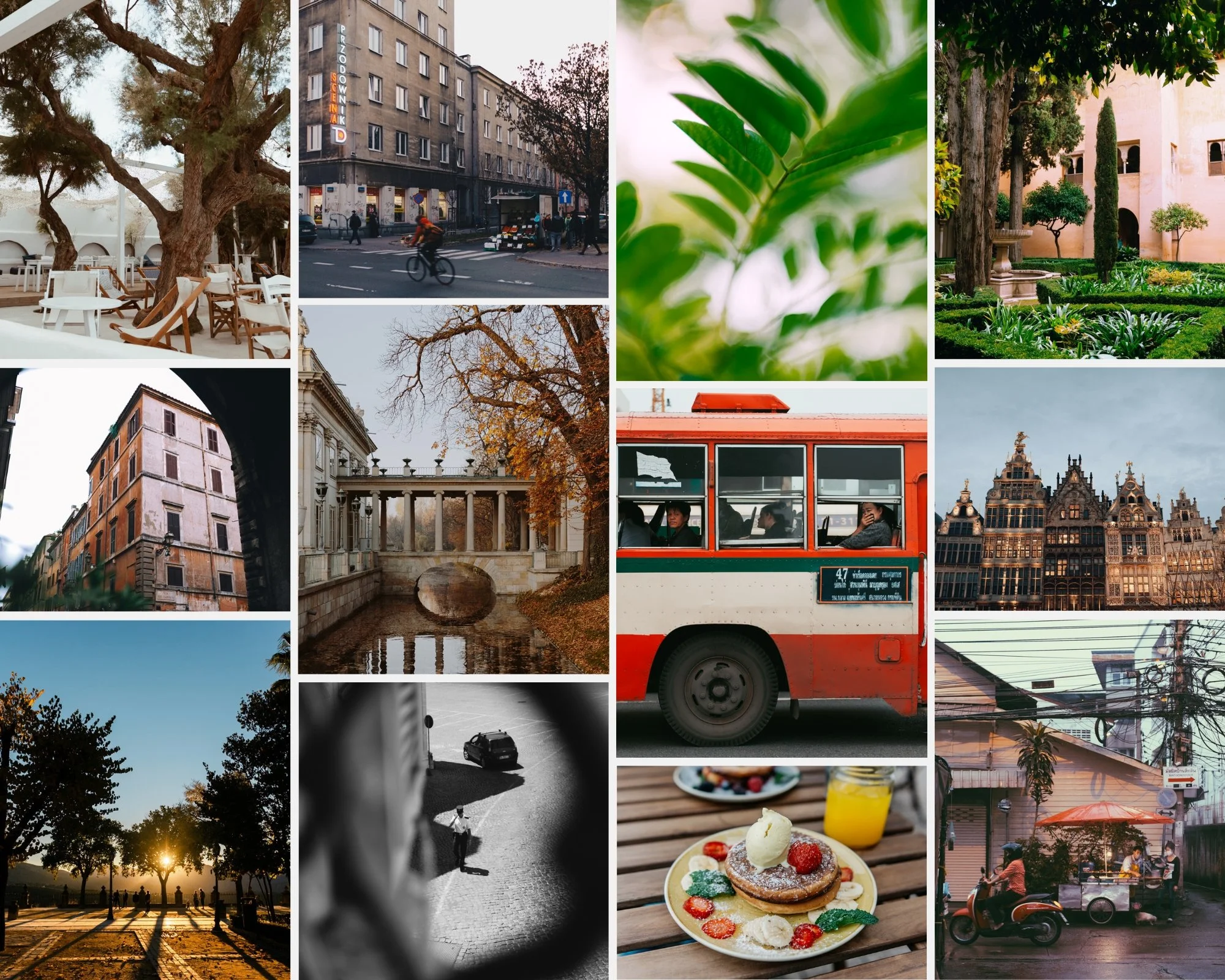
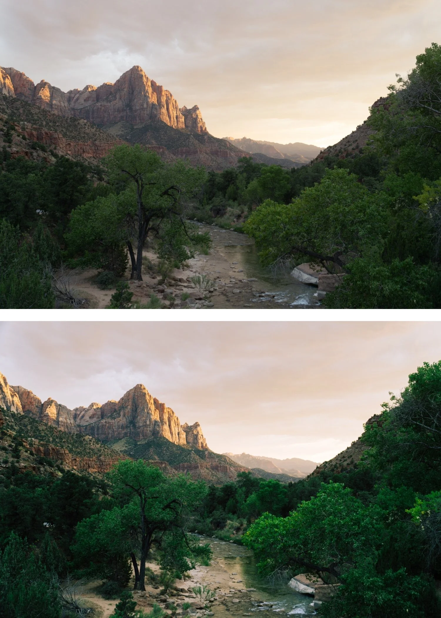
 Image 4 of 4
Chromatic 01 Classic Kodachrome | Kodachrome Film Preset for Lightroom Mobile & Desktop
-
K1 is for travel, landscape, and outdoor photographers who want the vivid color presence of classic slide film applied as a versatile everyday starting point.
For photographers who have found standard digital color too flat or neutral and want more color presence and life without the heavy saturation of a vivid filter.
-
The reds are different. Kodachrome's red rendering was its most distinctive quality — warm, slightly shifted toward orange, richer than digital. K1 replicates this specifically.
Blues have depth without going vivid. The slightly cyan-shifted blue of Kodachrome — sky, water, shadows — adds depth without the oversaturation of pushing Blue Saturation.
Skin tones stay warm within the vibrant palette. Kodachrome was widely used for portrait photography — the warm skin tones are calibrated to work alongside the vivid color rather than conflicting with it.
-
1 × K1 Classic Kodachrome DNG file — for Lightroom Mobile
1 × K1 Classic Kodachrome XMP file — for Lightroom Classic
Installation guide
Lifetime access -
This preset captures the vibrant, warm-saturated aesthetic similar to the iconic K1 filters. It’s the perfect professional alternative for those wanting an authentic, analog-inspired look that feels "real" rather than "filtered." By emulating the high-contrast and rich saturation of vintage 35mm film, the K1 ensures your digital shots have a polished, nostalgic finish that stands out on both desktop and mobile.
-
Step 1 — White balance first. K1 assumes a warm-neutral starting point — 5,000-5,400K for outdoor daylight. Kodachrome's warm color science reads most naturally on a warm-neutral foundation. On cool white balance, the vivid color can read as oversaturated rather than vibrant.
Step 2 — Apply K1 Classic Kodachrome. The Kodachrome color rendering, moderate contrast, and film character apply simultaneously.
Step 3 — Adjust Exposure and White Balance per photo. K1 handles the Kodachrome color identity. These two adjustments handle the per-photo differences.
Portrait photography with K1: the vivid palette of Kodachrome is primarily suited to outdoor and travel subjects. For close-up portrait work, reduce to 78-82% strength and check that Orange Saturation after applying reads as warm rather than orange. K1's skin rendering is warm by nature — on subjects in direct warm light, this works naturally.
Camera-specific notes: Sony files need Green Hue +8 toward yellow after applying — Sony's slightly teal greens compete with Kodachrome's warm palette. Canon files are a natural fit for K1's warm color direction.
On phone photos: 80-82% strength.
-
What is the difference between K1 and K2? K1 is the clean, balanced Kodachrome baseline — vivid but controlled. K2 Warm Kodachrome adds golden warmth on top — better for golden hour and warm-light environments. K1 for versatile everyday use, K2 for warm-light conditions.
Is K1 accurate to the actual Kodachrome film stock? K1 is a Lightroom interpretation of Kodachrome's color science — the vivid reds, deep blues, warm midtones, and moderate contrast are all calibrated to reference the original stock. It is not a technical emulation of the chemical process but a careful recreation of the visual characteristics.
GET ALL 3 CHROMATIC ARCHIVE PRESETS
The full Chromatic Archive gives you three calibrated expressions of Kodachrome slide film color — Classic Kodachrome for versatile vibrant use, Warm Kodachrome for golden light and warm environments, and High Contrast Slide for maximum visual impact in landscape and travel photography.
Three presets. One Kodachrome philosophy. $6.66 per preset.
THE STUDIO ARCHIVE
Want everything? The Studio Archive contains 130+ presets — every collection we make, including the complete Chromatic Archive — for $89 total. That is $0.68 per preset with every future release included for life.