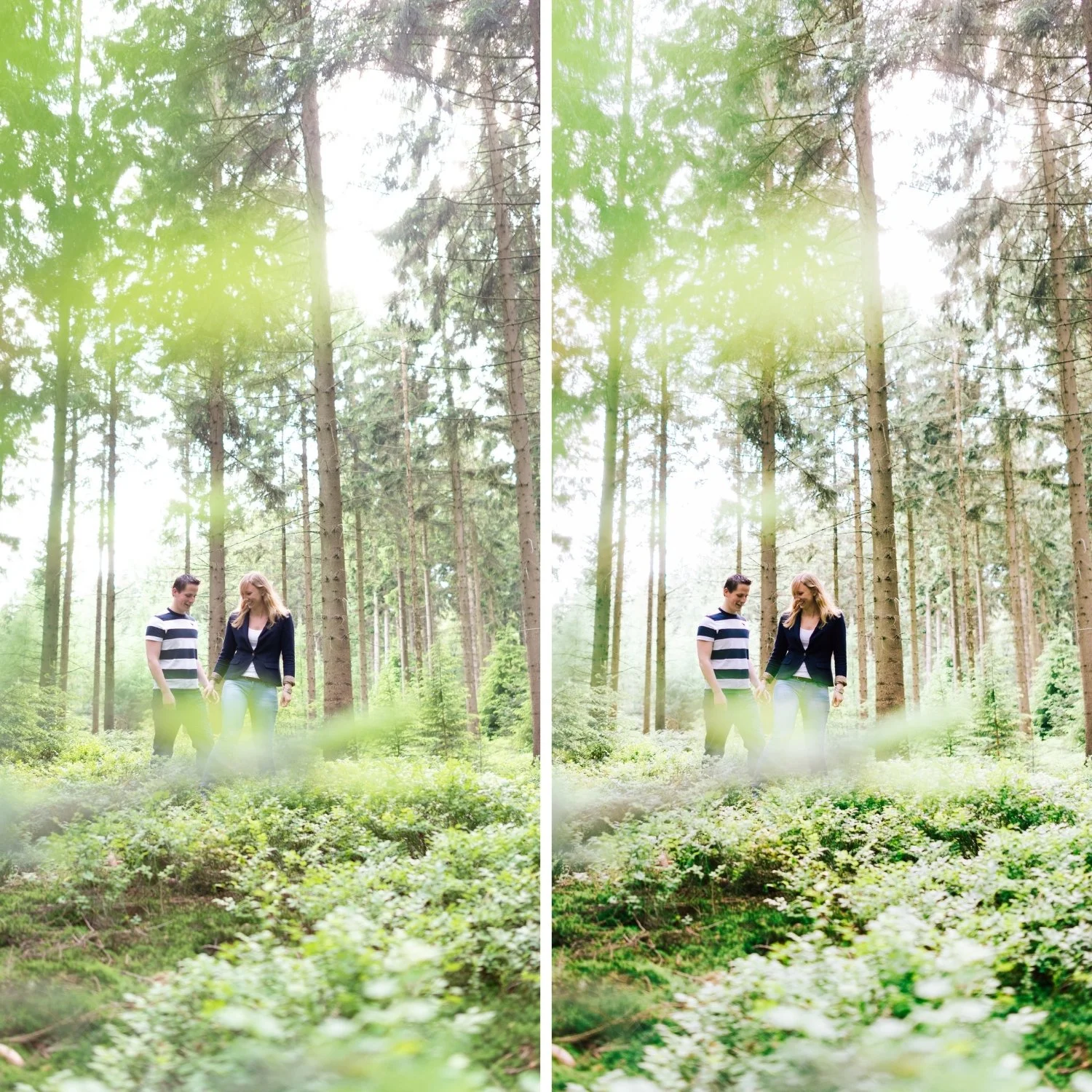
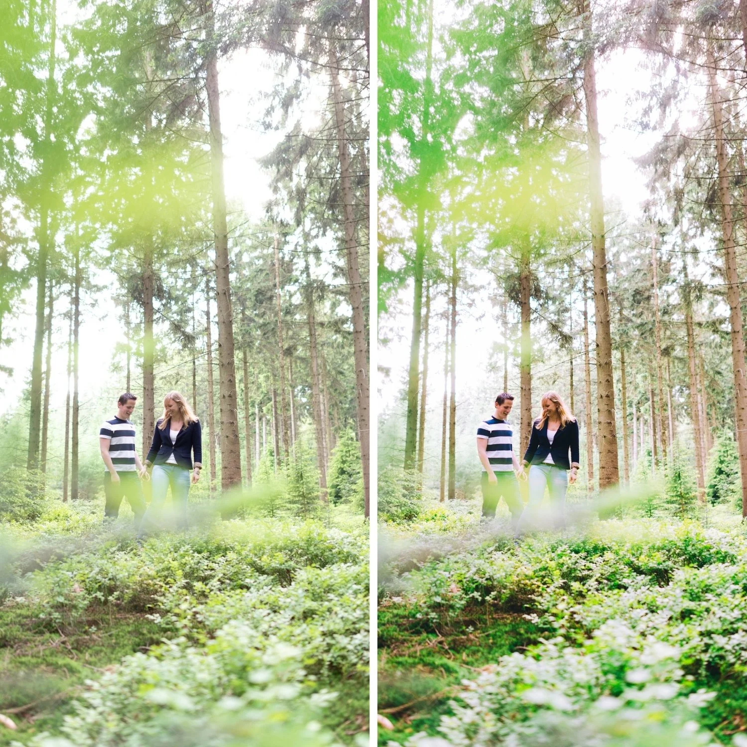
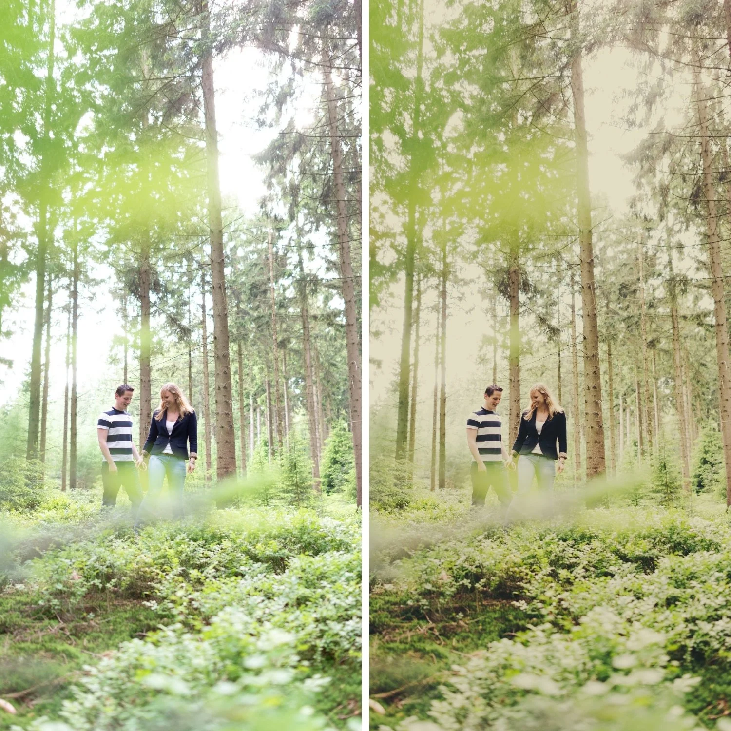
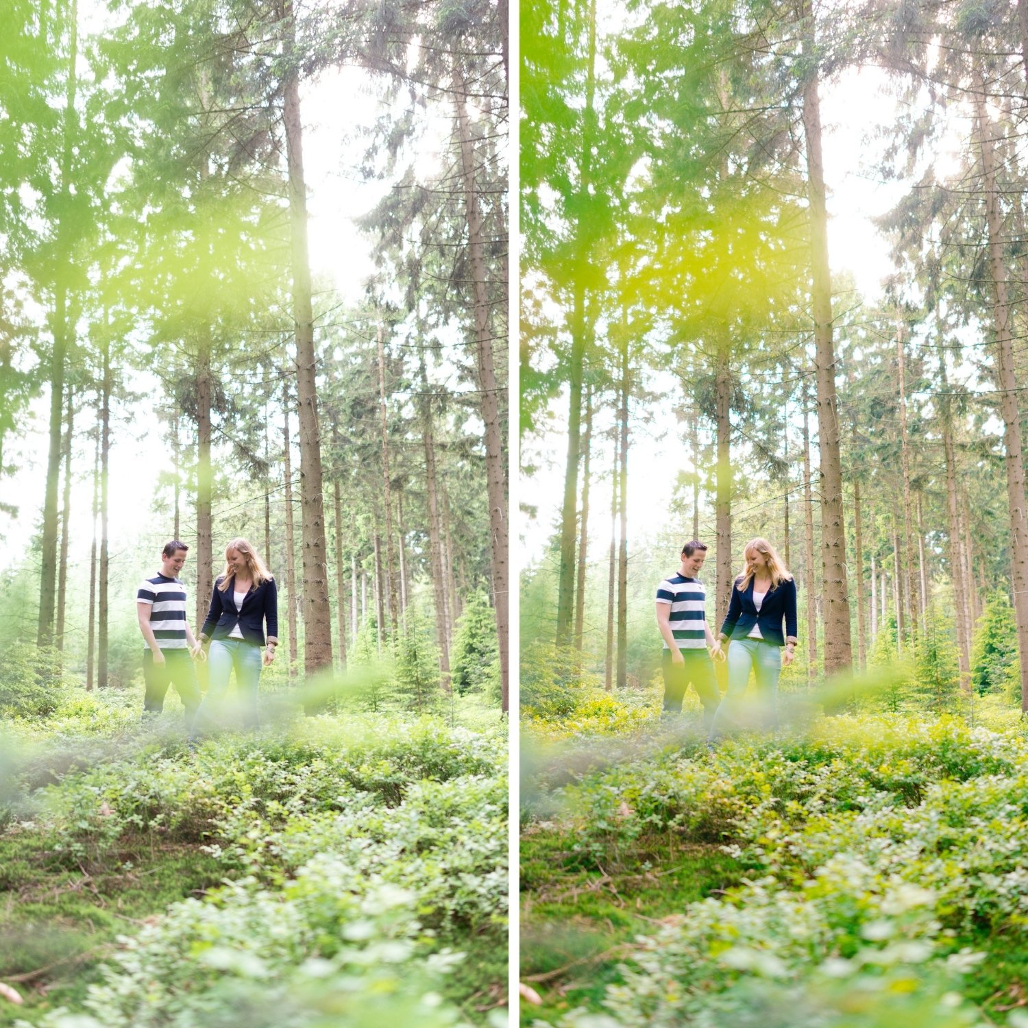
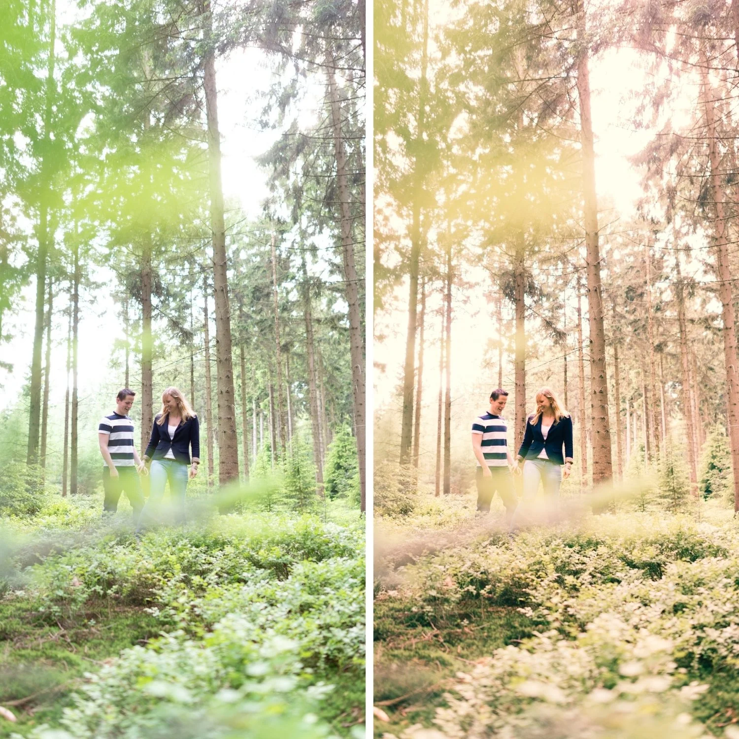
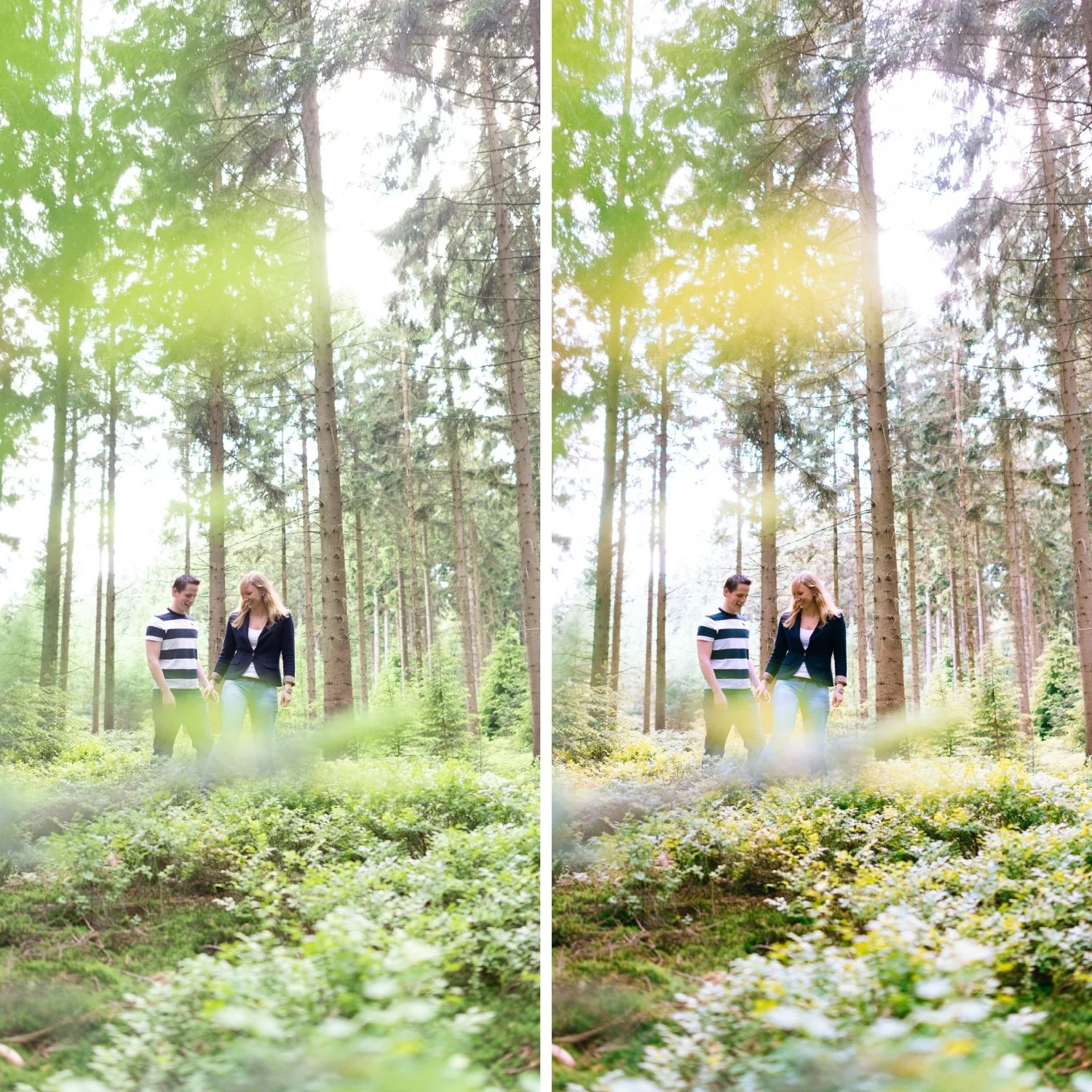
 Image 1 of 4
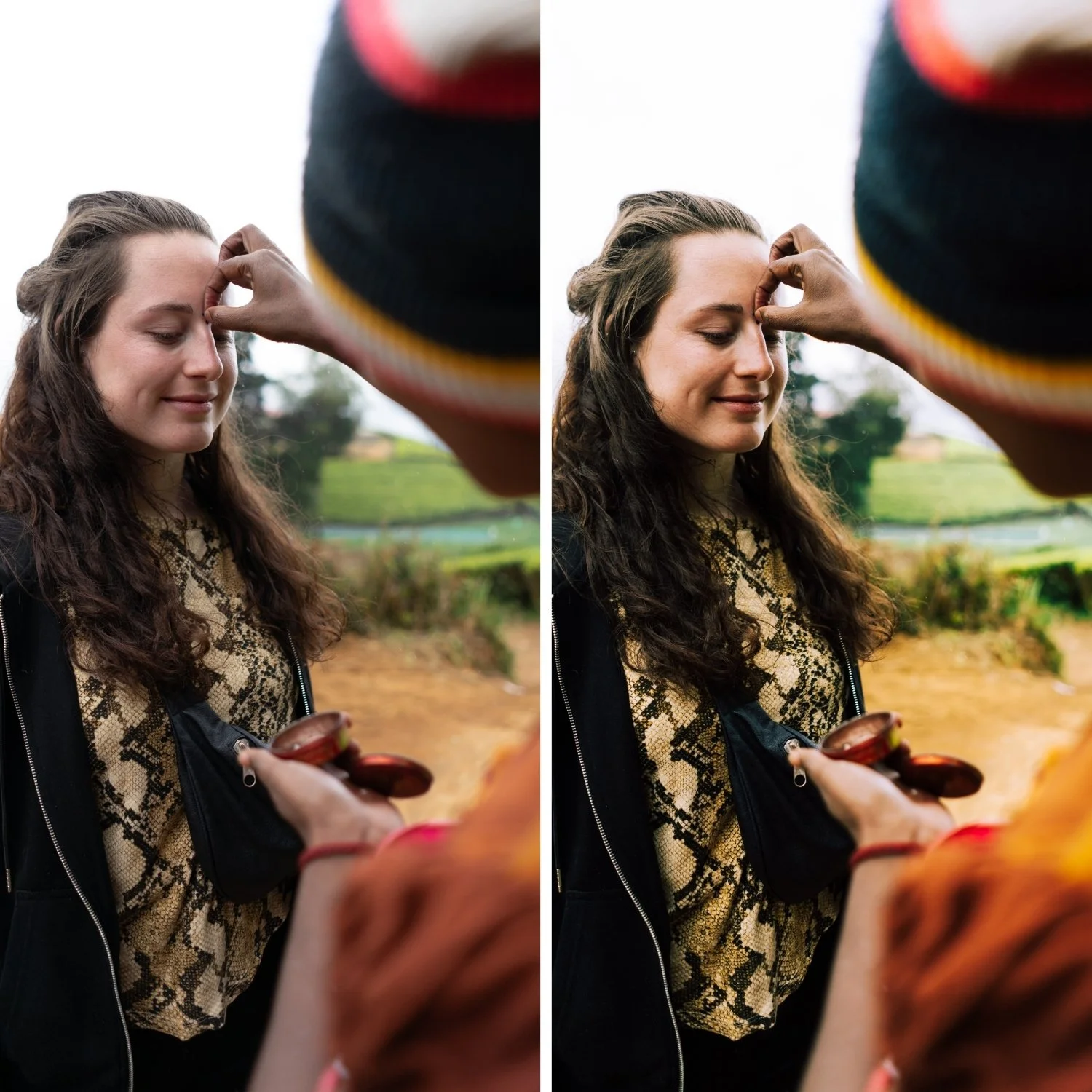
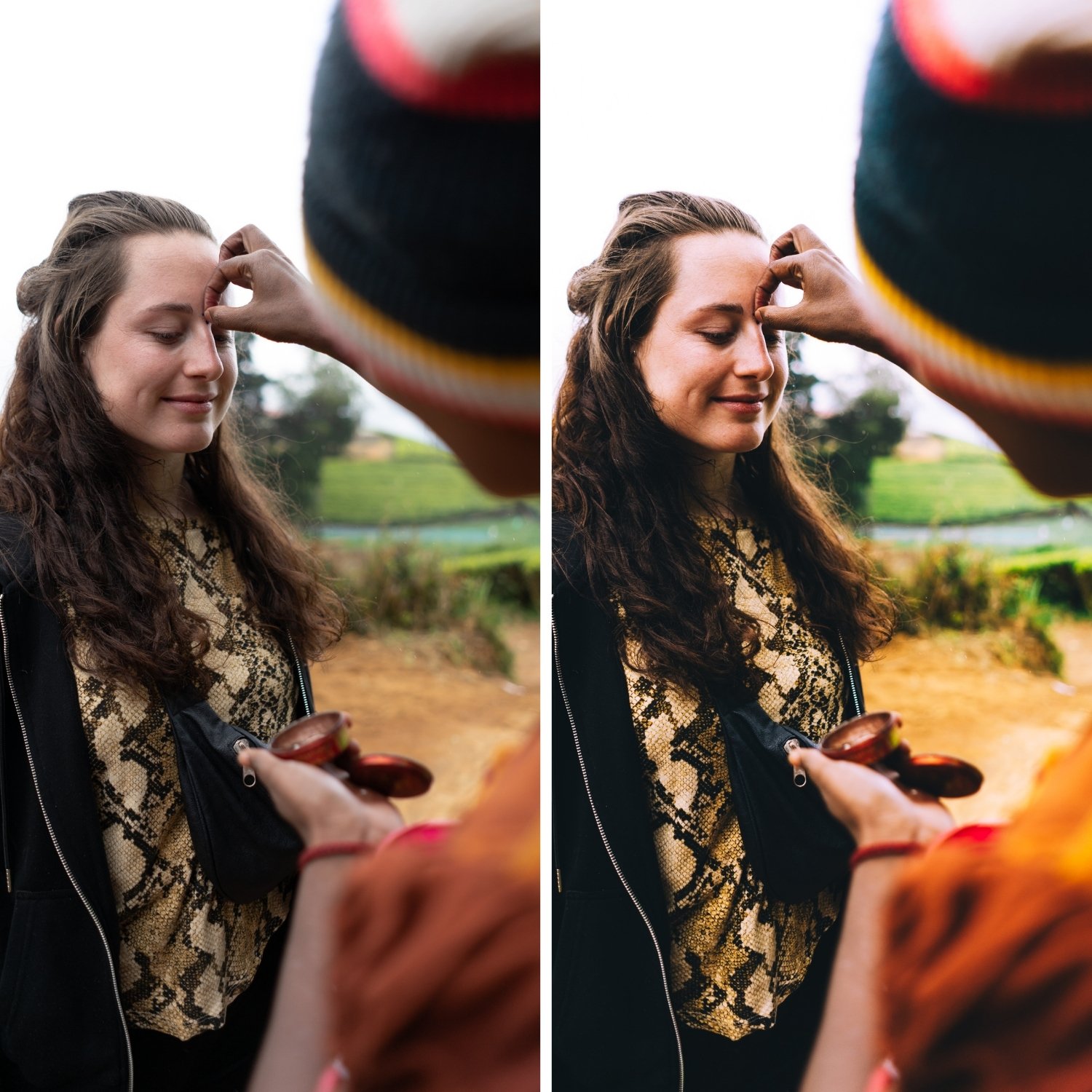
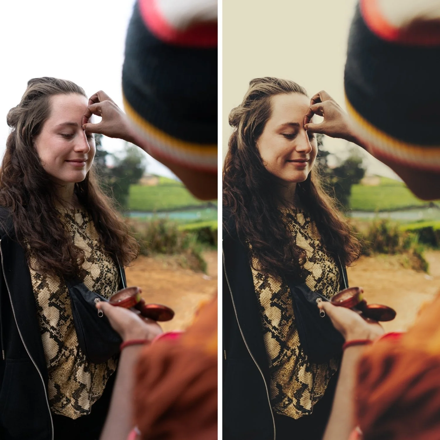
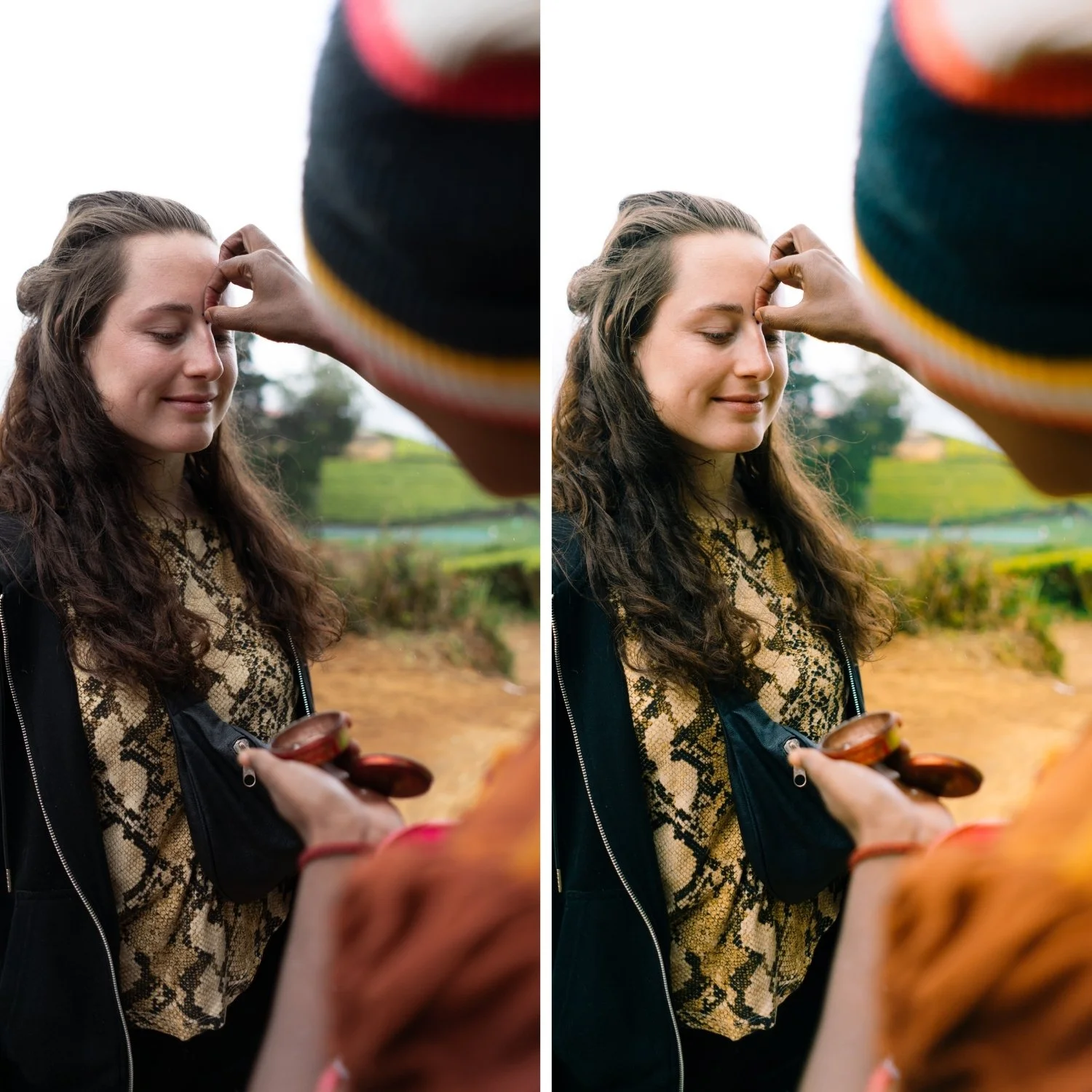
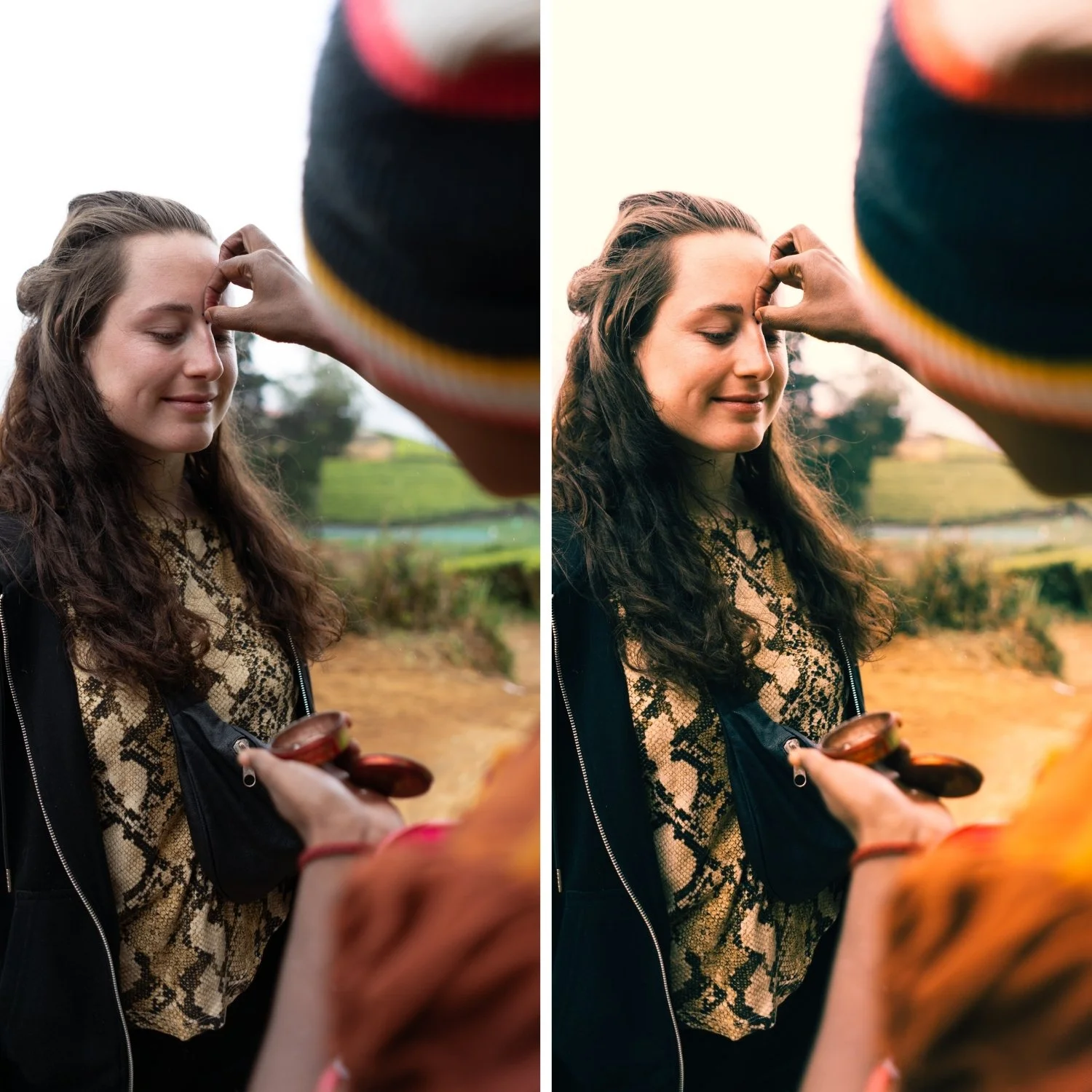
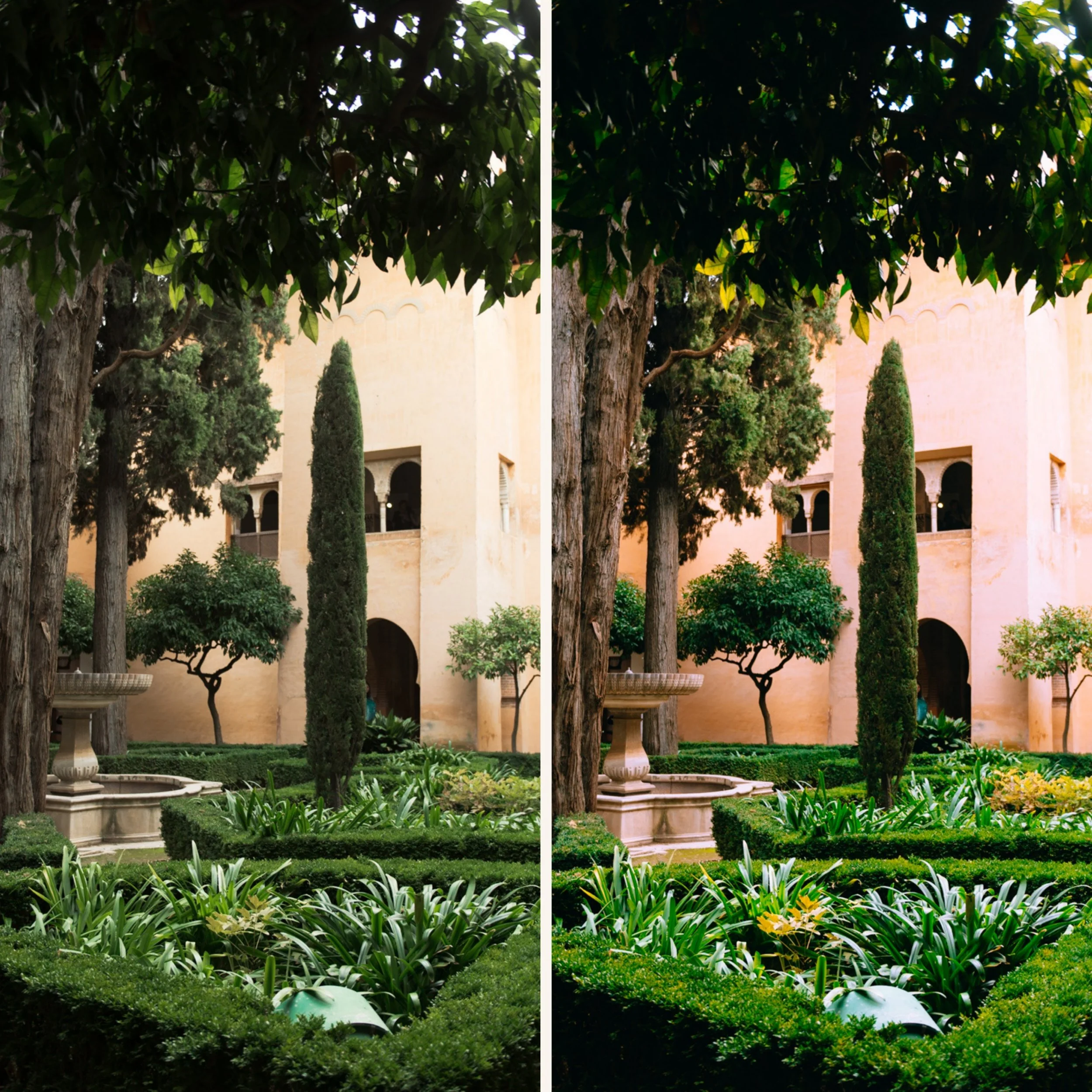
 Image 2 of 4
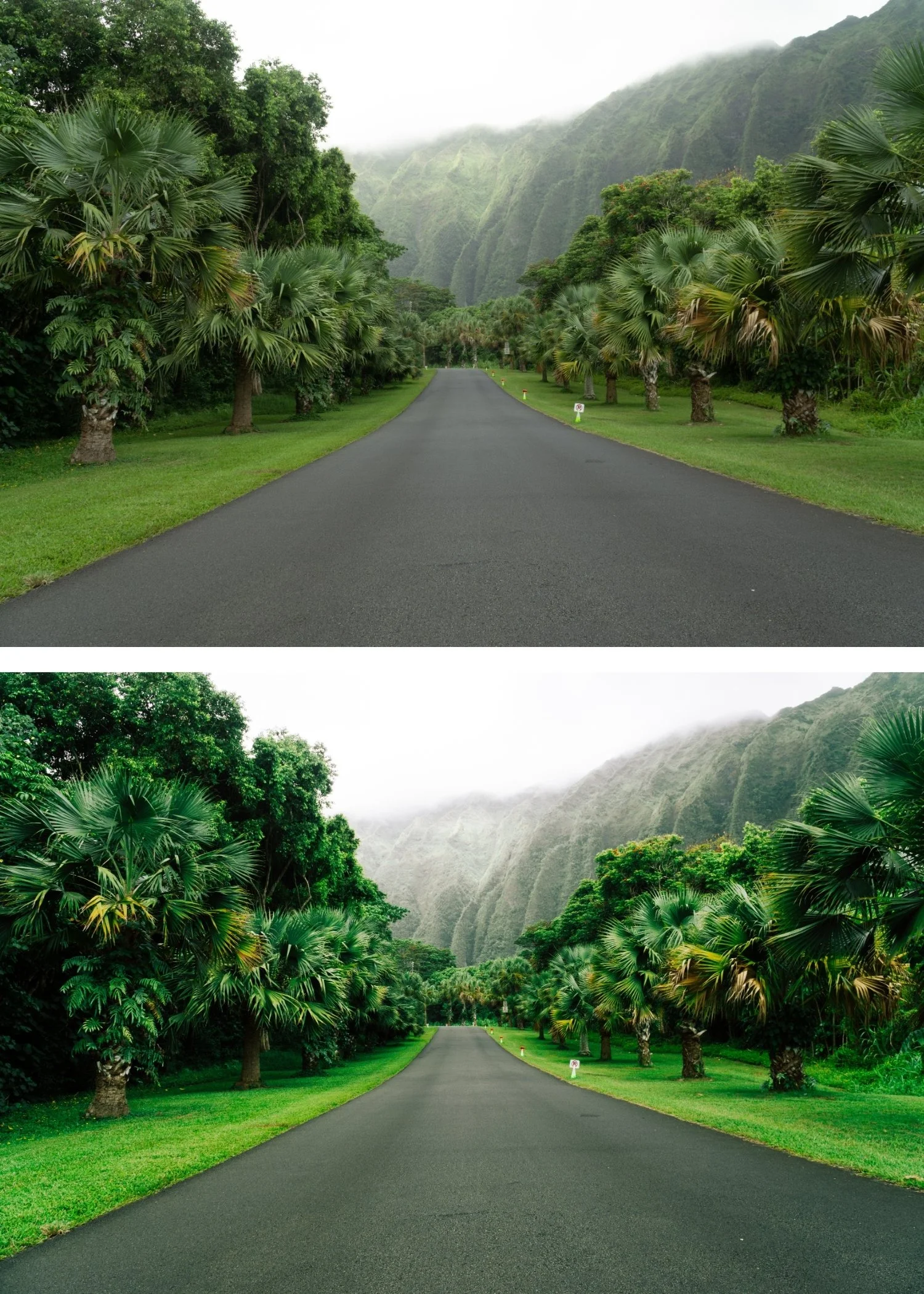
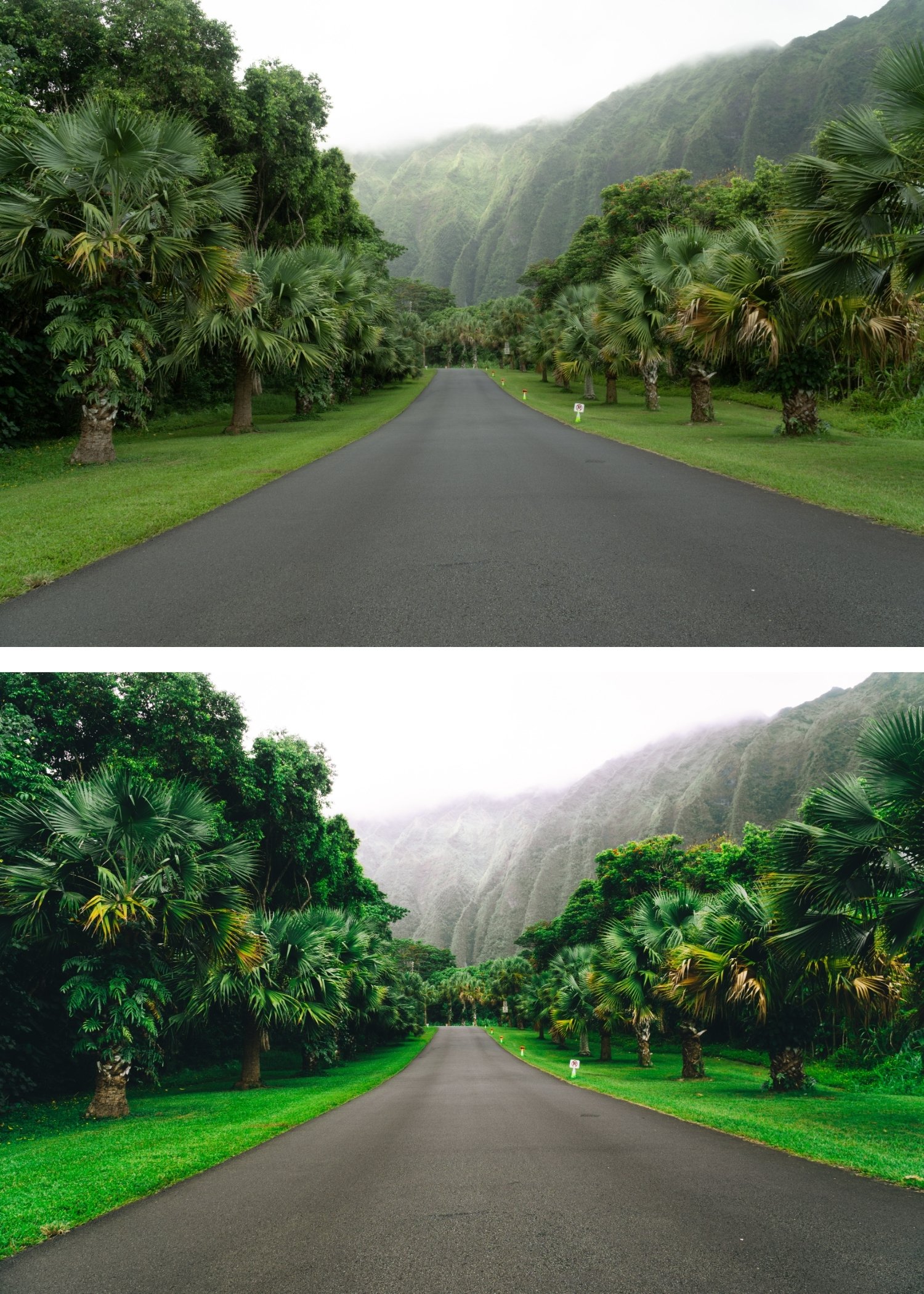
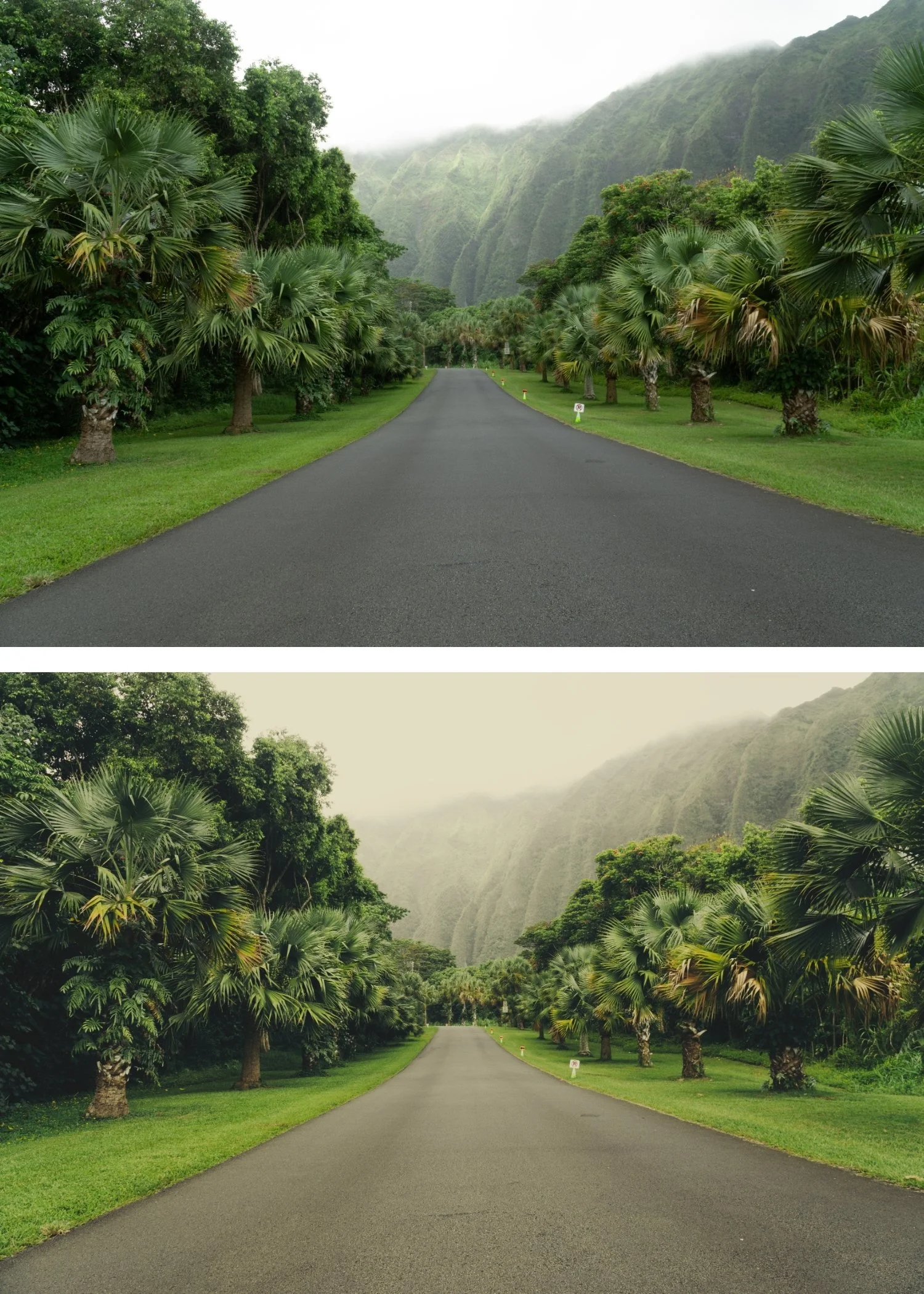
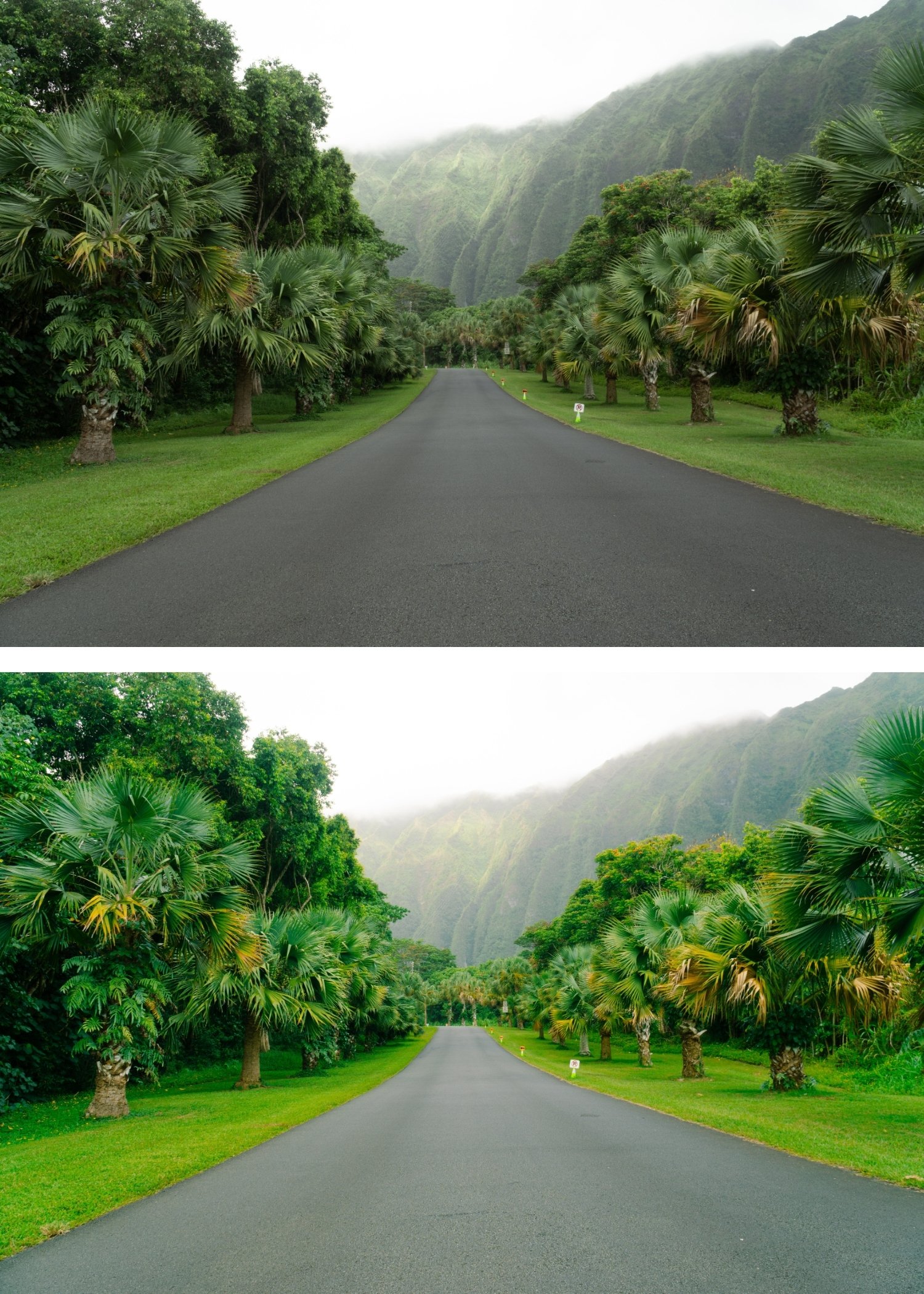
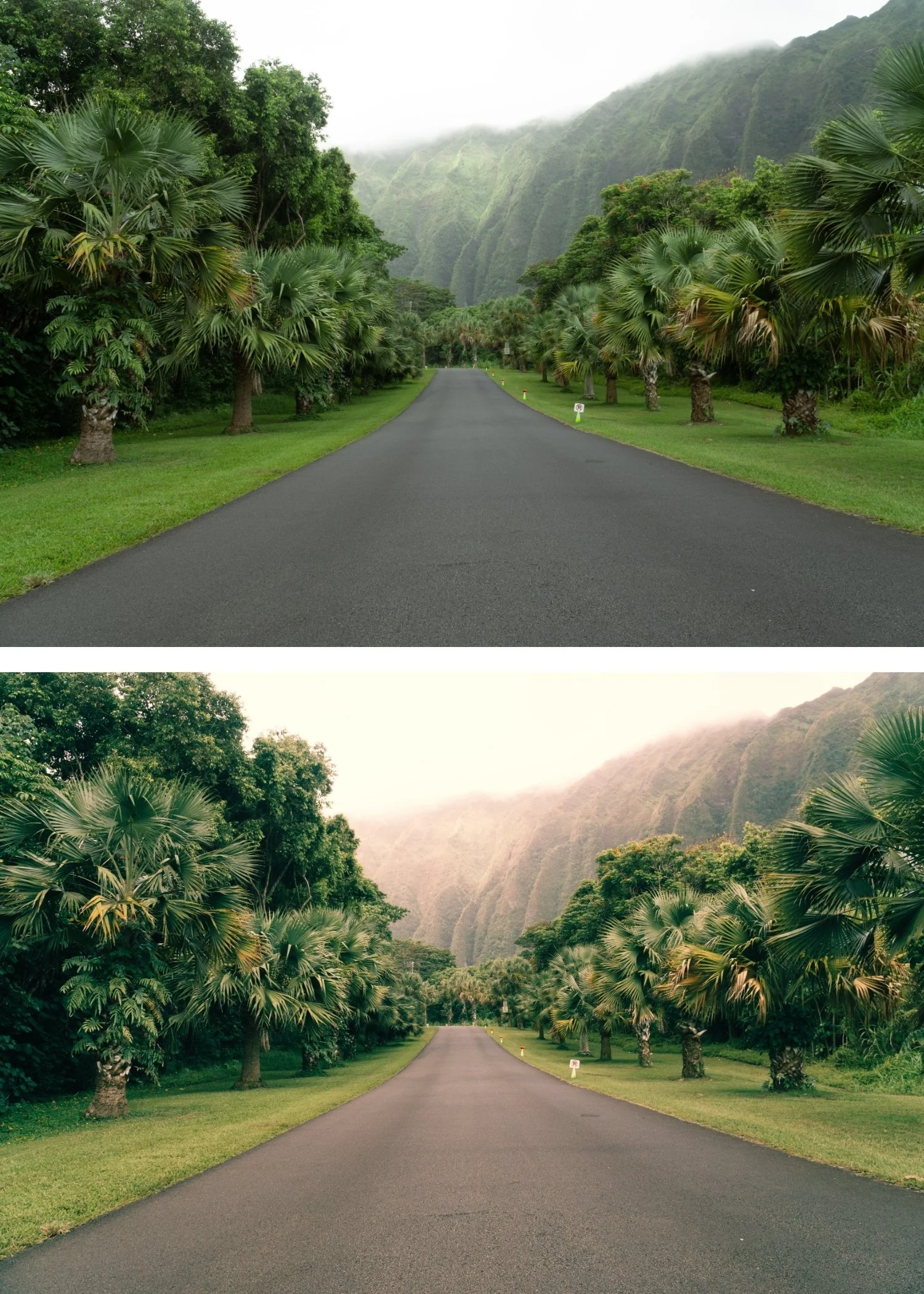
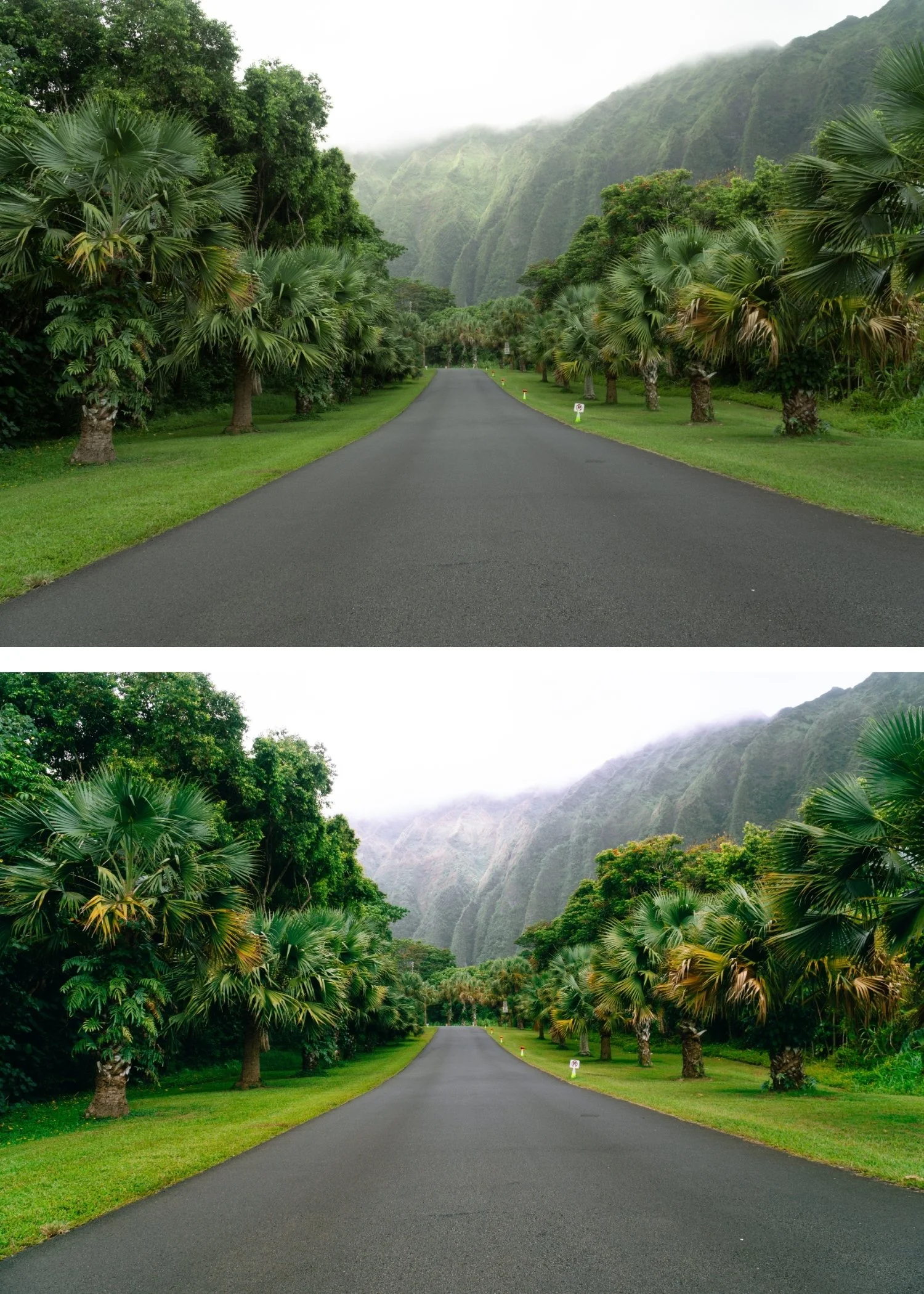
 Image 3 of 4
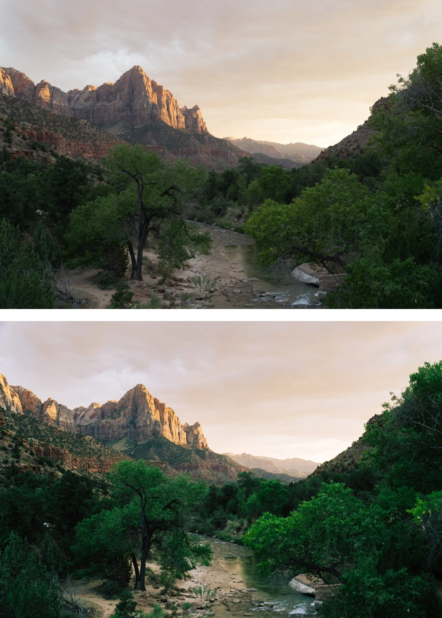
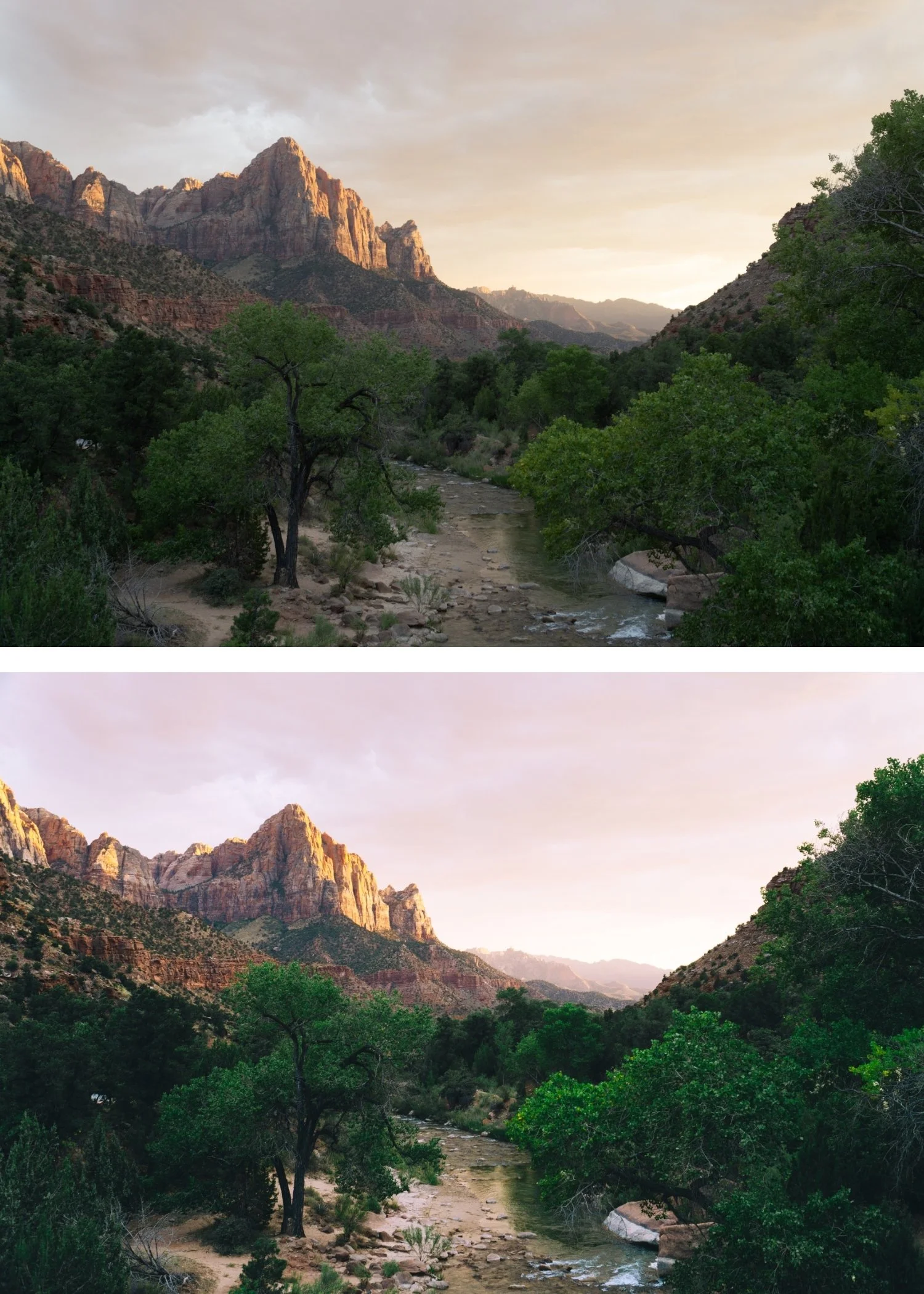
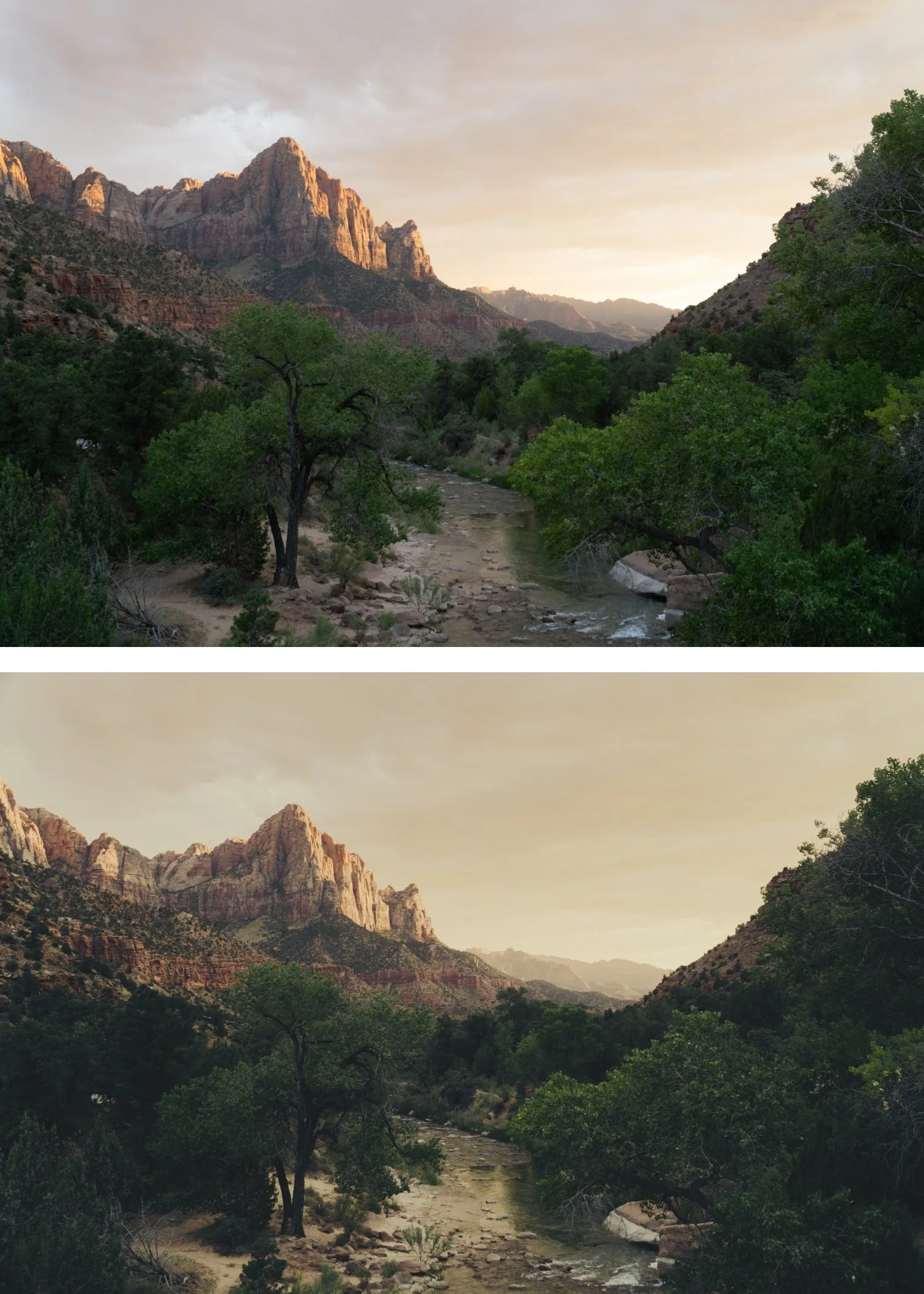
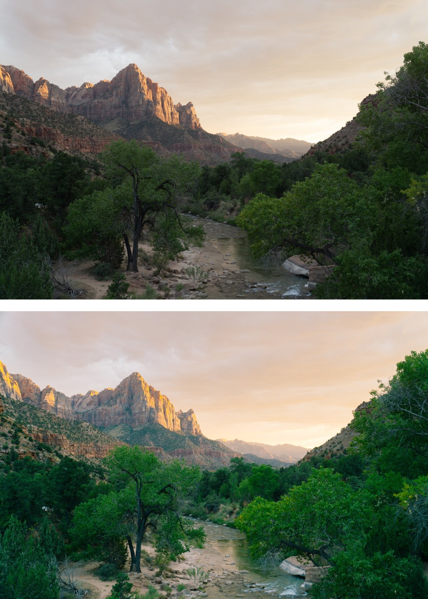
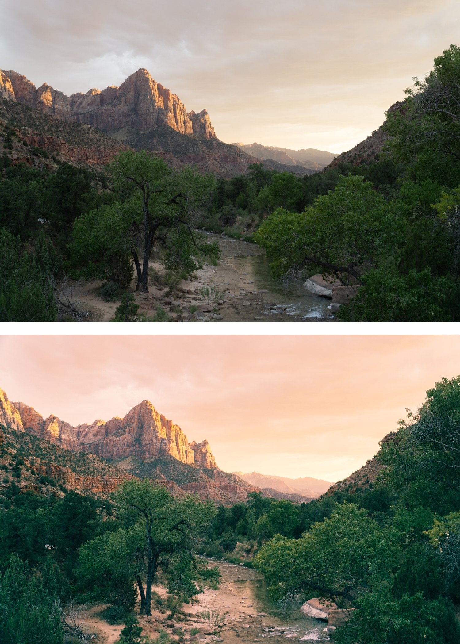
 Image 4 of 4
Chromatic 03 High Contrast Slide | Kodachrome Film Preset for Lightroom Mobile & Desktop

-
K3 is for landscape, architectural, and travel photographers who want maximum visual impact — the most dramatic expression of Kodachrome color for subjects that can carry it.
For photographers who find K1 and K2 insufficiently bold for their landscape and architectural content.
-
The contrast adds visual weight. K3's higher contrast creates the dimensional quality that makes landscape and architectural photography feel immediate and powerful.
The color stays Kodachrome. Despite the higher contrast, K3's color remains calibrated to the Kodachrome palette — vivid reds, deep blues, warm midtones — rather than going into generic oversaturation.
It references the original slide film tradition. Early Kodachrome's bold, high-contrast quality defined the look of mid-20th century landscape and travel photography. K3 places work within that tradition.
-
1 × K3 High Contrast Slide DNG file — for Lightroom Mobile
1 × K3 High Contrast Slide XMP file — for Lightroom Classic
Installation guide
Lifetime access -
This preset captures the muted, sophisticated aesthetic similar to the iconic K3 filters. It’s the perfect professional alternative for those wanting a balanced, analog-inspired look that feels mature and polished. By emulating the "low-contrast" development of premium professional color-negative film, the K3 ensures your digital shots have a high-end, editorial finish.
-
Step 1 — Exposure check before applying. K3's higher contrast amplifies both the qualities and the problems of a starting file. Check that highlights are not clipping before applying — pull Highlights -20 to -30 if necessary. Correctly exposed files with good tonal range produce the best K3 results.
Step 2 — White balance. 5,000-5,400K for outdoor daylight. K3 is calibrated for neutral to slightly warm starting points.
Step 3 — Apply K3 High Contrast Slide. Assess the result and adjust Exposure if the contrast has pushed the overall brightness higher or lower than expected.
Portrait photography with K3: K3 is primarily calibrated for landscape and travel subjects. For portrait use, reduce to 72-75% strength and add a Radial Gradient on the face with Highlights -10 and Shadows +8 to manage the facial contrast.
On phone photos: 75-78% strength. Phone cameras add their own contrast computationally — K3's elevated contrast on top can read heavy without the reduction.
-
Is K3 too contrasty for everyday photography? K3 is calibrated for landscape, travel, and architectural photography with strong inherent subject matter. For everyday lifestyle and portrait photography, K1 or K2 produce more balanced results.
What is the difference between K3 and H6 Editorial Summer? K3 is bold with Kodachrome warm color — vivid reds, warm tones, high contrast. H6 is bold with cool summer editorial color — clean, polished, cooler palette. K3 for Kodachrome travel impact, H6 for cool fashion editorial.
GET ALL 3 CHROMATIC ARCHIVE PRESETS
The full Chromatic Archive gives you three calibrated expressions of Kodachrome slide film color — Classic Kodachrome for versatile vibrant use, Warm Kodachrome for golden light and warm environments, and High Contrast Slide for maximum visual impact in landscape and travel photography.
Three presets. One Kodachrome philosophy. $6.66 per preset.


THE STUDIO ARCHIVE
Want everything? The Studio Archive contains 130+ presets — every collection we make, including the complete Chromatic Archive — for $89 total. That is $0.68 per preset with every future release included for life.