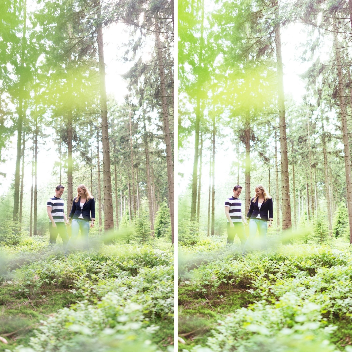
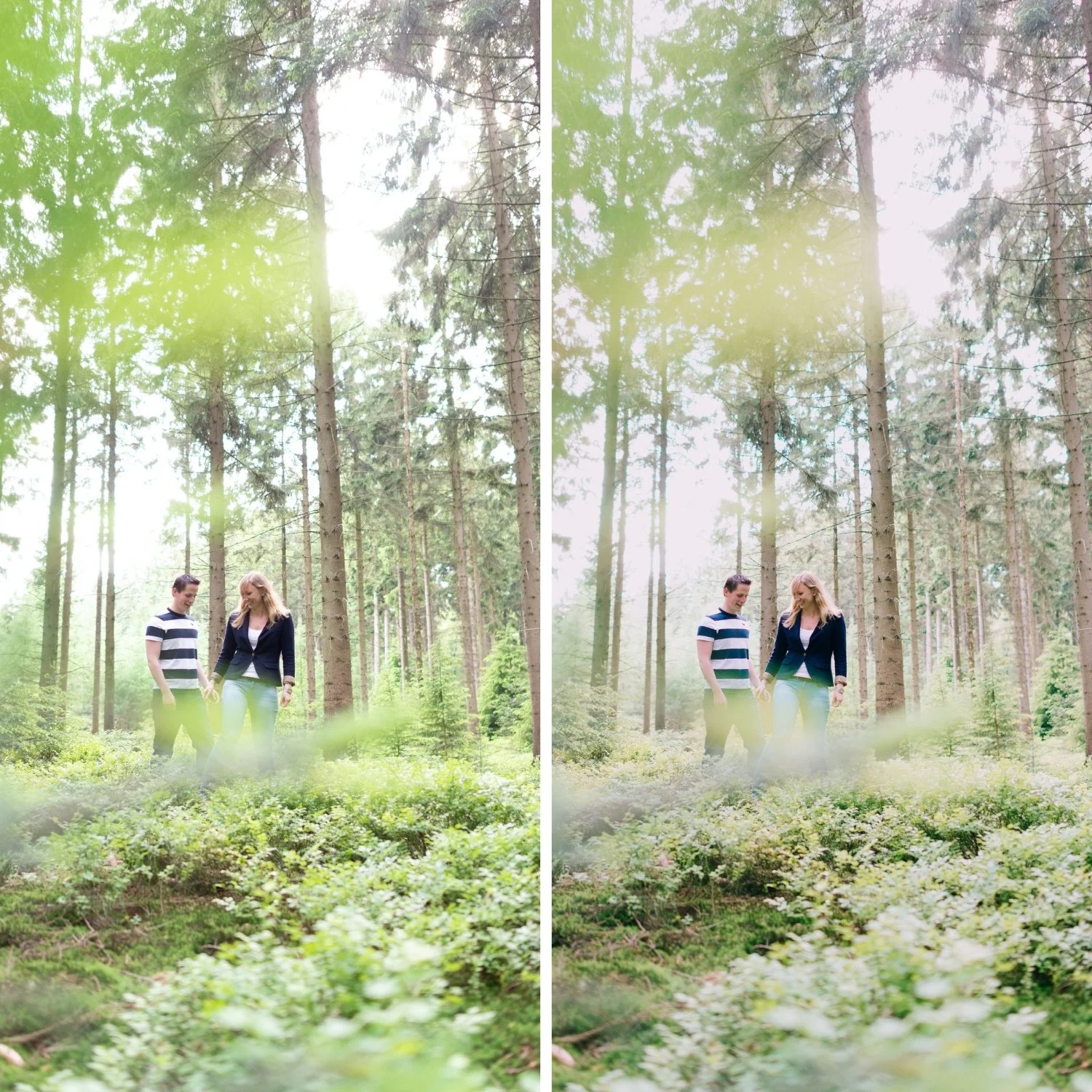
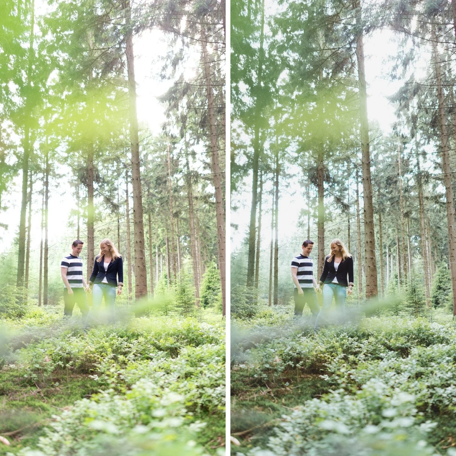
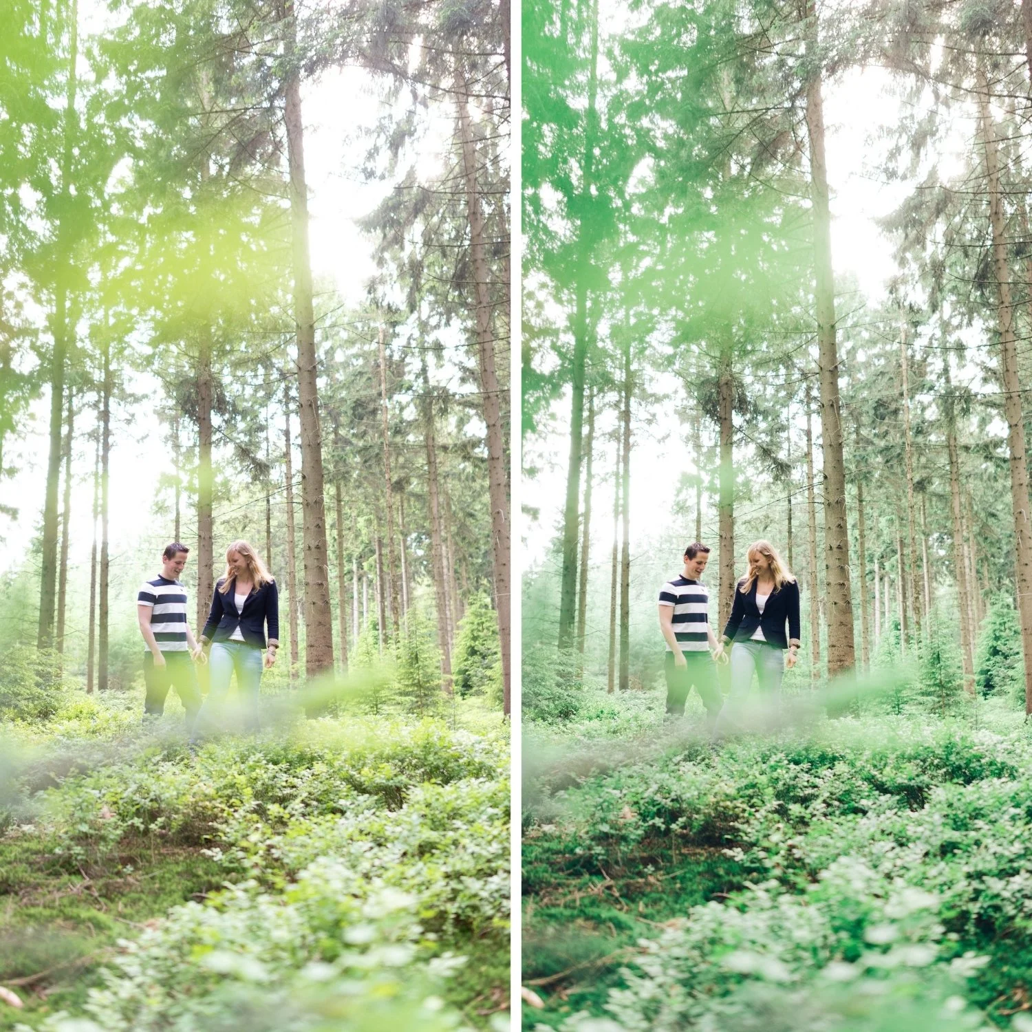
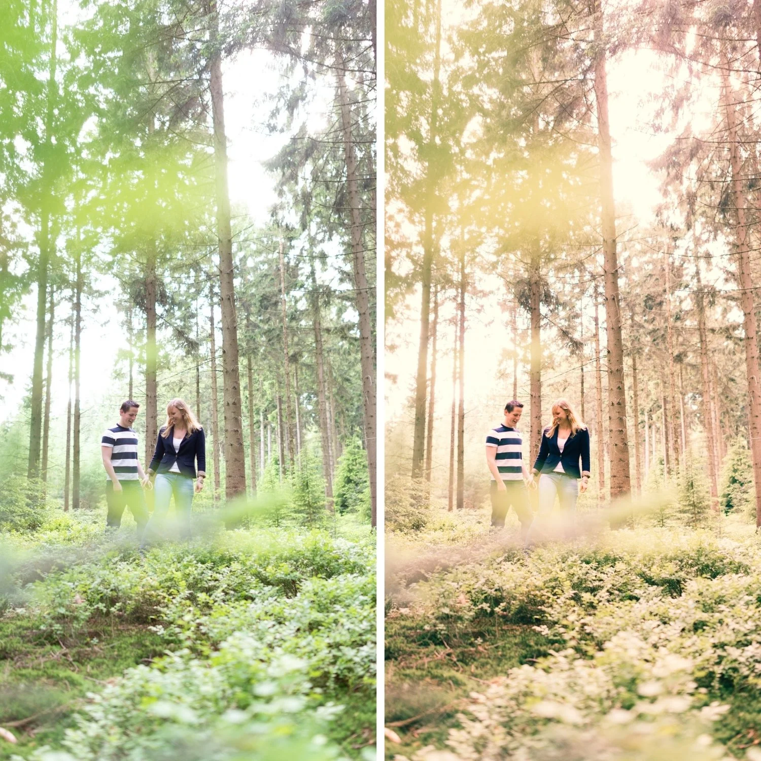
Image 1 of 4
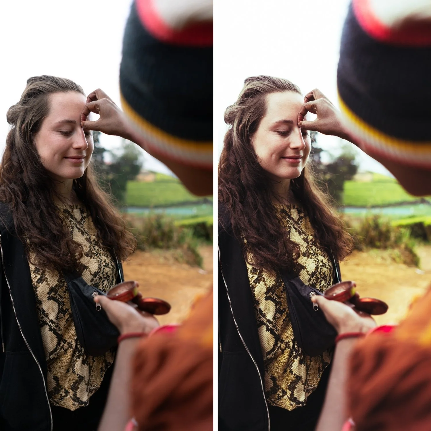
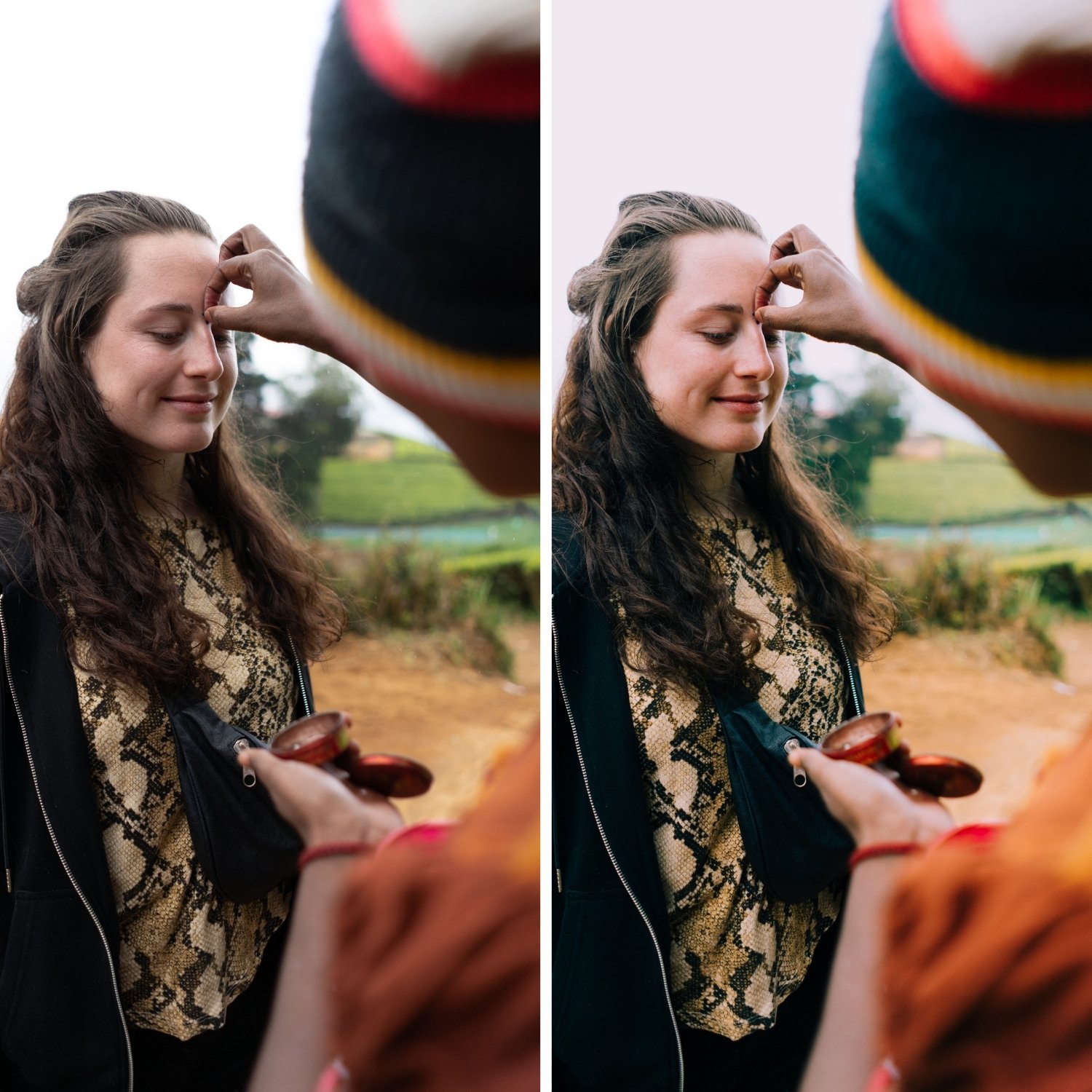
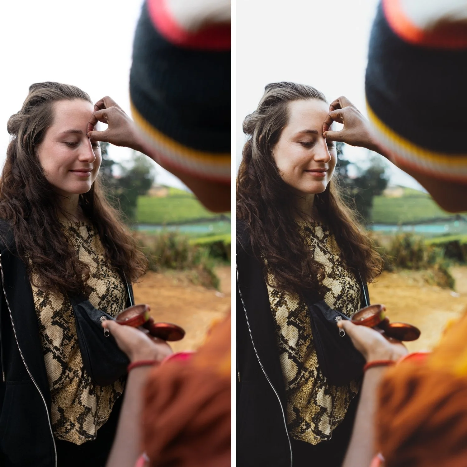
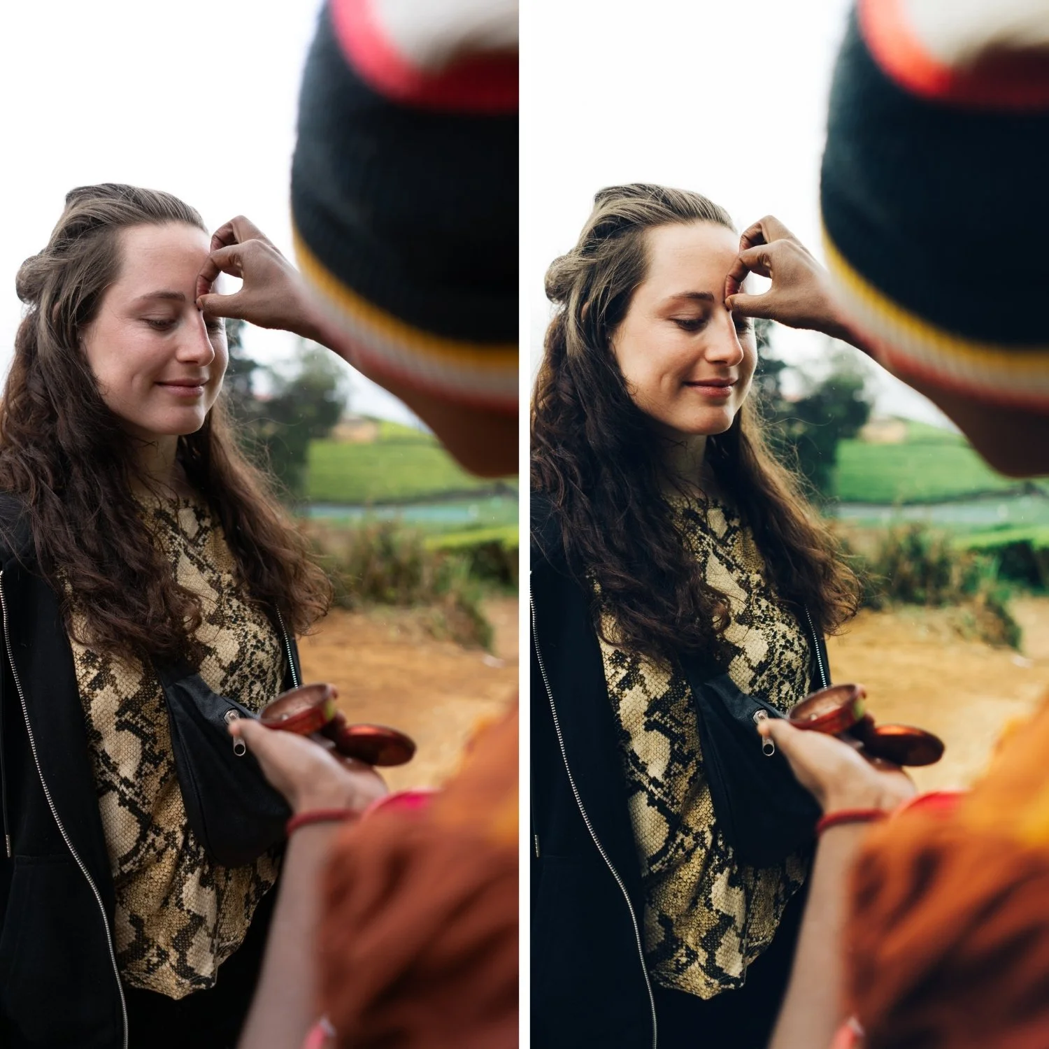
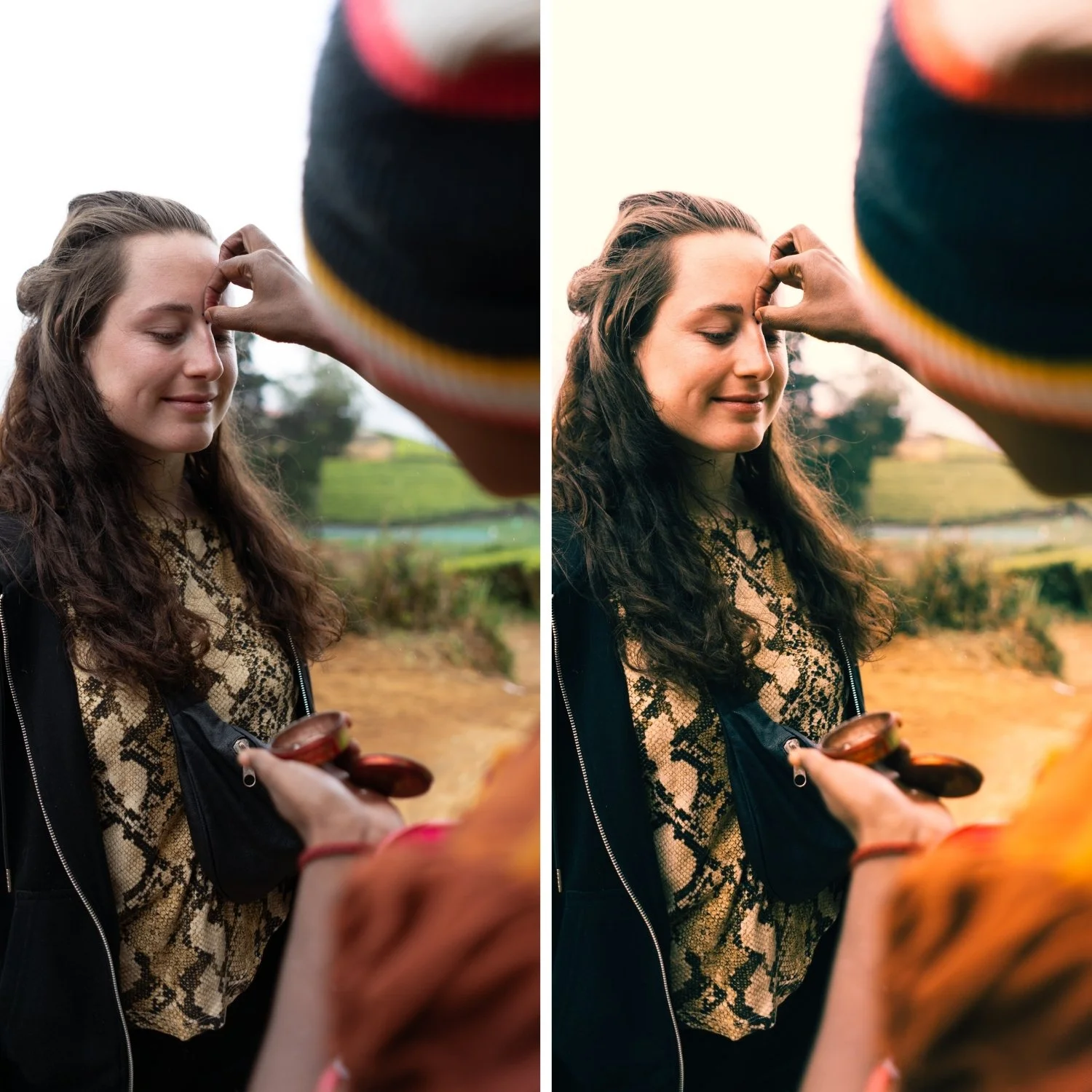
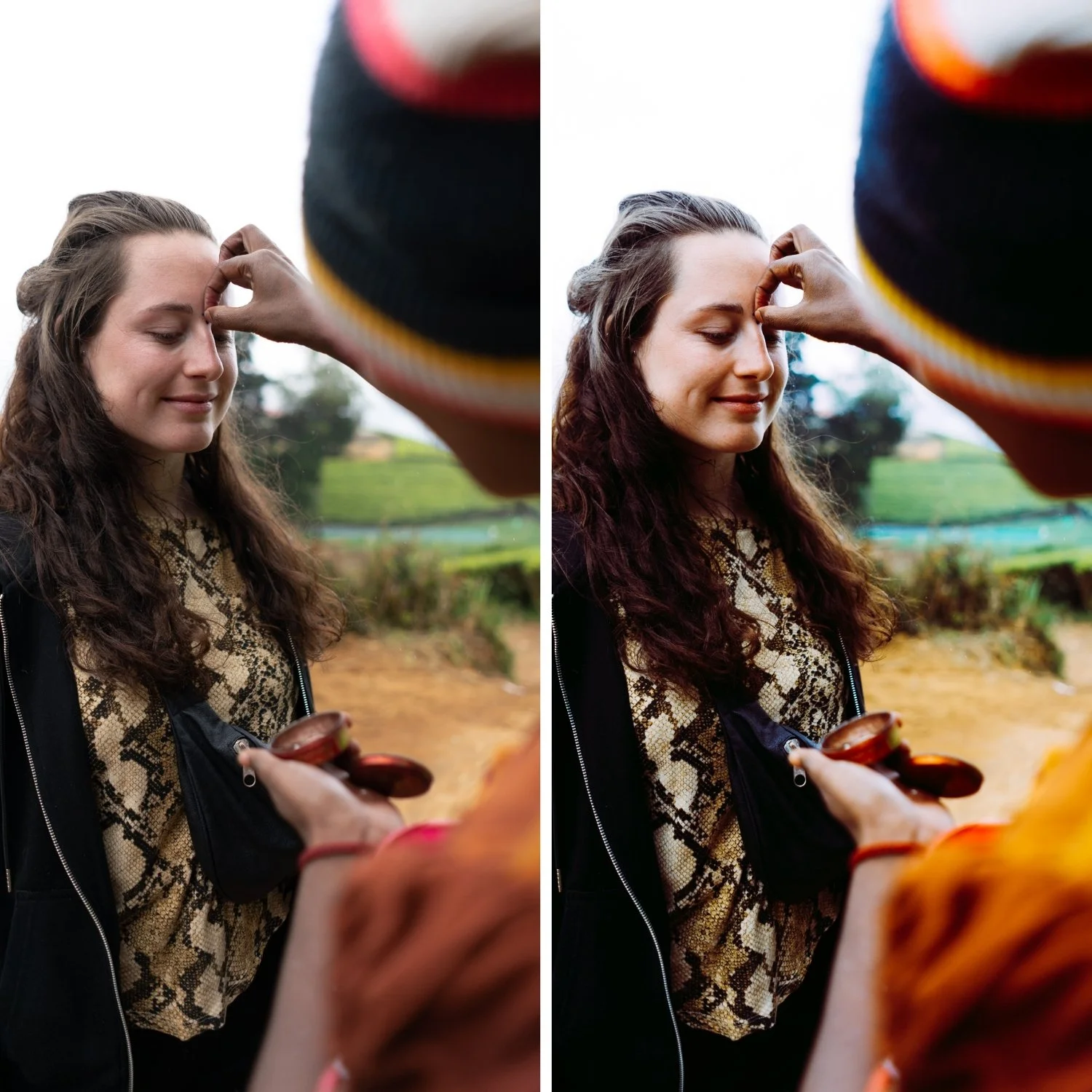 Image 2 of 4
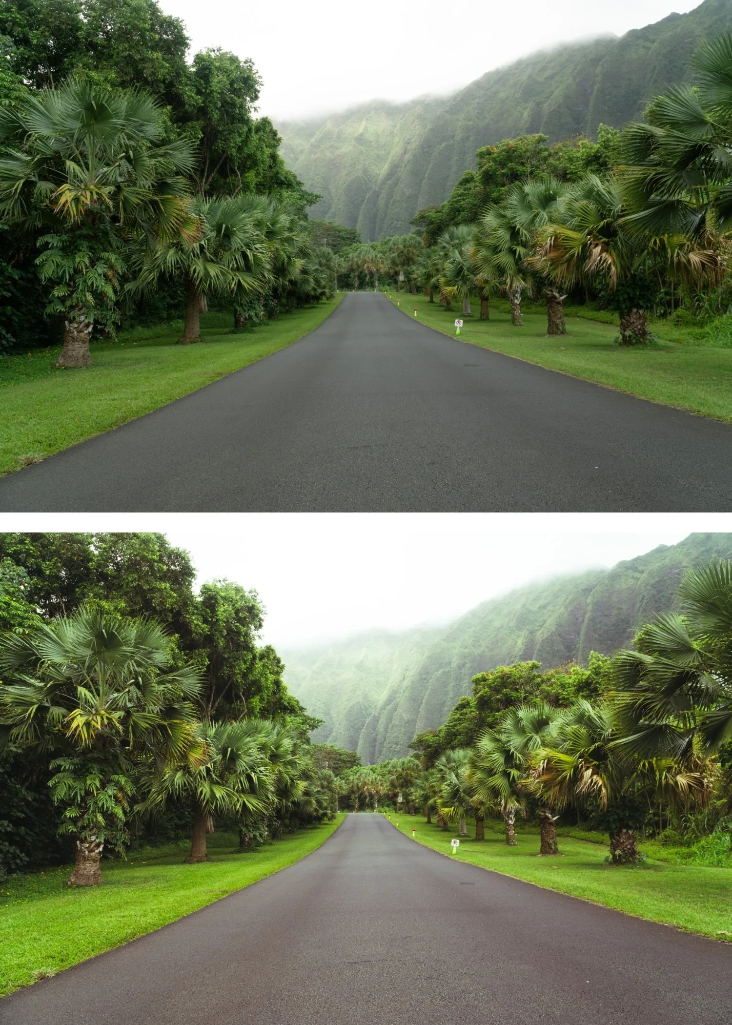
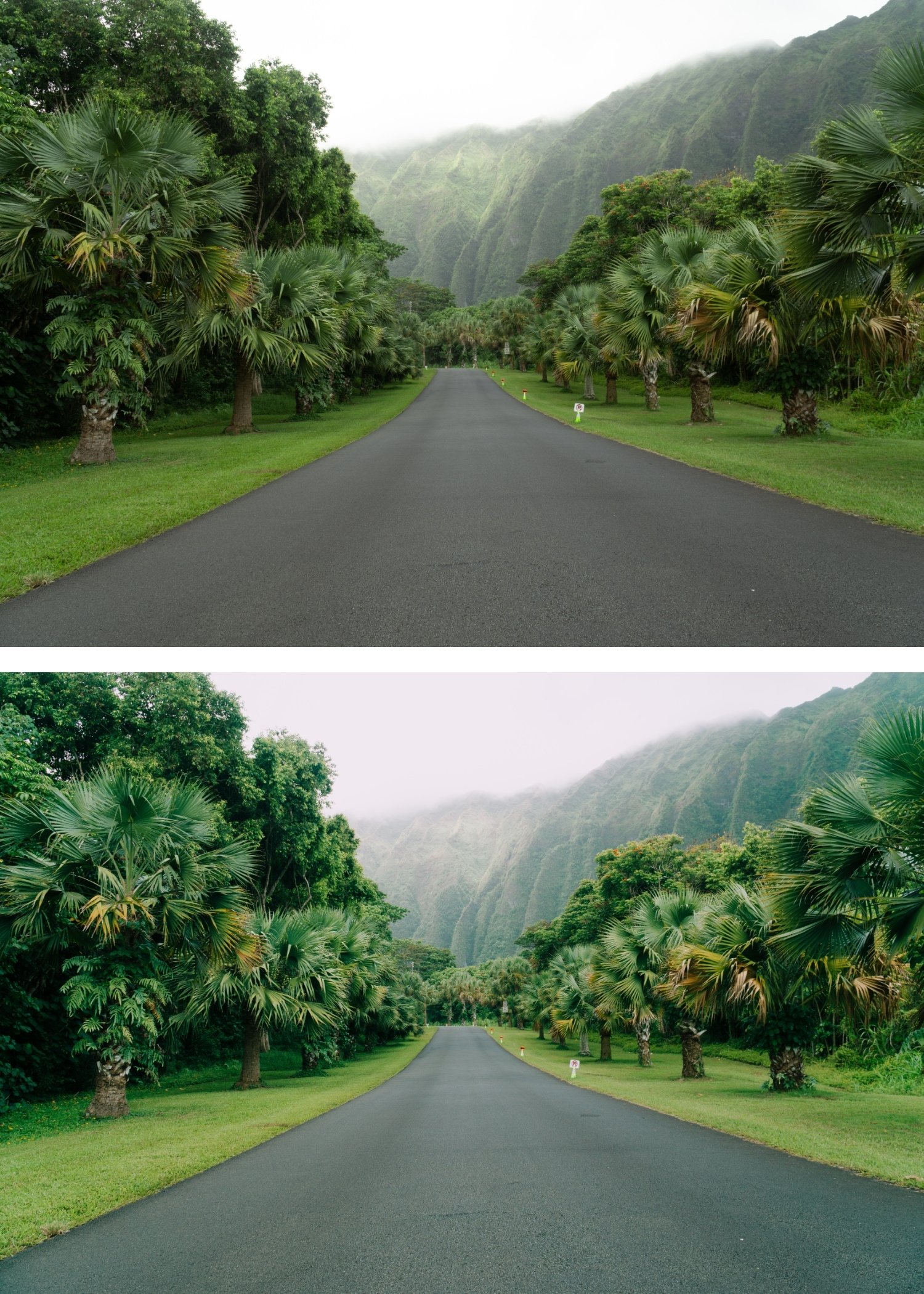
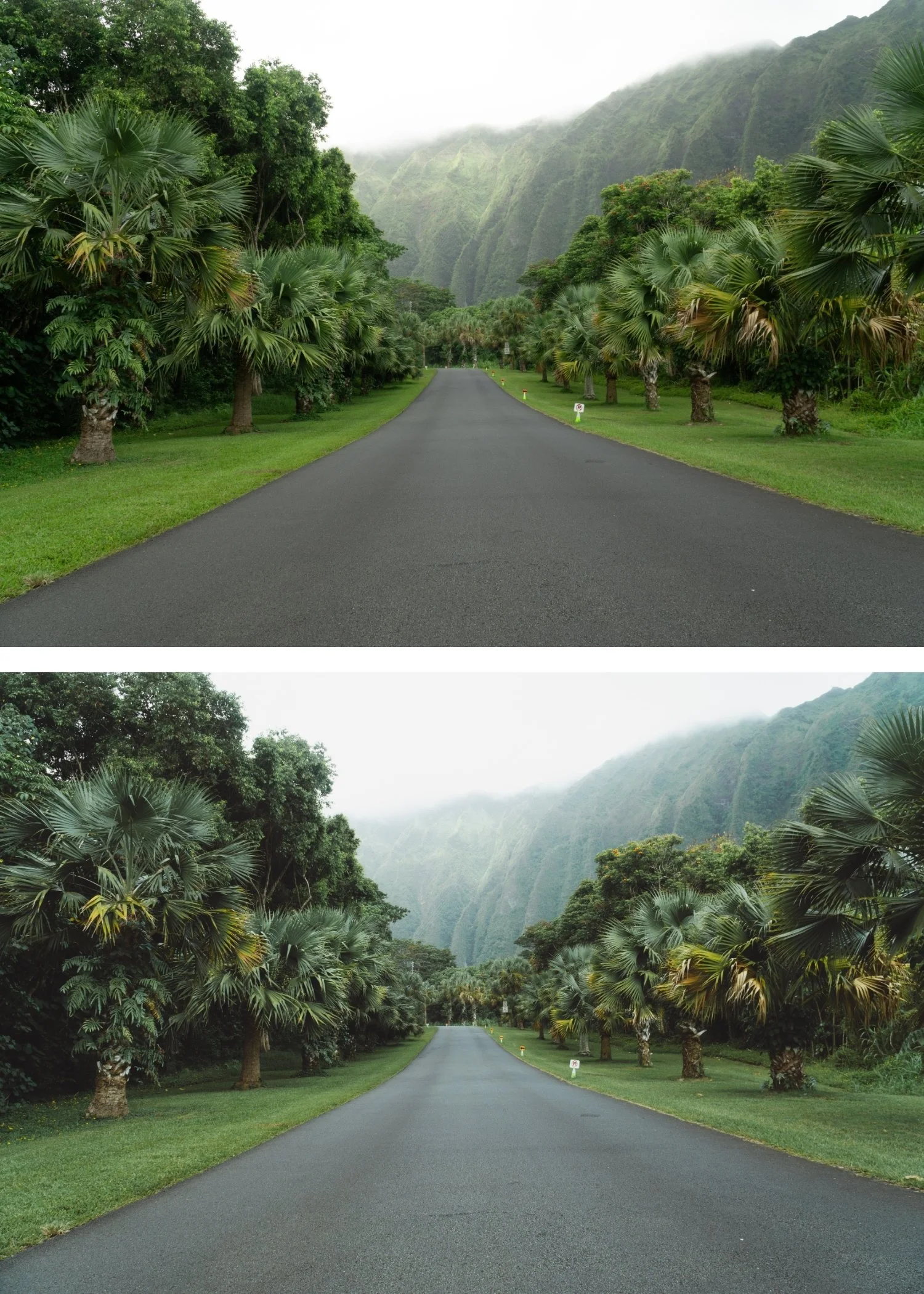
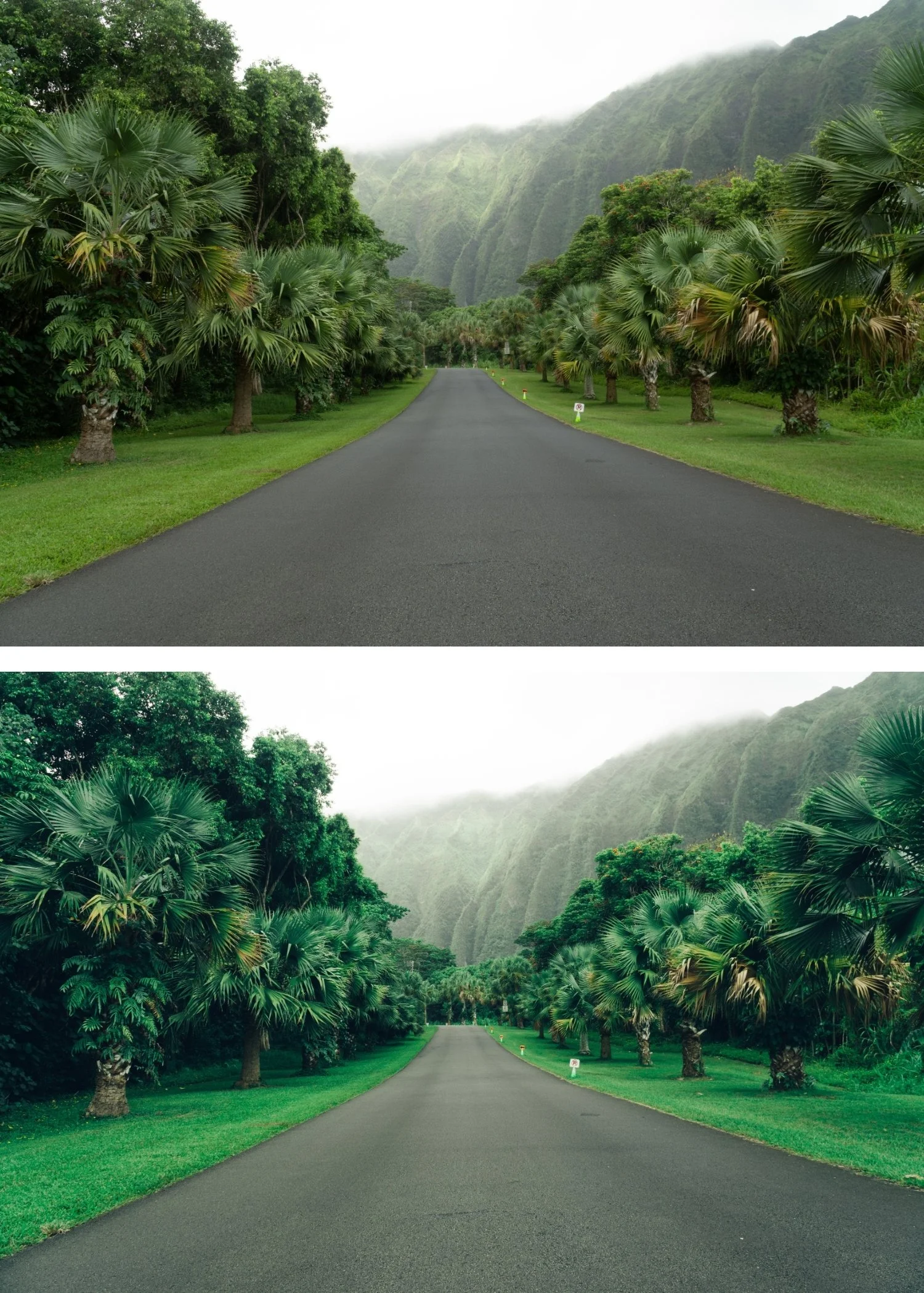
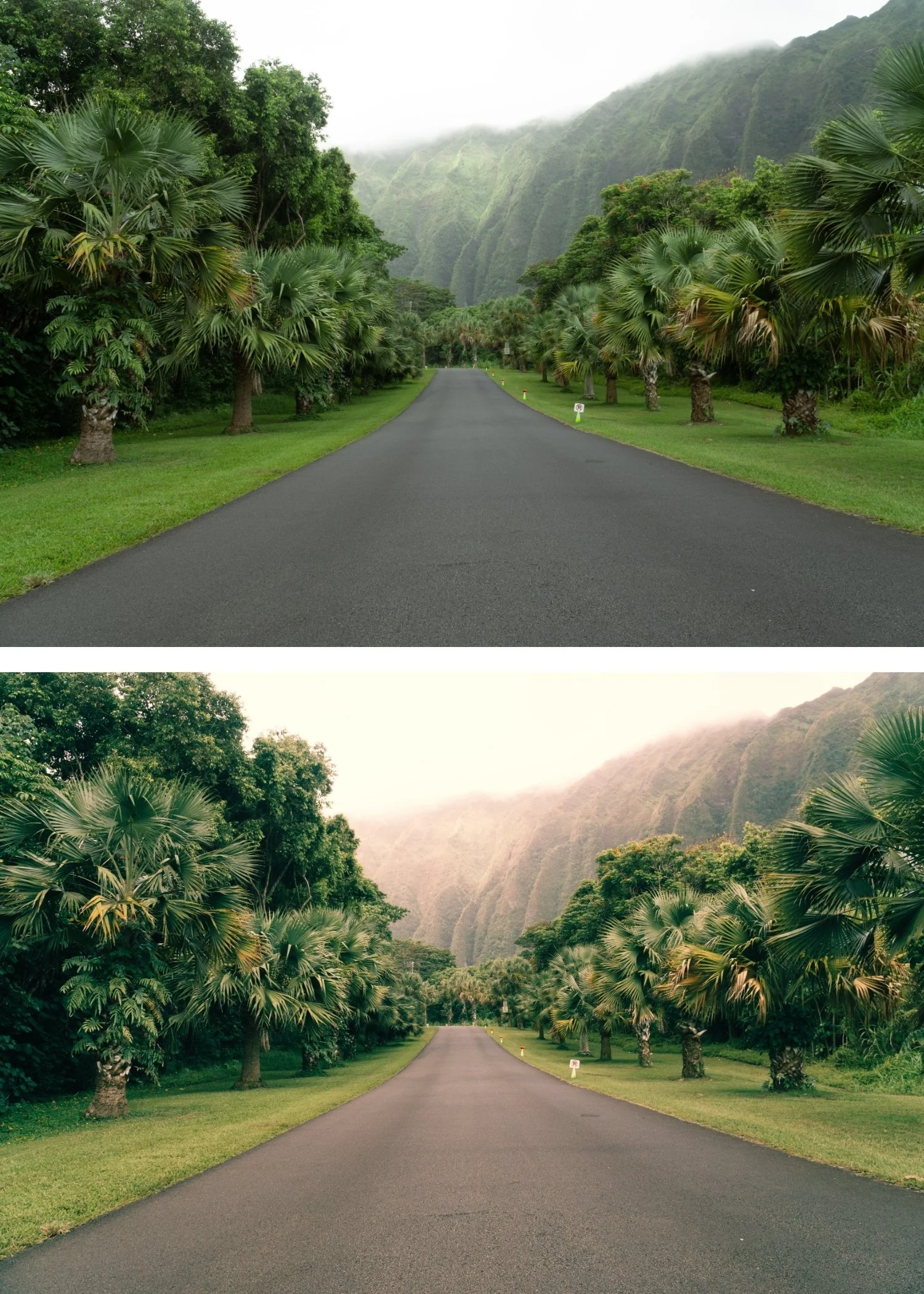
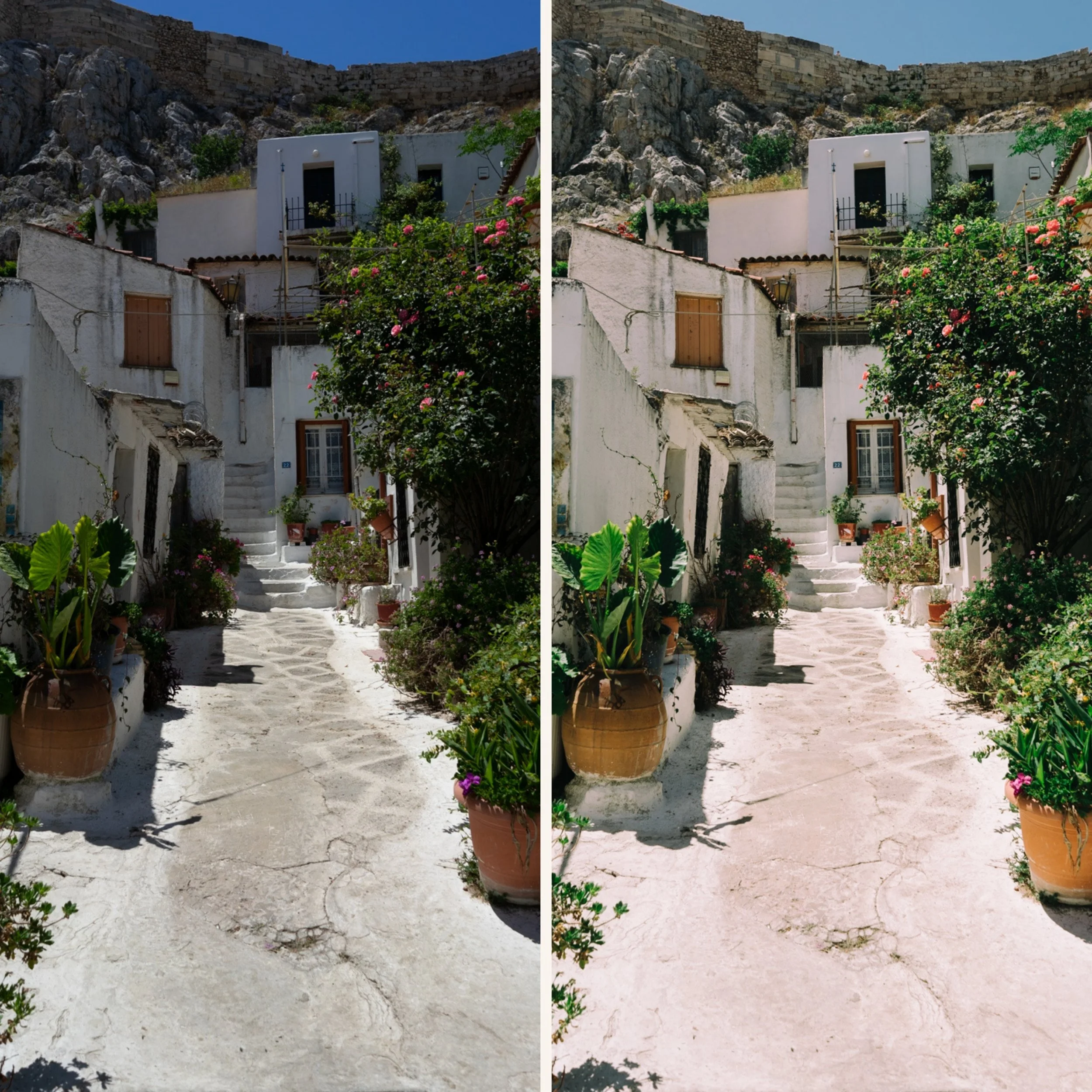
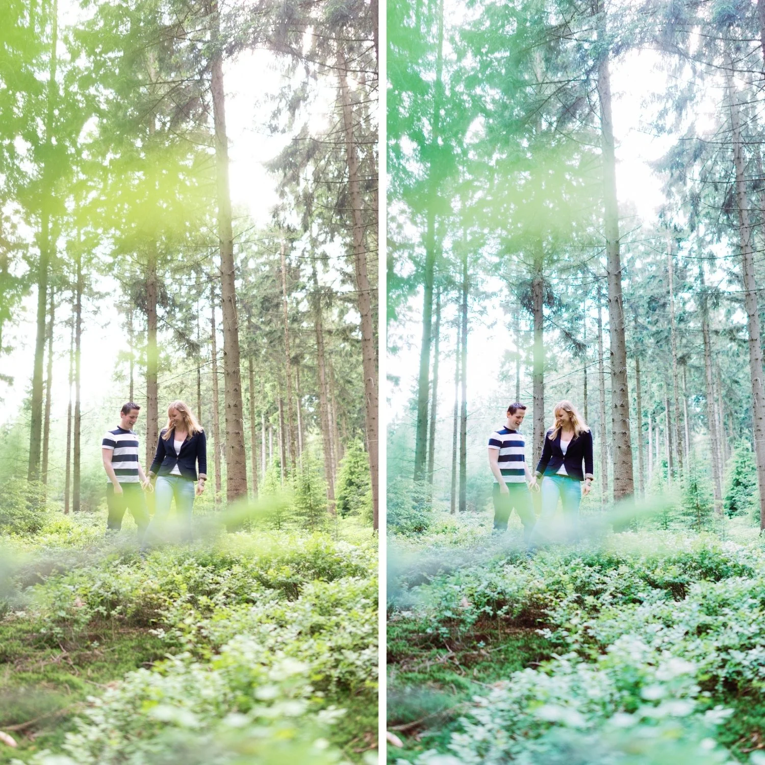
 Image 3 of 4
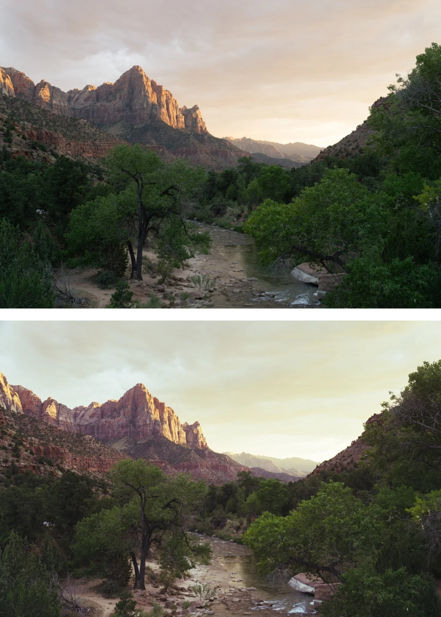
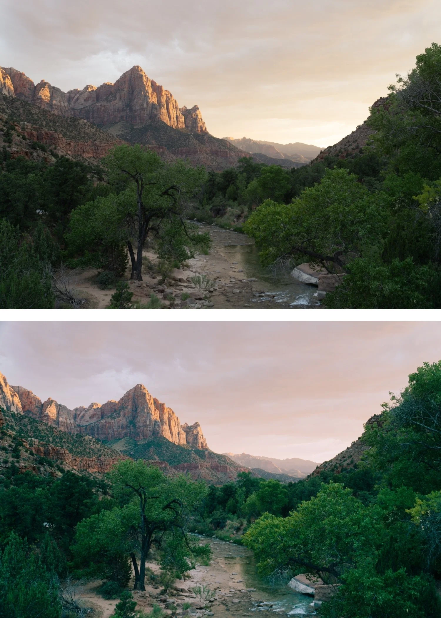
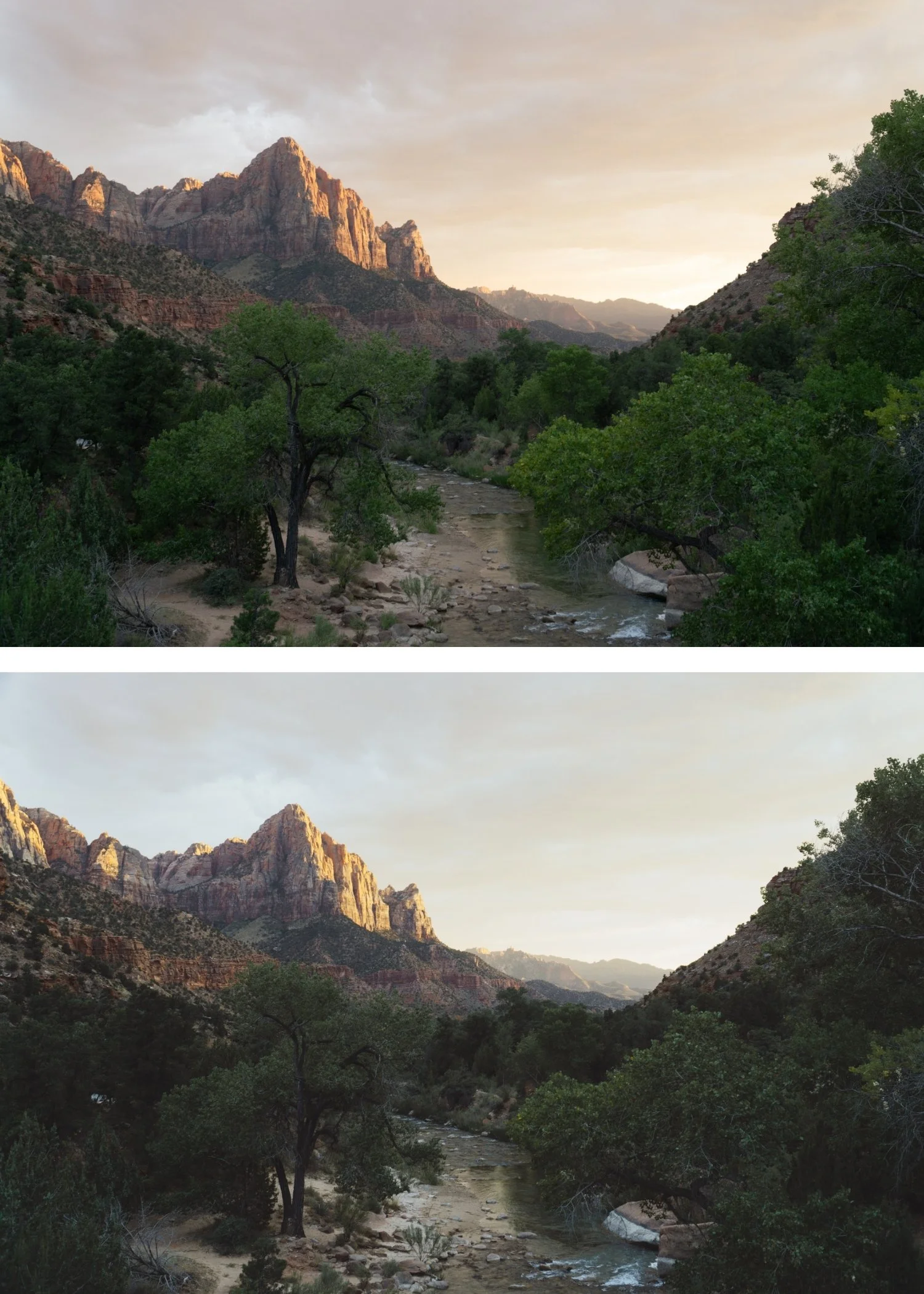
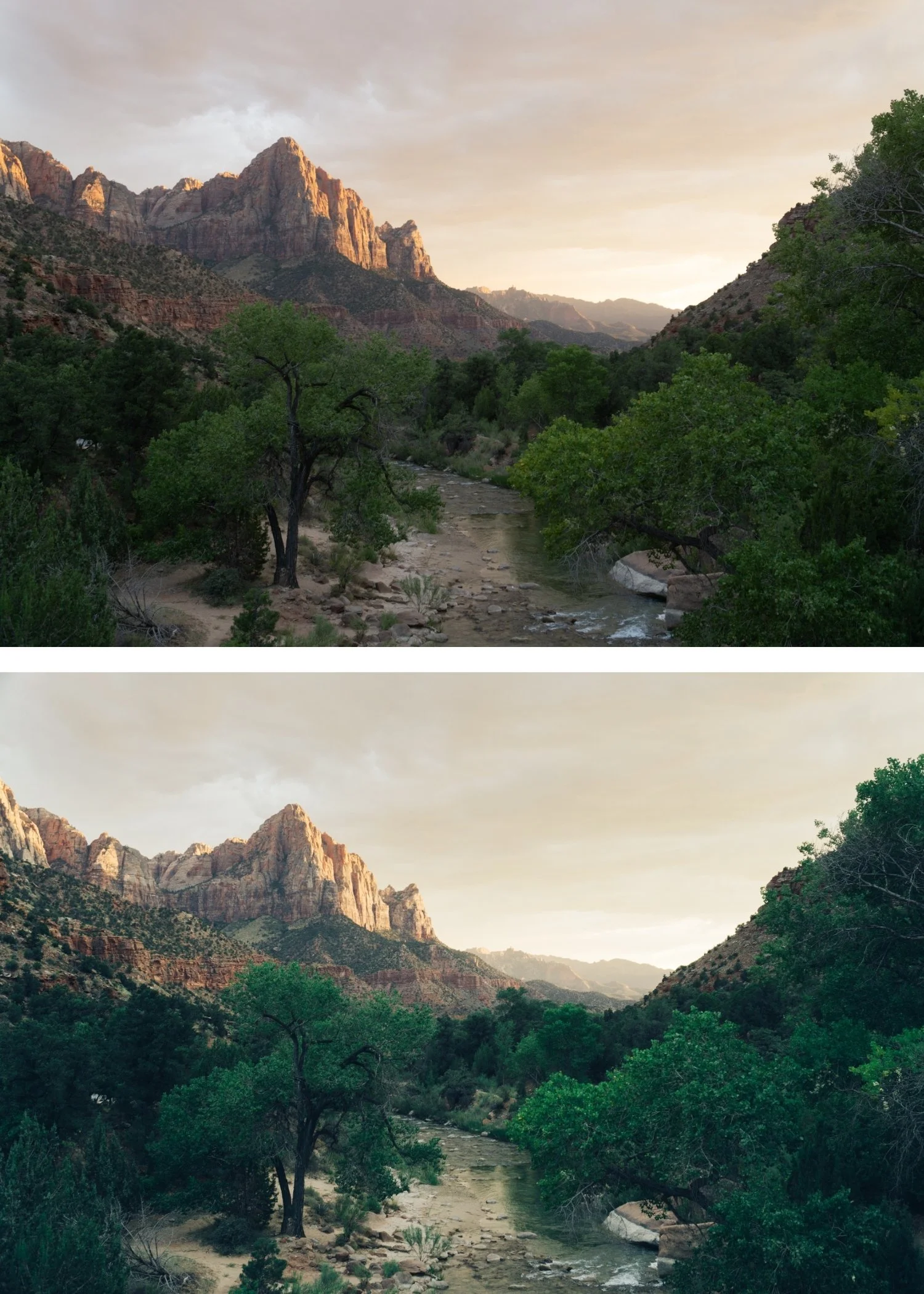
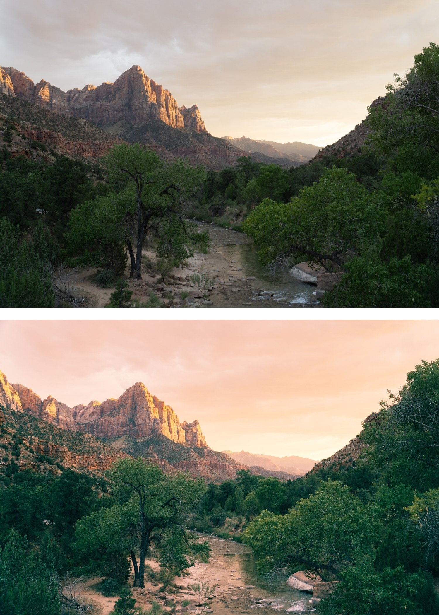
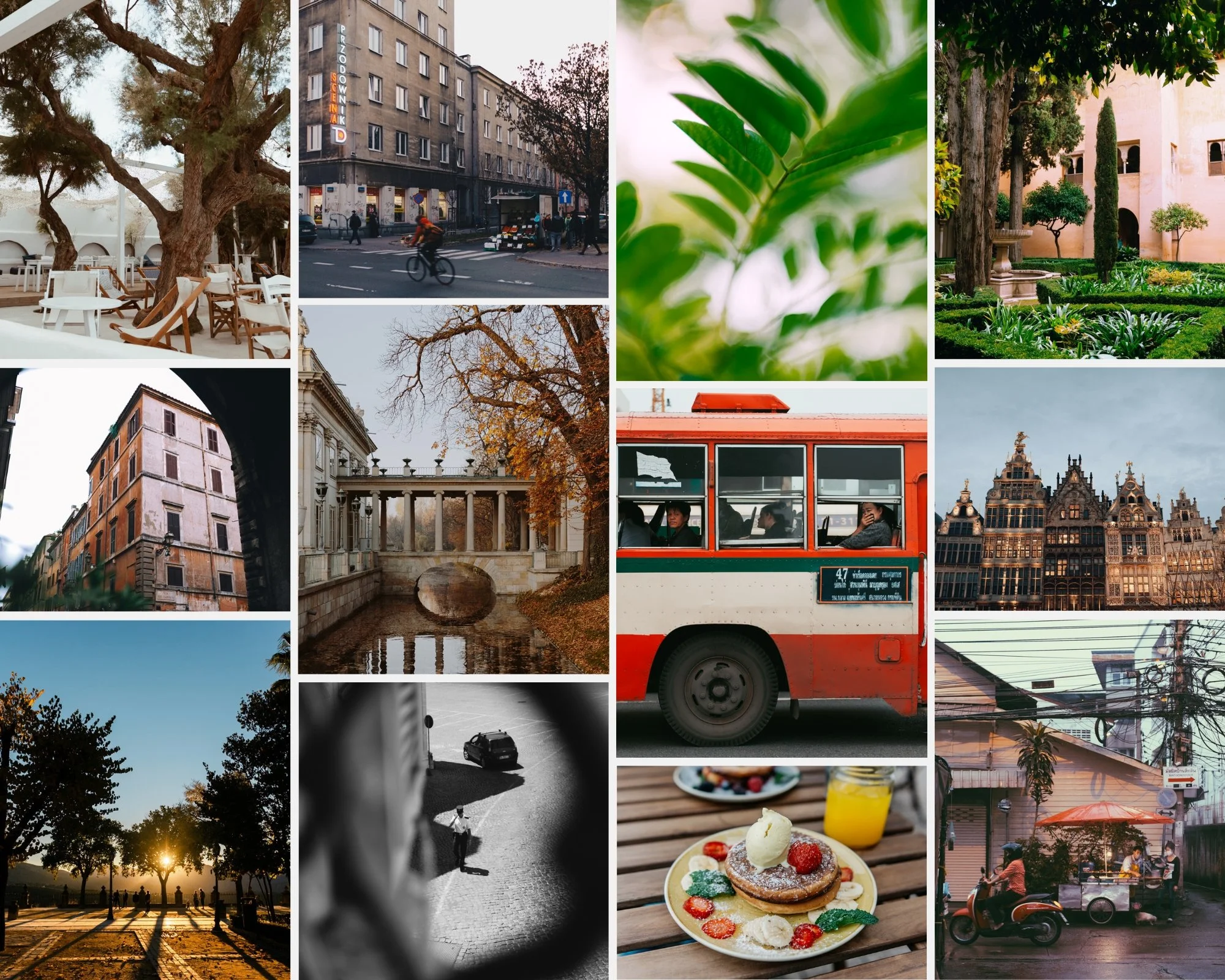
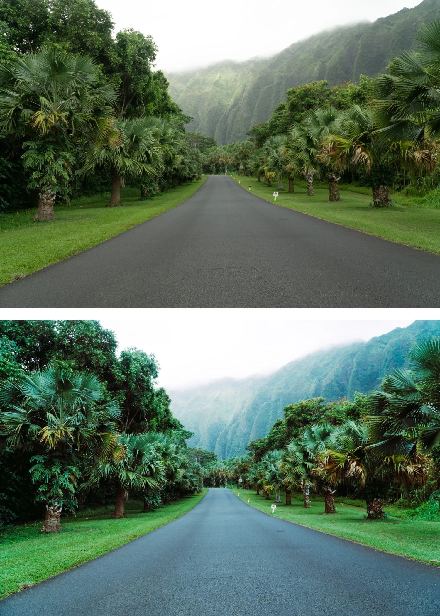
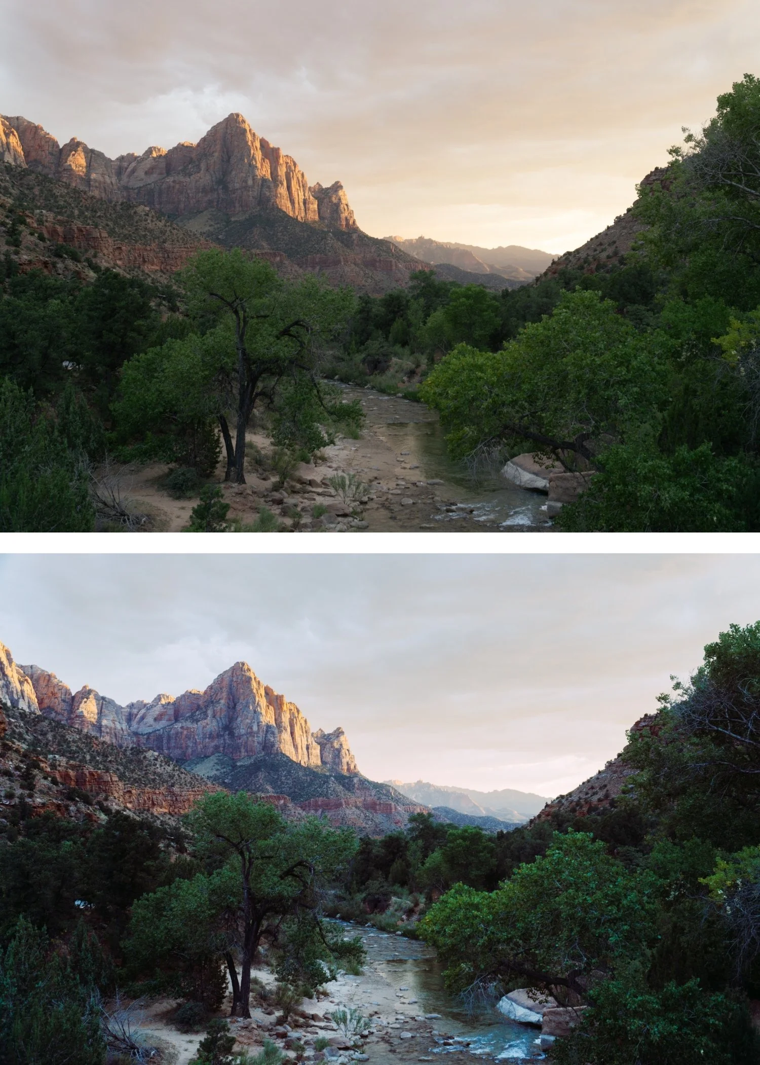 Image 4 of 4
Quartz 03 Bold Shift | Cross-Processed Film Preset for Lightroom Mobile & Desktop
-
Q3 is for photographers who want the cross-processed aesthetic as a clearly visible stylistic statement — where the colour shifts are intentionally present and contribute to the visual identity of the work.
For photographers who have tried Q1 and Q2 and want the next level of cross-processed expression.
-
The cross-processed character is clearly present. Q3's stronger shifts are strong enough to be immediately distinctive — photographs have the specific quality that made cross-processing famous in editorial photography.
It produces the most characterful accessible editorial results. Of the strongly cross-processed presets, Q3 has the most visible character while remaining applicable to serious editorial and lifestyle photography.
It suits bold subject matter. Fashion, creative portraits, travel photography in colourful environments — Q3's character amplifies the inherent visual qualities of bold subjects.
-
1 × Q3 Bold Shift DNG file — for Lightroom Mobile
1 × Q3 Bold Shift XMP file — for Lightroom Classic
Installation guide
Lifetime access -
This preset captures the look of "expired" professional film stocks and the nostalgic aesthetics of 1970s independent cinema. It is the professional answer for photographers who want their work to feel "lived-in" and timeless. By emulating the subtle yellow-green shadow shifts and the soft, paper-like highlight compression of aged analog emulsions known for their tactile and warm soul Q3 ensures your photos possess a gentle, archival quality. It transforms digital files into frames that feel like discovered treasures from a vintage family chest.
-
Step 1 — White balance first. Cross-processed film had unpredictable white balance responses — set Temperature to 5,000-5,400K as a neutral starting point. The colour shifts of cross-processing are built into the preset's calibration rather than the white balance, so a neutral starting point gives the shifts the most consistent foundation.
Step 2 — Apply Q3 Bold Shift. The bold cross-processed shifts, tonal character, and film grain apply simultaneously.
Step 3 — Assess carefully per photo. Q3 produces more variation between photos than Q1 and Q2 — correct exposure matters more. Photos with strong subject matter and correct exposure produce the most compelling results.
Portrait photography with Q3: reduce to 78-80% strength. Q3's stronger shifts can affect skin rendering — check Orange Saturation after applying and reduce by -3 to -5 if needed. Add Orange Luminance +6 to maintain skin presence.
On phone photos: 78-80% strength.
-
Is Q3 too bold for professional photography? Q3 is calibrated for editorial and creative contexts where visible colour character is appropriate and intentional. For professional photography requiring natural colour or subtle editorial quality, Q1 or Q2 are more appropriate.
What is the difference between Q3 and Q7 Vibrant Bold? Q3 has strong cross-processed shifts in a controlled, editorial register. Q7 is the most vivid preset in the collection — maximum vibrancy and the boldest colour statement. Q3 for bold editorial character, Q7 for maximum creative expression.
GET ALL 10 QUARTZ ARCHIVE PRESETS
The full Quartz Archive gives you ten calibrated cross-processed editorial looks — Clean Cross for subtle everyday editorial character, Cool Editorial for refined fashion photography, Bold Shift for clearly distinctive colour, Warm Cross for golden outdoor editorial, Deep Cinematic for maximum tonal impact, Cool Moody for atmospheric urban depth, Vibrant Bold for maximum colour statement, Soft Faded for gentle editorial lifestyle, High Contrast for dramatic directional light, and Experimental for the most extreme creative expression.
Ten presets. One editorial philosophy. $2.70 per preset.


THE STUDIO ARCHIVE
Want everything? The Studio Archive contains 130+ presets — every collection we make, including the complete Quartz Archive — for $89 total. That is $0.68 per preset with every future release included for life.