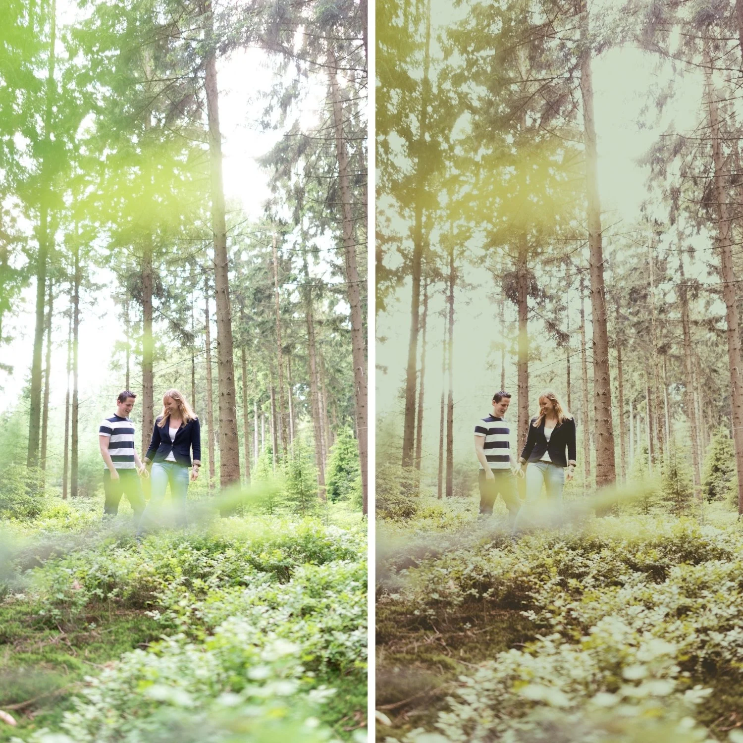
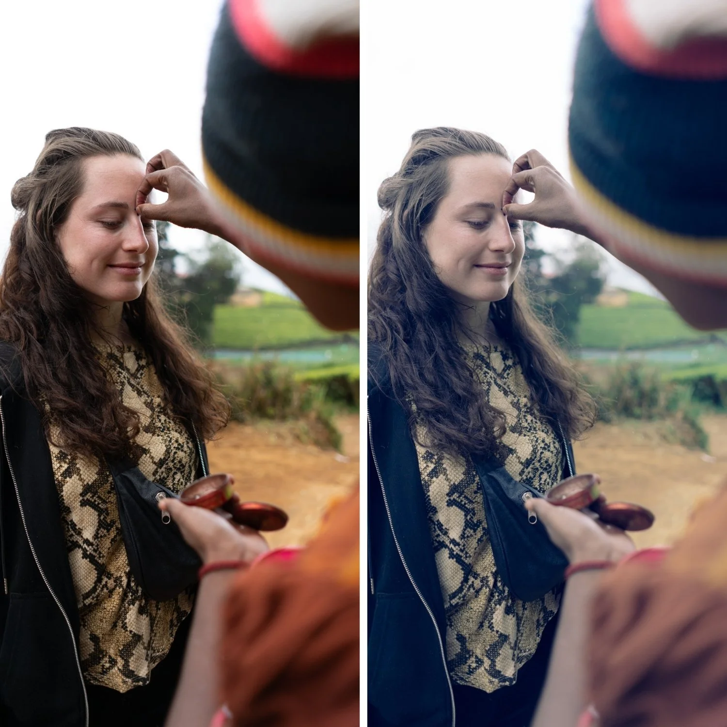
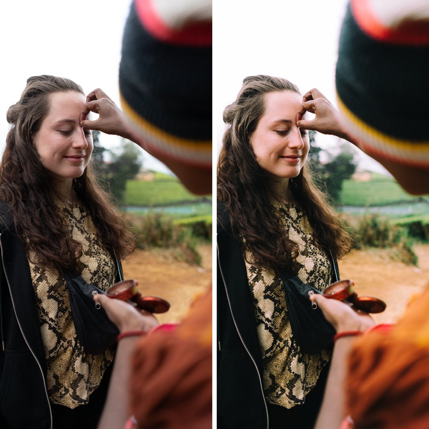
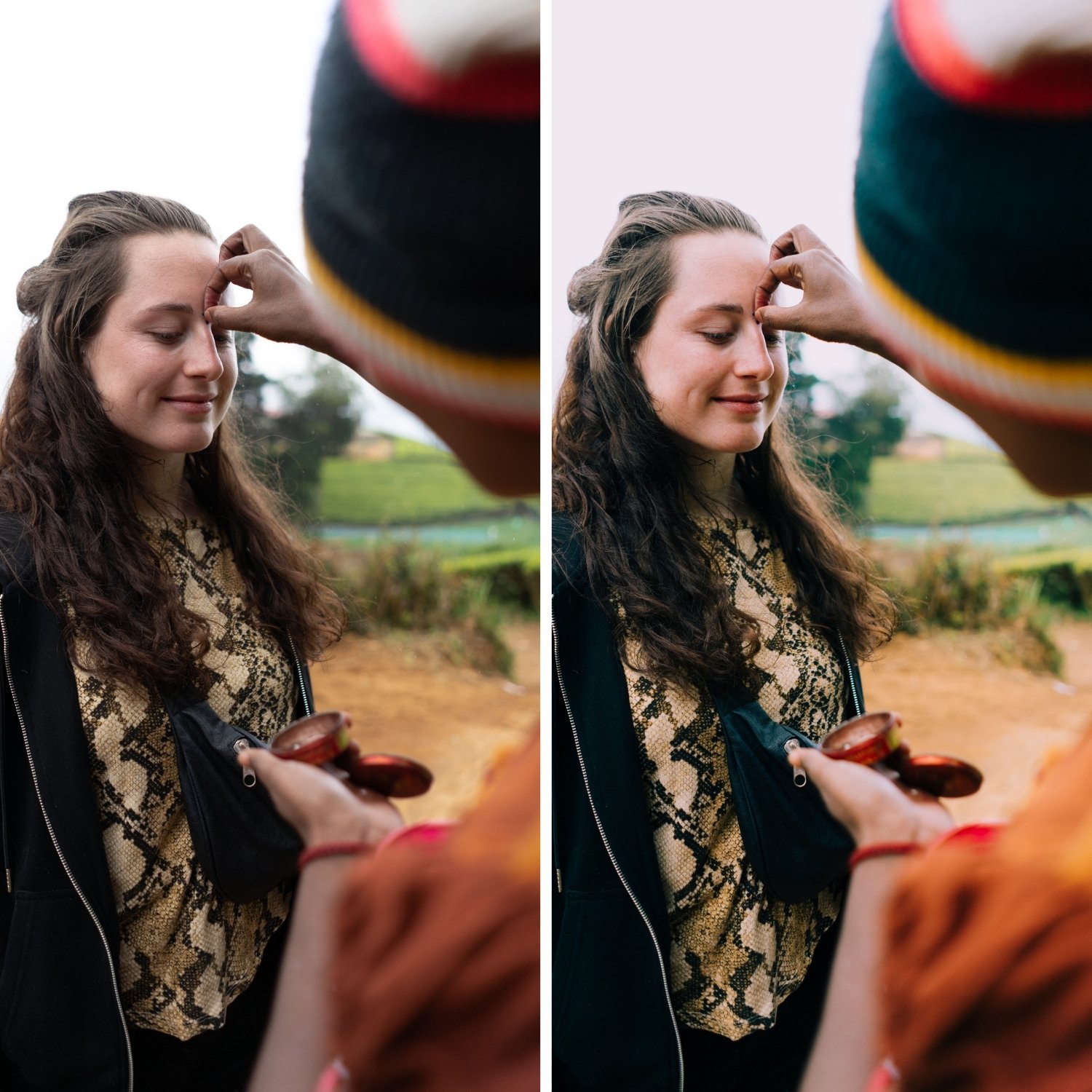
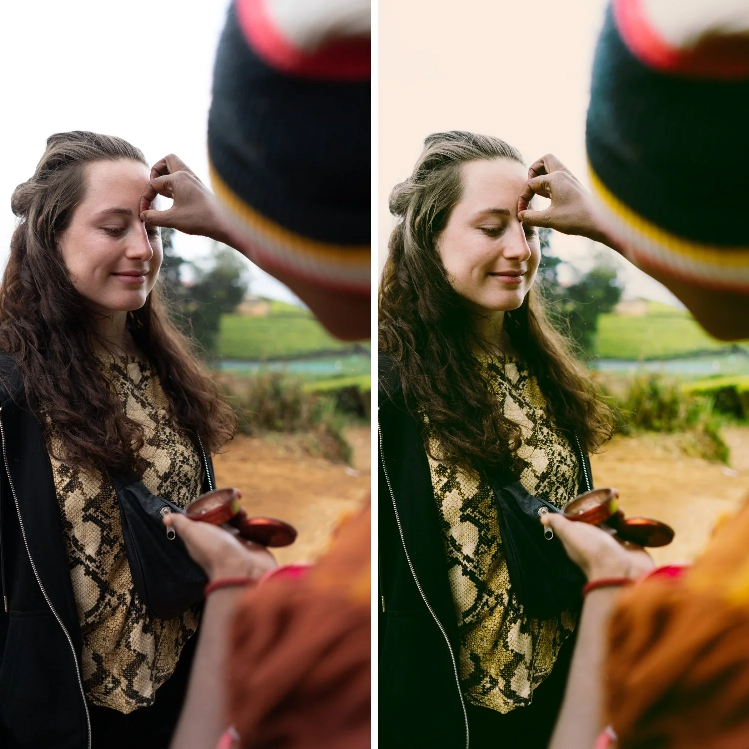
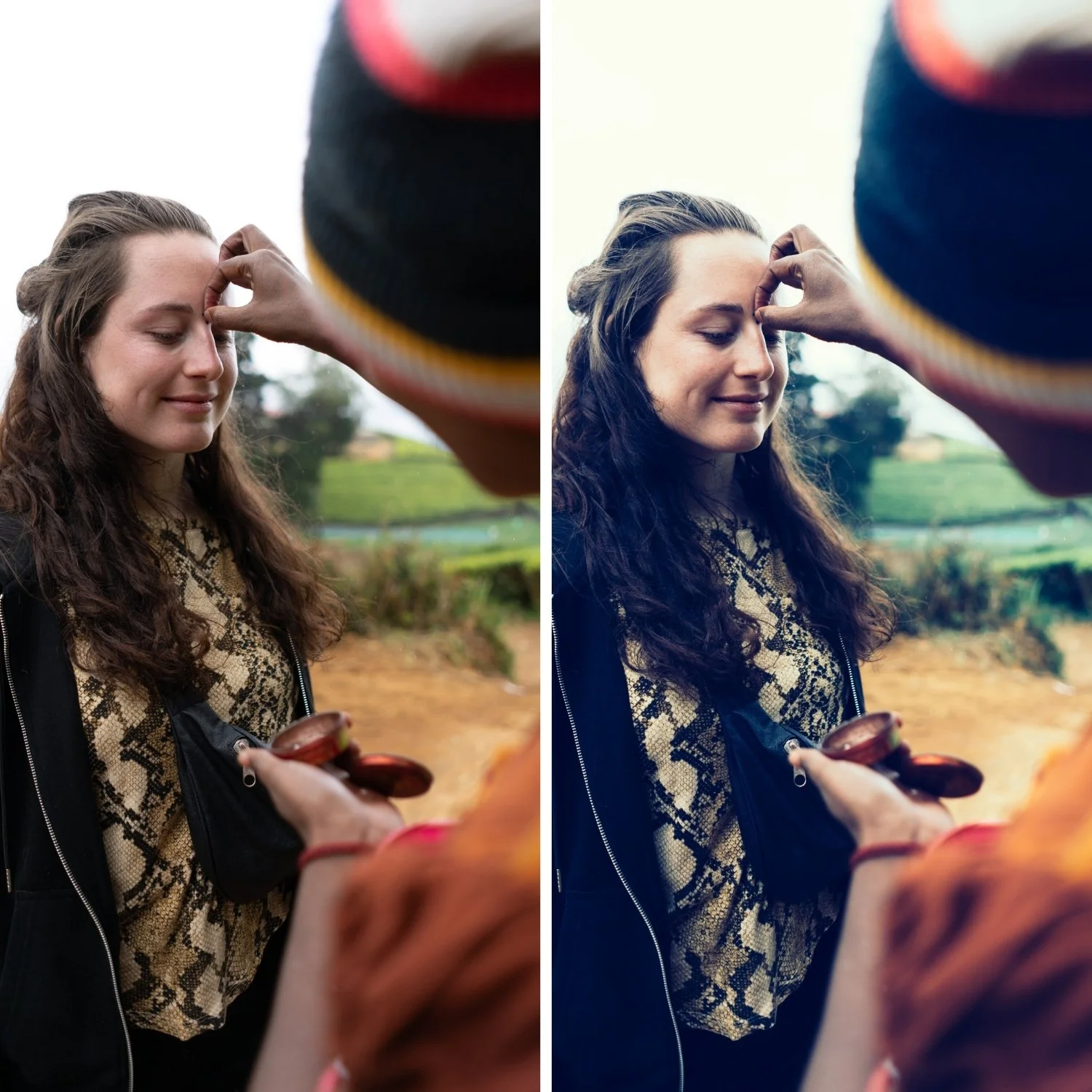
 Image 1 of 4
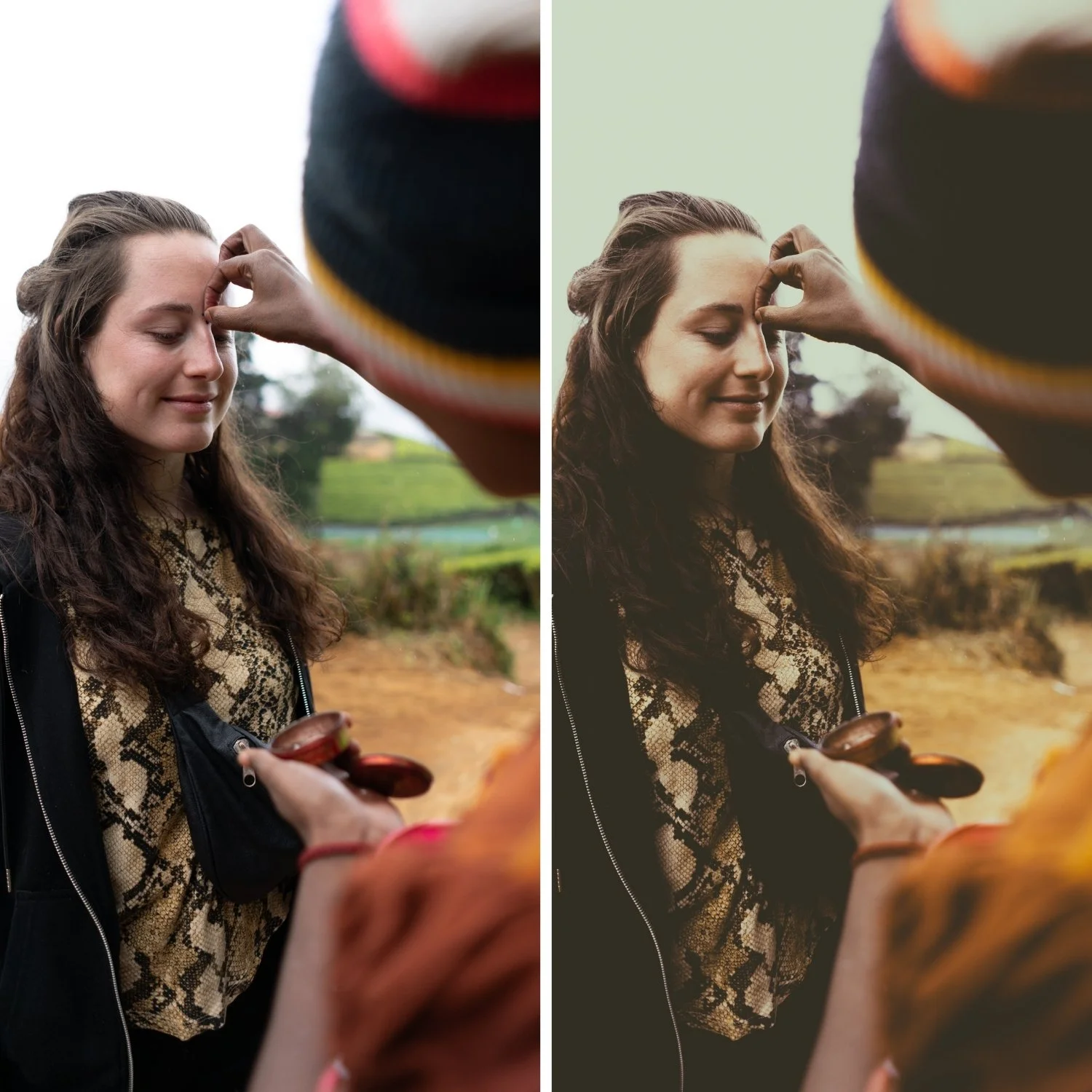
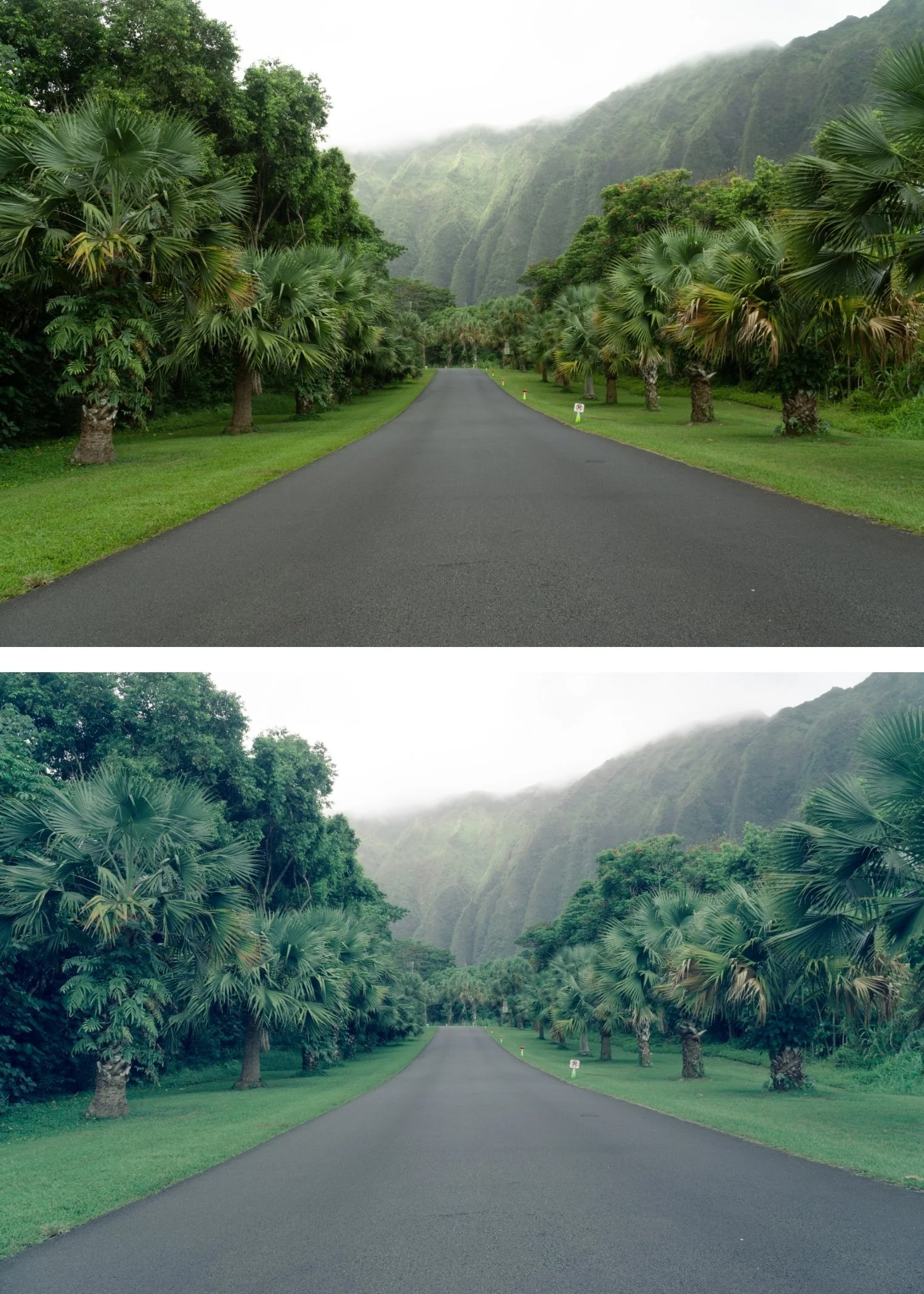
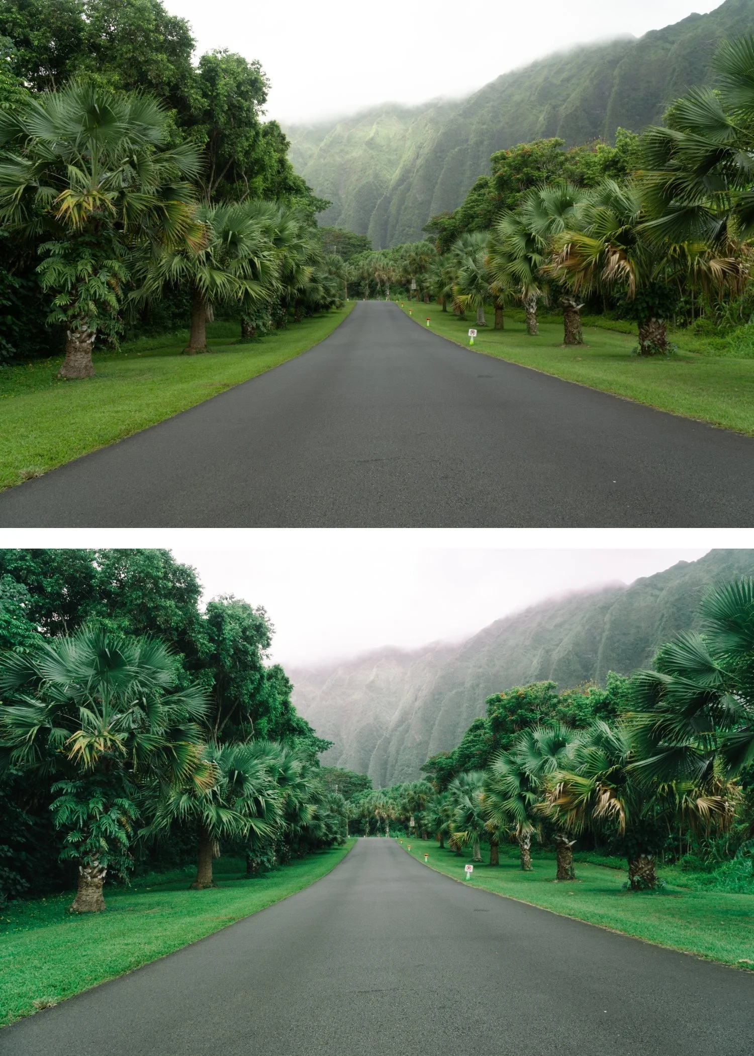
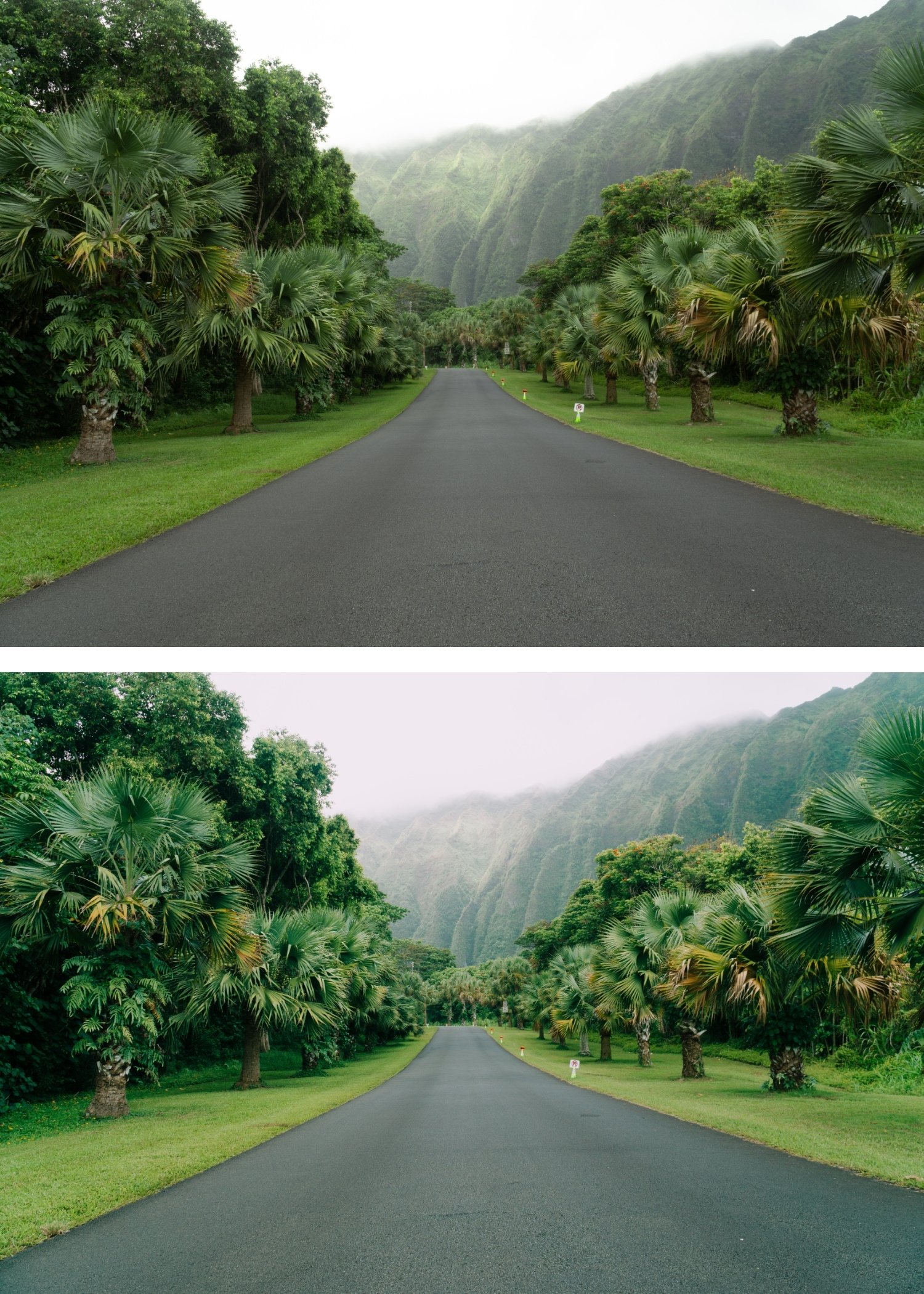
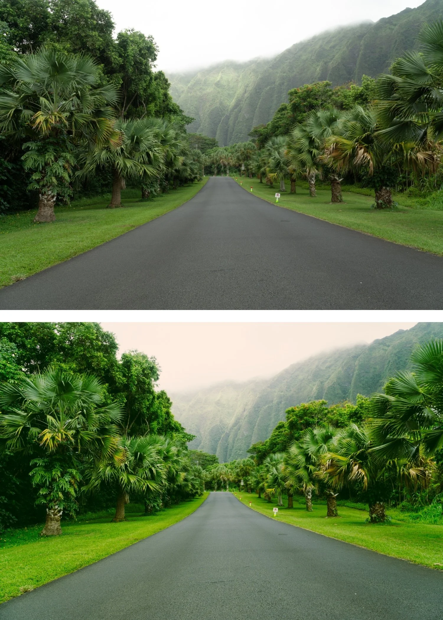
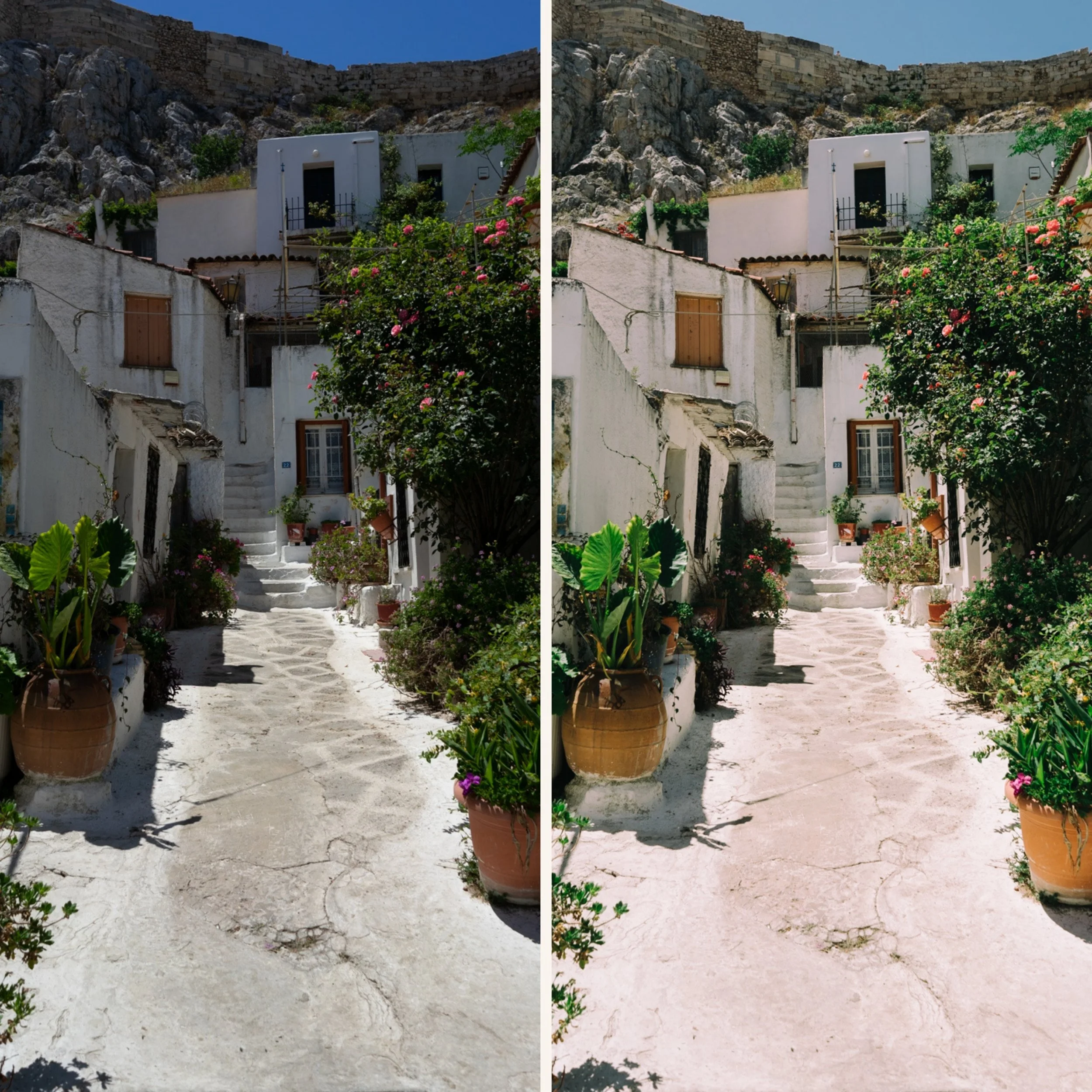
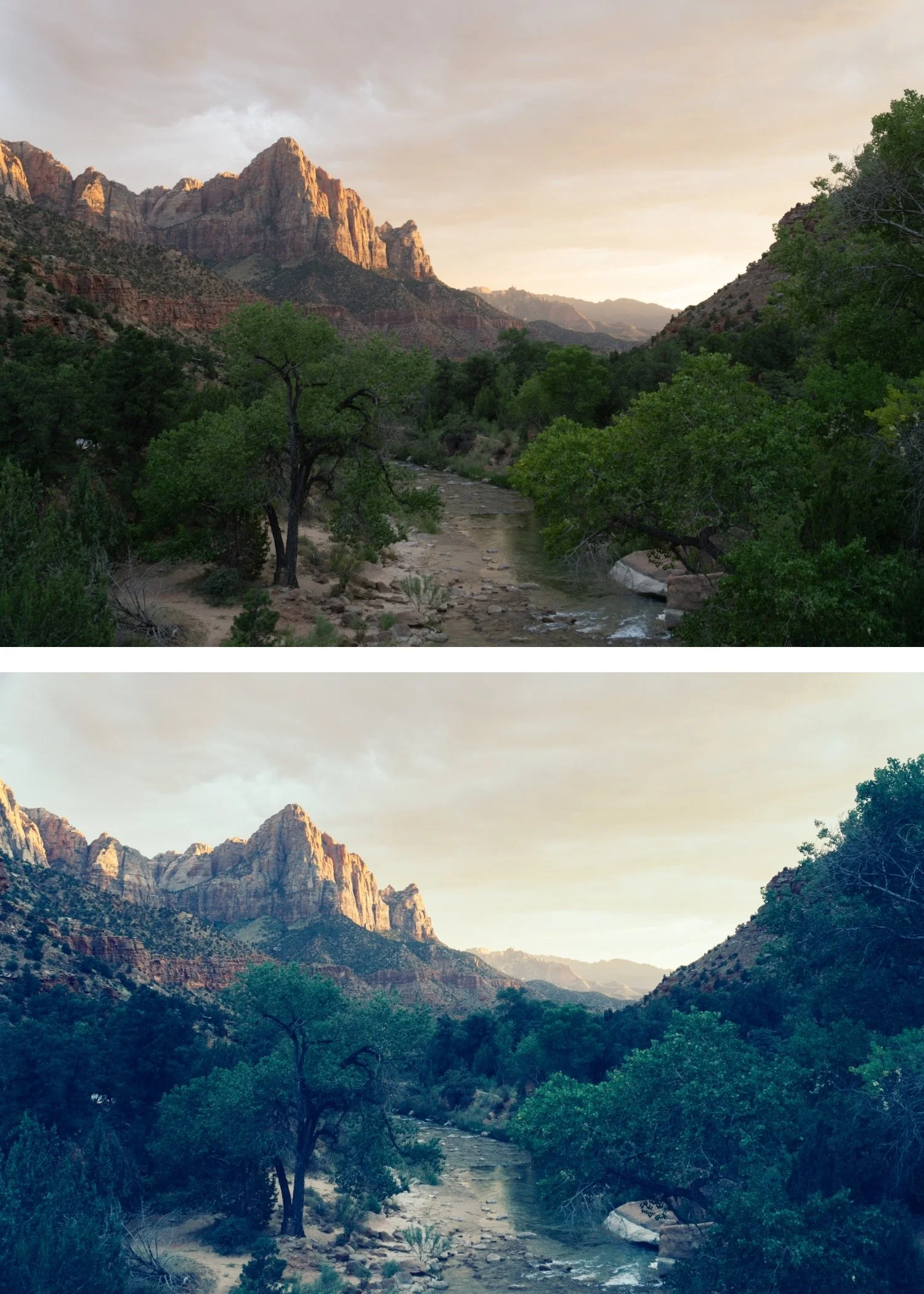
 Image 2 of 4
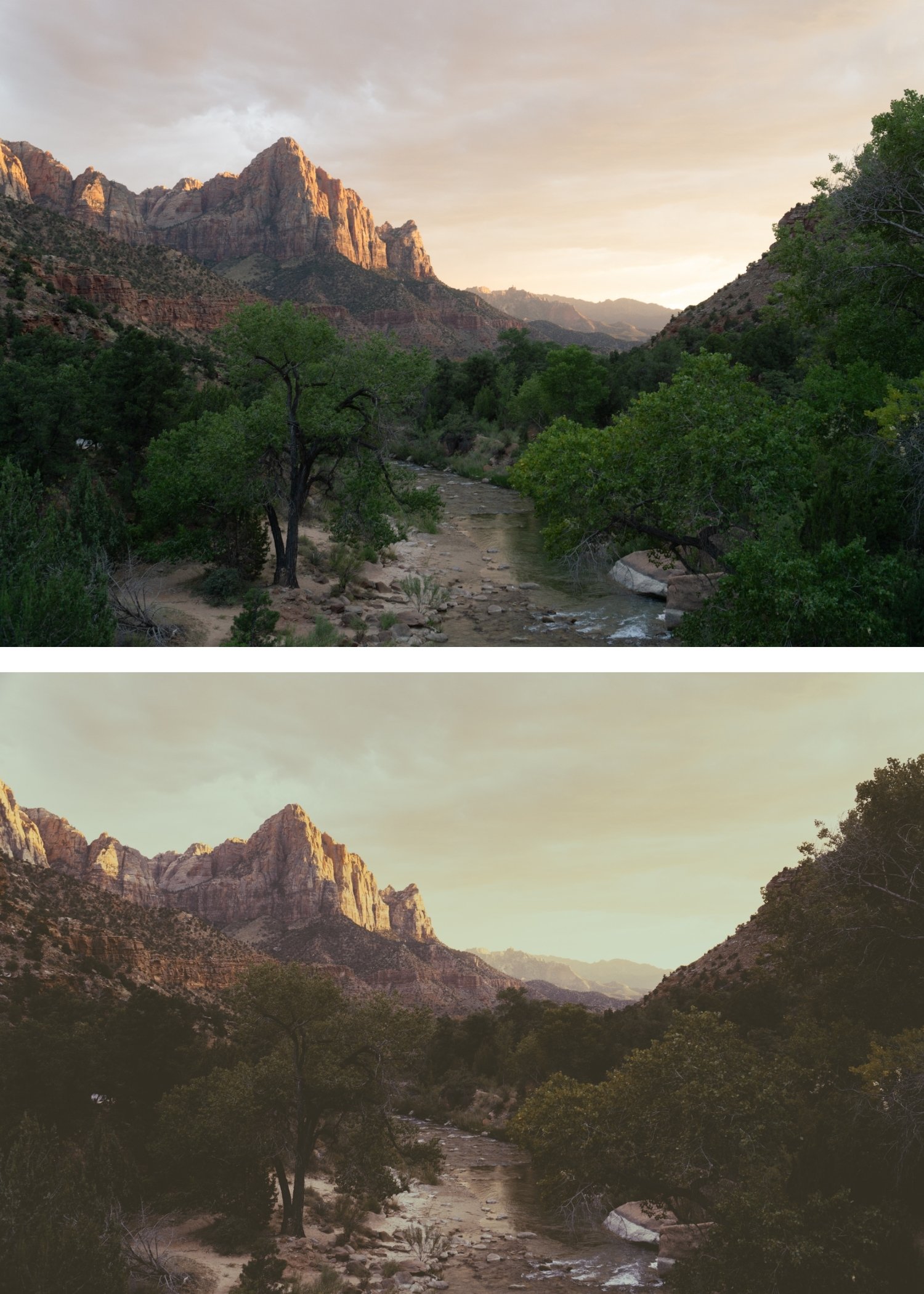
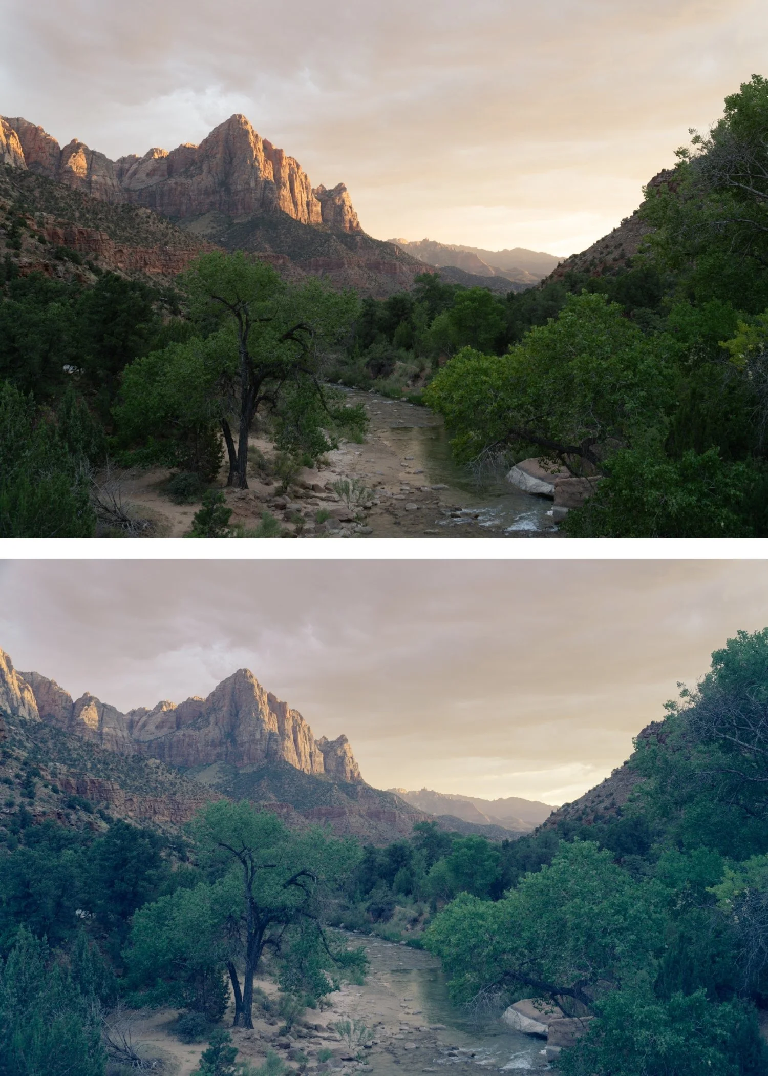
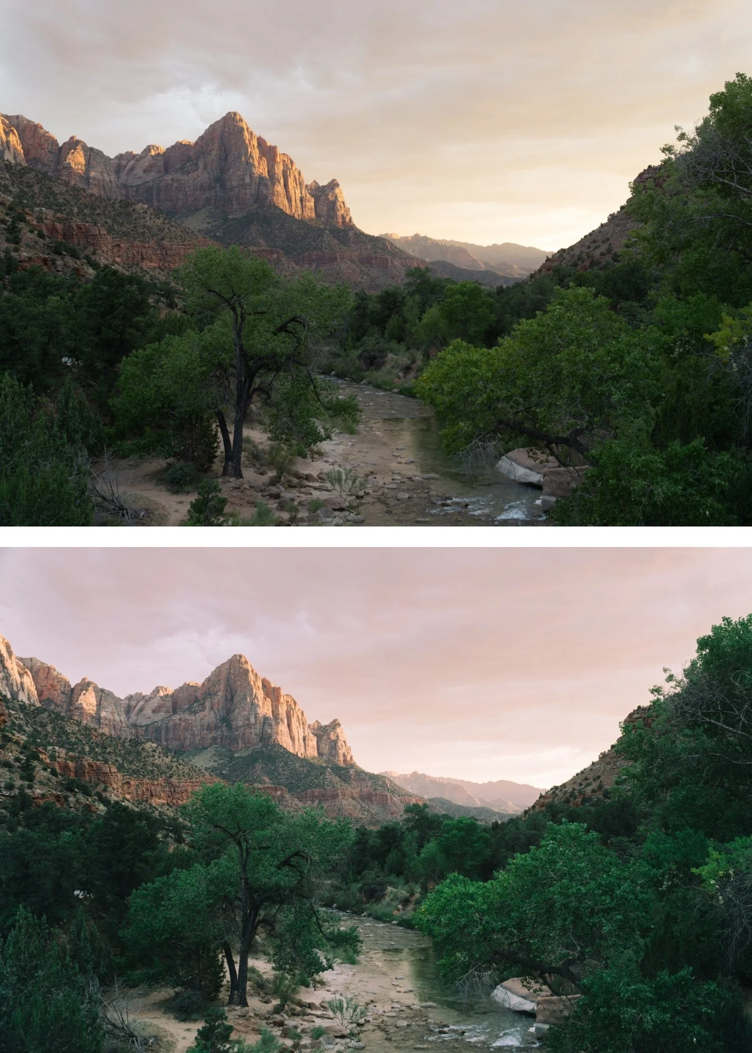
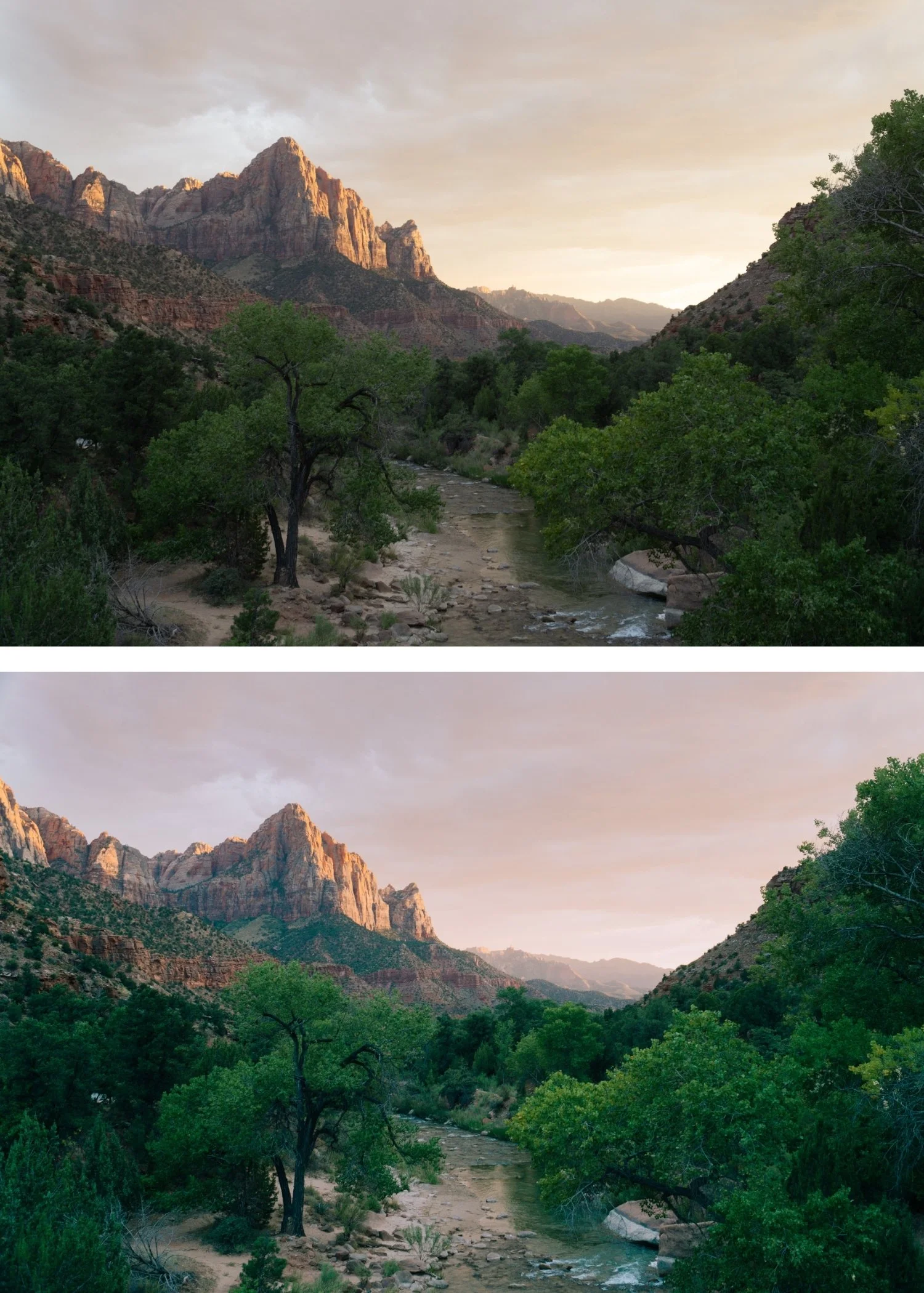
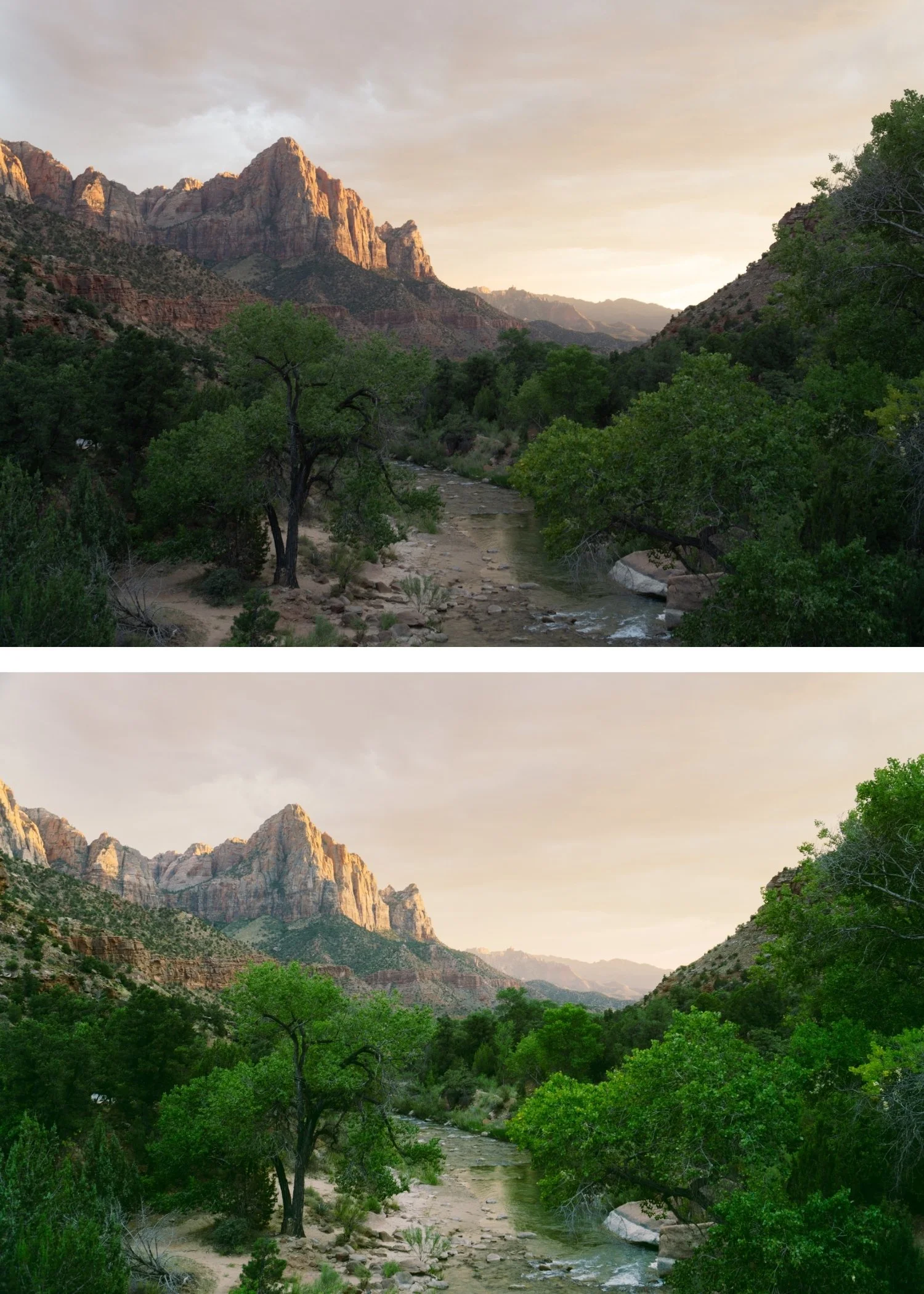
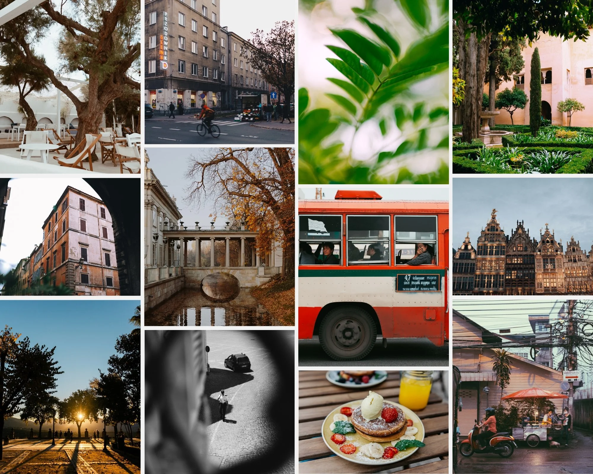
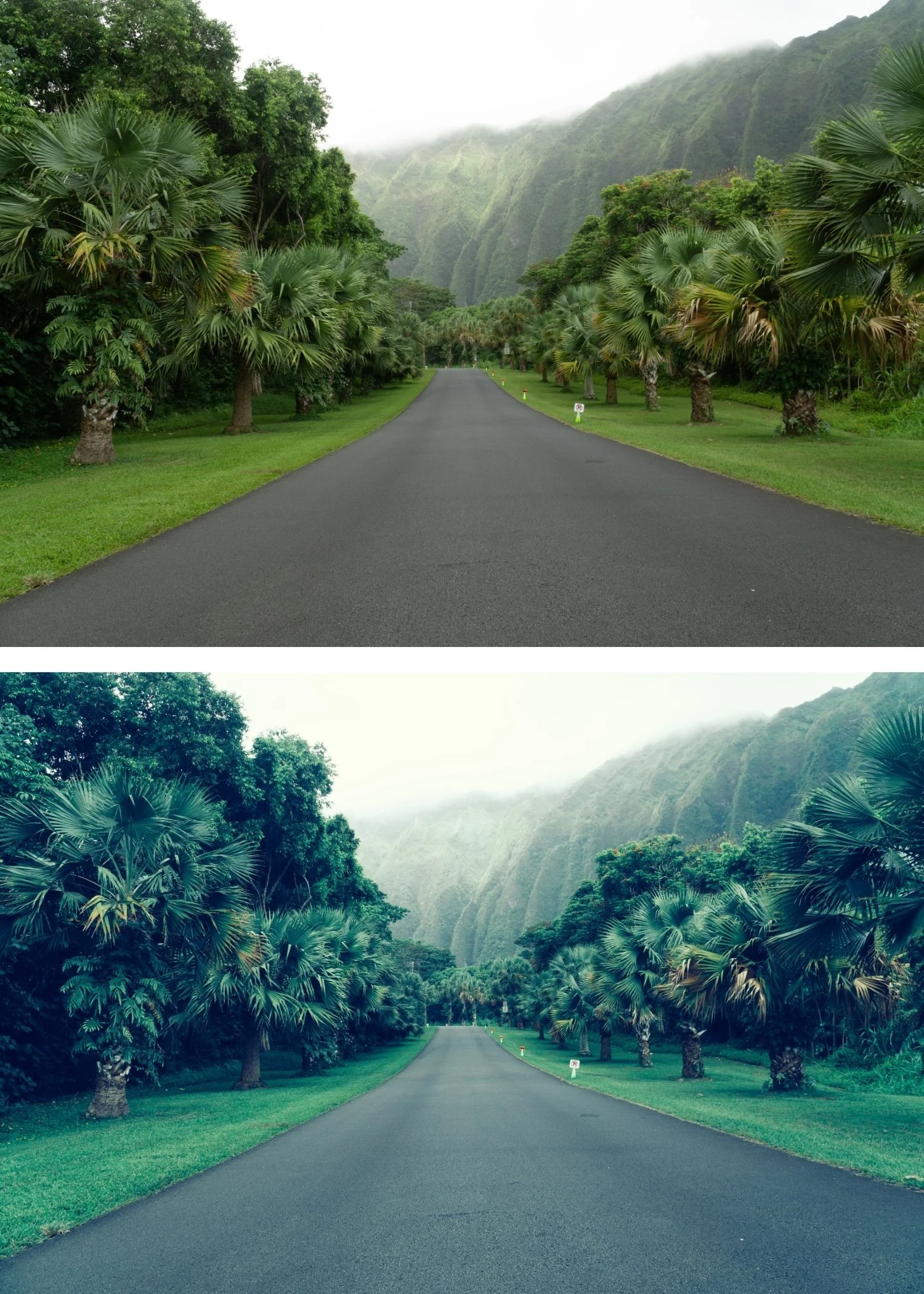 Image 3 of 4
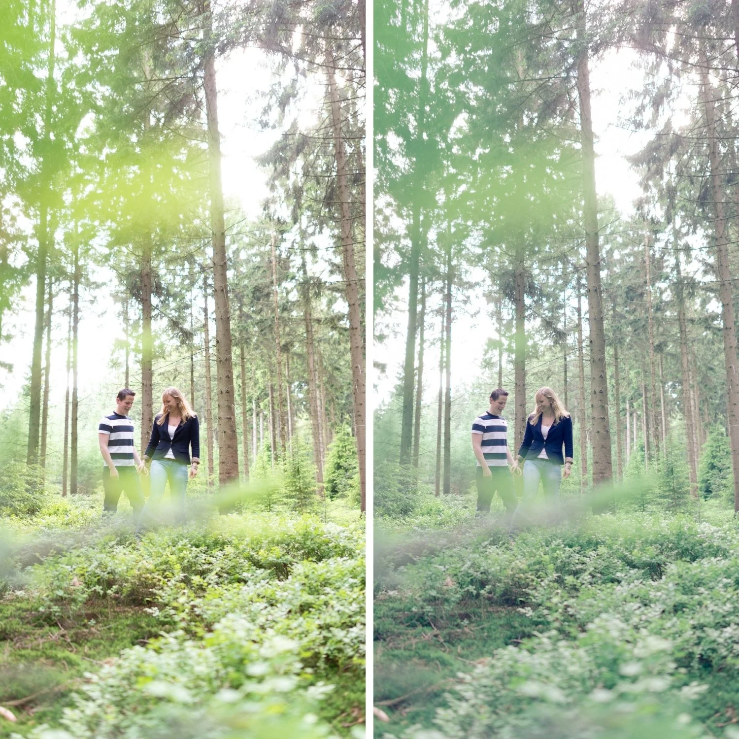
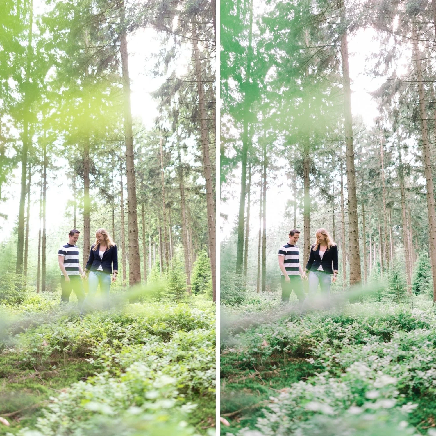
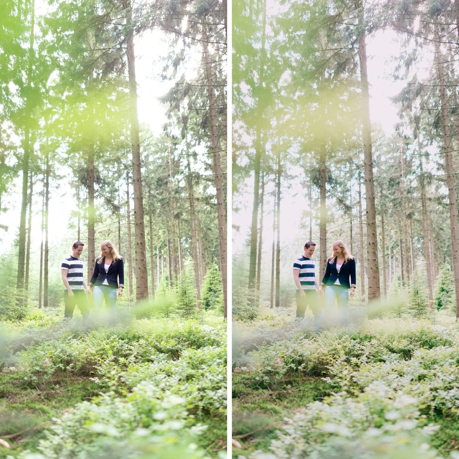
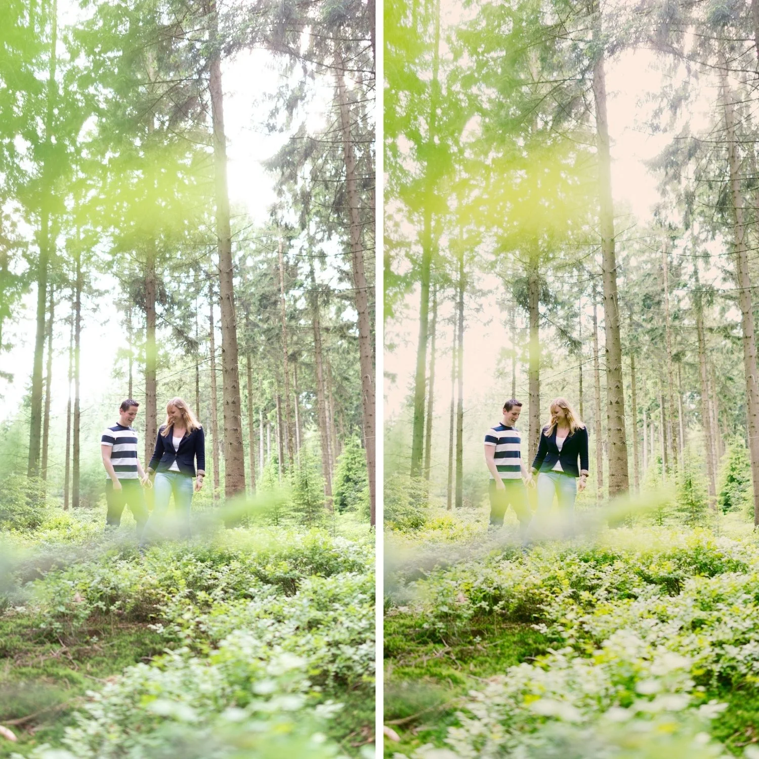
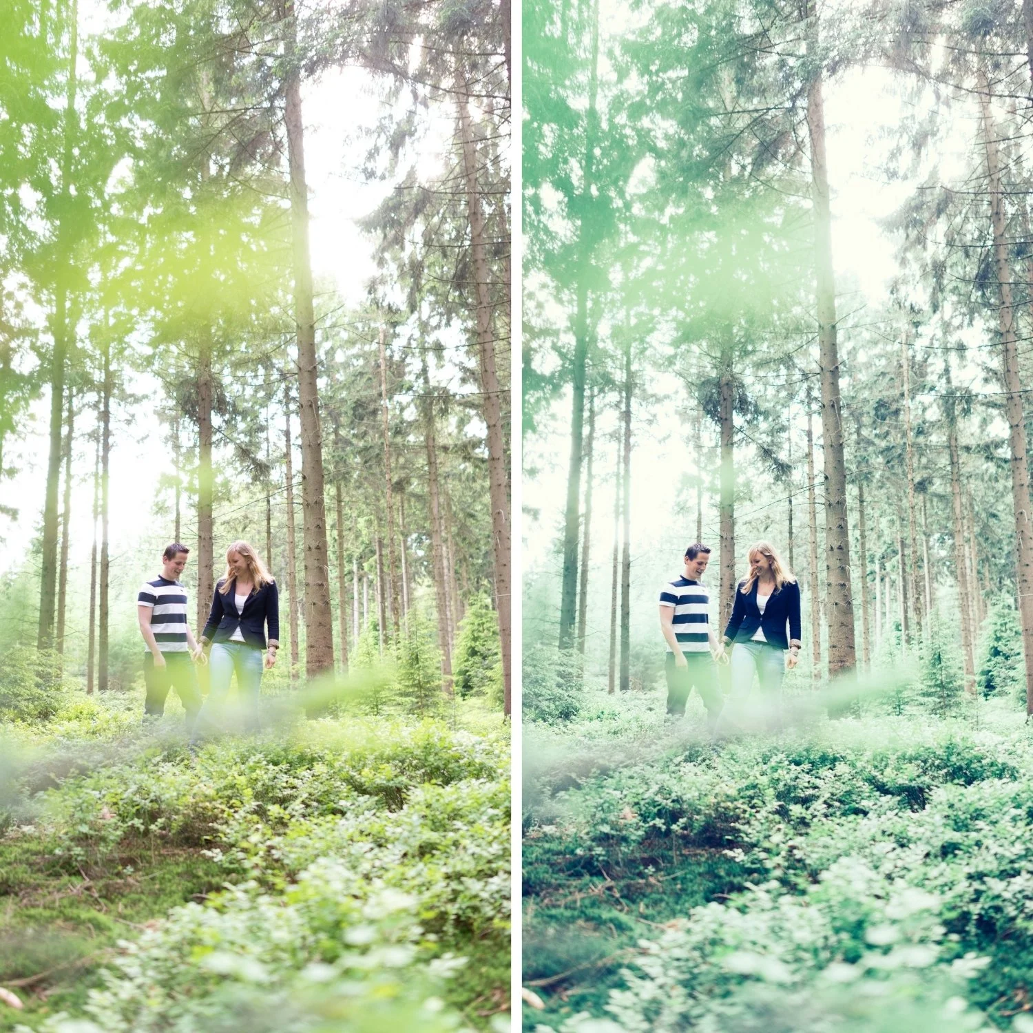
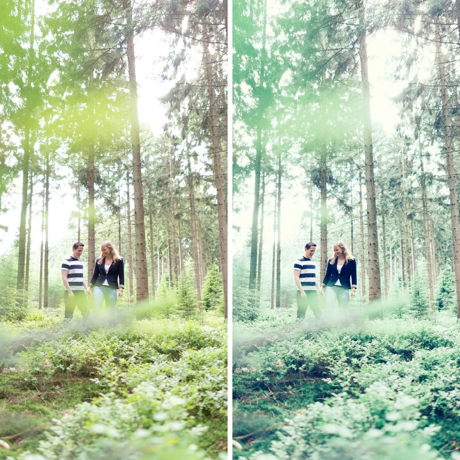
 Image 4 of 4
Quartz 09 High Contrast | Cross-Processed Film Preset for Lightroom Mobile & Desktop
-
Q9 is for editorial and travel photographers who shoot in strong directional light — direct sun, dramatic landscapes, bold architectural subjects with strong shadows — and want the most dramatic combination of tonal contrast and cross-processed colour in the collection.
For photographers who find Q5 Deep Cinematic insufficiently contrasty and want the maximum tonal drama in the Quartz Archive.
-
Contrast and colour shifts amplify each other. Q9's combination of high contrast and strong cross-processed shifts produces results more impactful than either quality alone — the tonal drama emphasises the distinctive colour and vice versa.
It produces the most dramatically editorial result. Of the ten presets, Q9 creates the most immediately commanding individual photographs when the light conditions support it.
It suits bold outdoor subjects in strong light. Strong directional sun, dramatic landscapes, bold architecture — Q9's character works with these conditions directly.
-
1 × Q9 High Contrast DNG file — for Lightroom Mobile
1 × Q9 High Contrast XMP file — for Lightroom Classic
Installation guide
Lifetime access -
This preset captures the aesthetic of professional color-negative film that has been aged in warm conditions, resulting in a unique amber-bias. It is the professional answer for photographers who want their work to feel "historical" but modern. By emulating the warm shadow-crossover and the characteristic "creamy" grain of vintage cinema emulsions—known for their ability to evoke deep nostalgia—Q9 ensures your photos possess an unmistakable soul. It transforms digital files into frames that look like they were pulled from a 1960s editorial archive in the South of France.
-
Step 1 — White balance first. Cross-processed film had unpredictable white balance responses — set Temperature to 5,000-5,400K as a neutral starting point. The colour shifts of cross-processing are built into the preset's calibration rather than the white balance, so a neutral starting point gives the shifts the most consistent foundation.
Step 2 — Exposure and highlight check before applying. Q9's high contrast amplifies both qualities and problems. Pull Highlights -20 to -25 before applying if bright areas are near clipping — Q9's contrast will push them further. Correctly exposed files with strong tonal range produce the best results.
Step 3 — Apply Q9 High Contrast. Assess each photo carefully — Q9 produces significant variation between photos. Strong directional light photos produce the most compelling results; flat light photos can look over-processed.
Portrait photography with Q9: Q9 is primarily for landscape and architectural editorial subjects. For portrait use, reduce to 72-75% and add a Radial Gradient on the face with Highlights -10 and Shadows +8 to manage facial contrast.
On phone photos: 76-78% strength. Phone cameras add their own contrast — Q9's elevated contrast on top can be excessive without reduction.
-
Is Q9 too contrasty for everyday photography? Q9 is calibrated for editorial photography with strong directional light. For everyday photography or soft-light content, Q1 or Q8 produce more accessible and balanced results.
What is the difference between Q9 and K3 High Contrast Slide? K3 has Kodachrome warm colour with high contrast — the warmth and contrast work together. Q9 has cross-processed colour shifts with maximum tonal contrast — a very different colour direction and philosophy. K3 for bold warm Kodachrome travel, Q9 for dramatic cross-processed editorial.
GET ALL 10 QUARTZ ARCHIVE PRESETS
The full Quartz Archive gives you ten calibrated cross-processed editorial looks — Clean Cross for subtle everyday editorial character, Cool Editorial for refined fashion photography, Bold Shift for clearly distinctive colour, Warm Cross for golden outdoor editorial, Deep Cinematic for maximum tonal impact, Cool Moody for atmospheric urban depth, Vibrant Bold for maximum colour statement, Soft Faded for gentle editorial lifestyle, High Contrast for dramatic directional light, and Experimental for the most extreme creative expression.
Ten presets. One editorial philosophy. $2.70 per preset.

THE STUDIO ARCHIVE
Want everything? The Studio Archive contains 130+ presets — every collection we make, including the complete Quartz Archive — for $89 total. That is $0.68 per preset with every future release included for life.