90s Film Look in Lightroom
The 90s photography aesthetic is not about technical precision. It is about a specific feeling: the snapshot quality of personal photography before digital cameras were ubiquitous, the specific warmth of film in casual indoor conditions, the slightly imperfect color of cameras that were built for accessibility rather than accuracy. Understanding what created those properties technically is what allows you to recreate them deliberately rather than chasing a surface-level imitation.
The 90s look draws from two distinct sources: analog film cameras in casual point-and-shoot form from the late 1980s through the mid-1990s, and early digital cameras (digicams) from the late 1990s through the early 2000s. Both share aesthetic characteristics despite being technically different: warm skin rendering, slightly compressed shadows, hot highlights from flash photography, and a color character that prioritizes warmth and casual energy over technical accuracy.
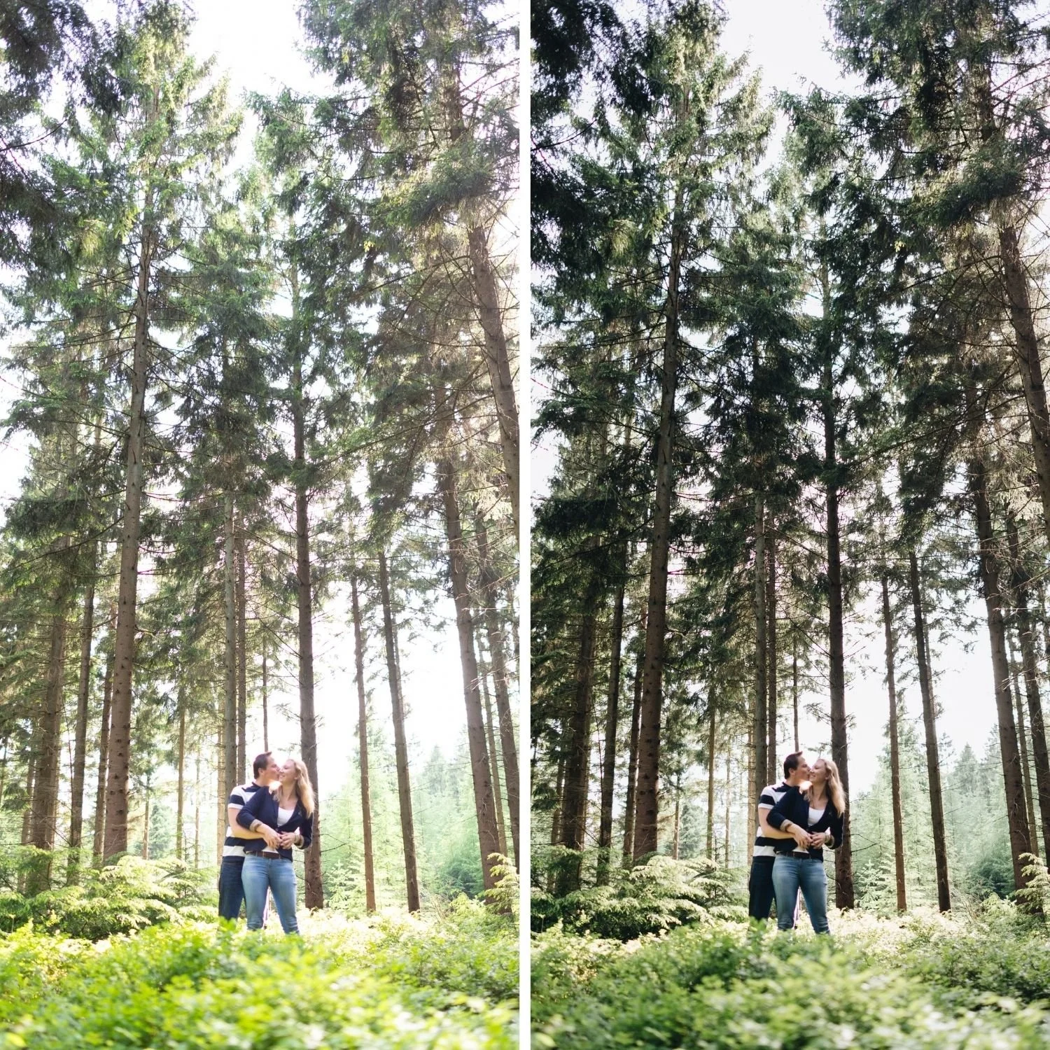
What Creates the 90s Aesthetic
The most distinctive property of 90s photography is flash energy. Point-and-shoot cameras and early digicams used built-in flash as a primary light source in any indoor or low-light situation. This produced a specific tonal structure: the subject is brightly lit from the front, shadows fall away quickly behind them, and the background is darker and less detailed than the subject. The result reads immediately as a casual, social snapshot rather than a composed photograph.
The second characteristic is warm, slightly imperfect color. Film stocks from this era and early digital sensors rendered color differently from today's cameras. Reds and oranges were prominent. Blues were slightly compressed. Greens were warm rather than vivid. The overall color temperature of indoor photography was pushed warm by the ambient lighting conditions that were common in homes and venues before LED and daylight-balanced lighting became widespread.
The third characteristic is texture and imperfection. Film grain from fast film stocks in indoor and low-light conditions, the noise character of early digital sensors, and the slight softness of consumer camera lenses combined to create photographs with a textural quality that high-resolution modern cameras and sharp prime lenses do not produce naturally.
Building the Exposure Structure
The flash snapshot tonal structure is the foundation of a convincing 90s look. In Lightroom, this means working against the standard film aesthetic approach in one specific way: rather than protecting highlights aggressively, you allow the subject-facing areas to be brighter than would normally be ideal. The highlights on the subject should feel slightly hot. The background should be relatively darker.
Exposure: increase until the subject feels front-lit and present. Highlights: reduce only slightly, by around negative 10 to negative 20, rather than the more aggressive reduction that most film editing requires. Shadows: lift slightly to prevent faces from going muddy in areas not reached by the flash. Blacks: keep relatively deep, around 0 to negative 10, to maintain the darker background quality.
The overall result should feel unbalanced in a specific way: bright and warm on the primary subject, darker and less detailed in the background. This is the flash snapshot structure.
Color: Warm but Intentionally Imperfect
The color in 90s photography is warm without being golden, slightly imperfect without being obviously wrong. The goal is color that feels like it was produced by a camera that prioritized convenience over accuracy, rather than color that feels like a filter applied to technically correct photography.
Orange Saturation should be reduced to between negative 5 and negative 15. This prevents the vivid orange that modern cameras produce in warm indoor conditions, while keeping the warmth present. Orange Luminance should increase to between positive 5 and positive 10 to keep faces bright and present despite the saturation reduction.
Yellow Saturation reduction of negative 5 to negative 20 removes the mustard quality that warm indoor lighting creates when combined with warm white balance. Green Saturation reduction of negative 10 to negative 25 removes the neon quality and replaces it with the slightly warm, more natural green rendering of the film era. Blue Saturation reduction of negative 5 to negative 20 is particularly impactful for the 90s look: clean, electric digital blues read as modern, while slightly compressed blues read as appropriately aged.
White balance should sit warmer than neutral but not aggressively golden. A Temperature range of 5,400 to 6,200K for indoor photography references the warmth of tungsten-balanced film in indoor conditions without the golden quality of sunset photography.
Texture: Grain Plus Character
The texture of 90s photography is not simply grain. It is a combination of grain, the softness from consumer camera optics, and the noise character of film and early digital sensors. In Lightroom, approximating this requires thinking about texture at multiple levels.
Grain: Amount 22 to 35, Size 24 to 36, Roughness 52 to 68. This range produces grain that is clearly visible and textured rather than fine and subtle. The 90s look benefits from more obvious grain than the restrained calibration of contemporary film aesthetics.
Clarity should be at 0 or slightly negative, between 0 and negative 10. Adding Clarity creates the crisp, digital quality that reads as modern. The 90s look is defined in part by slightly blunted edge definition that references the softer optics of consumer cameras. Texture can similarly be at 0 or slightly negative. The combination of reduced Clarity with visible grain and slightly warm color produces the characteristic slightly soft, textured quality of the era.

The Contrast Philosophy
The contrast in 90s photography is not the soft, dimensional quality of carefully crafted film aesthetic editing. It is simpler and slightly blunter: moderate midtone separation with compressed shadows and slightly hot highlights. The Contrast slider at positive 10 to positive 25 captures this more directly than a carefully shaped Tone Curve, which is appropriate for the 90s context where the goal is imperfection rather than refinement.
Avoid stacking Contrast, Clarity, Texture, and Dehaze simultaneously. The 90s look should feel slightly blunt rather than crunchy. Heavy stacking of contrast-adding controls produces a HDR-adjacent quality that reads as modern rather than nostalgic.
Color Grading for the Specific 90s Warmth
Color Grading in the Highlight range with Hue around 35 to 45 and Saturation of 8 to 14 adds the specific warm-amber quality of flash photography in warm indoor conditions. Slightly higher Saturation than standard film editing references the more aggressive warmth of the 90s aesthetic. Shadow Color Grading should remain close to neutral or very slightly cool at low Saturation, around 3 to 5, to add subtle depth without creating the teal shadow quality that references a different and more recent aesthetic.
FAQ
What is the difference between 90s film and 90s digicam?
90s film has more organic grain, warmer more saturated color, and the specific roll-off quality of analog emulsion. 90s digicam is slightly sharper and has a more blunt, imperfect color quality from early digital sensor rendering. Both share the flash snapshot energy and the warm, casual color character that defines the era.
Does the 90s look work on modern photography subjects?
Yes. The 90s aesthetic is an editing approach applied to modern digital photographs. It works best on casual, social, indoor photography where the flash snapshot structure suits the subject. It works less well on composed outdoor landscape photography where the aesthetic philosophy is mismatched with the subject matter.
Why do my 90s edits look modern instead of nostalgic?
The most common cause is blues that are too clean and electric, Clarity that is too high, or highlights that are too carefully managed. Reduce Blue Saturation, lower Clarity, and allow highlights to be slightly hotter than standard film editing recommends.
Try the 90s approach on your own photographs:
Download the free Analog Film preset as a starting point, then apply the Blue Saturation reduction, increased grain, and slightly hotter exposure structure described above to understand how the 90s shift works from a calibrated film base.
For a complete vintage and retro aesthetic system, the Polaroid Instant Archive covers the instant film direction and the Quartz Archive covers the experimental color direction. The Studio Archive includes both at $89.
