Cinematic Lightroom Preset — Complete Guide (2026)
Cinematic Lightroom Preset — Complete Guide (2026)
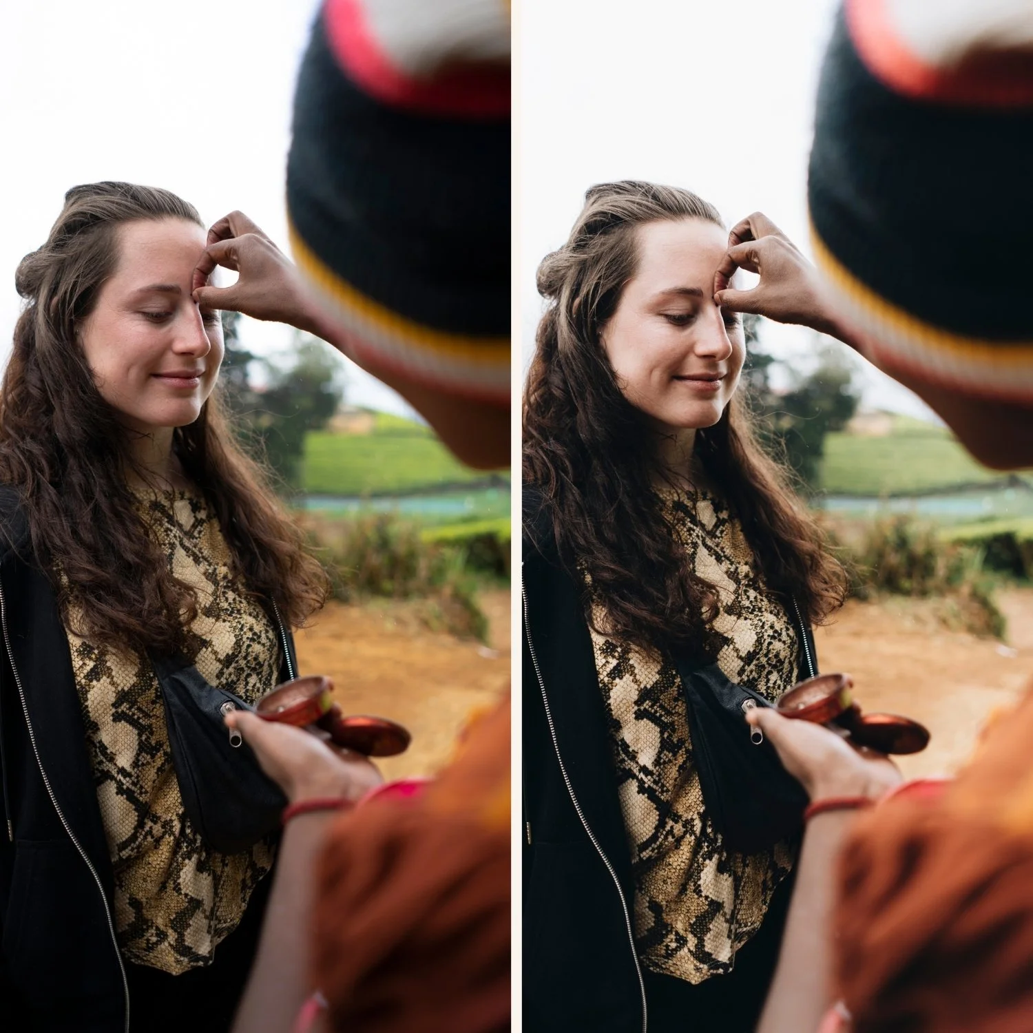
Cinematic editing gives photos the visual quality of a film frame — bold tonal separation, controlled color grading, deep shadows with preserved detail, and a high-contrast look that feels deliberate and dramatic. It's not about making photos look like screenshots from films. It's about applying the same visual principles that film colorists use — intentional color, strong contrast, and a sense that every element of the image has been considered.
The cinematic look has become one of the most searched editing aesthetics in Lightroom — driven by a generation of photographers influenced by film and television color grading — and one of the most misunderstood. Most "cinematic" presets just lower exposure and add a teal/orange split. The result looks like a filter, not like a film.
This guide covers what actually makes an edit cinematic, the exact technique for creating it in Lightroom, and which presets deliver the most authentic results.
What actually makes an edit look cinematic?
Cinematic color grading in professional film is built around three specific techniques that translate directly to Lightroom:
Split-tone color grading — the most defining characteristic. Warm highlights paired with cool shadows (or vice versa) creates depth and visual interest that single-temperature editing can't achieve. This is what gives the "filmic" look to so much modern photography and film.
Controlled contrast — strong separation between light and dark areas but not harsh. The tone curve is the tool — a proper S-curve creates cinematic depth while preserving detail in both highlights and shadows.
Muted, intentional color — cinematic color is never vivid or uncontrolled. Overall saturation is reduced, specific colors are adjusted deliberately, and the result feels like a conscious choice rather than a default.
Deep but detailed shadows — cinematic images have shadows that feel heavy and atmospheric but retain visible texture. This is the difference from simply lowering exposure — the shadows are processed to maintain detail while appearing dark.
Cinematic vs moody — understanding the overlap
These two aesthetics overlap significantly and are often confused. Understanding the difference helps you choose the right approach.
Cinematic:
Higher contrast — stronger tonal separation
More deliberate color grading — specific split-tone choices
Bold visual identity — the look is immediately apparent
Works across color and near-monochrome approaches
References film and television color grading
Moody:
More atmospheric — the mood is implied rather than stated
Warmer and less structured — controlled shadow depth rather than high contrast
More subtle — the look enhances rather than defines
Specifically warm in shadow tones
References analog film photography
Cinematic is bolder. Moody is subtler. Cinematic is more about visual drama. Moody is more about atmosphere. Many scenes suit both — but choosing the right aesthetic for the subject and lighting makes the difference between a edit that feels intentional and one that feels generic.
The Moody Film Archive covers both approaches — it's built with enough tonal depth and controlled color to serve both moody and cinematic editing needs.
Exact Lightroom settings for cinematic color grading
Basic panel:
Exposure: -0.2 to +0.2 (depends entirely on the scene)
Contrast: +10 to +25 (higher than film presets — cinematic needs contrast)
Highlights: -30 to -50 (aggressive protection — cinematic images have controlled highlights)
Shadows: +5 to +20 (lift slightly — cinematic shadows have visible texture)
Whites: -15 to -30
Blacks: -10 to +5 (slightly darker than moody — cinematic can have deeper blacks)
Presence:
Clarity: 0 to +15 (slight positive clarity adds cinematic sharpness and micro-contrast)
Vibrance: -15 to -25 (significantly muted)
Saturation: -5 to -15
Tone Curve — the most important tool: The tone curve is where cinematic depth comes from. Don't rely only on the sliders.
Create a proper S-curve:
Lift the black point slightly (bottom-left anchor up 5-10 units)
Create a dip in the lower shadows (drag the curve down slightly at 25-30%)
Keep midtones relatively unchanged
Create a gentler top on the highlights (pull the curve down at 75-80%)
This creates the specific cinematic tonal shape — deep but textured shadows, strong midtone contrast, protected highlights.
Color Grading — the defining section:
This is where cinematic editing is made or broken. The Color Grading panel applies colour to shadows, midtones, and highlights independently.
Classic warm/cool split:
Shadows: cool teal-blue (hue 200-220, saturation 20-30)
Highlights: warm orange-yellow (hue 30-50, saturation 15-25)
Midtones: neutral
Classic warm/cool reverse:
Shadows: warm amber (hue 20-40, saturation 20-30)
Highlights: cool (hue 200-220, saturation 10-15)
Midtones: neutral
Single-direction warm:
Shadows: warm amber (hue 20-35, saturation 20-25)
Highlights: neutral to slightly warm
Midtones: neutral This is closer to atmospheric moody than classic cinematic split-tone.
HSL — Saturation:
Green: -15 to -25
Blue: -10 to -20
Red: -5 to -10
Orange: -5 to 0 (keep skin relatively natural)
Effects:
Grain Amount: 15-25
Size: 25-30
Roughness: 40-50
The teal and orange problem
The most overused cinematic color grading approach is teal shadows + orange highlights — used so ubiquitously in Hollywood films and Instagram photography that it has become a cliché. It's not wrong, but it's been done so many times it no longer reads as intentional.
More interesting cinematic approaches:
Warm shadows + cool highlights — the reverse of the classic. Warm, atmospheric shadows with clean, slightly cool highlights. Creates depth without the teal/orange predictability.
Monochromatic color grading — keeping both shadows and highlights in the same warm or cool direction but with different saturation levels. More subtle and sophisticated.
Green-shifted midtones — a slight green shift in midtones creates a specific filmic quality associated with older film stocks. Very subtle — midtone saturation 5-10 in the green direction.
Desaturated warm — very warm Color Grading with very low overall saturation. Creates warmth without vivid color — cinematic without the teal/orange drama.
Common cinematic editing mistakes
Too much teal — the most common problem. Teal shadows at Saturation 40-50 looks like a filter. Keep Color Grading shadow saturation at 20-30 maximum. The effect should be felt rather than immediately apparent.
No tone curve — using only the Basic panel sliders without a tone curve creates contrast that feels aggressive rather than cinematic. The S-curve on the Tone Curve panel creates depth that sliders alone can't.
Applying to wrong lighting — cinematic editing works best on scenes with strong directional light and clear subject separation. Flat, even light with cinematic color grading looks over-processed.
Forgetting skin tones — heavy Color Grading can push skin into unnatural territory. Keep Orange Saturation in HSL at 0 to -5 rather than the same reduction as other colors. Check skin tones after applying any Color Grading.
Over-darkening — lowering exposure aggressively is not the same as cinematic. Cinematic images can be bright, dark, or neutral — the defining characteristic is the Color Grading and tone curve, not the exposure level.
The Moody Film Archive — cinematic film system
The Moody Film Archive is The Editing Studio's most cinematic collection. Deep shadows, atmospheric color, controlled contrast — built for photographers who want cinematic depth and visual impact in their editing.
M1 — Warm Cinematic Base The foundation cinematic look. Warm shadows, controlled highlights, natural skin tones. The most versatile preset in the collection — works across portrait, travel, and street photography.
M2 — Deep Cinema Deeper shadows and stronger contrast than M1. Best for dramatic scenes with strong directional light where maximum cinematic depth is wanted.
M3 — Earthy Cinematic Warm, earthy tones with cinematic contrast. Golden-brown midtones and rich shadows. Best for travel and lifestyle photography with a warm, atmospheric cinematic quality.
M4 — Autumn Cinema Warm golden-brown tones that enhance cinematic scenes in warm environments. Best for golden hour and autumn/seasonal photography.
M5 — Cool Cinematic The most neutral and cinematic preset in the collection — less warm, more urban. Cool-leaning shadows with warm highlights. Strong on street photography and architecture where the classic split-tone cinematic approach works best.
M6 — Dark Cinema Maximum cinematic depth. Deep shadows, strong muted color, high tonal drama. Best for high-contrast scenes with clear subject separation where the darkness serves the composition.
→ Get the Moody Film Archive — $27
Or get the full collection including the Moody Film Archive:
Cinematic editing on Lightroom Mobile
The Color Grading panel is available in full on Lightroom Mobile — the same three-way shadow/midtone/highlight color grading that creates the cinematic split-tone effect. Before applying on mobile:
Reduce Sharpening from 40 to 25-30
Set Clarity to 0 before applying (add manually after)
Disable Smart HDR for flatter, more controllable base images
Install guides:
FAQ
What is a cinematic Lightroom preset?
A cinematic preset applies split-tone color grading, controlled high contrast, and muted overall color to create the visual quality of a professionally color-graded film frame. Key elements are the Color Grading panel (different colors in shadows vs highlights), a proper S-curve tone curve, and reduced saturation across all channels.
How do I get the cinematic look in Lightroom?
The Color Grading panel is your primary tool. Add warm tones to highlights and cool tones to shadows (or reverse) with saturation 15-25 in each. Add a proper S-curve in the Tone Curve. Reduce overall Vibrance by -15 to -25. These three adjustments together create the cinematic color quality.
What's the difference between cinematic and moody editing?
Cinematic is defined by bold contrast, split-tone color grading, and a deliberate visual statement. Moody is more atmospheric — controlled shadow depth, warm color, less aggressive contrast. Cinematic is bolder and more dramatic. Moody is subtler and more atmospheric. The Moody Film Archive works for both.
Why does my cinematic edit look like a filter?
Usually caused by too-aggressive Color Grading saturation (keep under 30), or teal/orange split that's too obvious. Reduce the Color Grading saturation to 15-20 and check that the effect is felt rather than immediately apparent. Subtle cinematic grading looks intentional. Heavy-handed grading looks like a preset.
Can cinematic presets work for portrait photography?
Yes, with adjustment. After applying, check skin tones — cinematic Color Grading can push skin toward unnatural tones. Keep Orange Saturation in HSL at 0 to -5 and Orange Luminance at +5-10. The M1 and M3 presets from the Moody Film Archive are the most portrait-friendly of the cinematic options.