How to Get Natural Film Tones in Lightroom (2026)
How to Get Natural Film Tones in Lightroom (2027)
Natural film tones are not a filter applied over a photo. They are a specific set of tonal and color characteristics that reference how analog film photography actually looked. Understanding those characteristics — and replicating them precisely — is the difference between photography that looks genuinely analog and photography that looks like an Instagram filter.
What natural film tones actually look like
Natural film photography — Kodak Portra, Fuji 400H, Kodak Gold, standard Ektar — has consistent characteristics across all film stocks.
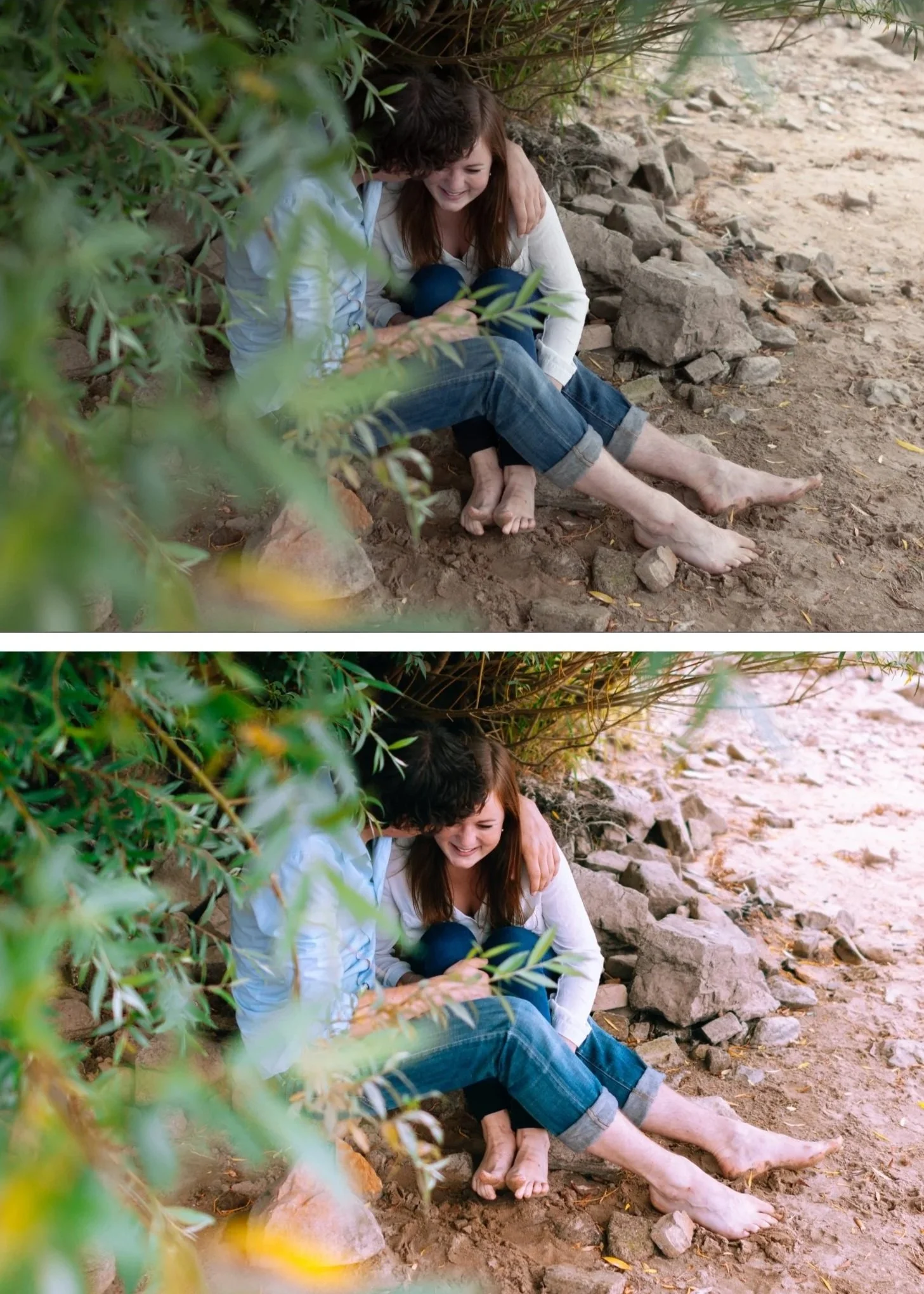
Warm, slightly lifted shadows. Film shadows never go to pure black. They lift to a dark warm grey with preserved texture. This is the characteristic most immediately associated with analog photography.
Soft highlight roll-off. Film highlights compress gradually rather than clipping abruptly. Bright areas retain detail and softness up to maximum exposure.
Muted, organic color. Film color is not vivid — it is organic, slightly muted, and often warm. Saturation is lower than digital. Greens are warmer and more yellow. Blues are softer and deeper.
Natural skin rendering. Film skin tones are warm, creamy, and flattering across a wide range of lighting conditions. Digital skin is accurate but often clinical by comparison.
Organic grain. Fine, irregular, warm-biased grain that adds texture without looking like digital noise.
Step 1 — The black point and shadow foundation
Blacks: +20 to +30
This is the most important single adjustment for natural film tones. Lifting Blacks prevents the pure dark shadows of digital and creates the warm lifted shadow floor of analog photography.
Shadows: +15 to +25
Opens the mid-shadow range above the lifted black floor.
Shadow Color Grading: hue 35-45, saturation 12-16
Warm amber toning in shadows is the color science of most classic film stocks. This single adjustment is responsible for more of the analog feeling than any other color adjustment.
Step 2 — Soft highlights
Highlights: -25 to -40Whites: -15 to -25
Tone Curve highlight anchor: Add a point at 75-80%, drag down 5-8 units.
The combination creates the gradual highlight roll-off of film. Highlights retain detail and have a soft, glowing quality rather than cutting off sharply.
Step 3 — Organic color
Vibrance: -10 to -18
Saturation: -5 to -10
Digital color is too vivid for natural film tones. Reducing Vibrance targets the most oversaturated channels — typically greens and blues — which is correct for film emulation.
Green Hue: +10 to +15 toward yellow
Green Saturation: -15 to -20
Blue Saturation: -10 to -15
These three adjustments transform the digital color of outdoor photography into the organic, warm-muted quality of film.
Step 4 — Natural skin
Orange Luminance: +10 to +15
Orange Hue: toward yellow +5 to +8
Orange Saturation: 0 to +8
Orange Luminance brightens skin naturally without adding color. Orange Hue shifts toward golden rather than vivid orange. Orange Saturation kept controlled prevents the orange stacking that creates artificial skin.
Step 5 — Film grain
Amount: 15-22, Size: 22-26, Roughness: 42-50
Fine, organic, subtle. Grain is part of the natural film look but should read as texture at 100% zoom rather than an obvious visual effect at normal viewing size.
Natural film tones for specific film stocks
Kodak Portra 400 quality: Warm, creamy, high Orange Luminance, warm Color Grading in shadows, slight yellow-green shift in Green Hue.
Full guide: Kodak Portra 400 Lightroom Preset Guide
Fuji 400H quality: Cool, airy, slightly green-shifted. Shadow Color Grading with very slight cool-green toning rather than warm amber. Lower overall temperature.
Full guide: Fuji 400H Lightroom Preset Guide
FAQ
What is the difference between natural film tones and moody film tones?
Natural film tones reference the clean, everyday quality of professional portrait and lifestyle film photography — Portra, Fuji 400H, Kodak Gold. Moody film tones push further: deeper shadows, stronger Color Grading, more cinematic atmosphere. Natural is the foundation; moody is a more expressive version.
Why do my film tones look warm but not natural?
Usually because Orange Saturation is too high. Natural film warmth comes from Orange Hue shifted toward yellow and warm Shadow Color Grading — not from Orange Saturation. High Orange Saturation creates vivid orange rather than natural warm.