Fuji 400H Lightroom Preset — Complete Guide (2026)
Fuji 400H Lightroom Preset — Complete Guide (2026)
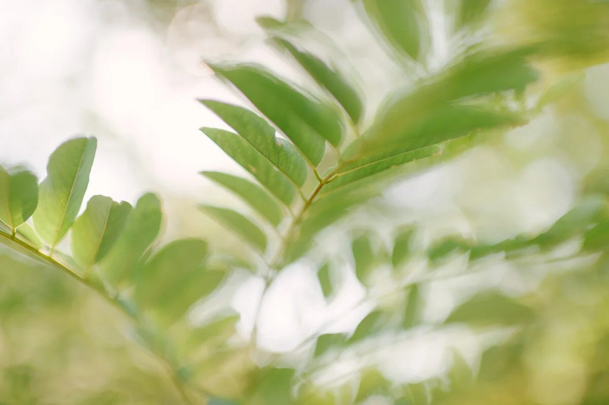
Fuji 400H is one of the most iconic film stocks ever made. For two decades it was the film of choice for wedding and portrait photographers who wanted something distinctly different from Kodak — cooler, airier, with a specific green shift in the shadows that no other film stock replicated.
Fuji discontinued 400H in 2021. But the look lives on in Lightroom, and this guide covers exactly how to recreate it.

What makes Fuji 400H different from other film stocks
Fuji 400H had a specific color signature that photographers recognized immediately. Understanding what made it distinctive is the key to recreating it accurately.
Cool, slightly airy color temperature. Where Kodak Portra 400 runs warm, Fuji 400H ran neutral to slightly cool. Skin tones on 400H had a clean, slightly cooler quality that felt modern and refined rather than warm and nostalgic.
Green-shifted shadows. The most recognizable characteristic of 400H. Shadow areas had a subtle green-cyan shift that created a specific separation between warm highlights and cool green shadows. Not vivid green — subtle. But unmistakably Fuji.
Soft, lifted blacks. Like all medium-speed film stocks, 400H had lifted blacks that never went to pure dark. The shadows were open and airy even in low-contrast scenes.
Gentle, reduced contrast. 400H was not a high-contrast film. The tonal range was compressed and soft, which made it particularly flattering for skin in bright outdoor light.
Fine, subtle grain. At ISO 400, 400H had fine grain that added texture without being obvious. More visible in shadow areas than highlights.
Slightly desaturated, cool color palette. The overall color was less vivid than Kodak films. Colors felt muted and elegant — blue skies less saturated, greens less vivid, skin tones clean but not warm.
Exact Lightroom settings for the Fuji 400H look
Basic panel
Exposure: +0.3 to +0.5 (400H was typically overexposed slightly for the airy quality)
Contrast: -20 to -30
Highlights: -20 to -30
Shadows: +20 to +30
Whites: -15 to -25
Blacks: +20 to +30
White balance
Temperature: -200 to -400 from neutral (cooler than standard daylight)
Tint: +5 to +10 (slight green toward magenta — the green shift comes from Color Grading, not from Tint)
Presence
Clarity: -5 to -10
Vibrance: -10 to -15
Saturation: -5 to -10
Tone Curve
Lift the black point: drag bottom-left anchor up 15-20 units
Soften highlights: anchor at 75-80%, drag down 5-8 units
Very gentle, flat S-curve — 400H had almost no contrast
Color Mix — the most important section for 400H
Hue:
Green: shift toward cyan (-8 to -12) — moves outdoor greens toward the cooler Fuji quality
Aqua: shift toward green (-5 to -8)
Saturation:
Green: -10 to -15
Blue: -10 to -15
Aqua: -5 to -10
Orange: 0 to +5 (keep skin relatively natural within the cool palette)
Luminance:
Orange: +10 to +15 (natural skin brightness within the cool palette)
Blue: -5 to -10 (slightly darker skies)
Color Grading — the 400H shadow green shift
This is the defining 400H adjustment in Lightroom.
Shadows: green-cyan (hue 155-175, saturation 12-18)
Highlights: very slight warm ivory (hue 35-50, saturation 5-8)
Midtones: neutral
The cool green shadow toning combined with barely-warm highlights creates the specific warm-cool separation that was the signature of 400H photography. Keep shadow saturation subtle — 12-18 maximum. If you can clearly see the green in the shadows, it is too much.
Grain
Amount: 18-22
Size: 20-25
Roughness: 38-45
Fine grain, slightly rough. 400H grain was visible in shadow areas but barely noticeable in highlights.
Fuji 400H vs Kodak Portra 400 — the key differences
These were the two most popular professional film stocks of the same era, and understanding their differences helps you choose the right approach for your subject.
Color temperature. Portra 400 runs warm — golden, slightly orange-shifted skin tones. 400H runs cool — neutral to slightly cooler skin tones with a green shadow shift. Portra looks warm and romantic. 400H looks clean and refined.
Contrast. Portra 400 has slightly more contrast and tonal depth. 400H is softer and more compressed tonally — the highlights and shadows are closer together.
Skin tones. Portra 400 makes skin look warm and healthy. 400H makes skin look clean and natural — less obviously warm but with a specific clarity that many portrait photographers preferred.
Shadow color. Portra shadows are neutral to slightly warm. 400H shadows have the distinctive green-cyan shift that is its most recognizable characteristic.
Best use. Portra 400 suits warm light photography, golden hour sessions, and any scenario where warmth and richness are the goal. 400H suits overcast light, airy outdoor portraits, and editorial work where clean and cool is the direction.
For the full Kodak Portra 400 guide: Kodak Portra 400 Lightroom Preset Guide
When Fuji 400H works best
Overcast outdoor portraits. The cool, airy quality of 400H suits flat overcast light beautifully. Where warm presets fight against grey light, 400H leans into it. The cool palette enhances the clean, diffused quality of overcast conditions.
Wedding photography in open shade. 400H became famous in wedding photography precisely because it worked in the open shade conditions that wedding photographers often use for portraits. The cool, airy quality photographed white dresses cleanly and made skin look natural rather than warm.
Lifestyle photography with clean aesthetic. The editorial, slightly detached quality of 400H suits minimalist lifestyle photography. Clean environments, neutral clothing, considered compositions.
Fine art portrait photography. The refined, cool quality references the fine art film photography tradition. Less obviously nostalgic than Kodak stocks, more contemporary.
Summer outdoor photography. Counterintuitively, 400H suits summer photography well — the cool quality balances the natural warmth of summer light and keeps skin from going orange in warm conditions.
The Fuji 400H look on Lightroom Mobile
The same settings above apply in Lightroom Mobile. Two mobile-specific adjustments before applying:
Reduce Sharpening to 20. iPhone processing adds aggressive sharpening that works against the soft, airy quality of 400H.
Reduce Clarity to -10 before applying. Mobile cameras add micro-contrast that fights against the film softness.
Both adjustments take 20 seconds and significantly improve the 400H result on mobile photos.
Install guide: How to Install Lightroom Presets on iPhone and How to Install Lightroom Presets on Android
The Timeless Film Archive
The Timeless Film Archive includes the Fuji 400H preset alongside the Kodak Portra 400 look, warm silver B&W, and cool urban B&W — four iconic film looks in one collection.
$6.75 per preset. The classics, digitally calibrated.
EXPLORE THE TIMELESS FILM ARCHIVE — $27
Free Fuji 400H preset
Download the free Fuji 400H preset and apply the workflow above. It is pre-calibrated with the cool airy color, green shadow shift, lifted blacks, and fine grain of the original film stock.
FAQ
What is the Fuji 400H film look?
Fuji 400H was a professional color negative film known for its cool, airy color temperature, soft contrast, lifted blacks, and distinctive green-cyan shadow shift. It was widely used in wedding and portrait photography for its clean, refined quality that differed from the warmer Kodak stocks.
Why was Fuji 400H discontinued?
Fuji discontinued 400H in 2021 as part of a broader reduction in their film product lineup. The look lives on in Lightroom presets calibrated to its specific color characteristics.
What is the difference between Fuji 400H and Kodak Portra 400?
400H is cool, airy, and slightly green-shifted in shadows. Portra 400 is warm, natural, and slightly golden. 400H suits overcast light and clean editorial work. Portra suits warm light and romantic portrait work. Both are great — the choice depends on your lighting conditions and aesthetic direction.
Can I recreate Fuji 400H without a preset?
Yes. The key adjustments are: Temperature -200 to -400 from neutral, green-cyan Color Grading in shadows (hue 155-175, saturation 12-18), Blacks +20-30, Contrast -20-30, and slight Vibrance reduction. The Color Grading shadow shift is the most important single adjustment.
Does Fuji 400H work for all subjects?
It works for most subjects but is best suited to portrait, wedding, and lifestyle photography where the cool, clean quality is appropriate. For subjects where warmth is the goal — golden hour landscapes, food photography, warm interior scenes — Kodak Portra 400 or a warmer film preset is a better fit.
Does the 400H look work on iPhone photos?
Yes. Reduce Sharpening to 20 and Clarity to -10 before applying. The cool, airy quality translates well to iPhone photos once the digital sharpness is reduced.
Related guides