Disposable Camera Look in Lightroom
The disposable camera look has specific characteristics that make it immediately recognizable: direct flash light quality, slightly overexposed bright areas, vivid primary colors, visible grain, and the specific color rendering of consumer 35mm film. This is the Y2K digicam aesthetic applied to actual film photography — and it is more technically specific than most Instagram filter versions of it suggest.
What disposable cameras actually look like
Disposable cameras — Fujifilm QuickSnap, Kodak FunSaver — used ISO 800 consumer film with a fixed flash that fired at close range. The results had consistent characteristics regardless of the photographer:
Direct flash quality. Hard, flat light from directly in front. Strong catchlights in eyes. Hard shadows behind subjects. Slightly overexposed skin in close-up shots.
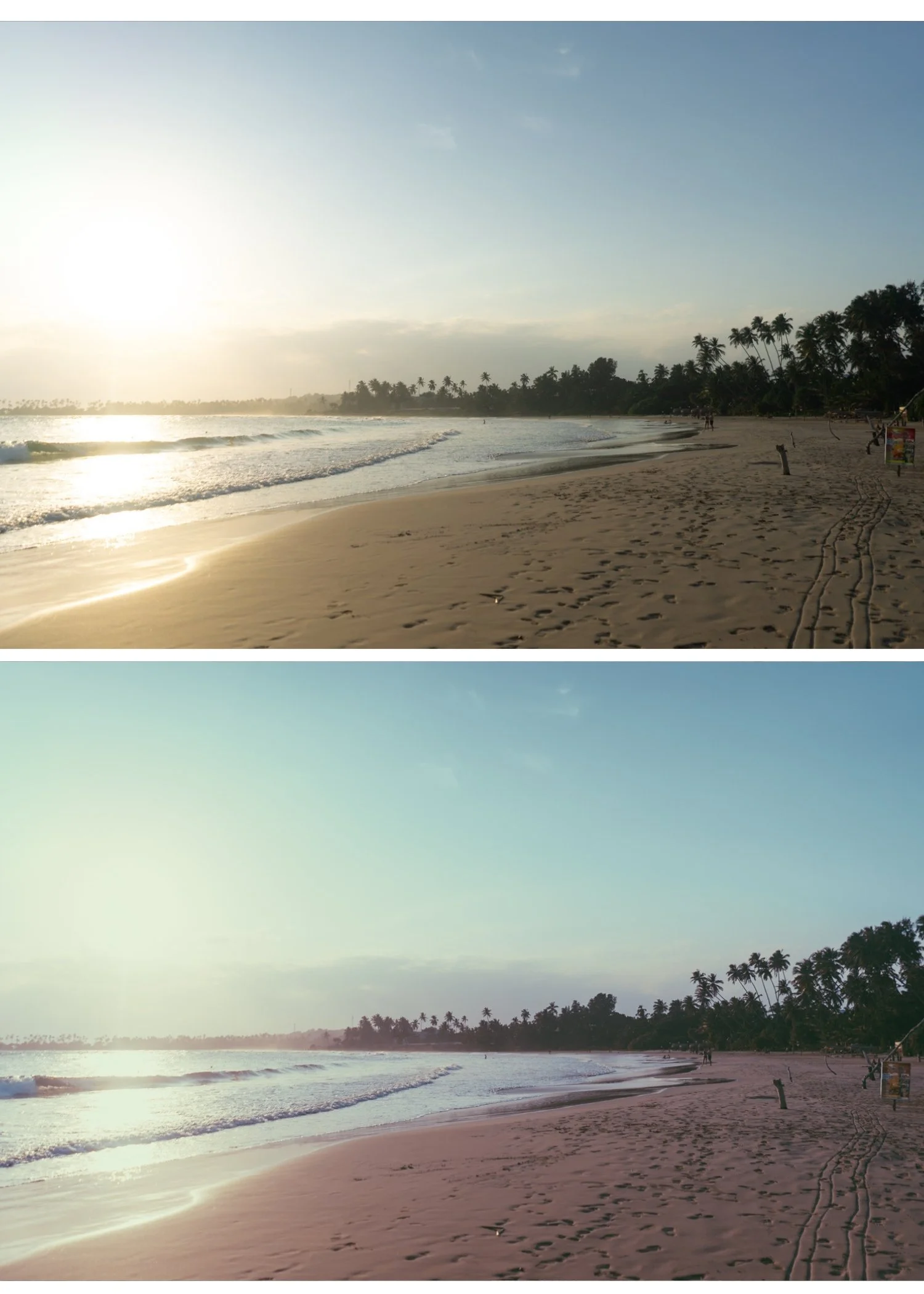
Consumer film color. Kodak Gold and Fuji 200 — warm, slightly vivid, slightly oversaturated compared to professional film. Primary colors popped. Skin was warm-orange.
Visible grain. ISO 800 in consumer film produced obvious, chunky grain — more aggressive than the fine grain of professional stocks.
Slight overexposure. The fixed flash was calibrated for approximately 1-2 meters. At close range it overexposed. The slight bloom on highlights is part of the look.
The Lightroom recipe
Step 1 — Start with a flash photo if possible The disposable look works best on photos taken with direct on-camera flash or ring flash. If you are shooting for the aesthetic: enable flash, shoot at 1-2 meters from the subject, and slightly overexpose (exposure compensation +0.3 to +0.5).
If you are applying the look to non-flash photos: add Highlights +15 to +20 (unusual — this lifts rather than pulls highlights to simulate the slight overexposure of flash). Reduce Shadows -10 to create harder tonal separation.
Step 2 — Color Vibrance: +12 to +18 (consumer film was vivid) Orange Saturation: +8 to +12 (warm, slightly orange skin) Orange Hue: -5 toward red (Kodak Gold color shift) Green Saturation: +5 (vivid consumer-film greens) White Balance: 5,400-5,800K, Tint +3
Step 3 — Contrast Contrast: +15 to +20 (opposite of the film look — consumer flash photos had higher contrast) Clarity: +8 to +12 (sharper, more digital-adjacent edge rendering) Blacks: 0 to +8 (some lift but not as much as film look presets)
Step 4 — Grain Amount: 35-45 Size: 28-36 Roughness: 50-58 This is the most aggressive grain in any TES preset recipe. Disposable camera grain was coarse and visible.
Step 5 — Vignette (optional) A slight hard vignette (-8 to -12, Feather 40-50) references the optical vignetting of disposable camera lenses.
The quick version — one preset
The A5 Deep Contrast preset from the Analog Film Archive gets closest to the disposable look out of the collection. Apply at 90%, then add Vibrance +12, Grain Amount up to 38, and Orange Saturation +8. Not identical but in the right direction.
FAQ
Why does my disposable camera edit look like an Instagram filter instead of real film?
Two things: grain is too fine (Amount below 25 looks like noise reduction, not film grain) and Clarity is negative instead of slightly positive. Disposable cameras had more sharpness and contrast than fine-art film photography. Keep Clarity at 0 to +10 and grain chunky.
Does this work on iPhone photos?
Yes. Apply Sharpening 35 (higher than usual — disposable cameras were sharp), skip the phone-specific Clarity reduction, and apply grain at the values above.