Kodak Portra Style Lightroom Presets
Kodak Portra Style Lightroom Presets
Kodak Portra has been the professional standard for portrait and wedding film photography for decades. It was engineered specifically to flatter skin tones across a wide range of lighting conditions, to render highlights with a soft, creamy quality rather than harsh clipping, and to handle shadow detail with more transparency than most film stocks. These properties made it the default choice for photographers who needed consistent, flattering results across varied conditions without the unpredictable qualities of more characterful films.
When photographers talk about Portra style in Lightroom, they are describing a specific set of visual properties rather than a single look. Understanding those properties is the difference between a Portra-style preset that works across your whole gallery and one that only works in ideal conditions.
What Portra Style Actually Is
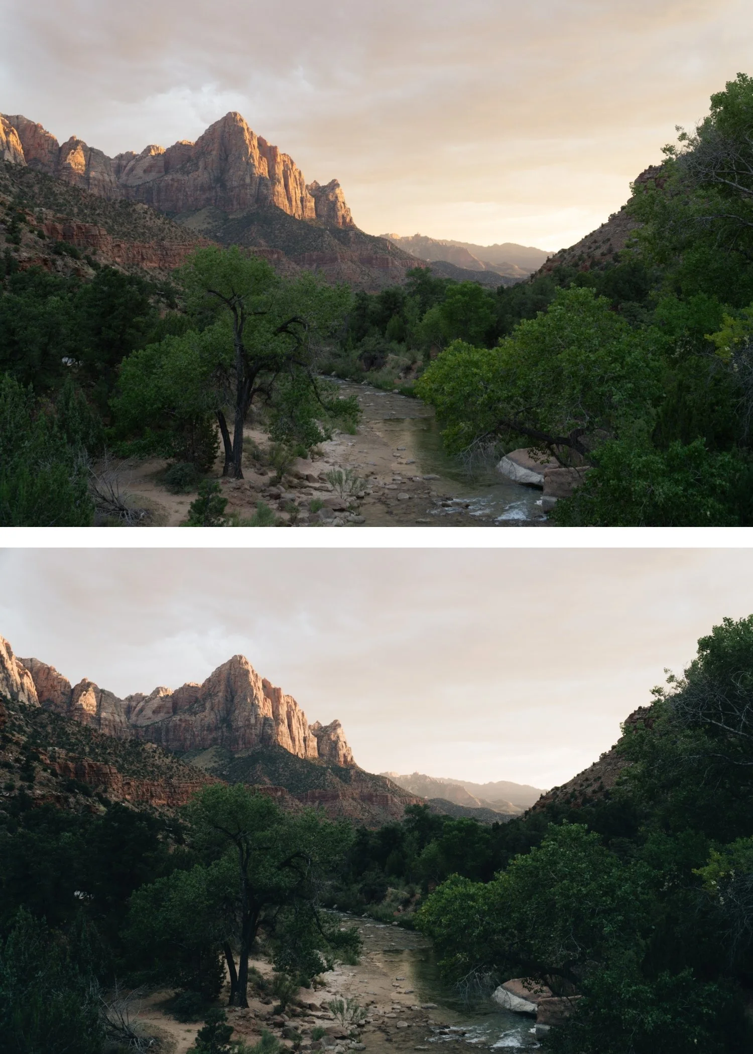
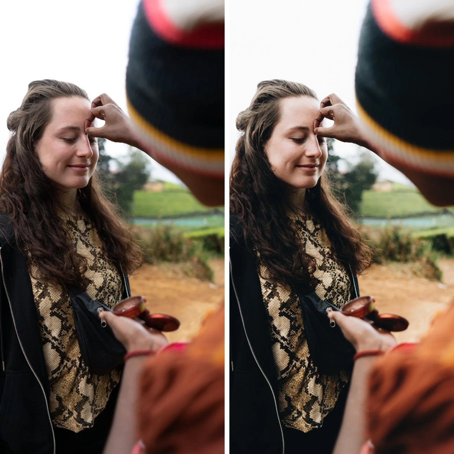
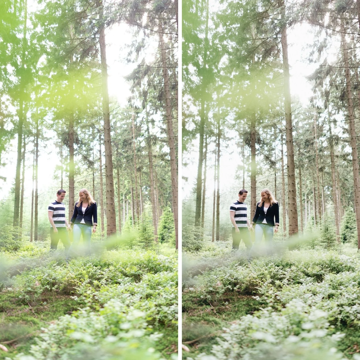
The Portra aesthetic has five core properties that together create the look. Skin-first color is the foundation: warm, healthy, natural-looking skin tones that remain flattering regardless of ambient light temperature. Soft highlight roll-off is the most immediately recognizable quality: bright areas compress gradually rather than clipping, producing a creamy luminosity in highlights rather than harsh blown-out whites. Gentle contrast provides tonal depth without punch, using the layered separation of film rather than the global aggression of digital contrast adjustment. Restrained saturation keeps color present but calm, preventing the vivid digital rendering that makes photographs feel processed. And a smooth editorial mood that arises from the combination of these properties, producing images that feel considered and timeless rather than heavily stylized.
What Portra style is not is equally important to understand. It is not heavy matte blacks with lifted shadow floors. It is not teal shadows. It is not high-contrast punch. It is not saturated orange skin. Each of these can appear in edits labeled as "Portra inspired" but they represent a misunderstanding of what the original film stock actually did.
Why Portra Style Works Across Subjects
The reason Portra style is so widely used in portrait, wedding, and lifestyle photography is that it solves the real problems these genres face. The underlying contrast structure that makes Portra style work is explained in detail in How to Balance Contrast for a Soft Analog Look. Digital skin tones tend toward either too red or too orange depending on ambient temperature. Highlights in bright conditions clip easily and lose detail. Foliage and outdoor environments render too vividly and fight for attention against the primary subject. The overall digital rendering feels sharp and processed rather than organic and natural.
Portra style editing addresses each of these systematically. The reduced saturation and increased luminance in the Orange HSL channel produces skin that reads as warm and glowing rather than orange. The Tone Curve adjustments protect highlight detail and produce the gradual roll-off. The reduced Green and Blue saturation brings outdoor environments back to a more organic quality. The overall effect is a photograph that looks like it was captured in better conditions than it actually was.
The Key Adjustments That Create Portra Style Color
Exposure and highlights. Before any color work, exposure needs to be set with room for the highlight adjustments. Pull Highlights to -15 through -45 depending on how bright the scene is. This gives the Tone Curve the material it needs to produce soft roll-off rather than clipped highlights.
White balance. Portra style warmth is subtle and lives in the highlights rather than in a pushed temperature setting. Neutralize obvious casts first, then add very slight warmth to the temperature (+3 to +8). Avoid heavy Tint adjustments. If whites are starting to look yellow, the temperature has been pushed too far.
Tone Curve for creamy highlights. Pull the top-right highlight point down slightly, keeping whites luminous rather than grey, and avoiding a hard S-curve. The goal is highlight compression rather than highlight reduction. The highlights should still feel present and bright, just with a gradual rather than abrupt transition to the maximum.
Orange channel for skin. Reduce Orange Saturation by -5 to -20 and increase Orange Luminance by +5 to +15. This combination is the most important single adjustment for Portra-style skin rendering. The saturation reduction removes the digital intensity from warm-toned skin. The luminance increase keeps skin bright and present rather than slightly muddy.
Green and yellow channels for outdoor color. Reduce Green Saturation by -10 to -30 and make a slight Hue shift toward yellow. Reduce Yellow Saturation by -5 to -15. These two adjustments together remove the digital neon quality from outdoor environments that makes travel and lifestyle photography feel cheap.
Blue channel for skies. Reduce Blue Saturation by -5 to -20 to keep skies natural rather than electric. Subtle Blue Luminance adjustments can be made based on the specific scene.
Color Grading for warmth and depth. Push Highlight Hue to 40-55 with Saturation at 5-12. This places the Portra warmth in the highlight range specifically, which is where the original film stock's warm bias was most pronounced. Shadow grading should be kept very close to neutral: a very slight cool direction at low saturation (3-8) adds depth without the obvious teal that would contradict the Portra philosophy.
Keeping the Look Consistent
Portra style fails most often not in individual images but across a gallery. Because the look depends on color balance, it is sensitive to white balance variations between shots. The most reliable approach is to correct white balance before applying any Portra-style preset or settings. Start from a neutral baseline, apply the Portra adjustments, and then make per-image Exposure and White Balance refinements. This workflow keeps the color philosophy consistent while accommodating the natural variation between shots.
The second consistency issue is skin tone variation across different subjects and lighting temperatures. For a complete guide to skin tone management in film-style editing, How to Keep Skin Tones Natural in Film-Style Edits addresses each variable systematically. Darker skin tones need different Orange Luminance values than lighter skin tones. Photographs in cooler ambient light need slightly warmer white balance before applying the settings than photographs in warm afternoon light. Having a base Portra setup and knowing how to adapt the Orange and White Balance values per image is the practical skill that separates photographers who use the look consistently from those who only achieve it occasionally.
FAQ
Do Portra style presets work on camera RAW files or only film scans?
Portra style presets work on digital RAW files. They are calibrated to produce the visual behavior of Portra on digital sensor output, not to process actual film scans, which would have different properties.
Why does my Portra edit look orange?
The most common cause is Orange Saturation at 0 or above combined with a warmly-pushed white balance. Reduce Orange Saturation in HSL to -10 through -20 and confirm that Temperature is not pushed so far that whites start reading as yellow.
What is the difference between Portra 160, 400, and 800 in terms of Lightroom presets?
Portra 160 is cooler, finer-grained, and has the most restrained color. Portra 400 is the most balanced and widely used. Portra 800 is warmer, has more visible grain, and is slightly more aggressive in its color rendering. Lightroom presets inspired by each use the same structural approach but vary the white balance direction, grain character, and warmth intensity.
Is Portra style the same as the analog film look in general?
Portra style is one specific expression of the analog look, optimized for skin tones and portrait work. Other film stocks and analog aesthetics have different priorities. Kodachrome is more vibrant and saturated. Fuji Provia is cooler and more neutral. Portra's specific advantage is its skin-first approach and soft highlight behavior. For a comparison with Kodachrome's very different color philosophy, see Kodachrome Style Lightroom Presets.
Want to try a Portra-inspired base on your own photos?
Download the free Analog Film preset as a starting point for understanding the film color philosophy.
For a preset collection built specifically around the Portra aesthetic with warm, skin-flattering film tones calibrated for both portrait and travel work, explore the Essence Archive.