Why Nikon RAW Files Look Dull Straight Out of Camera
Why Nikon RAW Files Look Dull Straight Out of Camera
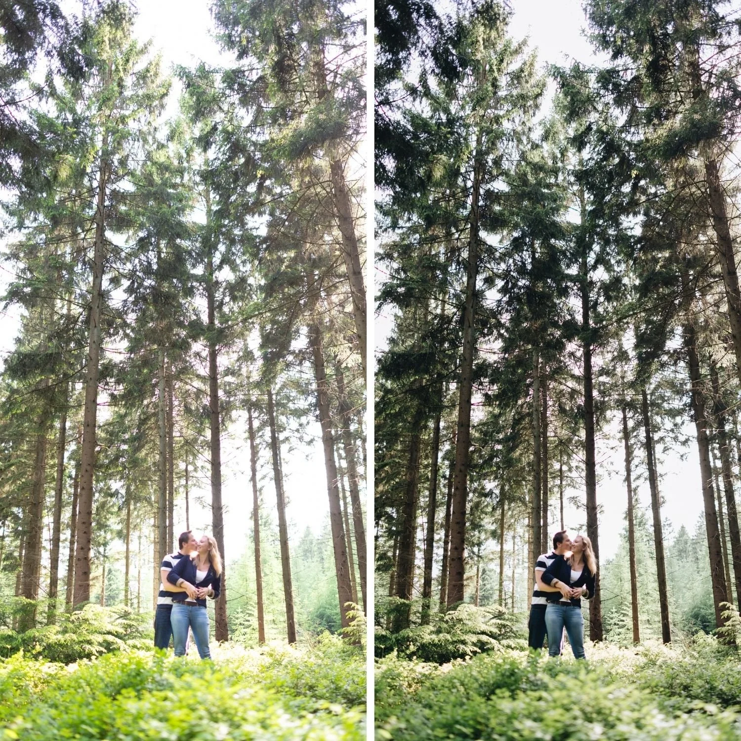
You review a photograph on the back of your Nikon and it looks excellent. Contrast, colour, punch. You import it into Lightroom and it looks like a different photograph entirely. Flat, muted, lifeless.
Nothing has gone wrong. What you saw on the camera screen was never the RAW file, and two specific in camera settings usually explain most of the gap, alongside one Lightroom profile choice that most photographers never touch.

What You Were Actually Looking At
The image on your camera screen is a JPEG preview generated by the camera's processor, shaped by whichever Picture Control is active. If that is set to Standard, which is the factory default, the processor has already applied a meaningful contrast and saturation lift before you ever see the image. Active D-Lighting, if left on, adds HDR style tonal compression on top of that, lifting shadows and protecting highlights in the preview.
When Lightroom opens the RAW file it applies its own baseline profile, deliberately neutral by comparison. Adobe Color adds a modest amount of contrast and saturation. Neither replicates the specific combination of Picture Control and Active D-Lighting that produced what you saw on the camera screen.
The Two Camera Settings Worth Changing
Before the RAW file ever reaches Lightroom, two in camera settings determine how large the gap between screen and file will be.
Picture Control: switch from Standard to Neutral, or to Flat for maximum editing latitude on cinematic work. In the Shooting Menu, under Set Picture Control. This does not change the RAW data itself, but it does change the JPEG preview and histogram you see while shooting, bringing them closer to what Lightroom will actually show you.
Active D-Lighting: turn it off, also in the Shooting Menu. This is an HDR style tonal compression applied to the preview and, on some Nikon bodies, partially baked into the RAW file's metadata interpretation. Disabling it gives Lightroom the fuller, uncompressed tonal range to work with rather than a version the camera has already flattened toward a safer middle ground.
Why the Neutral RAW Is an Advantage, Not a Problem
A flat file is more editable than a punchy one. This is the entire argument for shooting RAW and it applies with particular force to film aesthetic work.
Film editing requires specific tonal control: a lifted shadow floor, compressed highlights, gentle midtone separation built through a curve rather than a slider. A file that already has contrast baked in resists all three. Starting from the neutral RAW means the film curve is the only contrast structure in the file, which is what actually makes it read as considered rather than fought over.
The Corrections Nikon Files Need
Camera Calibration: Camera Neutral or Camera Flat. The most film friendly Nikon profile, balanced without the added contrast that Camera Standard applies.
Highlights negative 25 to negative 35, Whites negative 12 to negative 20, Blacks and Shadows both positive 15 to positive 20. This is the tonal foundation, and the lifted shadow floor here is doing the actual work of making the file look intentional rather than simply dark.
Green Saturation negative 15 to negative 20, consistently. Green Hue, however, is not consistent, and this is the step most guides get wrong by giving a single fixed value. Some Nikon files need a shift toward teal, negative 8 to negative 12, since Nikon greens already sit warm yellow and pushing further yellow overcorrects into mustard. Other files, particularly older DSLR bodies, need the opposite, positive 5 to positive 8 toward yellow. Test both directions on your own files rather than assuming one applies.
Vibrance negative 8 to negative 12, before the preset, the same logic that applies to Sony though less aggressive here since Nikon starts from a calmer base.
Apply the preset at 90 to 95 percent strength. Higher than Canon or Sony typically need, since the prepared Nikon file is already close to what most presets assume.
Orange Luminance positive 12 to positive 15, Orange Saturation 0 to positive 8. Nikon renders skin accurately rather than flatteringly, which means it needs lifting rather than restraining, the opposite instinct from Canon.
Best Lightroom Presets for Nikon Z Series covers this full preparation workflow including how it varies across the Z, D, and APS-C ranges.
Matching the Camera Screen If You Actually Want To
Some photographers want the RAW to match what they saw on the back of the camera, particularly when delivering to clients who saw the preview during the shoot. Lightroom includes Camera Matching profiles for Nikon, including Camera Standard, which applies Nikon's own contrast and saturation curve. This is the fastest route to the camera screen look, but it reintroduces the baked in contrast that a film curve then has to work against, so it is a weaker starting point for film aesthetic editing than Camera Neutral, even though it is the more familiar looking result on first glance.
Setting Expectations at Capture
If the gap between screen and file bothers you mid shoot, the Picture Control and Active D-Lighting changes above mean what you see on the camera screen is already closer to what Lightroom will show, which also makes the histogram you are checking during the shoot more honest about actual exposure rather than a flattered preview of it.
FAQ
Should I shoot JPEG if I like the camera screen look?
If you consistently prefer the Picture Control output and rarely need shadow recovery or cross body consistency, JPEG is a legitimate choice. The flat RAW is only an advantage if you actually edit it.
Does Active D-Lighting affect my RAW files or just the JPEG preview?
Primarily the preview and any embedded JPEG, though some bodies partially reflect it in how the RAW is interpreted on import. Turning it off is the safer default for anyone editing seriously rather than shooting straight JPEG.
Why do Nikon files look duller than Sony files in Lightroom?
Both are neutral by design. Nikon's Picture Controls are more aggressive than Sony's Creative Looks by default, so the gap between the camera screen and the RAW file is larger on Nikon, which makes the RAW feel duller by comparison even though the underlying files are comparably flat.
Try a film base on your Nikon files:
Download the free Analog preset and apply it after Camera Neutral and the green channel testing described above, at 90 to 95 percent strength.
For collections that suit Nikon's shadow performance once correctly prepared, the Moody Film Archive and Vesper Archive both work well. The Studio Archive at $89 includes both.
