Why Sony Colors Look Flat Compared to Canon
Why Sony Colors Look Flat Compared to Canon
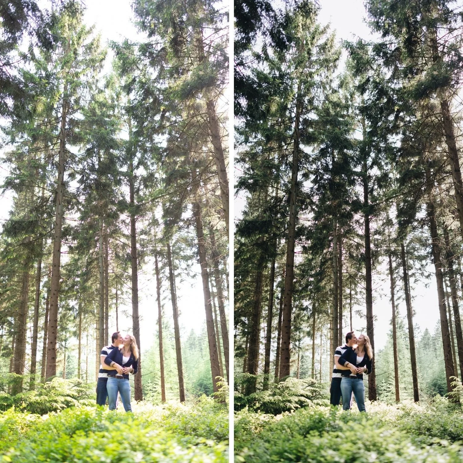
Photographers who switch from Canon to Sony, or who shoot both systems at the same event, consistently report the same thing: the Sony files look flat. Skin looks pale. Greens look cold. The overall image lacks the immediate appeal that a Canon file has straight out of camera.
The observation is accurate. The cause is a deliberate engineering decision rather than a deficiency, and the fix is not simply pushing saturation, which makes the problem worse rather than better. It is five specific adjustments applied in a specific order, before the film preset ever touches the file.

What Sony Is Actually Doing
Sony calibrates for colorimetric accuracy. The goal is to record what the sensor measured rather than to render it pleasingly. For commercial, product, and scientific photography this is the correct priority. For portraits viewed straight out of camera it produces a file that looks technically correct and emotionally cold.
Canon does the opposite. It applies a warm bias in the orange and red channels and a slight saturation lift, which produces skin that looks healthy and inviting before any editing happens. Neither approach is better. They serve different priorities. But if your reference point is Canon output, Sony files will always look flat until you correct for the difference, and reaching for more saturation as the fix stacks vivid on top of already vivid rather than solving the actual problem.
The Preparation, In Order
Camera Calibration: Camera Standard. Not Camera Neutral, and this distinction matters. Adobe Color, the Lightroom default, renders Sony files with more contrast and slightly more vivid colour than Sony's own rendering. Camera Standard applies Sony's native colour science instead, which is the correct neutral foundation to build from.
Vibrance negative 10 to negative 15, before the preset. Sony's vivid saturation is the most immediately recognisable characteristic working against a natural result, and pushing more saturation on top of it, which is the instinctive reaction to flat looking files, moves further from the fix rather than toward it. Reducing Vibrance first brings the starting point closer to organic colour, so whatever comes next is building on a calmer base.
Clarity negative 8 to negative 12. Sony's sharp, high micro contrast rendering reads as clinical. Negative Clarity softens it. Push further for portrait work, negative 12 through negative 15.
Green and blue softening. Green Hue positive 10 to positive 15 toward yellow, Green Saturation negative 15 to negative 20, Blue Saturation negative 8 to negative 12. Sony's blue green shifted foliage and saturated blues are the most digitally obvious part of outdoor Sony photography.
Shadow warmth through Colour Grading, not Tint. Sony shadows render neutral to cool, where warmth needs to sit for the file to feel present rather than flat. Add it directly: Shadows Hue 35 to 45, Saturation 10 to 14. This is a different mechanism than raising Tint globally, and it is the one most photographers skip, which is often the actual reason a file still reads flat after everything else has been corrected.
Why This Fixes Flat Skin Specifically
The flat quality Sony skin reads with is not primarily a saturation problem, even though it looks like one. It is a combination of accurate, unflattering colour and cool, unwarmed shadow tone. Pushing Orange Saturation up to compensate, without the Colour Grading step above, leaves skin looking artificially rosy in the highlights while the shadow side of the face stays cool and grey, which reads as more processed rather than less flat.
Orange Saturation: negative 10 to negative 18. Orange Luminance: positive 10 to positive 18, doing more of the actual lifting work than saturation does. Red Saturation: negative 5 to negative 12. Applied after the five step preparation, not instead of it, this combination produces skin that reads warm and present rather than either flat or artificially pushed.
Checking Whether the Preparation Actually Worked
Find a neutral surface in the frame, such as a grey wall or a white shirt, after applying the full five step preparation. It should read as genuinely neutral rather than cool or greenish. If it still reads cool, the Colour Grading shadow warmth needs pushing slightly further, toward the top of the Saturation 10 to 14 range rather than the bottom.
Check skin next, specifically in the shadow side of a face rather than the lit side, since that is where the flat, cool quality is most visible and most often missed. Warm, present shadow tone on skin is the clearest sign the preparation is complete. If the lit side of the face looks fine but the shadow side still reads grey, the Colour Grading step is doing less work than it needs to, rather than the Orange channel adjustment being wrong.
What Sony Gives You in Return
The flatness has a genuine technical upside worth remembering while you are correcting for it. Sony's highlight retention is meaningfully better than Canon's. Recovery of negative 40 to negative 60 in Highlights frequently produces usable detail where a Canon file at the same exposure shows flat white. For film editing this matters, because the soft highlight roll off that defines the aesthetic requires actual highlight data to shape, and Sony gives the Tone Curve more to work with than a warmer but less recoverable file would.
Building This Into a Default Workflow
Rather than correcting each file individually, build the five step preparation into a saved preset applied on import. Camera Standard, Vibrance negative 12, Clarity negative 10, the green and blue adjustments, and the Colour Grading shadow warmth, saved together and applied to every Sony file before anything else happens. This puts every photograph at a corrected, warm ready baseline before a film preset is applied on top, and it removes the temptation to reach for a saturation boost that solves the visible symptom while leaving the underlying flatness in place.
Best Lightroom Presets for Sony A7 IVcovers this full preparation workflow in more detail, including body specific grain and sharpening values.
FAQ
Is Sony colour science actually worse than Canon?
No. It is more accurate and less immediately flattering. Accuracy is an advantage for commercial work and a starting point that requires correction for portrait and film aesthetic work.
Why does adding more saturation make Sony files look worse rather than better?
Sony's vivid rendering is already the problem, not the absence of colour. Adding saturation on top increases the vivid, clinical quality rather than correcting it. The fix runs in the opposite direction: reduce Vibrance and Clarity first, then add warmth specifically through Colour Grading rather than through global saturation.
Does this apply to all Sony bodies?
Yes across the current A7 and A7C range. Older bodies including the A7 III typically need a slightly stronger Colour Grading shadow push and a marginally larger Green Hue shift to reach the same result.
Try the five step preparation on your own Sony files:
Download the free Analog presetand apply it after the full preparation described above rather than on an unprepared file.
For collections that suit a properly prepared Sony base, the Vesper Archive and California Archiveboth work well. The Studio Archive at $89 includes both.
