Best Lightroom Settings for Dark Photos (2026)
Best Lightroom Settings for Dark Photos (2026)
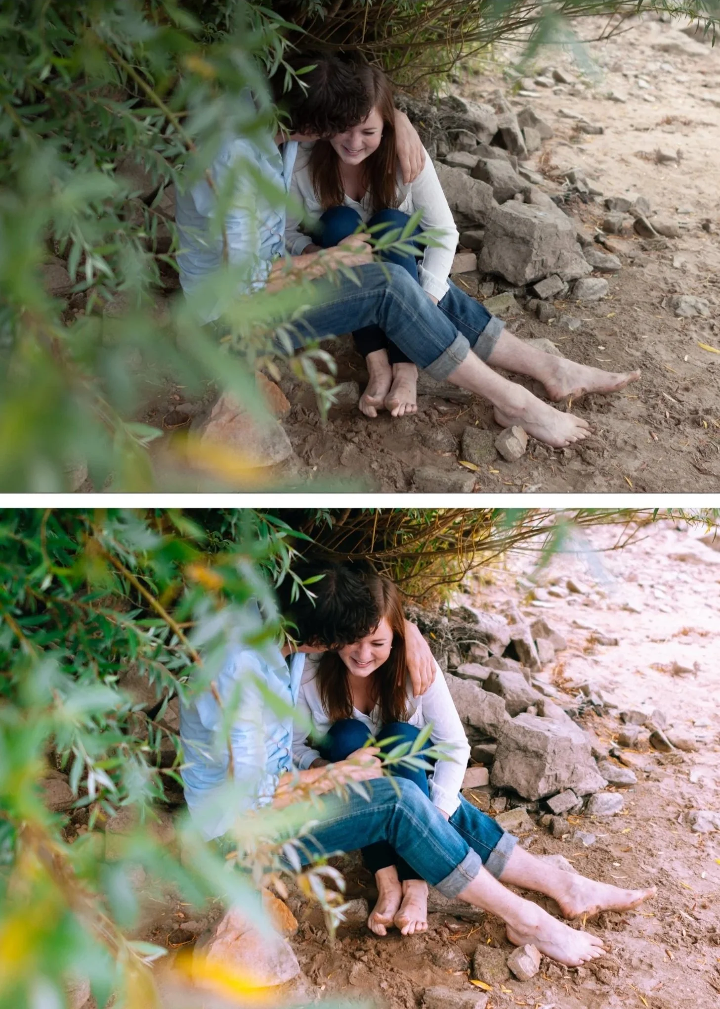
Dark photography in Lightroom fails in one of two ways: shadows that crush to pure black with no detail, or shadows that are lifted so much the photo looks grey and flat. The correct approach to dark photo editing creates photos that are genuinely dark and atmospheric while retaining the tonal depth and warmth that separates professional dark editing from a simple underexposure.
The dark photo problem
Pure black shadows look digital, not dark. Real atmospheric darkness — the darkness in a well-lit restaurant, in low evening light, in a dramatically lit interior — has tonal depth. Shadows are dark but they contain information: warm amber colour grading, slight texture, the suggestion of detail.
The goal is not to go dark — it is to go deep.
The Lightroom settings for dark, atmospheric photos
Exposure: -0.3 to -0.8 depending on how dark you want the overall mood. Start conservative and go darker if needed.
Highlights: -35 to -55. Dark photos with blown highlights look wrong — the bright areas feel mismatched with the dark atmosphere. Pull Highlights aggressively.
Blacks: +10 to +18. Even in dark photography, blacks should not hit pure black. A slight lift creates the warm shadow floor. Less lift than in clean analog editing — the shadows are intentionally dark — but never zero.
Shadows: 0 to +10. Minimal shadow lift for dark photography. The shadows should remain dark. If lifting above +15 in dark editing, the photo stops looking dark and starts looking grey.
Contrast: -10 to -15. Counter-intuitive but important. Dark editing gets its contrast from the tonal separation in the shadows rather than from the Contrast slider. The slider creates flat digital contrast. The Tone Curve and Color Grading create dimensional dark quality.
Clarity: -10. Dark photography benefits from soft, organic edges. Positive Clarity on dark photos creates a gritty quality that is not the same as atmospheric depth.
Tone Curve for dark photography
Build the dark version of the film S-curve:
Bottom anchor: lift only 10-12 units (less than clean film editing — darker shadow floor) Point at 25%: nudge down 3-4 units (push shadows slightly darker) Point at 65%: nudge down 5-6 units (compress midtones toward darker) Top anchor: down 8-10 units (lower highlight ceiling)
This creates a darker overall curve with the same organic quality — the photo reads as intentionally and dimensionally dark rather than underexposed.
Color Grading for dark photography
Shadows: Hue 35-40, Saturation 16-20. More saturation than clean analog editing — dark shadows need more warmth to avoid reading as cold and lifeless.
Midtones: Hue 38, Saturation 5-8. A slight warmth through the midtone range supports the shadow warmth.
Highlights: neutral. Dark photography benefits from neutral or very slightly warm highlights — not obviously colour-graded.
Best presets for dark photography
M4 Moody Classic — balanced dark with warm shadow quality. The most versatile dark preset.
M5 Warm Dark — the warmest and darkest in the Moody Film Archive. Low-light, indoor, and atmospheric night photography.
V4 — dark with cinematic depth.
FAQ
Why do my dark photos look grey instead of dark?
Shadows have been lifted too much without corresponding depth in the Tone Curve. Reduce Blacks back toward 0 to +10, reduce Shadow lift to 0 to +8, and add the dark Tone Curve above.
How dark is too dark?
Check the histogram. If the histogram is entirely pushed to the left with a large flat area at the bottom, detail is being lost. For atmospheric dark photography, the histogram should have a broad distribution in the shadow range with clear detail — not a wall on the left edge.