Kodachrome Style Lightroom Presets
Kodachrome Style Lightroom Presets
Kodachrome was not just a film stock. It was the visual language of professional photography for more than half a century. From the 1930s through the early 2000s, photojournalists, travel photographers, and National Geographic shooters used Kodachrome as their default because of a combination of properties that no other film could quite replicate: vivid reds, deep slightly-cyan-shifted blues, warm midtones that made skin and warm surfaces look rich rather than orange, and a moderate contrast that gave photographs immediate visual impact without the harshness of more aggressive stocks.
When Kodak discontinued Kodachrome in 2010, it marked the end of a specific visual era in photography. But the aesthetic properties of the film are fully recreable in Lightroom, and understanding what those properties actually were is what distinguishes a Kodachrome-style preset that produces the authentic quality from one that simply increases saturation and calls itself Kodachrome-inspired.
What Kodachrome's Color Science Actually Did
Kodachrome was a reversal film, meaning it produced a positive image directly from the exposure rather than a negative that required printing. This technical distinction created several specific visual properties. The color layers were processed using a unique multi-step chemical process that produced more saturated, vivid color than most other film stocks, particularly in the red and blue channels.
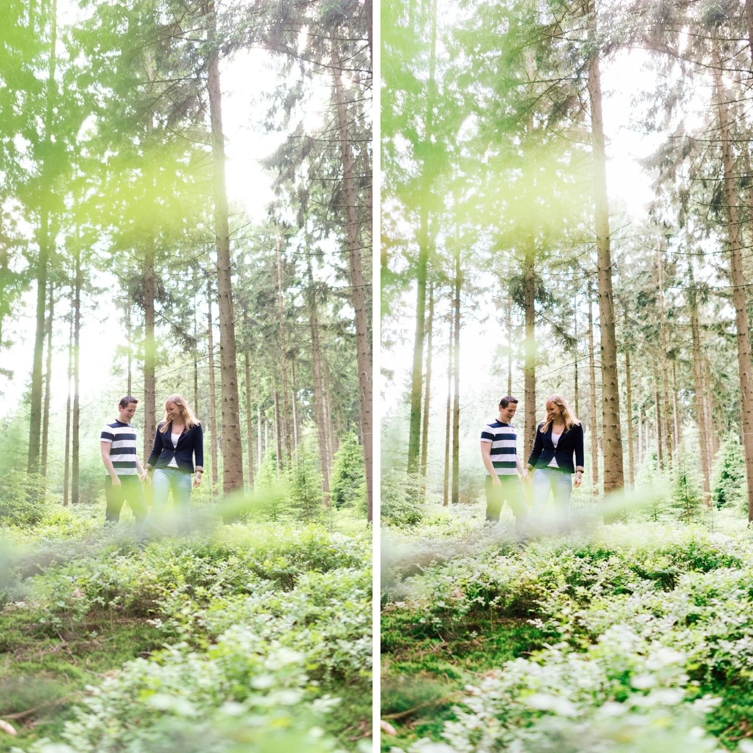
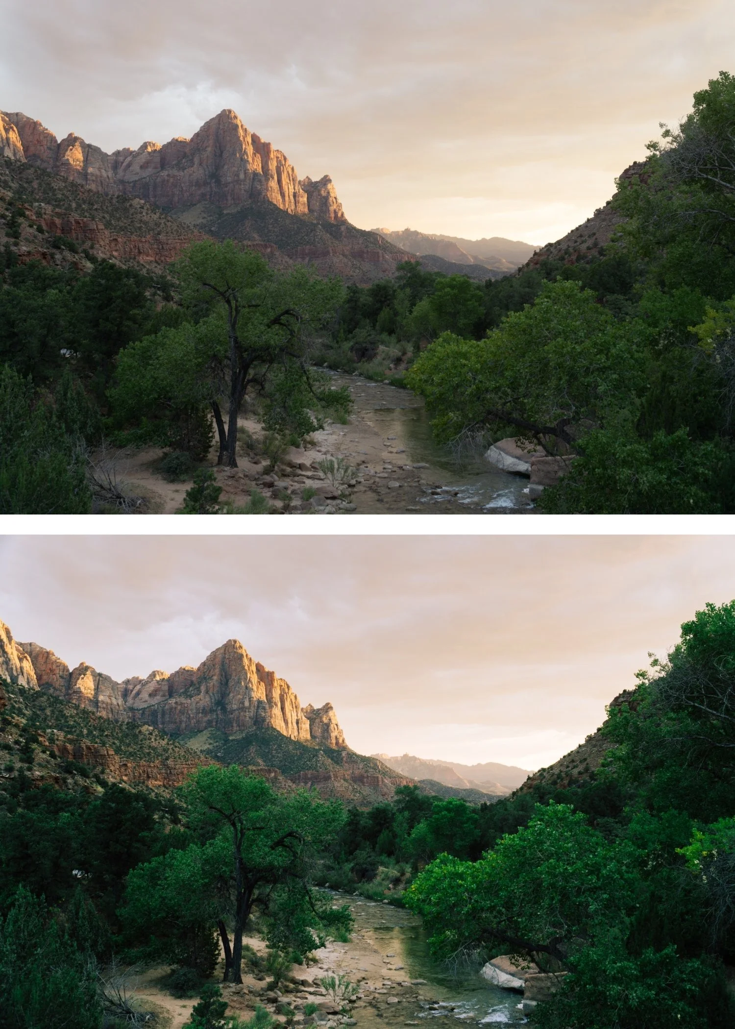
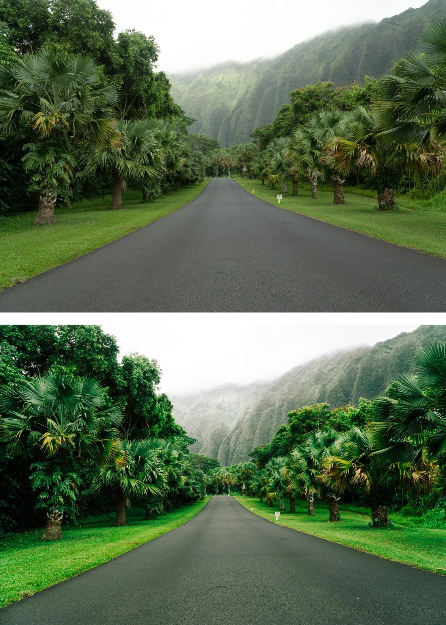
Reds in Kodachrome images have a specific quality: warmer than the primary red of most digital cameras, slightly shifted toward amber, and more saturated. This is why photographs on Kodachrome have that immediate visual richness in warm-toned subjects. Blues are deep and slightly cyan-shifted, which is why Kodachrome sky photography has the specific blue depth that makes it immediately identifiable. Skin tones are warm and present without being orange because the red shift in Kodachrome's rendering was specifically tuned to the orange-amber range where skin lives. The contrast was moderate: more than Portra, less than the highly contrasty stocks. And the overall saturation was significantly higher than the organic, muted quality of Portra or Fuji films.
How to Recreate Kodachrome Properties in Lightroom
Red and orange channel rendering. Kodachrome reds are its most distinctive property. In the HSL panel, this is best approximated by keeping Red Saturation at 0 to +5 rather than reducing it, which preserves the film's characteristic vivid red rendering. Red Hue should be adjusted slightly toward orange (+3 to +6) to reference the warm red quality of Kodachrome rather than the more primary digital red. Orange Saturation can remain relatively neutral (-5 to +5) because the warm rendering in the red channel handles the richness in warm subjects. Orange Luminance at +5 to +10 keeps skin warm and dimensional.
Blue channel depth. Kodachrome blues are deep and vivid by modern standards. Rather than reducing Blue Saturation as you would for most film aesthetics, Kodachrome style keeps it relatively strong or reduces it only slightly (-5 to +5 depending on the scene). The key difference from digital blues is the slightly cyan shift: pushing Blue Hue slightly toward cyan (+3 to +6) creates the specific quality of Kodachrome's sky rendering. This is the opposite direction from most film preset blue adjustments, which typically move away from cyan.
Moderate contrast with Tone Curve. Kodachrome had more contrast than Portra but was not a high-contrast stock. A moderate Tone Curve that creates clear tonal separation without the soft, creamy quality of Portra-style editing is appropriate. The shadow point should remain darker than in most film aesthetics, and the midtone separation should be more pronounced. Highlight roll-off is gentler than in the Portra approach, with bright areas allowed to be more vivid and less compressed.
Color Grading for warmth. Highlight Color Grading with Hue 40-50 and Saturation 8-15 places the Kodachrome warmth in the highlights specifically. This is more saturated than most film aesthetics because Kodachrome's vivid color was one of its defining properties. The subtle version of this highlight warmth approach is used in the Warm Nostalgic Photo Editing Style for a more restrained but related warmth direction. Shadow grading should be kept near neutral to avoid adding an unauthentic teal that was not characteristic of the original stock.
Where Kodachrome Style Works Best
Kodachrome was primarily used for outdoor photography in daylight conditions, and the aesthetic is specifically calibrated for those conditions. Travel photography in warm, colorful environments is where it performs most compellingly: Mediterranean architecture, tropical destinations, outdoor markets, landscapes in strong directional light. For the full outdoor travel editing framework, How to Create a Timeless Travel Aesthetic covers how to maintain visual coherence across a full trip. The vivid color rendering amplifies the inherent energy of these environments rather than muting it.
Portrait photography in warm outdoor light also suits the Kodachrome approach because the specific warmth of the film's red rendering flatters skin tones while the overall vibrancy adds life and energy to the image. The moderate contrast creates dimension without harshness.
Where Kodachrome style tends to work less well is in cool or overcast conditions, where the vivid color rendering creates a mismatch with the ambient light temperature, and in interior photography, where the high saturation can make artificial lighting look garish.
The Difference Between Kodachrome and Other Vibrant Film Looks
Kodachrome is often confused with simply "vibrant film" or the New Modern aesthetic because both have bold color presence. The difference is in the specific color rendering. Kodachrome's vibrancy is warm: reds are amber-warm, blues have a cyan depth, and the overall palette references warm outdoor light even at its most saturated. For comparison, Why Teal and Orange Looks Dated explains why heavy cool-warm separation in editing reads very differently from Kodachrome's warm-first approach. Modern vibrant presets and New Modern aesthetics are bold across all color channels without the warm directional bias that Kodachrome's chemistry produced. The Kodachrome look feels like outdoor film photography at its most vivid. The modern vibrant look feels like digital color enhanced for visual impact.
Understanding this difference is what allows you to use Kodachrome-style editing appropriately rather than applying it generically as a saturation boost.
FAQ
Can I use Kodachrome style for portrait photography?
Yes in warm outdoor conditions where the vivid color and warm rendering suit the ambient light. In studio or controlled lighting environments, the high saturation can make the look read as over-processed. Reduce preset strength to 75-82% for portrait use and check that Orange rendering is dimensional rather than vivid-orange.
Why does Kodachrome style make my blues look cyan?
This is a property of the original film rather than a calibration error. Kodachrome's blue channel had a specific cyan shift that distinguished it from other stocks. If the cyan reads as too strong in your images, reduce Blue Saturation by -5 to -10 after applying.
Is Kodachrome style the same as cross-processed film?
No. Cross-processing is a specific technique where film is developed in the wrong chemistry, producing dramatic, unpredictable color shifts. Kodachrome style references the specific, calibrated color science of a particular film stock processed correctly. They are aesthetically different directions.
Does Kodachrome style age well?
The vivid, outdoor-calibrated quality of Kodachrome has been compelling for decades. For contrast with a more restrained film aesthetic that is equally timeless, Kodak Portra Style Lightroom Presets covers the skin-first, low-saturation counterpart to the Kodachrome approach. and shows no signs of dating in the way that heavily trend-based looks do. It references a specific photographic tradition rather than a specific social media moment.
Try a vibrant warm film base on your own photos:
Download the free Analog Film preset as a starting point for understanding film color philosophy before exploring the more vibrant Kodachrome direction.
For a preset collection built specifically around Kodachrome color science with calibrated reds, deep blues, and warm midtones for outdoor and travel photography, explore the Chromatic Archive.