Shadow Color Separation Techniques for Film Looks in Lightroom
Shadow Color Separation Techniques for Film Looks in Lightroom
Shadow color is where many photographers make their biggest editing mistakes. They either ignore it entirely — leaving shadows neutral and grey — or they push it too far and produce the obvious teal shadows that define the dated look. The middle ground, where shadow color adds dimension and depth without announcing itself as a color treatment, is where film editing lives.
Understanding shadow color separation and how to apply it correctly produces the specific dimensional quality that makes film photography feel different from digital. This guide covers the techniques and the calibration.
What Shadow Color Separation Means
Color separation in photography refers to the relationship between the color of highlights and the color of shadows. In neutral digital photography, both highlights and shadows are roughly the same color temperature — slightly warm in warm light, slightly cool in overcast. There is no meaningful color difference between the tonal ranges, just a difference in brightness.
Film photography has inherent color separation from several sources. Film base density adds a slight warm cast to the darkest areas of film images — the physical substrate has a color that contributes to shadow tone. Warm outdoor photography has cool diffuse skylight in the shadows while the highlights are lit by warm direct sunlight, creating natural warm-cool separation. Different film stocks have different color biases in their shadow range based on their chemistry.
When photographers talk about the dimensional quality of film photography, they are largely describing the effect of this shadow color separation. Shadows that have color — even subtle color — add depth and atmosphere to an image in a way that neutral grey shadows cannot.
Technique 1: Subtle Cool Shadow Depth
The most widely applicable shadow color technique for film aesthetics is subtle cool depth in the shadows. This references the natural behavior of outdoor photography where shadows are lit by diffuse blue-tinted skylight rather than by direct warm sun.
In the Color Grading panel, set Shadow Hue to 200-220 (blue-cyan range) and Shadow Saturation to 3-7. This adds cool depth to dark areas — perceptible when you look for it but not identifiable as a color treatment at casual inspection.
The specific Hue value within the 200-220 range matters. Hue at 200 is more blue, Hue at 220 is slightly more cyan. For natural outdoor photography, 205-215 produces the most organic result. Hue below 195 moves toward pure blue, which reads as more digital. Hue above 225 starts producing the visible teal that reads as an obvious edit.
Saturation must stay below 8 for this technique to work naturally. At Saturation 10-15, cool shadow grading becomes visible as a treatment. At Saturation 20+, it produces the heavy teal that dates photographs immediately.
Technique 2: Warm Shadow Base (Film Stock Warmth)
Many warm film stocks have a subtle amber-warm bias in the shadow range from the chemistry of their base layer. This creates shadows that feel warm and inviting rather than cool and receding.
In Color Grading, set Shadow Hue to 25-40 (amber range) and Shadow Saturation to 2-6. This adds the specific quality of warm-base film shadows — dark areas that feel warm and present rather than cool and absent.
This technique is most effective on warm portrait photography, lifestyle photography in warm indoor light, and travel photography in warm-climate environments. It reinforces the ambient warmth throughout the tonal range rather than creating the warm-cool split of Technique 1.
Paired with Highlight Color Grading that is also warm (Hue 40-55, Saturation 6-10), this produces a fully warm film palette — consistent warm character from highlights through shadows without the color separation of the first technique.
Technique 3: The HSL Shadow Approach
An alternative to Color Grading for shadow toning is using specific HSL adjustments to affect how particular color channels render in their darker values. This is more targeted than Color Grading because it affects specific colors rather than the entire shadow range.
For the blue shadows of outdoor photography: in the HSL panel, shifting Blue Hue slightly toward cyan (+5 to +10) and reducing Blue Saturation (-10 to -20) produces cool shadow depth through the blue channel specifically. This affects shadows that contain blue light — clear skies, window light, shade. It does not affect warm-toned subjects in the shadow range.
For organic green shadow depth: shifting Green Hue slightly toward yellow (-5 to -10 on the Hue slider) and reducing Green Saturation (-10 to -20) removes the vivid, neon quality from dark areas of vegetation and replaces it with a more organic, earthy shadow quality.
Avoiding the Heavy Teal Shadow
The heavy teal shadow is produced by excessive Shadow Saturation in the blue-cyan range combined with Shadow Hue in the 170-200 range. The 170-190 Hue range is specifically problematic because it sits in the aqua-cyan area where shadows read as visibly blue-green at moderate saturation levels.
To avoid it: keep Shadow Saturation below 8 in any direction. If using the cool shadow direction, keep Hue at 205-215 rather than 170-195. If results still read too obviously as teal, reduce Saturation to 3-5 and evaluate again.
The Blending slider in the Color Grading panel also affects how aggressively shadow toning reaches into the lower midtones. At high Blending values (60+), shadow color can bleed into lower midtones and affect skin in shadow areas. Keep Blending at 45-55 for most film aesthetics.
Checking Shadow Color Results
After applying shadow color techniques, examine three areas of the photograph. First, check shadow areas that should be neutral — concrete walls, grey fabric, neutral surfaces. If these have a visible color cast, the shadow Saturation is too high. Second, check skin in shadow areas for unwanted color shifts. Third, view the photograph at normal size and assess whether the shadows add depth and dimension or read as colored.
The goal is that shadows feel dimensional and present rather than flat and neutral, without any identifiable color treatment being visible.
FAQ
How is shadow color different from shadow brightness?
Shadow brightness is controlled by the Shadows slider and Blacks in the Basic panel, and by the shadow range of the Tone Curve. Shadow color is controlled by Color Grading and the HSL panel. Both affect shadows, but in different properties — one in lightness, one in color.
Should I use shadow color on every photograph?
No. Shadow color techniques are most valuable in photographs with prominent shadow areas — portraits in directional light, outdoor scenes with clear shadow definition, travel photography with atmospheric conditions. In flat, evenly-lit photographs without significant shadows, shadow color grading has minimal effect.
Why does my shadow color look different at different preset strengths?
Shadow Color Grading Saturation scales with preset strength. At 80% strength, a Shadow Saturation of 8 applies at an effective 6.4. If reducing preset strength removes the shadow color too much, increase the Saturation value slightly to compensate.
Is cool shadow color appropriate for indoor photography?
For indoor photography in warm artificial light (tungsten, candles), cool shadow color creates a mismatch with the warm ambient — the warm light should produce relatively warm shadows. For warm indoor photography, the warm shadow base technique (Technique 2) is more appropriate than the cool shadow technique.
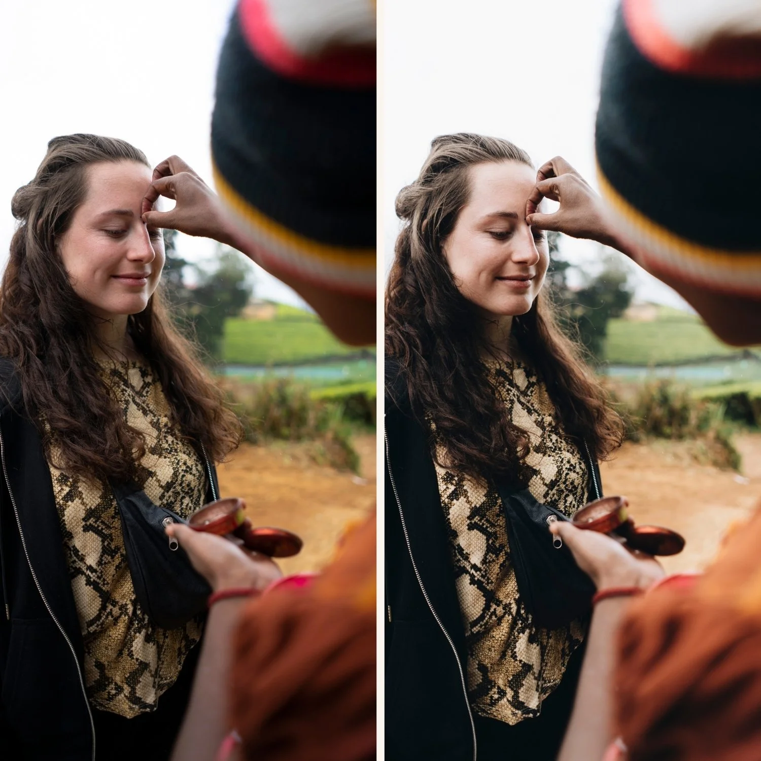
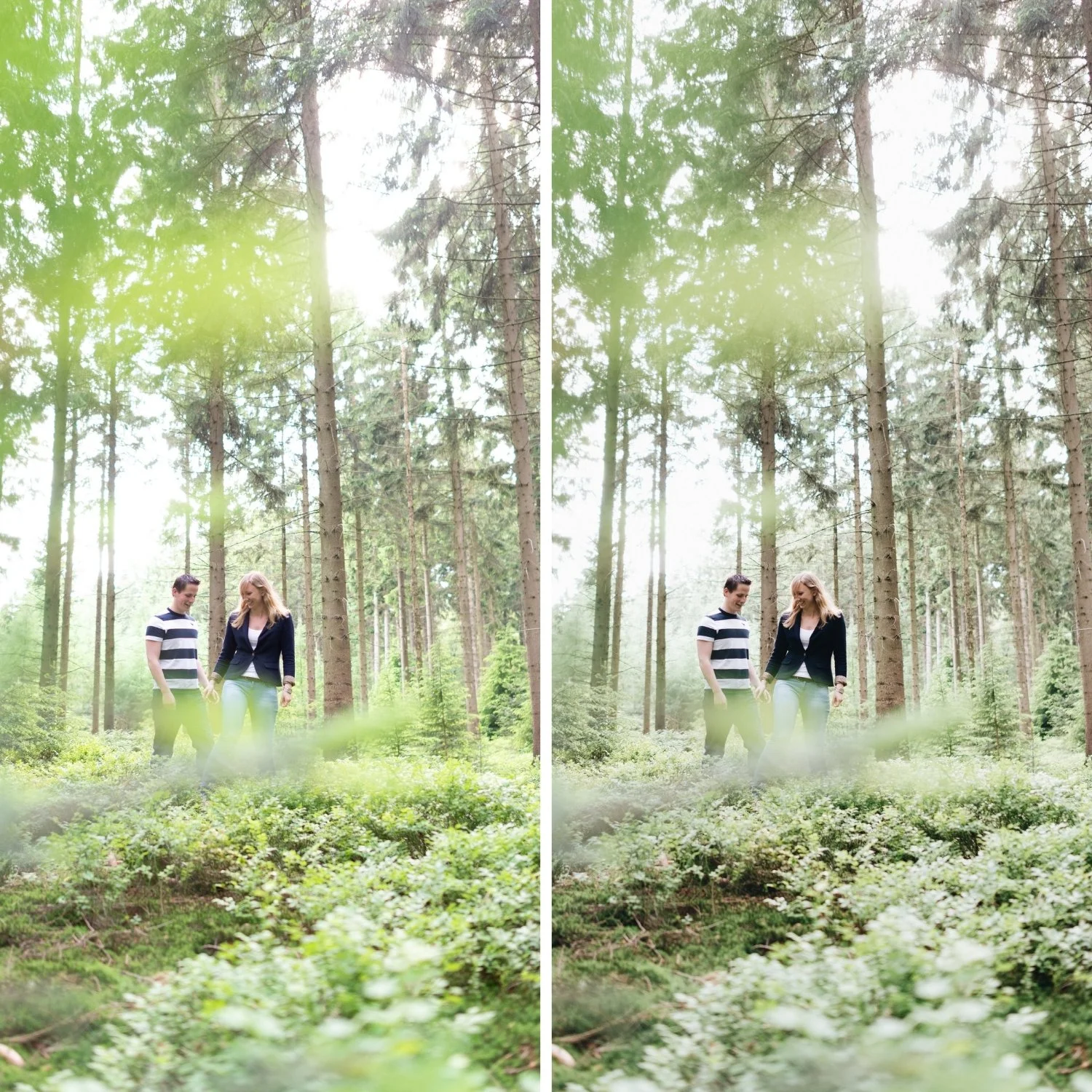
See shadow color separation applied in a calibrated film preset:
Download the free Analog Film preset and examine the Color Grading Shadow settings as a reference point.
For a collection that uses dimensional shadow color as a core technique across varied film aesthetics, explore the Moody Film Archive for cool shadow depth, and the Vesper Archive for warm shadow character.