Moody Fall Film Look — Lightroom Guide (2026)
Moody Fall Film Look — Lightroom Guide (2026)
Autumn photography has the richest natural light of any season — golden, amber, low-angle sun with warm fall colors that align naturally with the film look. The moody fall film look takes this warmth further. Not just warm, but deep. Not just amber, but cinematic. The specific quality of fall light at its most atmospheric — foggy mornings, golden late afternoons, dark forest interiors — translated into a consistent editing aesthetic.
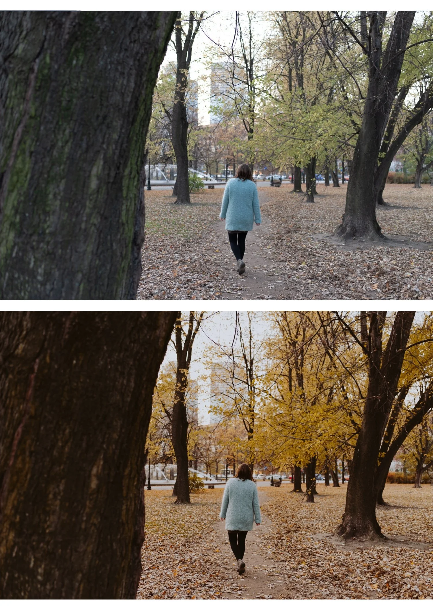
What makes moody fall different from just warm fall
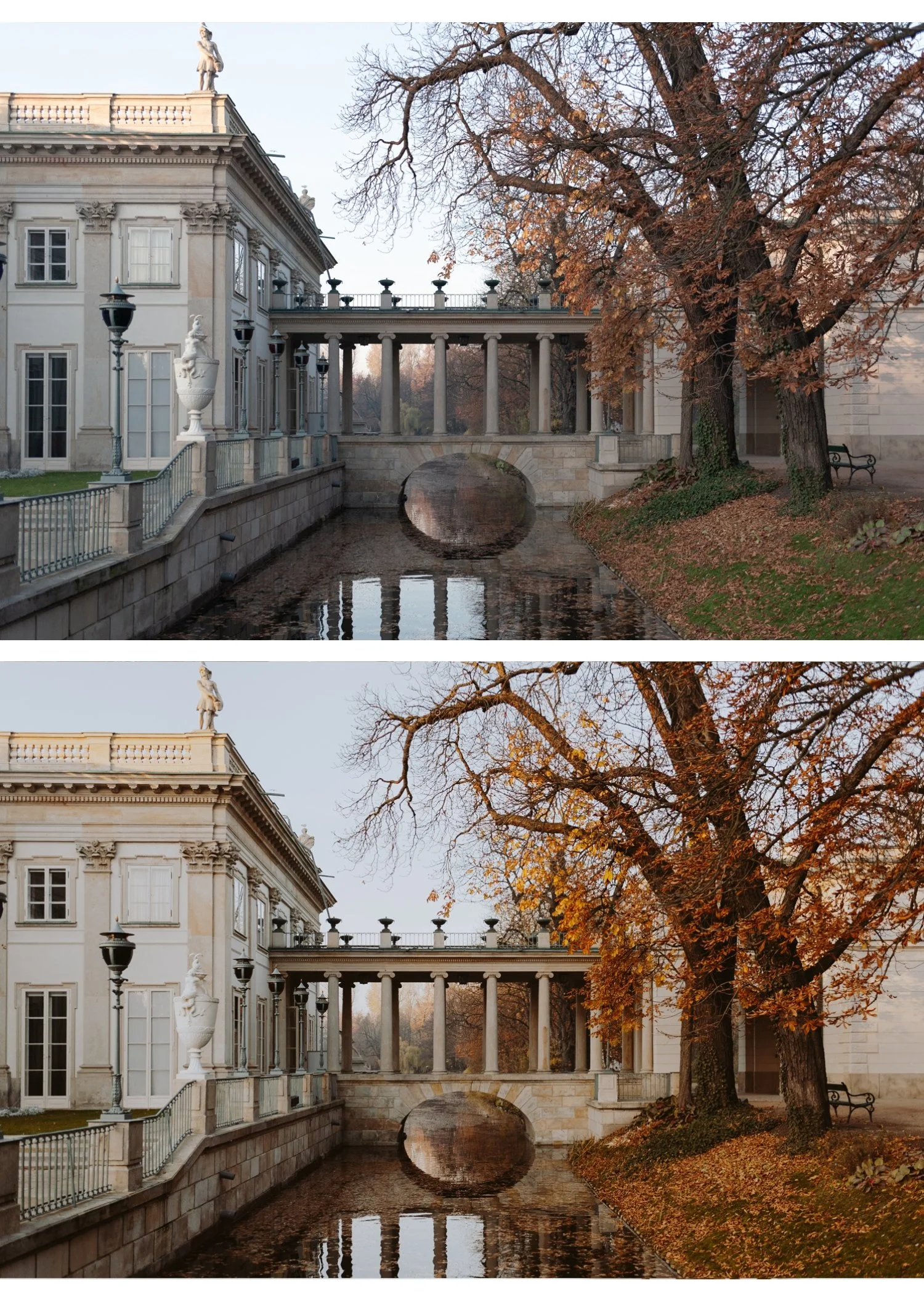
Warm fall editing preserves the golden, amber quality of autumn light. Moody fall editing adds depth — specifically in the shadows and midtones. The distinction is tonal weight.
A warm fall photo is bright, golden, inviting. A moody fall photo has the same warmth in the highlights and midtones but the shadows are deeper, richer, and more atmospheric. The result feels like the difference between a warm afternoon walk and standing at the edge of a forest as the light drops.
The technical difference: moody fall uses less Blacks lift (+15 to +20 instead of +25 to +35) and more Shadow Color Grading saturation (14-18 instead of 8-12). The shadows stay dark and warm rather than open and airy.
Step 1 — White balance for fall
The first mistake in fall editing: letting Auto white balance neutralize the warmth of fall light.
Fall afternoon light is genuinely warm — 4,500-5,500K. Auto white balance often sets Temperature lower to "correct" it toward neutral. This removes the very quality you want to enhance.
Set white balance manually:
Warm fall afternoon: 5,500-5,800K, Tint +5 to +8
Overcast fall: 5,800-6,200K, Tint +4 to +6
Fall golden hour: 5,200-5,600K, Tint +6 to +10 — golden hour fall light is already very warm, preserve rather than add
Fix white balance before applying any preset. A warm preset on a correctly warm white balance creates golden depth. A warm preset on a neutralized Auto white balance creates an unnatural orange push.
Step 2 — Tonal foundation
Highlights: -30 to -40 Preserve the warm amber quality in bright areas — blown highlights in fall photography lose the golden color entirely. The goal is detail in leaves, sky, and warm surfaces.
Blacks: +15 to +20 Less lift than spring or summer editing. Fall shadows should have depth — open but not airy. The shadow warmth from Color Grading provides the atmosphere.
Shadows: +15 to +20 Opens the shadow range just enough to show detail without losing the moody depth.
Contrast: -10 Remove digital contrast baseline. The Tone Curve creates the organic contrast instead.
Clarity: -8 to -10 Removes digital micro-contrast. Fall photography benefits from organic edge rendering.
Step 3 — Color calibration for fall
Vibrance: -8 to -12 Slightly muted. Fall colors are rich but not vivid — the film look mutes them toward organic quality without going flat.
Orange Hue: -5 to -8 toward red This is the most important fall-specific color adjustment. Shifting Orange Hue slightly toward red deepens autumn orange and amber tones — they read as rich, warm fall color rather than vivid digital orange.
Orange Saturation: +5 to +8 Higher than most film look editing. Fall allows more orange presence. Keep below +10 to avoid skin going orange on portrait work.
Green Hue: +10 to +14 toward yellow Fall forest greens are shifting toward yellow-gold. This shift reflects that reality rather than fighting it.
Green Saturation: -8 to -12 Slightly muted greens — organic, not vivid.
Yellow Saturation: +3 to +6 Yellow leaves, golden surfaces. A slight lift enhances the fall palette.
Step 4 — Color Grading for moody depth
This is where moody fall separates from warm fall.
Shadow Color Grading: Hue 35-40, Saturation 14-18 Richer and more saturated than other seasons. The warm amber quality in fall shadows is deeper than spring or summer. The shadows carry the mood.
Highlight Color Grading: Hue 40-45, Saturation 4-6 Very subtle warmth in the bright areas — reinforces the golden fall light without being obvious.
Midtone Color Grading: Hue 38, Saturation 5-8 Optional but effective for a warmer, more enveloping overall quality.
Step 5 — Grain for fall atmosphere
Fall photography benefits from more visible grain than spring or summer work. The atmospheric quality — fog, low light, forest scenes — carries grain naturally.
Amount: 20-25
Size: 25-28
Roughness: 46-52
On high-ISO fall photography (dark forest interiors, fog, blue hour): apply AI Denoise first, then add grain at these values. The clean base plus organic grain produces better results than noise on top of grain.
Best presets for fall photography
M5 Warm Dark — the warmest and most atmospheric moody preset. Deep, warm, cinematic. The primary fall preset for dark, atmospheric scenes — foggy mornings, dark forest, blue hour.
V5 Golden Velvet — warm, golden, slightly less dark than M5. The fall travel photography preset for brighter golden hour scenes.
M4 Moody Classic — more cinematic depth, slightly less warm than M5. For fall scenes where the atmosphere is the dominant element and the warmth is secondary.
A4 Golden Warmth — for brighter fall scenes in direct afternoon sun. Less moody but with the golden warmth calibrated for fall light.
Camera-specific adjustments for fall
Canon: Camera Neutral profile. Canon's warm color is already fall-adjacent — the Red Hue correction (+8) still applies to prevent skin going orange in warm fall light.
Sony: Camera Standard. Green Hue +10, Green Saturation -12. Sony's vivid greens fight against the muted, warm-shifting fall palette without correction.
Fujifilm: Provia or Velvia simulation profile depending on your intent. Velvia's vivid color on fall foliage produces a deliberately rich, almost over-the-top autumn quality that works for landscape photography specifically.
iPhone/Android: reduce Sharpening to 20, Clarity to -10 before applying. Reduce preset strength to 75-80%.
The complete moody fall workflow
Fix white balance manually (5,500-5,800K)
Apply Camera Calibration profile for your camera brand
Exposure foundation: Highlights -35, Blacks +18, Shadows +18, Contrast -10
Color calibration: Orange Hue -6, Orange Saturation +6, Green Hue +12, Green Saturation -10
Shadow Color Grading: Hue 38, Saturation 16
Apply M5 or V5 at 80-85%
Grain: Amount 22, Size 26, Roughness 48
Per-photo fine-tune: Exposure and White Balance only
FAQ
My fall photos look too orange. How do I fix it?
Two causes: white balance too warm before applying (above 6,000K) or Orange Saturation above +10. Set white balance to 5,500-5,800K and keep Orange Saturation at +5 to +8 maximum.
Why do my fall photos look flat instead of moody?
Shadow Color Grading saturation is too low. Increase to 14-18. Also check that Blacks are not lifted above +25 — too much shadow lift removes the depth that creates the moody quality.
Which fall scenes benefit most from the moody look?
Foggy mornings, dark forest interiors, blue hour after sunset, overcast fall days. Bright golden hour fall photography is better served by warm rather than moody — the light is already doing the atmospheric work.
Does the moody fall look work for portrait photography?
Yes, with one adjustment: keep Orange Saturation at +3 to +5 rather than +6 to +8 in fall portrait sessions. The deeper fall warmth plus a warm preset can push skin orange on portraits. V5 is better than M5 for fall portrait sessions.
