How to Edit Photos for Print vs Digital — Complete Guide (2026)
How to Edit Photos for Print vs Digital — Complete Guide (2026)
The same Lightroom edit produces different results on screen and in print. A photo that looks warm and luminous on your monitor can print cool and flat. A photo with beautiful shadow detail on screen can lose that detail in the darker areas of a print. Understanding why this happens and how to adjust for it is the difference between edits that look as good on the wall as they do on Instagram.
Why screen and print look different
Three technical reasons cause the difference between screen and print appearance:
Colour gamut. Screens display colour using transmitted light (RGB). Prints display colour using reflected light and ink (CMYK or archival inkjet). The colour range that ink can reproduce is smaller than what a screen can display. Vivid screen colours — particularly saturated blues, greens, and cyans — often cannot be matched accurately by print inks.
Gamma and brightness. Screens are backlit and display images brighter than prints. A photo calibrated to look correctly bright on a monitor will often appear dark in print because the print has no backlight. Prints need to be edited slightly brighter than they look on screen.
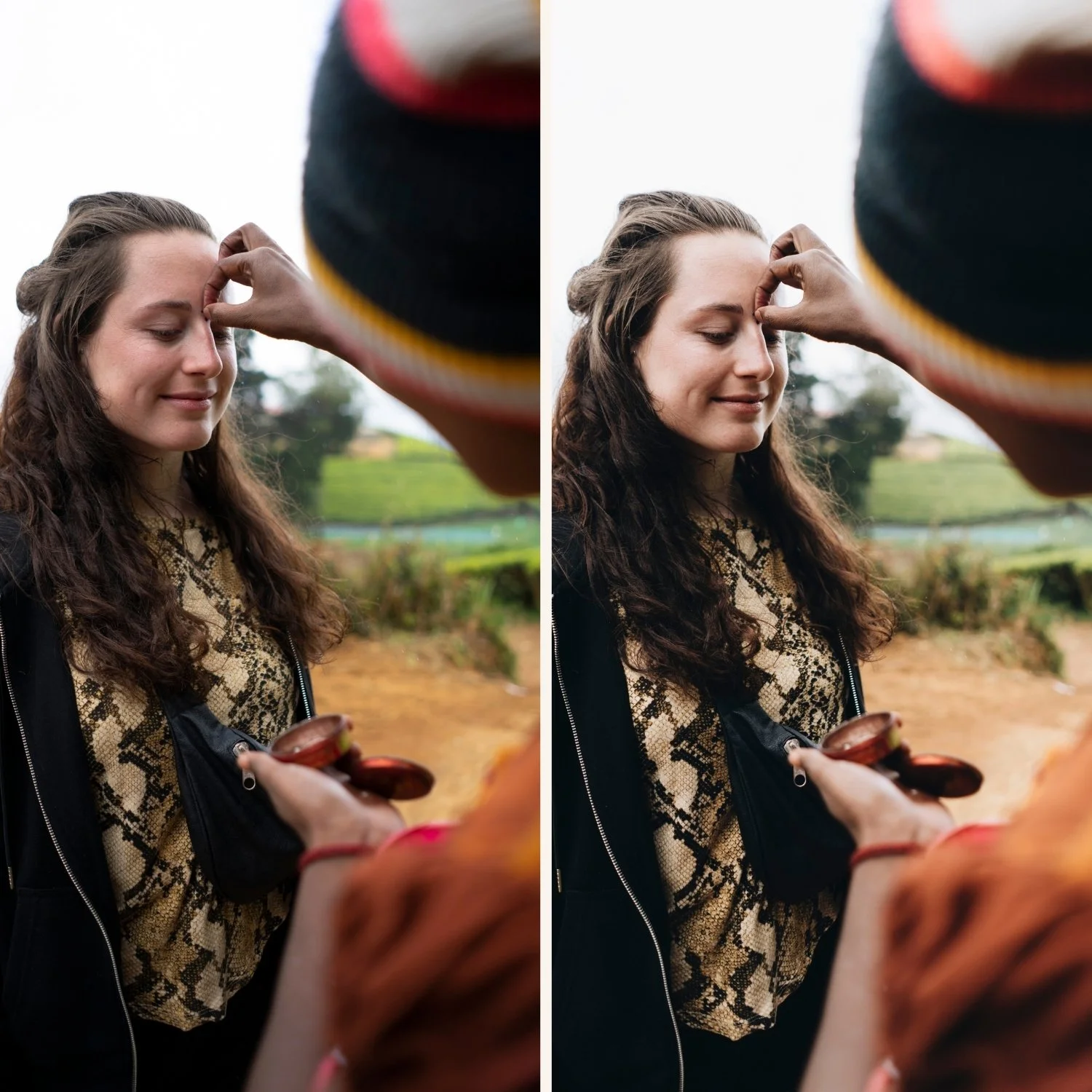
Black point. Digital black on screen is pure black. The darkest ink in a print is a deep dark grey — not pure black. Crushed shadows on screen look significantly different in print because the print's physical black point is lighter than the screen's. Film look editing (Blacks +18 to +28) actually translates well to print precisely because the lifted blacks are closer to the print's physical black point.
Editing adjustments for print
When preparing a photo specifically for print, these adjustments improve the print result:
Increase Exposure by +0.1 to +0.2. Compensate for the brightness difference between backlit screen and reflected print. The photo will look slightly bright on screen — it will look correctly bright in print.
Reduce Blacks by 3-5 units from the screen edit. The print's physical black point means that lifted blacks can appear grey rather than dark in print. Slight reduction brings the print shadow floor into alignment with the screen appearance. For film look photos: if the screen edit has Blacks +22, the print version might use Blacks +17-19.
Increase Clarity by +3 to +5 from the screen edit. Print reduces apparent sharpness slightly due to ink dot size and paper texture. A slight Clarity increase compensates. This is one of the few contexts where positive Clarity is appropriate on portrait photography.
Check saturation. Vivid, saturated colours — particularly blues and greens — often print less saturated than they appear on screen. If your edit has high Blue or Green Saturation, add +5 to +8 in those channels for the print version to compensate for the gamut reduction.
Export settings for print
Colour space: Adobe RGB for professional labs, sRGB for consumer labs and home printers.
Professional print labs (Mpix, Bay Photo, Miller's Lab) accept and prefer Adobe RGB because it covers a wider colour gamut than sRGB — more of the edit's colour range translates to the print. Consumer labs (Walmart, CVS, online print services) process in sRGB — submitting Adobe RGB files to a consumer lab can cause colour shifts because the lab's software may misinterpret the colour profile.
If you are unsure which your lab uses: ask them. The difference is significant for saturated colour.
Resolution: 300 PPI minimum for standard prints.
In Lightroom's export dialog: Image Sizing, check Resize to Fit, Resolution 300 PPI. This is the standard resolution for sharp printing at standard viewing distances.
For large format prints (above 60x90cm) intended for gallery viewing: 200-240 PPI at the final print size is acceptable because large prints are viewed from a greater distance.
Format: TIFF for professional labs, JPEG at 95+ quality for consumer labs.
TIFF is lossless — no compression artifacts. Professional labs process TIFF files without quality loss. JPEG at quality 95 or above is virtually indistinguishable from TIFF for most print work but the file size is smaller.
Do not add output sharpening. Professional labs add print-specific sharpening in their workflow. Adding output sharpening in Lightroom on top of the lab's sharpening produces over-sharpened results.
Export settings for digital display
For Instagram, websites, and digital portfolios, different settings apply:
Colour space: sRGB always. Every screen and social platform displays sRGB. Adobe RGB files display incorrectly on uncalibrated screens and may show colour shifts on social platforms.
Resolution: 72-96 PPI, 1080px on the long edge for social. Resolution does not affect screen sharpness — pixel dimensions do. 1080px at 72 PPI and 1080px at 300 PPI look identical on screen.
Format: JPEG at 85-90%. Social platforms compress files on upload. Starting at 85-90% quality gives the platform's algorithm more quality to work with.
Add output sharpening: Screen, Standard. Unlike print, screen output benefits from slight sharpening to compensate for JPEG compression softening.
Film look editing and print
The film look translates well to print for two specific reasons:
Lifted blacks. Film look editing keeps Blacks at +18 to +28 — a shadow floor that aligns with the print's physical black point better than crushed digital blacks. Film look photos often print with better shadow detail than more technically precise digital edits.
Muted, organic colour. Film look Vibrance at -8 to -15 and muted Green and Blue saturation keeps the colour within the printable gamut more reliably than vivid digital colour. The muted palette that looks organic on screen is also the palette that prints most accurately.
The primary film look adjustment needed for print is the +0.1 to +0.2 Exposure lift. The rest of the film look translates with minimal adjustment.
The Analog Film Archive for print photography
The Analog Film Archive presets are calibrated for organic, muted colour that translates well to print. The Shadow Color Grading, lifted blacks, and controlled saturation are all qualities that align with print colour rendering.
Explore the Analog Film Archive — $27 →
For photographers producing work for both digital and print, the Studio Archive includes the full collection.
FAQ
Why does my photo print darker than it looks on screen?
Your monitor is brighter than the print. Either calibrate your monitor to a lower brightness (80-100 cd/m2 is the print reference brightness) or apply the +0.1 to +0.2 Exposure increase for print described above.
Should I use a different preset for print versus digital?
No — create a print adjustment preset with the specific values above (Exposure +0.15, Blacks -4, Clarity +4) and apply it on top of your standard preset when preparing for print. Keep one editing direction; adapt the output settings.
Do professional labs correct colour when they print?
Some do, some do not. Labs that offer "colour correction" or "auto colour" services will adjust your file. If you want your edit printed exactly as you made it, specify "no colour correction" or "print as submitted" when ordering.
Is there a way to proof print results on screen?
Yes. Lightroom's Soft Proof function (View menu, Soft Proofing) simulates how your edit will look under a specific colour profile. Set the Soft Proof profile to your print lab's ICC profile (download from the lab's website) and you can see a simulation of the print result on screen.