How to Get the Dark Moody Look in Lightroom — Step by Step (2026)
How to Get the Dark Moody Look in Lightroom — Step by Step (2026)
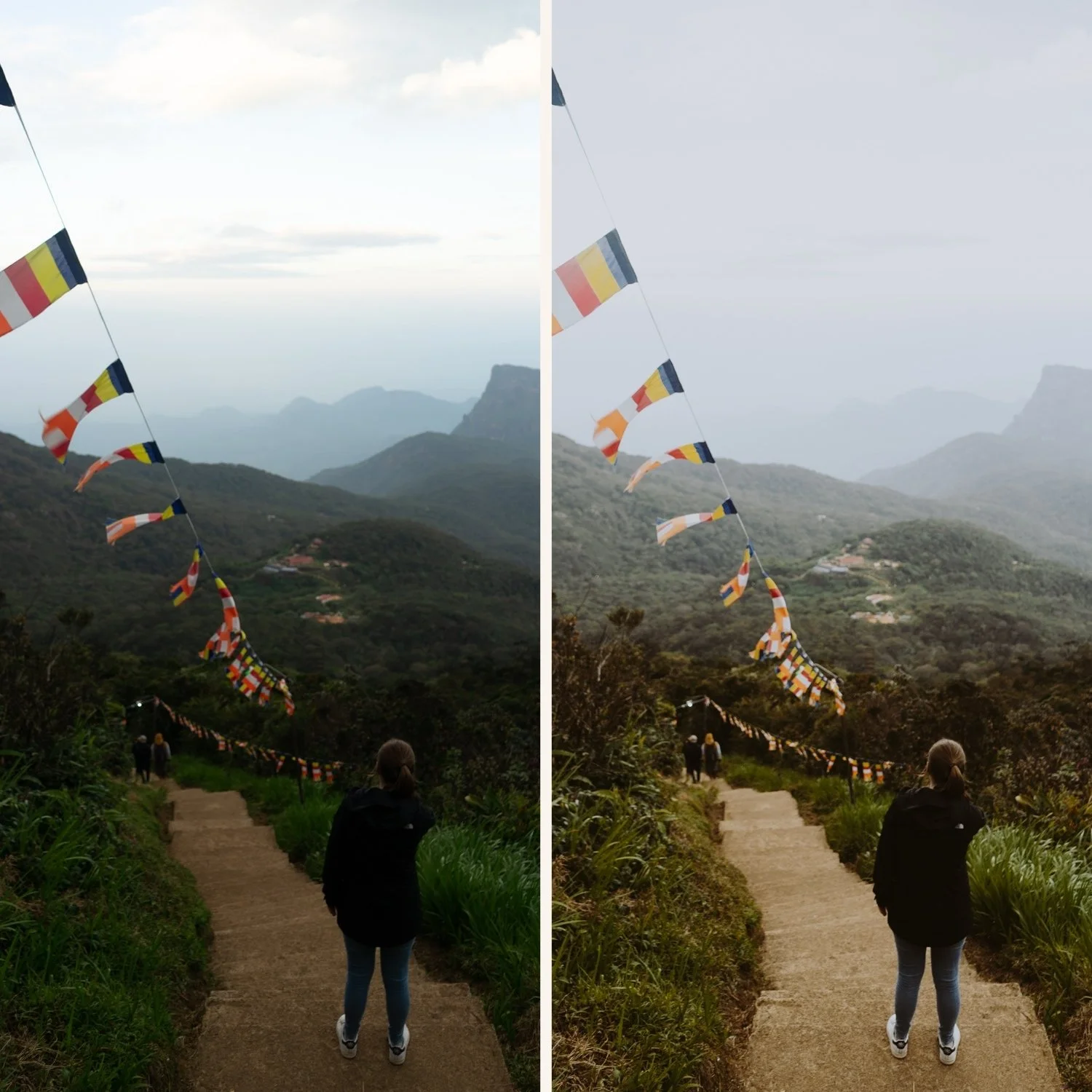
The dark moody look is one of the hardest editing styles to get right. Most photographers apply a dark preset and get muddy, flat results. The reason is almost always the same: the photo was wrong for the look before the edit even started.
This guide covers the complete workflow for dark moody editing in Lightroom, starting with choosing the right photo and ending with a consistent, cinematic result.
Step 1 — Choose the right photo
Dark moody editing amplifies what is already in the photo. It does not rescue a flat, evenly lit scene. Before opening Lightroom, check three things.
Strong directional light. The dark moody look needs contrast between lit and unlit areas. Side lighting, window light in a dark room, street lights, golden hour from a low angle. Overhead midday sun creates flat shadows that go nowhere when darkened.
A clear subject. In dark moody editing, the subject needs to stand out from the background by being either lighter or more textured. If the subject and background are the same brightness, darkening everything makes both disappear.
Shadow detail that is not already crushed. Dark moody editing pushes shadows darker. If your photo is already underexposed with blocked-up shadows, darkening further creates pure black areas with no detail. Shoot slightly brighter than you think you need and darken in editing.
Step 2 — Set the foundation before touching color
Fix exposure first. Set the overall exposure to slightly darker than neutral. For dark moody, -0.3 to -0.5 is a typical starting point before any preset is applied.
Pull highlights hard. Dark moody protects highlights aggressively. Highlights: -35 to -50. Whites: -20 to -35. This creates the soft, protected highlight quality that separates cinematic from harsh.
Lift shadows slightly. This is the step most photographers skip. Shadows: +5 to +15. Even in dark moody editing, slightly lifted shadows prevent the muddy, lost quality that comes from pure black. Film never crushes shadows completely.
Set white balance. Dark moody works with warm or neutral white balance, not cool. Cool white balance in dark photos looks grey and flat. Set Temperature to neutral or slightly warm before applying any preset or color grading.
Step 3 — Apply your preset at reduced strength
Apply your moody preset. Then immediately reduce the preset amount to 70-80% using the slider that appears after application.
Full strength moody presets on mobile photos often go too dark because iPhone and Android cameras already have higher contrast than the film originals the presets reference. Starting at 75% and adjusting from there gives you more control.
For the full preset guide: Dark Moody Lightroom Preset Guide
Step 4 — Build the cinematic quality with color grading
Color grading is what separates amateur dark editing from cinematic dark editing. Open the Color Grading panel.
Shadows: warm amber. Add a slight warm amber tint to the shadows (hue 25-40, saturation 15-20). This references the warm shadow quality of cinema film and is the defining characteristic of professional dark moody color work. Keep saturation subtle, 15 maximum.
Highlights: neutral to very slight warm. Keep highlights neutral or add the smallest amount of warm (hue 35-50, saturation 5-8). Highlights that are too colored look artificial.
Midtones: neutral. Leave midtones completely neutral. Touching midtones shifts the overall color balance and creates inconsistency across different photos.
Step 5 — Adjust color mix for film quality
Open the Color Mix panel. These three adjustments create the muted, cinematic color palette of dark moody photography.
Green Hue toward yellow (+15 to +20). Digital cameras render greens as vivid and neon. Shifting toward yellow creates the organic, muted green of film photography.
Green Saturation: -25 to -35. Significantly reduced. Vivid greens fight against the dark moody atmosphere.
Blue Saturation: -20 to -30. Muted blues. Dark moody color should feel heavy, not vivid.
Orange Luminance: +10 to +15. Even in dark scenes, this keeps skin tones visible and natural rather than disappearing into the surrounding darkness.
Step 6 — Add texture and grain
Dark moody editing benefits from more visible grain than clean film presets. Grain adds texture to darker areas that would otherwise look flat.
Effects panel: Amount 30-40, Size 30-35, Roughness 50-60.
Add grain after all other adjustments. Grain interacts with sharpening, so applying it last gives you the most control.
Step 7 — Check at 100% zoom
Zoom to 100% and look at three specific areas.
Darkest shadow areas. They should be dark but not pure black. You should be able to see some texture or detail even in the deepest shadows. If you see pure black with no detail, lift Blacks by +5 to +10.
Skin tones. Even in dark moody scenes, skin should look warm and natural. If skin looks grey or lost, lift Orange Luminance by +5.
Highlights. Bright areas should have a soft, glowing quality. If any area is clipping to pure white, pull Highlights further: -5 more.
Step 8 — Batch the session
After editing your best photo from a session, batch the rest using copy and paste settings. In Lightroom Mobile: three dots, Copy Settings, select all, go to the next photo, three dots, Paste Settings.
Then open each photo individually and adjust only exposure and white balance. The color and moody quality carry across consistently.
For the full batch guide: How to Batch Edit in Lightroom Mobile
The Moody Film Archive
The Moody Film Archive (M-Series) contains six presets covering the full range of moody cinematic editing from warm and subtle to deep and dramatic.
M4 Cool Matte and M5 Warm Dark are the most used for dark moody work. M6 Dark Dramatic for maximum impact.
EXPLORE THE MOODY FILM ARCHIVE
FAQ
Why does my dark moody edit look muddy instead of cinematic?
Usually caused by shadows that are completely crushed, no color grading in shadows, or a photo that was flat before editing. Lift Shadows slightly (+5 to +15), add warm Color Grading to shadows, and choose photos with strong directional light.
Can I get the dark moody look on iPhone photos?
Yes. Reduce Sharpening to 20 and Clarity to -10 before applying. iPhone processing adds digital harshness that works against the cinematic quality.
What is the difference between moody and dark moody?
Moody is warmer and less extreme. Dark moody pushes the exposure significantly lower and uses stronger tonal separation. Dark moody requires photos with strong directional light to work.