Dark Moody Lightroom Preset — Complete Guide (2026)
Dark Moody Lightroom Preset — Complete Guide (2026)
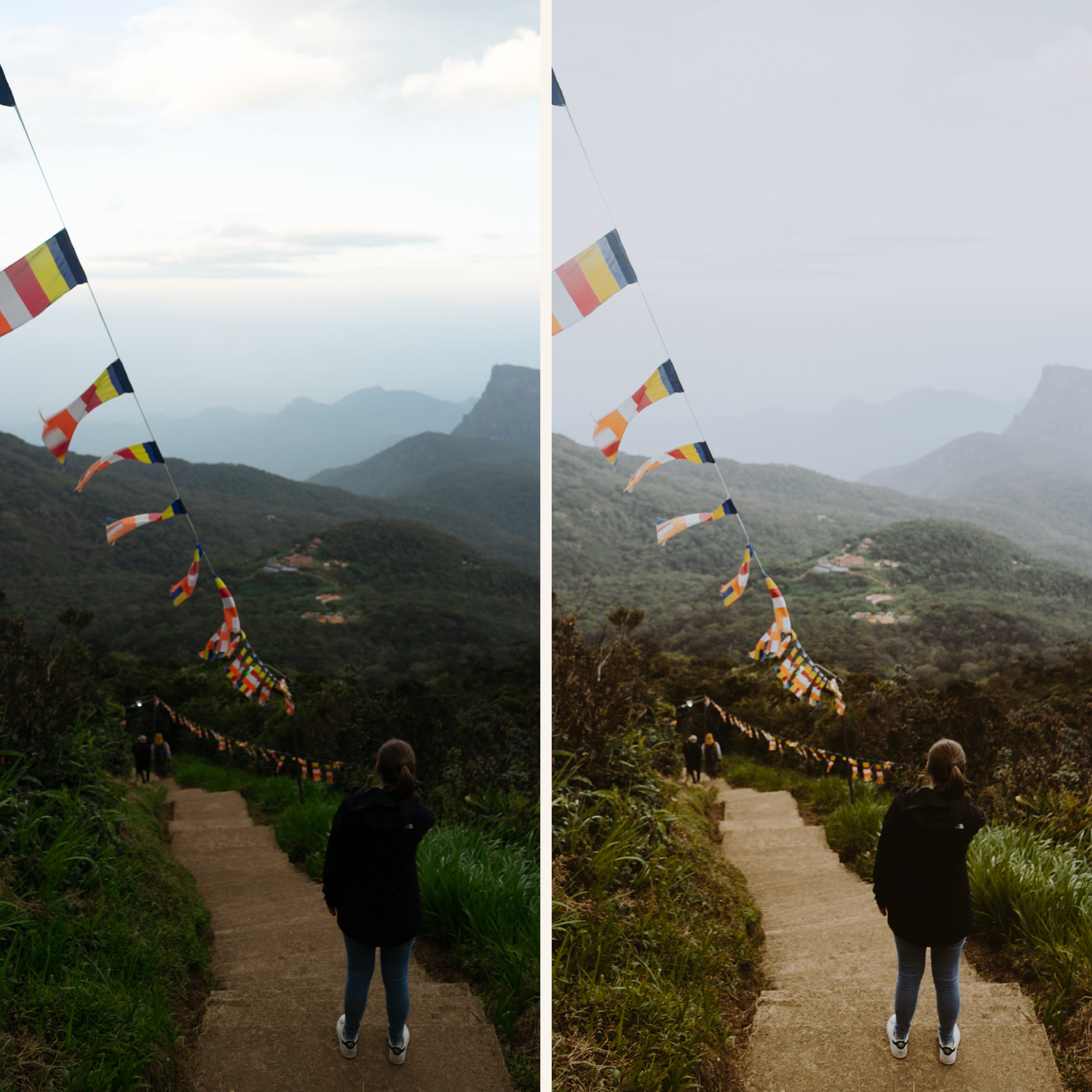
Dark moody editing is one of the most demanding editing styles to get right. The difference between a dark photo that feels cinematic and intentional versus one that looks underexposed and muddy comes down to a few specific adjustments — and most photographers get them wrong.
This guide covers exactly how to create the dark moody look in Lightroom, what separates good dark editing from bad, and which presets deliver the best results.
Dark moody vs moody — what's the difference?
Both aesthetics share the same foundation — controlled contrast, muted color, atmospheric depth. The difference is intensity.
Moody:
Slightly lowered exposure
Controlled shadows with visible detail
Warm, atmospheric color
Works across most lighting conditions
Dark moody:
Significantly lower exposure base
Deeper shadows with more dramatic contrast
Stronger tonal separation between light and dark areas
Requires scenes with strong directional light and clear subject separation
More unforgiving — works on fewer photos but with more impact when it does
Dark moody editing demands the right photo. It amplifies what's already there. A photo with strong directional light, deep shadows, and textured subject matter becomes cinematic. A flat, evenly-lit photo becomes muddy and lost.
The exact settings for dark moody editing in Lightroom
Basic panel:
Exposure: -0.5 to -1.0 (significantly darker base than standard moody)
Contrast: -15 to -25 (lower contrast prevents harsh digital look)
Highlights: -35 to -50 (aggressive highlight protection)
Shadows: +5 to +15 (lift slightly — this is what separates cinematic from muddy)
Whites: -20 to -35
Blacks: 0 to +10 (keep near zero — darker than standard moody)
Presence:
Texture: +5 to +15 (texture adds character in darker areas)
Clarity: -10 to -15 (removes digital harshness)
Vibrance: -15 to -20
Saturation: -10 to -15
Tone Curve:
Lift the black point slightly — even in dark moody, pure black should be avoided
Create a gentle fade in the shadows
Pull highlights down significantly
Keep midtones slightly darker than usual
Color Grading:
Shadows: warm amber or slightly cool blue-grey depending on style
Highlights: slightly warm or neutral
Midtones: neutral to slightly warm
HSL — the most important adjustments:
Green Hue: shift toward yellow (+15 to +20)
Green Saturation: -25 to -35
Blue Saturation: -20 to -30
Aqua Saturation: -15 to -25
Orange Luminance: +10 to +15 (keep skin visible even in dark scenes)
Grain:
Amount: 30-40 (more grain than standard moody — adds texture to dark areas)
Size: 30-35
Roughness: 50-60
What photos work for dark moody editing
Strong directional light — side light, backlight, window light in a dark room, street lights at night. The contrast between lit and unlit areas is what makes dark moody work.
Urban and architectural subjects — concrete, metal, stone, textured surfaces respond well to dark moody editing. The texture stays visible even in darker areas.
Rainy and overcast scenes — wet pavement reflects light in ways that work beautifully with dark moody processing.
Indoor low light — cafés, bars, dimly lit interiors where there's a mix of artificial warm light and shadow.
Night photography — dark moody amplifies the drama of night scenes while keeping artificial light sources from blowing out.
What doesn't work:
Bright daylight scenes — forcing dark moody on high-key photos always looks wrong
Flat front-lit portraits — without shadow depth, the edit just looks underexposed
White interiors — the preset fights against the natural brightness of the scene
The most common dark moody mistakes
No shadow detail — the most common problem. When shadows go completely black, the image looks broken rather than cinematic. Always lift blacks slightly (+5 to +10 minimum) and check that textured dark areas still have visible detail.
Too much clarity — clarity increases micro-contrast and makes dark areas look crunchy and harsh. For dark moody, keep clarity at 0 or negative.
Wrong white balance — dark moody works best with a warm or neutral white balance. Cold white balance on a dark photo looks clinical, not atmospheric.
Grain that's too coarse — heavy grain in dark areas turns into visible noise. Keep grain Size below 35 and check how it looks at 100% zoom before exporting.
Forcing it on the wrong photo — dark moody is unforgiving. If the original photo doesn't have strong light-shadow contrast, no amount of editing will make it look cinematic.
Best presets for dark moody editing
Moody Film Archive M2 and M6 — most dedicated dark moody presets
Within the Moody Film Archive, M2 Deep Cinematic and M6 Dark Film are the two presets built specifically for darker editing. M2 has more controlled depth — strong but with preserved detail. M6 is the most intense preset in the collection, best used on photos with strong directional light and clear subject separation.
→ Get the Moody Film Archive — $27
X Archive — cinematic dark contrast
The X Archive is the most cinematic and highest-contrast collection in the shop. If dark moody is your primary editing style, this is the more aggressive option — stronger tonal separation, bolder contrast, more dramatic overall character.
The Studio Archive — complete system
Both collections above plus 120+ more presets for $0.68 per preset.
→ Get The Studio Archive — $89
Dark moody on Lightroom Mobile
Dark moody is particularly challenging on mobile because phone cameras apply aggressive sharpening and HDR processing that makes dark areas look harsh and noisy.
Before applying a dark moody preset on Lightroom Mobile:
Reduce Sharpening from 40 to 15-20
Set Clarity to -10 to -15
Reduce Texture to 0 to +5
Disable HDR or Smart Tone in your camera settings before shooting
This gives the preset a softer, more film-like base that handles darker editing much better.
For the full mobile setup guide:
How to Install Lightroom Presets on iPhone
How to Install Lightroom Presets on Android
Try it free first
The free M5 preset is the cinematic neutral moody look — a controlled starting point that gives you a feel for the shadow depth and color science before going darker with M2 or M6.
FAQ
How do I make my Lightroom edits look dark and moody without losing detail?
The key is lifting blacks slightly (+5 to +15) while lowering the overall exposure. This creates the dark look while keeping shadow detail visible. Combine with negative clarity (-10 to -15) and the tone curve technique described above.
Why does my dark moody look muddy instead of cinematic?
Almost always caused by crushed blacks with no shadow detail, too much clarity, or applying the preset to a photo without strong directional light. Check your shadow detail and reduce clarity to 0 or negative.
What's the best dark moody preset for street photography?
The Moody Film Archive M5 (Cinematic Neutral) and M2 (Deep Cinematic) are the strongest options for street photography — controlled urban tone without excessive warmth.
Can dark moody presets work for portraits?
Yes, but carefully. Use M1 or M5 from the Moody Film Archive rather than M6 — and always increase Orange Luminance to keep skin visible. Dark moody portraits need strong directional light with clear shadow separation on the face.
Does dark moody work on RAW files only?
It works on both RAW and JPEG but performs significantly better on RAW. RAW files have more shadow detail to preserve, which is what dark moody editing depends on. On JPEG, shadow areas clip faster and grain looks more digital.