How to Get the Y2K Look in Lightroom
How to Get the Y2K Look in Lightroom
Most attempts at the Y2K digicam look fail in the same specific way: they end up looking like a film edit with the saturation pushed up. That happens because almost every editing instinct photographers have developed, lifting blacks, protecting highlights, reducing clarity, comes from film aesthetics, and Y2K digicam runs in the opposite direction on every one of those.
This guide covers the exact settings, and more importantly the reasoning behind why each one runs counter to what you would normally do.

The Aesthetic This Is Recreating
Early 2000s point and shoot cameras, the Canon PowerShot and Casio Exilim generation, had sensors with very limited dynamic range and aggressive in camera processing. Bright areas clipped instantly to pure white with no roll off. Colour was pushed vivid by the camera's processor. Edge detail was sharpened hard on a low resolution sensor, producing a crunchy quality. Built in flash was the primary light source indoors, producing a flat, bright subject against a rapidly darkening background.
Every one of those was a technical limitation at the time. All of them are now the aesthetic, which is why recreating the look means deliberately introducing qualities that modern cameras and film emulation both work hard to avoid.
The Exact Settings
Exposure: positive 0.5 to positive 1.0. Noticeably brighter than a correct exposure. The Y2K look is not subtle about brightness.
Highlights: positive 20 to positive 40. Whites: positive 20 to positive 40. Both pushed positive rather than negative. This is the single most counterintuitive instruction in the whole guide. You are deliberately courting clipping rather than protecting against it, because clipped highlights are the defining trait of the aesthetic rather than a mistake to correct.
Clarity: positive 10 to positive 20. Texture: positive 10 to positive 20. Both positive, producing the digital sharpened crunch that early sensors created through aggressive in camera processing.
Vibrance: positive 15 to positive 25. Vivid colour is essential rather than optional here.
Blue Saturation: positive 20 to positive 30. The specific vivid blue of early digital rendering, most visible in skies and clothing.
Orange Hue: negative 5 to negative 10, toward red. This produces the particular slightly pink orange skin cast that early digital cameras rendered, which is a large part of why a correctly done Y2K edit reads as genuinely period accurate rather than just bright.
Grain: 0 to 10. Minimal. The digicam era produced digital noise rather than film grain. If you want that noise quality specifically, reduce Noise Reduction to negative 20 to negative 30 to introduce it deliberately rather than adding film grain that reads from the wrong medium entirely.
The Mistake That Turns Y2K Into Film
If your Y2K edit looks close but somehow wrong, check two things: whether your blacks are lifted, and whether your highlights are protected.
Lifted blacks and soft highlight roll off are the two structural characteristics of film. Y2K digicam has neither. Blacks stay natural to slightly crushed. Highlights clip. If either of those film characteristics has crept in, the edit has quietly become a film look with high saturation, which is a different aesthetic entirely and reads as such.
Push Highlights and Whites positive until they clip, and leave Blacks alone. That single correction resolves most attempts that feel almost right. 90s Film Look in Lightroom covers the adjacent but genuinely different 90s film aesthetic, which does use lifted blacks, useful reading if you are unsure which of the two you actually want.
Which Photographs Suit This Treatment
The aesthetic works on some subject matter and actively fails on others, which is worth knowing before spending time on a frame that will not carry it.
It works on social and party photography, where the flash snapshot energy matches what the photograph already is. On casual indoor scenes with people, where the slightly harsh, bright quality reads as authentic rather than applied. On fashion content with Y2K styling, where the clothing and setting already establish the era and the edit needs to match rather than lead. And on anything shot with an actual flash, where the tonal structure the aesthetic wants is already present in the file.
It fails on carefully composed landscape work, where clipped highlights destroy the sky detail that is usually the point. On formal portraiture, where the harsh clarity is unflattering rather than characterful. And on anything shot in soft, even light, where there is no tonal drama for the treatment to amplify and the result reads as simply over processed.
Getting the Flash Look Without a Flash
The flat, bright, front lit quality of built in flash is a significant part of the aesthetic and it is partly recreatable in post even on a naturally lit photograph.
Increase Exposure until the subject reads bright and front lit. Reduce Shadows slightly rather than lifting them, so the background falls away darker behind the subject rather than staying evenly lit. The tonal structure you are aiming for is deliberately unbalanced: bright subject, darker surroundings, minimal gradation between the two.
This works best on photographs that already have some directional light on the subject. It cannot manufacture the look on a flat, evenly lit frame.
Applying This to Phone Photos
Phone cameras apply their own processing before you open the file, which means the digicam adjustments stack on top of existing contrast and saturation rather than starting from neutral.
Reduce every value in the settings above by roughly 20 percent when working on phone JPEG or HEIC files. Highlights positive 20 rather than positive 35, Vibrance positive 12 rather than positive 20. The aesthetic still reads correctly, but without the over processed quality that full strength values produce on an already processed file.
The Calibrated Version
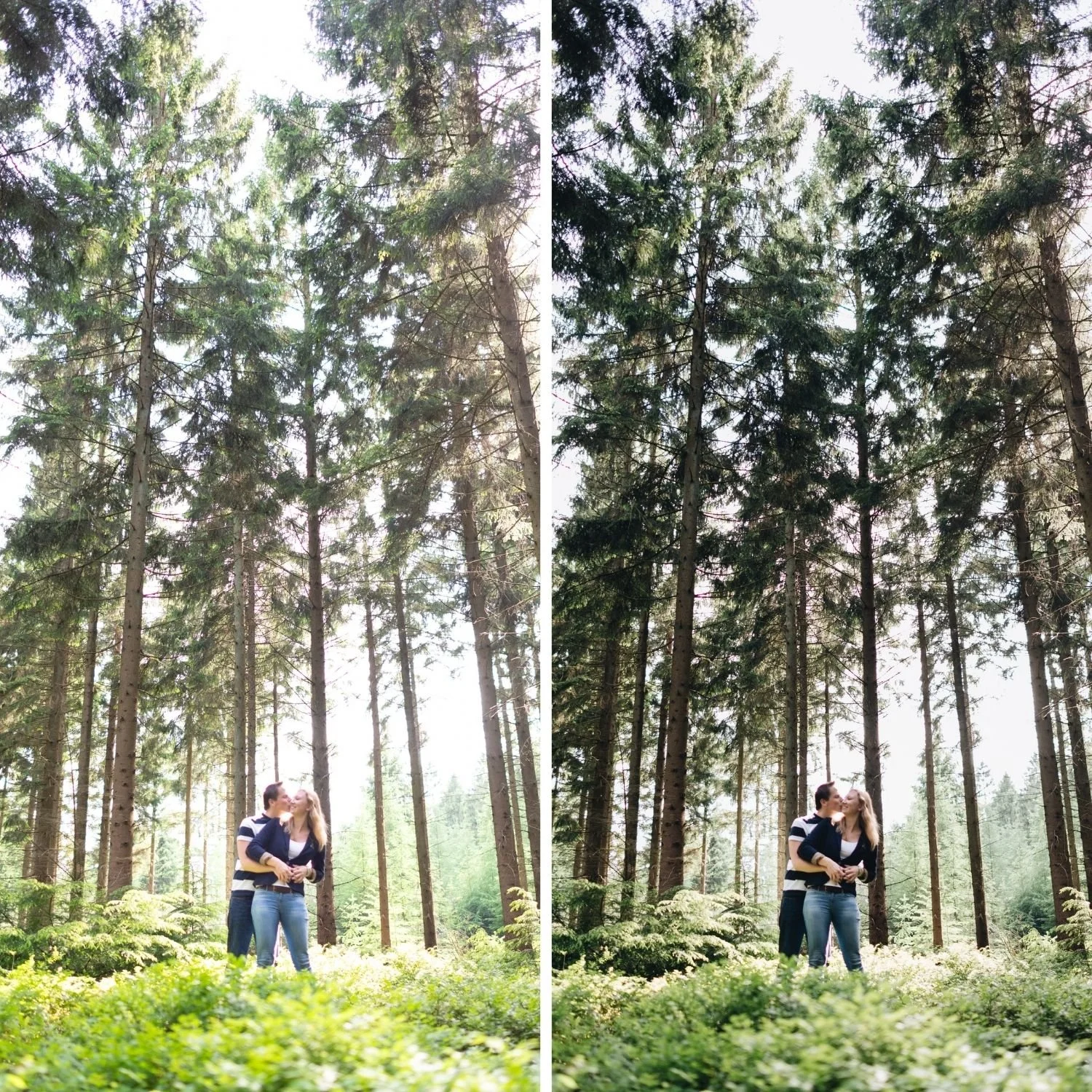
Everything above is available as a one click starting point. N1 Clean Modern and N2 Warm Modern from the Nostalgic Digicam Set apply this calibration directly, N1 as the neutral punchy version and N2 with additional warmth for outdoor content in warm light.
The set is $27 for four presets, or $6.75 individually. The other two presets in the set, P2 and P5, cover a warm instant film direction rather than the digicam aesthetic, which is a genuinely different look. Best Y2K Lightroom Presets covers the distinction between the two directions in detail.
FAQ
Why does my Y2K edit look like a normal bright photo rather than a digicam photo?
Most likely the highlights are still protected rather than clipping, and Clarity is at or below zero. Both need to run positive for the aesthetic to read as period accurate rather than simply bright.
Should I add grain to a Y2K edit?
Minimal or none. Grain is a film characteristic. Early digital cameras produced noise, which is structurally different. Reducing Noise Reduction into negative values introduces the correct texture if you want it.
Does this work on RAW files or only JPEG?
Both, and RAW gives more control over exactly where the highlights clip. The aesthetic itself does not require a JPEG, it requires the specific tonal and colour treatment described above.
Try the digicam calibration on your own photographs:
Download the free M5 preset as a warm starting point, then apply the Highlights, Clarity, and Vibrance adjustments above to move it toward the digicam direction manually.
For the calibrated version, N1 and N2 from the Nostalgic Digicam Setapply the full digicam treatment in one click at $6.75 per preset or $27 for the complete four preset set. TheStudio Archiveat $89 includes it alongside every other collection.
