Editing Instagram Photos in Lightroom Mobile
Editing Instagram Photos in Lightroom Mobile
Editing for Instagram has requirements that general photography editing does not. The photograph will be compressed by Instagram's upload pipeline. It will be viewed almost entirely on phone screens. It will sit in a grid alongside your other photographs where consistency matters more than individual optimisation. And it will be seen for roughly two seconds while someone scrolls past.
Editing with these constraints in mind produces better results than editing as though the photograph were destined for print and then uploading it and hoping the platform is kind to it.
The Feed Is the Unit, Not the Photograph
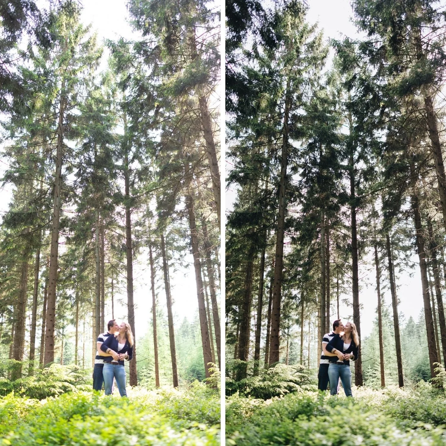
The single most important shift in Instagram editing is thinking about the grid rather than the individual image. A feed that reads as cohesive when viewed as a nine image grid communicates a clear visual identity immediately. A feed of individually excellent but inconsistently edited photographs communicates that the photographer has not settled on a perspective yet, regardless of how good any single image is.
Achieving this consistency requires the same discipline as any other gallery work: correct white balance to a target range before applying your preset, apply the same preset across photographs from the same lighting condition, and adjust Exposure per photograph rather than rebuilding the aesthetic on every image. The broader framework for this is covered in How to Build a Consistent Editing Workflow.
Step One: White Balance Before Anything Else
Phone auto white balance varies between shots. Two photographs taken thirty seconds apart in the same location can arrive in Lightroom with Temperature values 400 Kelvin apart, because the camera reassesses the scene for each frame. Applying the same preset to both produces visibly different results.
Set Temperature to a target range for the lighting condition before applying your preset. Outdoor daylight 5,200 to 5,500K. Overcast 5,500 to 6,200K. Indoor warm ambient 3,800 to 4,500K. This single habit does more for feed consistency than any other change you can make to your workflow.
Tint matters here too, particularly under LED lighting which frequently carries a green cast that Temperature alone does not address. Color Temperature vs Tint Deep Dive covers why both axes need setting independently.
Step Two: Apply Your Preset at Reduced Strength
Phone files have in camera processing already applied before they reach Lightroom. Apply presets at 80 to 85 percent strength for HEIC and JPEG files, and 85 to 92 percent for ProRAW.
In Lightroom Mobile, applying a preset displays an Amount slider that controls the strength of the application. The full mobile preset workflow including installation and organisation is covered in Best Film Presets for Lightroom Mobile.
Step Three: Exposure and Highlight Check
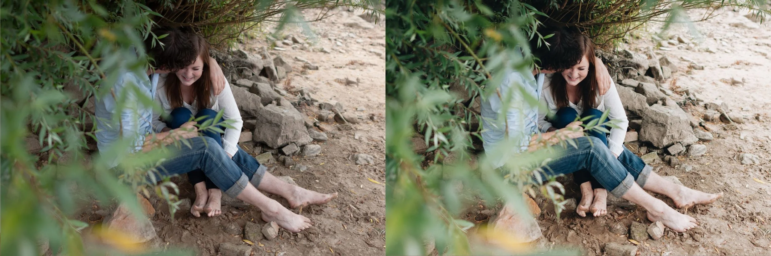
Adjust Exposure per photograph. Instagram viewing happens on bright phone screens in varied ambient light including outdoors, which means slightly brighter edits generally read better than slightly darker ones. Erring half a step bright is defensible for Instagram specifically in a way it would not be for print.
Check Highlights on every photograph. Phone HDR processing frequently leaves bright areas closer to clipping than the preview suggests, and Instagram compression is least forgiving in the brightest parts of an image where banding and artifacting appear first.
Step Four: Adjust for Compression
Instagram applies JPEG compression that is most visible in two specific places: smooth tonal gradients such as clear sky and skin, and fine high frequency detail such as film grain.
For gradients, slightly more tonal separation in the midtone range gives the compression algorithm more distinct values to work with, which reduces visible banding in large smooth areas. This does not mean adding heavy contrast, which creates its own problems, but a marginally more defined curve than you would use for a print version of the same photograph. How to Balance Contrast for a Soft Analog Look covers building tonal separation without introducing harshness.
For grain, moderate calibration survives compression better than either extreme. Grain Amount 14 to 20 with Size 22 to 30 tends to remain visible after upload without breaking into blocky artifacts. Very fine grain often disappears entirely during compression. Very coarse grain frequently degrades into visible blocks that look worse than no grain at all.
Step Five: Export at 1080 Pixels
Export at exactly 1080 pixels on the long edge. This is the width Instagram uses for display. Exporting at this exact dimension means Instagram does not resize your file, so its resizing algorithm is skipped entirely and Lightroom's substantially better resizing determines the final pixel data.
Set JPEG quality to 90 to 95 percent. Higher produces a larger file without visible benefit. Lower introduces artifacts before Instagram has even started compressing.
Set colour space to sRGB, since Instagram converts everything to sRGB regardless and performing the conversion yourself in Lightroom produces more predictable colour than letting Instagram do it.
Set output sharpening to Screen at Standard amount to compensate for the softness that resizing introduces.
For Android specific export considerations including the device level processing that some manufacturers apply during the handoff to Instagram, Android Instagram Export Settings covers the additional steps that avoid a second round of unwanted processing.
Step Six: Batch the Rest of the Set
For a shoot producing multiple Instagram posts, edit one photograph fully then use Copy Settings and Paste Settings to apply the same treatment to the rest of the set. Use the selective paste option to exclude Exposure and White Balance, keeping those as per photograph variables while everything else stays constant.
This is what keeps a week of scheduled content looking like it belongs together rather than like six separate editing sessions with different intentions.
What Not to Do
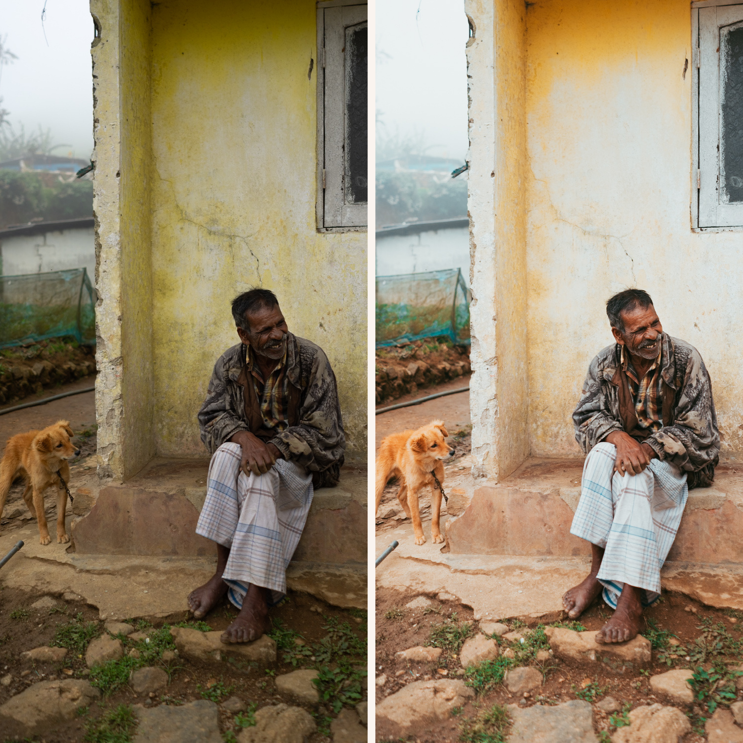
Do not edit each photograph to its individual maximum. A feed of individually optimised photographs reads as inconsistent even when every single image is good in isolation.
Do not push saturation for scroll stopping impact. Instagram compresses saturated areas more aggressively than restrained ones, and heavily saturated photographs degrade more visibly after upload.
Do not upload straight from Lightroom's share function on Android without exporting to the gallery first, as some device and Android version combinations apply additional processing during the direct share that undoes your export settings.
FAQ
What resolution should I export for Instagram?
1080 pixels on the long edge. Larger files get resized by Instagram using an algorithm that produces worse results than exporting at the target size from Lightroom.
Why does my photo look different after uploading?
Instagram compression, plus colour space conversion if you exported in anything other than sRGB. Exporting at 1080 in sRGB at 90 to 95 percent quality minimises both effects.
Should I edit differently for carousel posts?
Carousels use the same specifications as single images. Consistency across the images within a single carousel matters as much as consistency across the feed.
Build a consistent Instagram editing base:
Download the free Analog Film preset and apply it at 82 percent strength across a set of photographs to see how a consistent base produces feed cohesion.
For collections that suit social content specifically, the Bright and Clean Archive produces the clean bright quality that performs well on Instagram. The Studio Archive at $89 includes every collection.
