Kodachrome vs Portra: Which Film Look Do You Actually Want?
Kodachrome vs Portra: Which Film Look Do You Actually Want?
These two are the most requested film references in editing, and they are close to opposites. Photographers who ask for a film look without specifying which usually mean Portra, since that is the dominant aesthetic in current photography. Photographers who actually want Kodachrome and get a Portra style edit tend to find it flat and disappointing without being able to say why.
Understanding the difference resolves that, and it also explains why a single film preset cannot serve both.

The Fundamental Difference
Portra is a colour negative film. Kodachrome was a colour reversal, or slide, film. That technical distinction drives almost every visual difference between them.
Negative film had wide exposure latitude and a soft, forgiving response. Shadows never reached true black because of the film base density. Highlights rolled off gradually. Colour was restrained and skin rendered warm.
Slide film had narrow latitude and a contrasty response. Shadows went genuinely dark. Highlights clipped rather than rolling off. Colour was saturated and skin rendered accurately rather than flatteringly.
The Shadow Floor Is the Real Divide
If you only remember one technical difference between these two, make it this one.
Portra's lifted shadow floor comes from the physical base density of negative film. No matter how dark a scene was, the developed negative never reached zero density, so prints never reached true black. That soft floor is what makes Portra feel gentle, and it is why every Portra style preset lifts the Blacks slider.
Kodachrome, as a reversal film, projected directly. Dark areas were genuinely dark because there was no base density sitting between the light and the eye. Shadows reached black.
Every other difference between the two aesthetics, the contrast, the saturation, the skin rendering, sits on top of that structural difference. Get the shadow floor right and the rest follows more naturally. Get it wrong and no amount of colour adjustment produces the correct impression.
Testing Which One Your Photograph Wants
If you are unsure which direction suits a specific frame, there is a quick way to find out.
Apply a strong contrast increase and look at what happens to the shadows. If the photograph gains presence and the dark areas hold up, it can carry Kodachrome. If the shadows become blocky and detail disappears into black, the frame does not have the tonal information slide film emulation needs, and Portra logic will serve it better.
Then look at the colour. If reducing saturation makes the photograph feel calmer and more considered, go Portra. If it makes the photograph feel like something has been taken away, go Kodachrome.
This takes about thirty seconds per frame and is more reliable than deciding from the thumbnail.
The Third Option Most People Actually Want
Worth naming, since a meaningful share of photographers asking for one of these two actually want something else.
Aged Kodachrome, the warm faded quality of a slide that has sat in storage for forty years, is neither of the aesthetics above. It has Kodachrome's contrast structure with warmth and fading layered on top from dye degradation over decades.
If the reference image in your head is a scanned family slide from the seventies rather than a National Geographic spread from the same era, that is what you are picturing, and neither a clean Kodachrome edit nor a Portra edit will produce it. That sits in vintage or heritage preset territory instead.
Being clear about which of the three you want before starting saves the frustrating cycle of adjusting toward something you cannot quite reach because the underlying reference was never the one you were editing toward.
Side by Side
Contrast. Portra: low to moderate, soft. Kodachrome: high, punchy.
Blacks. Portra: lifted, never fully black. Kodachrome: genuine black.
Skin. Portra: warm, creamy, flattering. Kodachrome: accurate, slightly cool, documentary.
Reds. Portra: restrained, muted. Kodachrome: deep, saturated, dominant.
Blues. Portra: soft, slightly muted. Kodachrome: deep, rich, dark.
Greens. Portra: muted, organic. Kodachrome: richer, more present.
Overall impression. Portra: gentle, romantic, timeless. Kodachrome: bold, documentary, vivid.
Which Suits Which Photography
Portra suits portrait and wedding work, where warm flattering skin is the priority. Lifestyle and family photography, where the gentle register matches the emotional tone. Anything in soft or overcast light, where the low contrast rendering complements the ambient. Editorial work aiming for restraint.
Kodachrome suits travel and documentary photography, where strong colour is part of the subject. Landscape work with saturated natural colour. Street photography in bright, contrasty light. Architecture, particularly anything with painted or coloured surfaces. Any photograph where colour is doing compositional work.
The dividing question is straightforward: is the colour in your photograph something to soften, or something to celebrate? Portra softens. Kodachrome celebrates.
Why You Cannot Split the Difference
Photographers sometimes try to build a preset that is warm like Portra and saturated like Kodachrome. The result is usually neither, because the two aesthetics pull in genuinely incompatible directions on the shadow floor specifically.
Portra's lifted blacks are what create its softness. Kodachrome's genuine blacks are what create its punch. A middle position produces shadows that are neither soft nor deep, which reads as an incomplete edit rather than a considered aesthetic.
Pick one per photograph rather than blending them. How to Get the Kodachrome Look in Lightroom covers the full Kodachrome settings, and Portra Style Lightroom Presets covers the Portra direction.
Using Both Across a Body of Work
Nothing prevents using both aesthetics across different projects, provided they are not mixed within a single gallery.
A travel photographer might use Kodachrome for a documentary series in a colourful location and Portra for portrait work from the same trip. That is coherent, since the two bodies of work are visually distinct and clearly separated.
Mixing them within one gallery is not, since the shadow and colour behaviour differ enough that the set reads as inconsistently edited rather than deliberately varied. How to Edit a Full Shoot Consistently covers why consistency within a set matters more than variety.
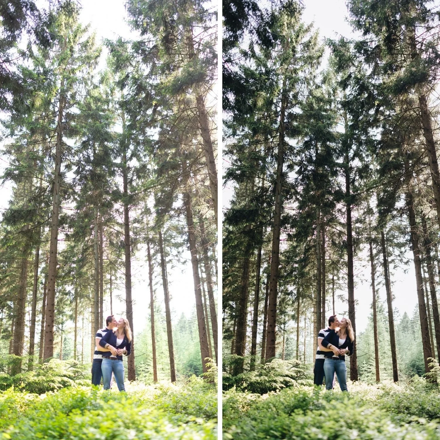
Which Collection for Which
The Chromatic Archive covers the Kodachrome slide film direction with its saturated, contrasty rendering.
For the Portra direction, warm skin and lifted shadows, the Essence and Vesper collections both sit in that register.
FAQ
Which is more popular right now?
Portra by a wide margin, since the soft warm aesthetic dominates current portrait and wedding photography. Kodachrome is having a resurgence in travel and documentary work.
Can I use a Kodachrome preset on portraits?
You can, and it produces a documentary rather than flattering result. For editorial or environmental portraiture that often suits the work. For traditional portrait or wedding photography, the accurate skin rendering is usually less desirable than Portra's warmth.
Which is easier to edit toward?
Portra, since most modern film presets already aim in that direction. Kodachrome requires deliberately reversing several standard film editing instincts, particularly the lifted shadow floor.
Try both directions on the same photograph:
Download the free Analog preset for the warm negative film direction, then apply the Kodachrome adjustments to a copy of the same file and compare them directly.
For the slide film direction, theChromatic Archiveapplies the full Kodachrome rendering. The Studio Archive at $89 includes both directions alongside every other collection.
