How to Get the Kodachrome Look in Lightroom
How to Get the Kodachrome Look in Lightroom
Most attempts at a Kodachrome edit start from a wrong assumption: that it was a warm, faded, nostalgic film. It was not. Kodachrome was a slide film with high contrast, deep saturation, and a very specific colour rendering that made it the standard for National Geographic and professional documentary work for decades.
Recreating it means understanding what it actually did, which in several respects runs opposite to the general warm film aesthetic most presets aim for.

What Kodachrome Actually Looked Like
Four properties made it recognisable, and none of them is warmth for its own sake.
Deep, rich reds. Kodachrome rendered red with a depth and saturation that no other film matched, which is why it became the film of choice for anything with strong colour in the frame. Red clothing, painted architecture, and flags photographed on Kodachrome have a density that other stocks flattened.
Cool, deep blues. Skies rendered dark and rich rather than bright and open. This is one of the most distinctive markers and the one most often missed, since general film editing tends to lift and mute blues rather than deepening them.
High contrast with genuine black. As a slide film, Kodachrome had a much narrower exposure latitude than colour negative film. Shadows went genuinely dark rather than carrying the lifted, soft floor that negative film produced. This is the single biggest departure from standard film preset logic.
Restrained, slightly cool skin. Skin rendered accurately rather than flatteringly warm, which is why Kodachrome portraits look documentary rather than romantic.
Why Standard Film Presets Get This Wrong
The dominant film aesthetic in editing today is built on colour negative film: lifted blacks, soft highlight roll off, warm skin, muted colour. That is Portra logic, and it is close to the inverse of Kodachrome on three of those four properties.
Apply a warm negative film preset to a photograph and call it Kodachrome, and you get something with lifted shadows, warm skin, and muted colour. That is a perfectly good film edit. It is not Kodachrome, and anyone familiar with the stock will see the difference immediately.
The correction is to stop lifting the blacks. Understanding Color Curves for Film Editingcovers the shadow point construction that most film editing relies on, and Kodachrome is the case where you deliberately do not apply it.
The Exact Settings
Contrast: positive 10 to positive 20. Higher than almost any other film emulation. Slide film was contrasty and the edit should be.
Blacks: 0 to negative 10. Not lifted. This is the most important single instruction here. Shadows should reach genuine black rather than sitting at a soft grey floor.
Highlights: negative 20 to negative 35. Protected, since slide film had limited highlight latitude and clipped rather than rolling off, but the goal is retaining detail rather than the soft compression a negative film edit aims for.
Red Saturation: positive 10 to positive 20. Increased rather than reduced. This is the defining Kodachrome adjustment and it runs opposite to nearly every other film preset.
Blue Saturation: positive 10 to positive 20, Blue Luminance: negative 10 to negative 20. Deeper, richer, darker blues. The Luminance reduction is what produces the characteristic dense sky rather than a bright open one.
Orange Saturation: 0 to negative 8, Orange Luminance: 0 to positive 8. Restrained. Skin should read accurate rather than warm.
Green Saturation: negative 5 to negative 15, Green Hue: 0 to positive 5. Modest reduction. Kodachrome greens were richer than most film emulation assumes, so the aggressive green reduction that outdoor film editing normally applies is too much here.
Grain: Amount 10 to 18, Size 18 to 26. Kodachrome was famously fine grained for its era. Heavy grain is a mismatch.
The Tone Curve
Build an S-curve with a genuine anchor at the bottom rather than a lifted shadow point. Shadow point at output 0 to 8, considerably lower than the output 15 to 22 that standard film editing uses. Pronounced midtone S-curve for the contrast slide film carried. Highlight point pulled to output 235 to 245, less aggressive compression than negative film emulation applies.
This curve looks wrong if you are used to building film curves, because it is doing close to the opposite thing. That is the point.
Checking Your Kodachrome Edit
Three checks tell you whether the edit has landed or drifted back toward standard film logic.
Look at the darkest area of the frame. It should read as genuinely black or very close to it. If there is a visible grey floor where the deepest shadow sits, the Blacks slider is still lifted and the edit will read as soft rather than punchy no matter what the colour is doing.
Look at any red in the frame. It should be the most present colour, dense and saturated rather than muted. If red is sitting quietly alongside everything else, Red Saturation needs pushing further.
Look at the sky if there is one. It should read deep and rich rather than bright and open. If it looks light and airy, Blue Luminance needs reducing.
Where the Warm Kodachrome Association Comes From
Worth addressing directly, since it causes most of the confusion.
The Kodachrome most people picture is not the film as it was shot. It is a scanned print or a slide that has aged, and Kodachrome slides aged in a particular way, with the dyes shifting warm over decades of storage.
That warm, faded quality is genuine and it is what a lot of people mean when they say Kodachrome. But it is the look of aged Kodachrome rather than fresh Kodachrome, and the two are meaningfully different. If the warm faded version is what you actually want, that sits closer to a vintage or heritage preset direction than to the saturated slide film rendering described here.
Deciding which of the two you are actually after before you start editing saves a lot of adjusting toward something you cannot quite name.
Which Photographs Suit It
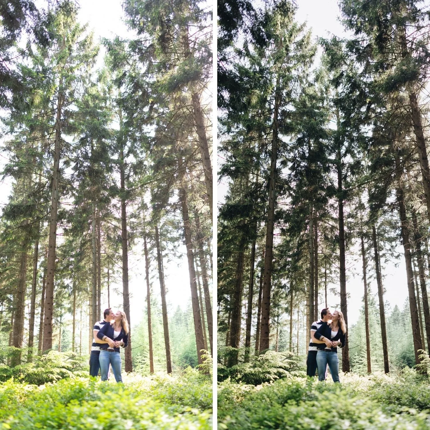
Kodachrome suits photographs with strong colour present in the frame: red architecture, vivid clothing, saturated landscape, anything where colour is doing compositional work rather than sitting quietly in the background.
It suits bright, contrasty light rather than soft overcast, since the high contrast rendering needs tonal separation to work with.
It works less well on soft portrait light, muted palettes, and overcast conditions, where the contrast and saturation have nothing to grip and the result reads as harsh rather than rich.
The Calibrated Version
The Chromatic Archive is built around this specific rendering rather than the general warm film direction. K1 Classic Kodachrome applies the full calibration, and K3 High Contrast Slide pushes the contrast and saturation further for photographs that carry it.
For landscape work specifically, where Kodachrome was historically most used, Best Film Presets for Landscape Photography covers how the Kodachrome direction compares against the muted organic approach that most landscape film editing takes.
FAQ
Was Kodachrome a warm film?
Not particularly. It was saturated and contrasty with deep reds and cool blues. The warm nostalgic association comes from faded prints and aged slides rather than from how the film actually rendered when fresh.
Why do my Kodachrome edits look flat?
Almost always lifted blacks. Standard film editing lifts the shadow floor, and Kodachrome specifically did not. Set Blacks to 0 or slightly negative.
Is Kodachrome the same as Ektachrome?
No. Both were slide films, but Ektachrome rendered cooler and less saturated, with a distinctive blue green cast that Kodachrome did not have.
Try the Kodachrome direction on your own photographs:
Download the free Analog presetas a comparison point, then apply the Red and Blue channel adjustments above to see how far the Kodachrome direction sits from standard warm film editing.
For the calibrated version, theChromatic Archiveapplies the full slide film rendering. TheStudio Archiveat $89 includes it alongside every other collection.
