Sony Colors vs Film Look — How to Soften Sony's Clinical Rendering (2026)
Sony Colors vs Film Look — How to Soften Sony's Clinical Rendering (2026)
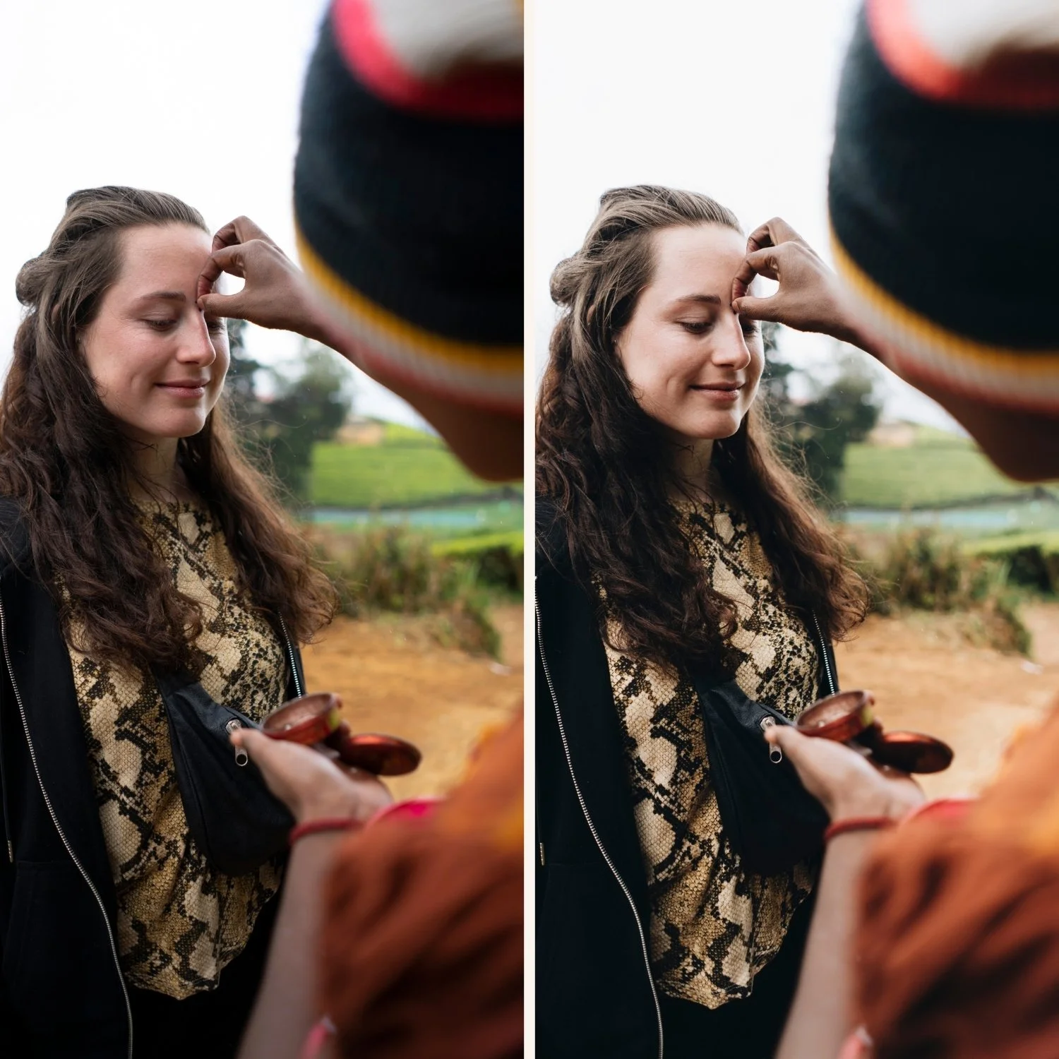
Sony cameras are technically impressive. The color is accurate. The dynamic range is excellent. The detail is sharp. And all of that precision is exactly the problem for photographers who want film quality — film is organic, slightly imprecise, and warm in a way that Sony's engineered accuracy is not.
Softening Sony's clinical rendering into natural film quality is entirely achievable in Lightroom. Here is how.
What "clinical" means in Sony color
Sony's color science prioritizes measurable accuracy. Colors render close to their actual spectral values. Skin tones are accurate rather than flattering. Greens are vivid and precise rather than warm and organic. Blues are clean and saturated rather than muted and deep.
This is excellent for product photography, scientific imaging, and any application where color accuracy matters. For film-style photography that references the imperfect warmth of analog — Sony's accuracy works against the aesthetic.
The solution is not to fight Sony's color science. It is to work with it by establishing a neutral base and adding the film character on top.
The five adjustments that soften Sony color
1. Camera Calibration: Camera Standard
This is the foundation. Adobe Color — the default — renders Sony files with more contrast and slightly more vivid color than Sony's actual rendering. Camera Standard in the Camera Calibration panel applies Sony's native color science and gives a more neutral, softened starting point.
2. Vibrance -10 to -15
Sony's vivid saturation is the most immediately recognizable characteristic that fights against film quality. Reducing Vibrance before applying any preset brings the starting point closer to the muted, organic color of film photography.
Do this before the preset — not after. The preset adds its own color character on top of the reduced base.
3. Clarity -8 to -12
Sony's sharp, high-micro-contrast rendering creates a crisp, precise quality. Negative Clarity reduces this micro-contrast and creates the softer, more organic edge quality of film photography.
For portrait photography on Sony: -12 to -15. For landscape and outdoor: -5 to -8.
4. Green and Blue softening
Sony's vivid greens and saturated blues are the most digital-looking aspects of outdoor Sony photography.
Green Hue: +10 to +15 toward yellow Green Saturation: -15 to -20 Blue Saturation: -8 to -12
These three adjustments transform Sony outdoor color from precise-digital to organic-film in one panel.
5. Shadow warmth
Sony's shadows render neutral to slightly cool. Film photography has warm shadows. Adding warm Color Grading to shadows adds the specific analog quality that Sony's accurate rendering lacks.
Color Grading, Shadows: hue 35-45, saturation 10-14.
Apply preset last, not first
The common mistake on Sony files is applying the film preset immediately and wondering why it does not look right. The preset is calibrated for a neutral starting point — Sony's vivid, high-contrast rendering is not neutral.
The five adjustments above create the neutral foundation. The preset then adds its film character at the right level. Apply in this order and Sony produces the best film quality of any major camera brand — the combination of Sony's technical excellence and well-calibrated film preset character is genuinely excellent.
Which presets work best with Sony's softened base
After the five adjustments above, any clean film preset works well. The Analog Film Archive A-Series is specifically calibrated for neutral color starting points — the clean, warm film quality adds exactly what Sony lacks without amplifying what it already has.
For warm atmospheric work: Vesper Archive V1 or V4. For portrait: Glow Portrait G1 — Orange Luminance adjusted for Sony's slightly cool skin rendering. For B&W: X Archive X1 — Sony converts to B&W with excellent tonal separation.
FAQ
Is Sony or Canon better for film look editing?
Different workflow, comparable results. Canon needs red reduction and warmth control. Sony needs Vibrance reduction and green adjustment. Fuji is easiest with its camera profiles. Sony with proper preparation produces film quality that matches or exceeds Canon.
Why does my Sony preset look too contrasty?
Sony's high-contrast rendering plus a preset that adds contrast creates stacked contrast. Reduce Contrast -15 to -20 before applying and check that the preset is not adding excessive Clarity.