Film Look Settings Explained in Simple Terms (2026)
Every adjustment in a film look edit has a specific purpose. Understanding what each one does — in plain language — makes you a better editor whether you use presets or edit manually. Here is every film look setting explained simply.
Basic panel settings
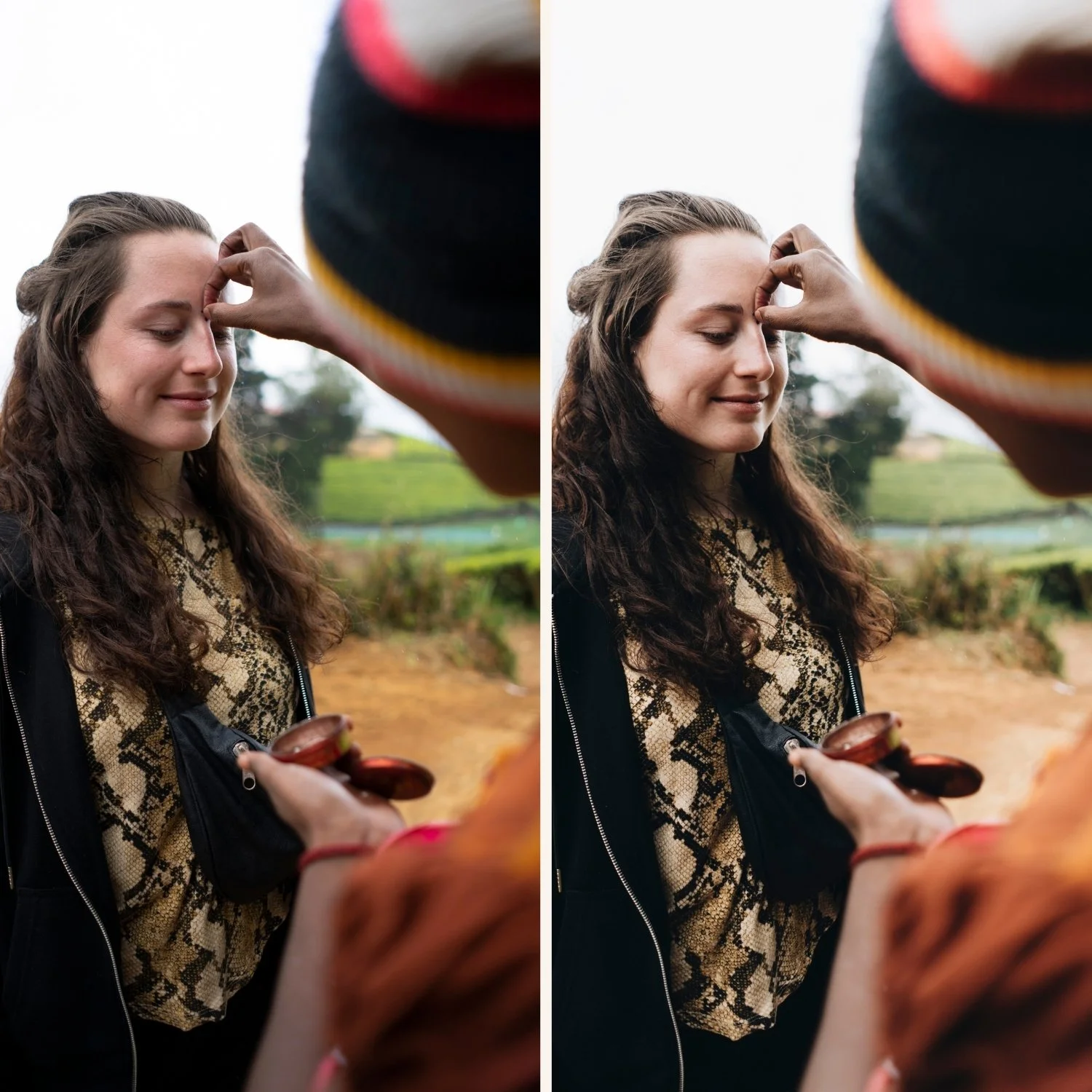
Blacks +20 to +30 This lifts the darkest areas of the photo from pure black to a slightly warm, lifted dark grey. Film photography never produced pure black — shadows always had subtle texture and warmth. This single adjustment is the most important for the film look.
Shadows +15 to +25 Opens the areas just above pure black — darker midtones and lower shadows. Combined with Blacks, this creates an open, airy quality in the shadow areas typical of film photography.
Highlights -25 to -40 Pulls back the brightest areas of the photo. Film highlights rolled off gradually rather than clipping sharply. This creates soft, detailed highlights with a glowing quality rather than harsh blown-out areas.
Whites -15 to -25 Protects the very brightest areas just before pure white. Film never clipped to pure white either — there was always a soft transition. Combined with Highlights, this creates the complete film highlight quality.
Contrast -10 to -15 Reduces the overall contrast of the photo. Film had softer, lower contrast than digital cameras. Too much contrast and photos look digital. The film look needs a slightly compressed tonal range.
Clarity -5 to -10 Reduces the micro-contrast — the fine edge sharpness throughout the photo. Negative Clarity creates the softer, more organic quality of film. Zero or positive Clarity looks sharp and digital.
Vibrance -10 to -15 Reduces the most saturated colors first. Film color was not vivid — it was organic and slightly muted. Vibrance targets vivid blues and greens most aggressively, which is exactly right for film emulation.
Tone Curve
Lifted black point In the Tone Curve, drag the bottom-left anchor point up 15-18 units. This creates the lifted shadow floor that is the most distinctive tonal characteristic of film. The shadow floor prevents pure black from ever appearing in the image.
Soft highlight ceiling Drag the top-right anchor point down 5-8 units. This creates the gradual highlight roll-off of film — bright areas compress before reaching maximum white rather than clipping sharply.
Color Mix (HSL) settings
Green Hue: +10 to +15 toward yellow Digital cameras render outdoor foliage as slightly neon, cyan-shifted green. Film rendered greens as warmer and more organic — yellow-olive rather than neon. This single adjustment transforms outdoor digital color to film color.
Green Saturation: -15 to -20 Reduces the vivid quality of digital greens. Film greens were muted and organic rather than vivid. This is the most important single Color Mix adjustment for outdoor photography.
Blue Saturation: -8 to -12 Film blues were softer and less saturated than digital blues. Reducing Blue Saturation creates the deeper, more natural sky quality of film photography.
Orange Luminance: +10 to +15 Brightens skin tones naturally without adding color. This is the most important Color Mix adjustment for portrait photography — creates the warm, natural skin brightness of film without adding orange.
Color Grading
Shadows: hue 35-45, saturation 12-16 This is the color science of classic film photography. Most film stocks rendered shadows with a warm amber quality — not neutral grey or cool blue like digital cameras. Adding warm amber Color Grading to shadows is the adjustment most responsible for the feeling of film warmth. Keep saturation below 18 — subtle is correct.
Highlights: neutral or very slight warm Film highlights were neutral to very slightly warm. Adding strong Color Grading to highlights creates an artificial quality. Keep highlights at neutral or add the smallest amount of warmth (hue 40, saturation 5 maximum).
Grain settings
Amount: 15-25 How visible the grain is. For subtle film quality: 15-18. For clearly visible film grain: 22-28.
Size: 22-28 The physical size of grain particles. Values below 20 create fine, almost invisible grain. Values above 35 create coarse, visible grain. Most film photography references sit at 22-28.
Roughness: 42-52 How irregular the grain pattern is. Below 40 creates uniform, artificial-looking grain. Above 40 creates the random, organic quality of real film grain. Always keep Roughness above 40.
Sharpening
Amount: 20-25 Lightroom's default sharpening is 40. For the film look, reduce to 20-25. High sharpening creates digital crispness that fights against the organic film quality. Lower sharpening creates softer, more natural edge rendering.
Why these settings work together
Each adjustment addresses one characteristic of digital photography that is different from film. Together they transform digital color into analog quality:
Lifted blacks + shadows → film shadow character
Highlights + whites + tone curve → film tonal quality
Vibrance + green + blue → film color character
Warm Color Grading in shadows → film warmth
Grain + lower sharpening → film texture
Apply all of them and the result reads as film. Apply any three or four and you get part of the way there. A film preset applies all of them simultaneously in one click.