Why Film Has Softer Contrast Than Digital
Why Film Has Softer Contrast Than Digital
The observation that film photography has softer contrast than digital is common and accurate. But simply reducing contrast in Lightroom does not produce the film quality. The contrast becomes lower, but it does not become film-like. Something is still missing. Understanding why film contrast is different — not just lower, but structurally different — is what allows you to recreate it correctly.
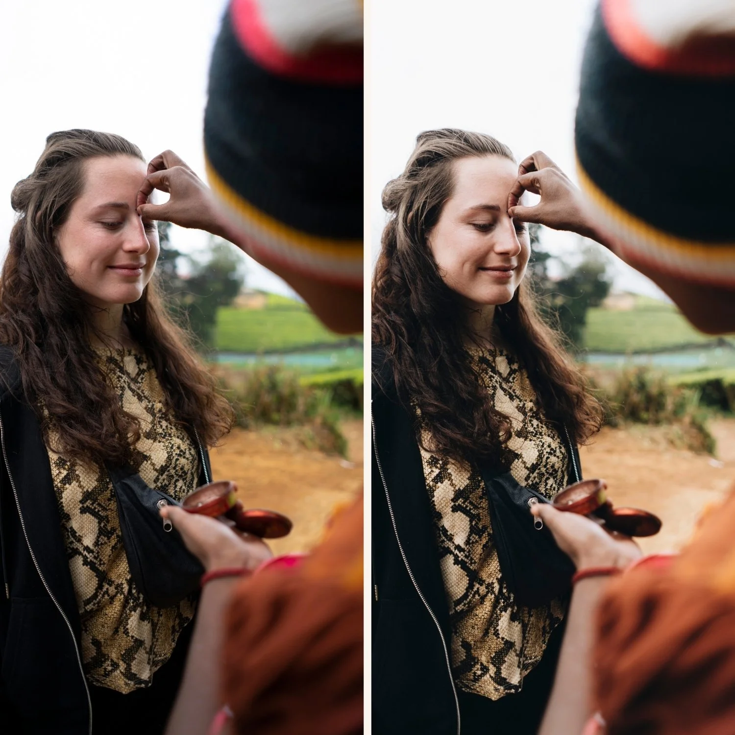
The Fundamental Difference: Linear vs Non-Linear Response
Digital sensors have a linear response to light. Within the exposure range of the sensor, each unit of additional light produces the same increase in output value. The relationship between the light hitting the sensor and the numerical value recorded is proportional and predictable. This linear response is technically accurate, and it is why digital photography captures highlight and shadow detail faithfully across a wide dynamic range.
Film emulsion has a non-linear response to light. The relationship between exposure and density is described by the characteristic curve — a mathematical representation of how the emulsion responds to increasing amounts of light. At the extremes of the exposure range, the curve flattens. In the shadow range, small increases in exposure produce relatively small increases in density. In the highlight range, the same effect occurs — the emulsion approaches its maximum density slowly, with diminishing returns at each additional stop of exposure.
This non-linear behavior is what produces the soft, gradual transitions at the extremes of the tonal range that photographers recognize as film contrast. The shadow areas and highlight areas compress rather than maintaining the linear proportionality of digital. The midtone range, where the characteristic curve is steepest, has more contrast than the extremes. The result is a tonal structure with natural, dimensional depth rather than the uniform tonal mapping of linear digital capture.
The Shoulder and Toe of the Characteristic Curve
Film photographers and technical photographers use the terms "shoulder" and "toe" to describe the flattening at the extremes of the characteristic curve.
The toe is the shadow end of the curve. The flattening of the response at the toe means that the darkest areas of a film photograph transition gradually from no density to measurable density. There is no abrupt start to shadow detail. This creates the shadow floor that film photographs have — the sense that shadows are deep but never completely absent.
The shoulder is the highlight end. The flattening at the shoulder means that highlights compress gradually as they approach maximum density. Instead of clipping abruptly, they roll off — becoming progressively less detailed but maintaining luminous quality rather than disappearing entirely into white. This is highlight roll-off, and it is a direct result of the shoulder of the characteristic curve.
Digital capture has neither a shoulder nor a toe in the same way. Within the linear range of the sensor, the response is flat and proportional. At the clipping point, it stops abruptly. There is no gradual flattening, only a hard limit. This is what gives digital highlights their harsh, clipped quality in high-contrast situations.
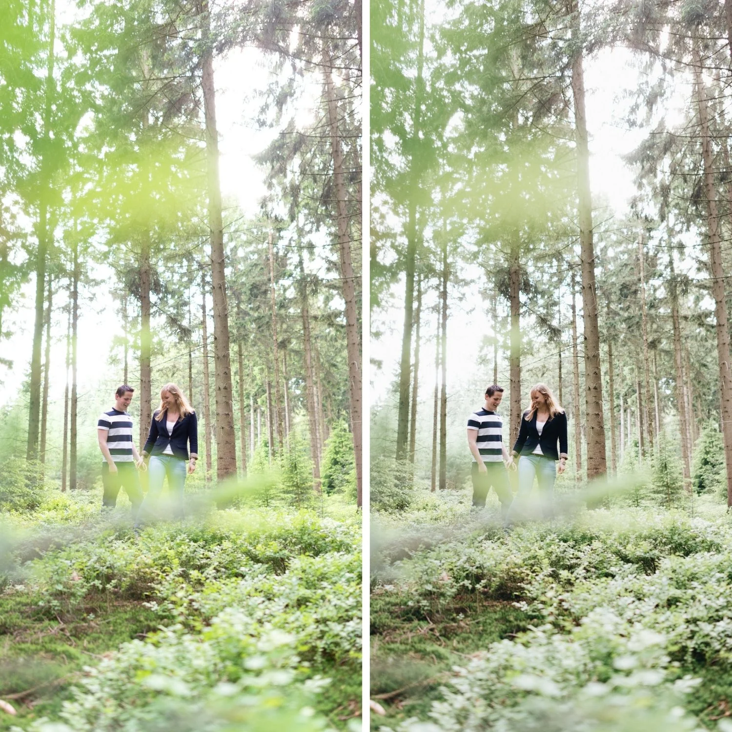
What This Means for Lightroom Editing
Recreating film contrast in Lightroom requires approximating the shape of the characteristic curve — specifically the shoulder and toe behavior — using the Tone Curve.
The toe is approximated by lifting the shadow point. In the Tone Curve Point Curve, move the bottom-left anchor point slightly upward. This maps the darkest input values to slightly lifted output values, creating the gradual transition from no detail to shadow depth that the toe produces.
The shoulder is approximated by pulling the highlight point slightly downward. Moving the top-right anchor point from maximum output to a slightly lower value creates the gradual compression in the highlight range that prevents clipping and produces luminous rather than absent highlights.
The midtone region is addressed with a gentle S-curve that adds the steeper-than-linear contrast in the midtones where the characteristic curve is at its most responsive. This adds the dimensional separation in the tonal ranges where subjects and skin tones live.
The global Contrast slider does none of this. It increases contrast linearly and uniformly — the opposite of the film characteristic curve's behavior. This is why reducing the Contrast slider and adding a soft Tone Curve produces results closer to film contrast, while increasing the Contrast slider makes photographs look more digital.
ISO and Contrast in Film Photography
Film contrast is also affected by ISO. Slower films (ISO 100-160) have steeper characteristic curves and more contrast in the midtone range. Faster films (ISO 400-800) have gentler curves and softer overall contrast. Pushed film — rated at a higher ISO than its nominal rating — has increased contrast from the extended development.
For Lightroom editing, this means that the "correct" amount of film contrast varies depending on which film stock is being referenced. A Portra 400 aesthetic has gently soft contrast. A Kodachrome aesthetic has more midtone punch. A pushed Tri-X black and white aesthetic has strong, gritty contrast. Each requires a differently shaped Tone Curve to reference the specific film's characteristic curve behavior.
FAQ
Does shooting on film actually produce less contrast than digital?
Film does not have lower contrast in absolute terms — it has different contrast structure. Slow film stocks in bright light can produce very contrasty results. The difference is the gradual behavior at the extremes rather than the overall contrast level.
Why does just reducing the Contrast slider not produce the film look?
The Contrast slider reduces contrast uniformly — it brings highlights and shadows closer together but does not create the toe and shoulder behavior of film. The result is lower contrast but not film-like structure. The Tone Curve can approximate the toe and shoulder behavior that the Contrast slider cannot.
Is the non-linear response of film a design choice or an accident of chemistry?
Both. The chemistry of silver halide emulsions naturally produces a non-linear response. Film manufacturers refined this behavior over decades, deliberately engineering the shoulder and toe characteristics of specific stocks to produce desired tonal properties. Portra's gentle shoulder was specifically designed for portrait and wedding work.
Try the soft film contrast on your own photos:
Download the free Analog Film preset and examine the Tone Curve to see the shoulder and toe approximation in a calibrated context.
For a deeper understanding of the Tone Curve technique, Understanding Color Curves for Film Editing covers the specific point curve shapes that recreate film contrast behavior. For the complete contrast approach, How to Balance Contrast for a Soft Analog Look applies these principles to the full editing workflow.
