Portrait Film Look Case Study
Portrait Film Look Case Study
Portrait photography is where film editing is most demanding and most rewarding. Getting skin tones right within a film palette requires more precision than travel or landscape editing. But when it works — warm, dimensional skin, soft highlights, organic grain — film portrait editing produces results that digital processing cannot replicate.
This case study covers a complete portrait edit from RAW file to finished film look, with specific reasoning behind every adjustment.
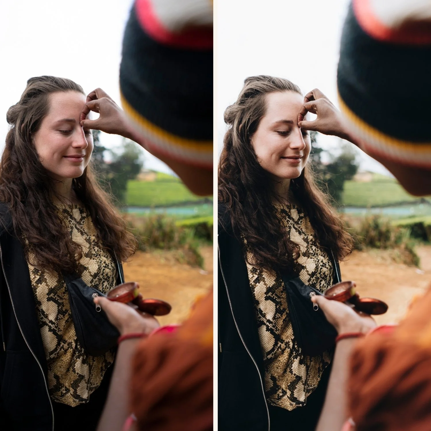
The Starting Photograph
Scenario: outdoor portrait of a woman in late afternoon light, approximately 5:00 PM in summer. Shot on Canon mirrorless RAW. The light is warm and directional — not golden hour, but the warmth is already strong in the ambient. The subject has medium-warm skin tones.
Starting file conditions: correctly exposed, slightly vivid digital color rendering. The Canon color science produces warmer-than-neutral results, which means less Temperature correction is needed but Orange Saturation management is critical. Skin reads digital — warm but with the flat orange quality of unprocessed Canon RAW in warm light.
Goal: warm, dimensional portrait in the Portra-style film aesthetic. Skin should be golden, warm, and present — not orange, not flat. Highlights on the face should roll off softly. The overall quality should feel like afternoon light on film.
Step 1: Exposure Assessment
Before any color work, assess the tonal range. Canon files in warm afternoon light often have slightly elevated highlights from the warm ambient — the bright areas of skin, white clothing, and background can be approaching clipping.
Highlights: -30. A meaningful reduction to protect facial highlights and the warm sky.
Whites: -15. Prevent the very brightest values from clipping when warmth is added.
Shadows: -10. Preserve shadow depth rather than lifting. Lifting shadows before applying a film preset produces flat, muddy results in the shadow areas of the face.
Blacks: +8. The shadow floor lift.
Exposure: 0. Correctly exposed.
Step 2: White Balance for Portrait-Specific Warmth
Canon's warm color science means the baseline is already warmer than Sony or Nikon files. For the warm portrait direction:
Temperature: 5,300K. Canon files at this Temperature read as warm-neutral rather than the cool-neutral that Sony files at the same setting would produce. The starting warmth is built into Canon's rendering.
Tint: +6. A moderate Tint push toward magenta. For portrait photography specifically, Tint has a significant effect on skin — a small positive Tint lifts the warmth and luminosity of skin in a way that Temperature alone cannot. At Tint 0 or negative, even warm-Temperature skin can look slightly olive.
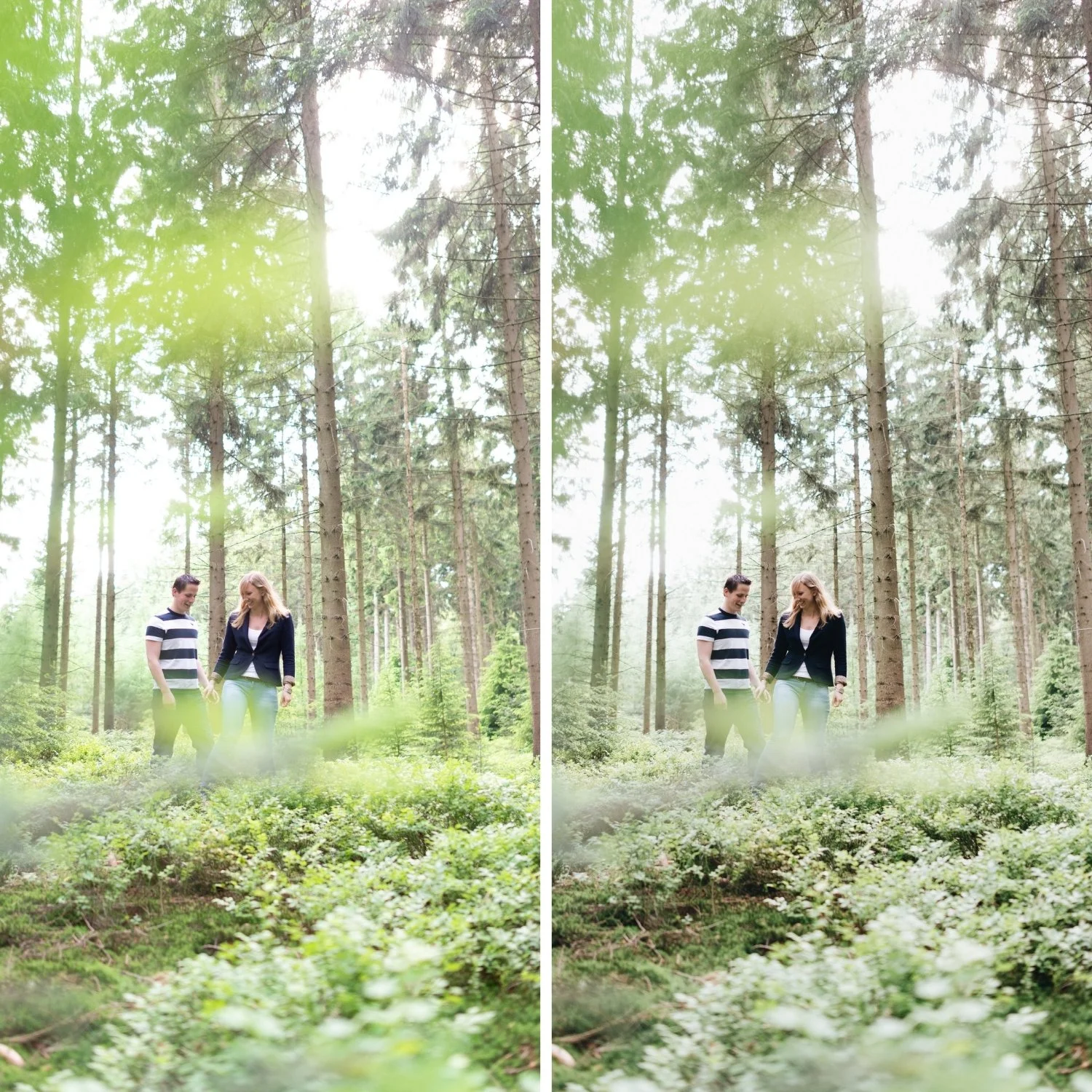
Step 3: Contrast Structure
Contrast: -15. Removing digital punch as the first step.
Tone Curve: This is the portrait-specific curve — softer in the midtones than a landscape curve to preserve smooth skin transitions.
Shadow point: output 18. Lifted shadow floor.
Lower midtone control point: input 65, output 58. Gentle downward displacement — less aggressive than landscape editing because the lower midtones in a portrait often contain facial shadow areas where over-compression creates harsh cheekbone shadows.
Upper midtone control point: input 188, output 202. Gentle upward displacement for the facial highlight range.
Highlight point: output 222. Protected highlights with soft roll-off.
The portrait Tone Curve is more conservative throughout than a landscape curve. The midtone range where skin lives needs smooth transitions, not contrast punching.
Step 4: The Critical HSL Adjustments for Skin
Orange Saturation: -18. Canon files in warm afternoon light push orange skin hard. This reduction is the most important single adjustment in the portrait edit.
Orange Luminance: +12. The compensating luminance lift that keeps skin bright and present within the muted saturation. Without this, the Saturation reduction makes skin appear slightly flat or muddy.
Red Saturation: -10. Prevents the warm direct light from creating a reddish quality in the brightest skin areas — cheeks, nose, forehead in afternoon light.
Red Luminance: +6. Keeps warm facial areas bright rather than having them darken when Red Saturation is reduced.
Green Saturation: -18, Green Hue +6. For outdoor portrait backgrounds — vegetation, grass, outdoor environments. The subject skin is not in the Green channel, but the background is.
Yellow Saturation: -10. Manages the slightly yellow quality that warm skin in warm light can develop when Temperature and warm Color Grading are combined.
Blue Saturation: -12. Sky and background.
Step 5: Color Grading for Portrait Film Quality
Highlight Hue 44, Saturation 8. The golden quality in skin highlights — the specific warmth that makes film portraits look luminous rather than digital. The highlights on cheekbones and the brightest skin areas pick up this golden warmth.
Shadow Hue 30, Saturation 4. Very subtle warm shadow direction. For portrait work, cool shadow grading can create an unflattering blue-grey quality in facial shadows. A warm direction keeps shadows within the skin tone family — dimensional depth that stays warm.
Blending: 55. Ensures smooth transitions between the highlight and shadow grading without harsh banding across the midtone skin range.
Midtone Color Grading: Saturation 2, Hue 42. Minimal — just a touch of warmth in the midtones to tie the highlights and shadows together. Heavy Midtone Color Grading shifts skin tones globally and is one of the most common causes of unnatural portrait color.
Step 6: Finishing
Clarity: -12. Portrait-specific — more negative than travel or landscape editing. The softness in the midtone detail structure is part of the film portrait quality.
Texture: -5. Further softening of fine detail in the portrait-specific range.
Grain: Amount 16, Size 24, Roughness 50. Portrait grain calibration — finer and less prominent than travel or street photography grain. The organic texture should add quality without being visible on skin at normal viewing sizes.
Checking the Final Result
With the adjustments complete, check five things. Skin in the highlights should read as golden and luminous — not orange, not yellow. Skin in the shadow areas should read as warm and present — not blue-grey, not flat. The transition from highlight to shadow across facial planes should be smooth — not harsh or banded. Background elements (vegetation, sky) should read as organic rather than vivid. The overall quality should feel like the best version of the starting photograph, not like a filter was applied.
FAQ
Why is Orange Luminance important alongside Orange Saturation?
Reducing Orange Saturation alone flattens the appearance of warm skin — it becomes less vivid but also less luminous. Increasing Orange Luminance compensates by lifting the brightness of the orange range, keeping skin warm-looking and present without the oversaturation.
Does this workflow work for all skin tones?
The structure is the same, but the values vary. For darker skin tones, increase Orange Luminance more (+15 to +20) and be less aggressive with Orange Saturation reduction (-8 to -14). For lighter skin tones, the Orange Saturation reduction can be more aggressive.
How do I handle portraits with multiple subjects who have different skin tones?
Apply the single-subject calibration first, then use local adjustments (Radial Gradients) to make per-subject corrections. Calibrate for the primary subject in the overall edit, and correct secondary subjects locally.
Apply the portrait film approach to your own photos:
Download the free Analog Film presetas a starting point and apply the portrait-specific HSL adjustments described above.
For portrait-specific preset collections built around this skin-first approach, the Essence Archiveand the Glow Portrait Archive are both calibrated for portrait work. For skin tone fundamentals, How to Edit Natural Skin Tones covers the complete approach.
