Best Lightroom Presets for Landscape Photography 2026
Best Lightroom Presets for Landscape Photography 2026
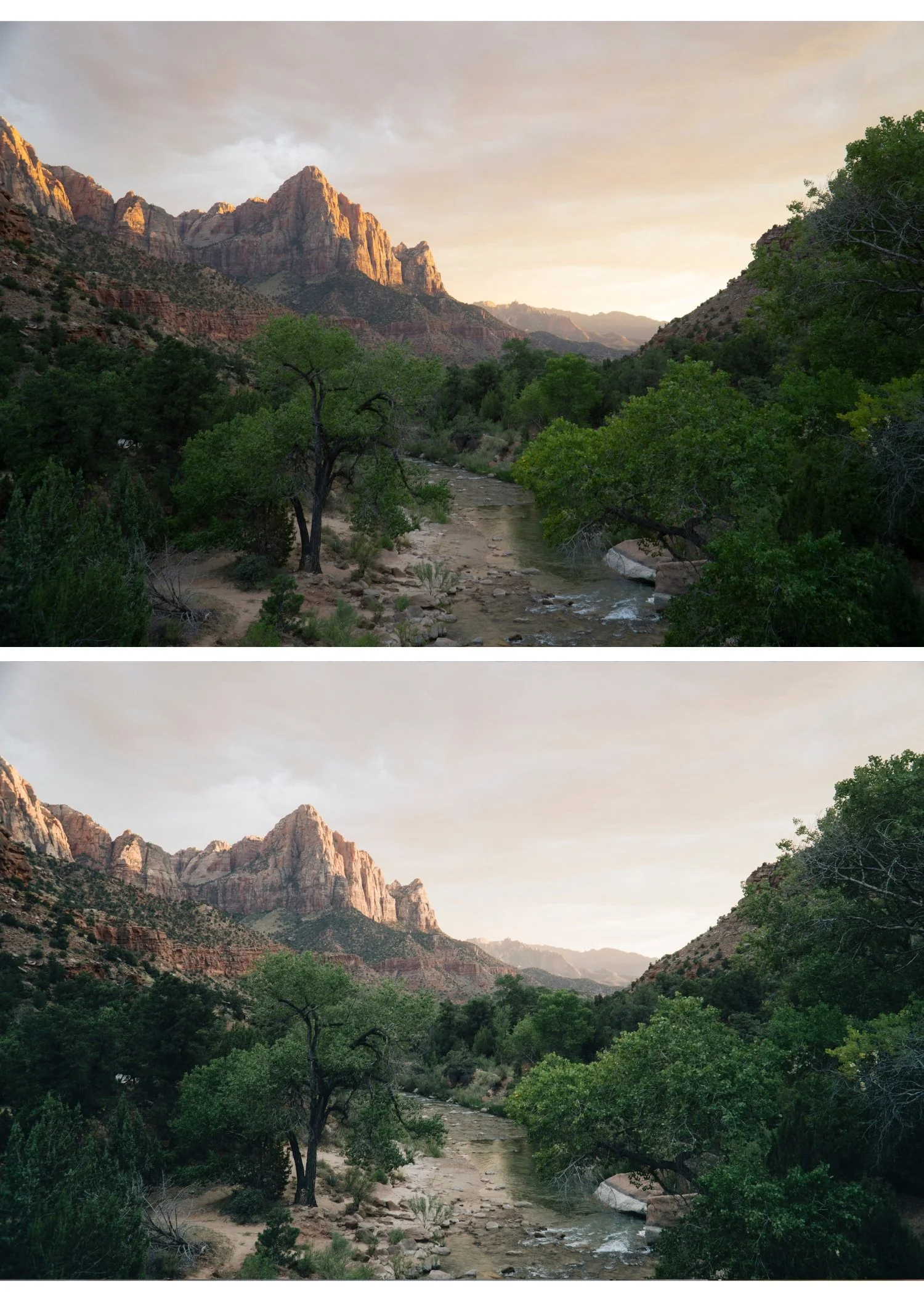
Landscape photography editing has one defining technical challenge: greens. Digital cameras render outdoor foliage, grass, and trees as vivid, slightly neon green that looks nothing like how the human eye perceives natural environments. The best landscape presets solve this first, then add the film character on top.
Every element of a landscape frame is visible and specific. A portrait has a primary subject and a supporting background. A landscape has sky, foreground, midground, vegetation, water, and stone all simultaneously present, all requiring correct rendering. A preset that handles sky beautifully but makes vegetation neon, or produces organic foliage but makes sky electric, fails as a landscape preset regardless of any other quality.
The Green Problem in Landscape Editing
Digital green has a blue shifted, overly vivid quality compared to real foliage, and it is the primary reason landscape photographs read as digital rather than organic. The fix is consistent across almost every landscape scenario.
Green Hue: shift toward yellow, positive 10 to positive 15. This moves the colour from digital cyan green toward organic yellow green. Green Saturation: negative 15 to negative 20, reducing the vivid oversaturation of digital foliage. Yellow Saturation: negative 5 to negative 10, which quiets the yellow green interaction at the edges of vegetation.
These three adjustments take thirty seconds and transform landscape photos from digital to organic before any preset is applied. For very bright summer conditions where vegetation sits at peak saturation, push Green Saturation further, to negative 25 or beyond. For overcast or autumn conditions, negative 10 to negative 15 is usually sufficient, since the vegetation itself is already less saturated.
The underlying reason digital and film render greens so differently, and why this correction works, is covered in Film vs Digital Color Science Explained.
Best Presets by Landscape Scenario
Golden hour landscapes. California Archive C7 Rich Warm or C8 Sun-Drenched. Both enhance the warm golden quality of late day light while protecting sky highlights. Vesper V5 Golden Velvet for a richer, more film-like golden quality.
Overcast and moody landscapes. Moody Film Archive M4 Cool Matte or M5 Editorial Depth for dramatic, atmospheric quality. M4 suits the flat, diffused light of overcast conditions specifically, where its cooler precision complements the ambient. M5 produces the strongest tonal separation and suits landscapes with some directional light still present. Analog Film Archive A3 Heritage Fade works for a softer, gentler moody quality.
Coastal and seascape. California Archive C4 Cool Outdoor or Summer Archive H4 Coastal Summer. Both enhance the cool blue quality of coastal light. Pull Highlights to negative 40 through negative 50 for water and sky, which clip faster than any other landscape element.
Mountain and alpine. Analog Film Archive A6 or A1 for clean, natural mountain colour. The clean minimal quality suits alpine environments where the grandeur of the scene should carry the photograph rather than a heavy colour treatment.
Forest and woodland. Analog Film Archive A3 or Vesper V3 Vintage Warm. After applying, shift Green Hue a further positive 5 toward yellow and reduce Green Saturation an additional negative 10, since woodland canopy light concentrates green more heavily than open landscape does.
Desert and arid. California Archive C5 Summer Warm or C7 Rich Warm. Warm, earthy tones enhance the red gold quality of desert environments. Reduce Orange Saturation slightly, negative 5, to prevent sandy colour from tipping too vivid.
Sky Handling in Landscape Presets
Sky is a dominant element in most landscape photographs and it needs specific attention beyond the general preset application
For blue sky, pull Highlights to negative 40 through negative 50 before applying any preset. After applying, check Blue Saturation. If the sky reads oversaturated, reduce Blue Saturation by a further negative 10 to negative 15 in the Color Mix panel, since digital sky saturation in good light consistently pushes beyond what the same sky looked like on film.
Clouds in bright sky clip quickly. Pull Whites to negative 20 through negative 30 to preserve cloud texture and detail.
For golden hour sky specifically, pull Highlights to negative 35 through negative 45. The warm preset adds warmth on top, but the sky detail needs protecting first or the warmth has nothing to work with.
Overcast grey sky adds no visual interest and is worth cropping out where composition allows. If it must stay in frame, darken it slightly with a gradient mask rather than leaving it as a flat, competing element.
Contrast Structure for Landscape Depth
Landscape photography benefits from more midtone contrast than portrait photography, because landscape subjects are less sensitive to harsh midtone rendering and more dependent on tonal separation for a sense of three dimensional depth. A mountain range receding into atmospheric haze, a forest floor with directional light filtering through canopy, and a coastal scene with waves and cliffs in the same frame all need dimensional tonal separation to read as three dimensional rather than flat.
The Tone Curve should carry a slightly more pronounced midtone S-curve than a portrait preset would use, while maintaining the same protected highlight point and lifted shadow floor described above. The upper midtone lift adds tonal dimension. The shadow floor lift preserves detail in the dark areas that directional outdoor light creates, particularly under canopy or in the shadow side of mountain terrain. How to Balance Contrast for a Soft Analog Look covers the specific curve construction in more detail.
Beyond Colour: Kodachrome and Black and White Landscape
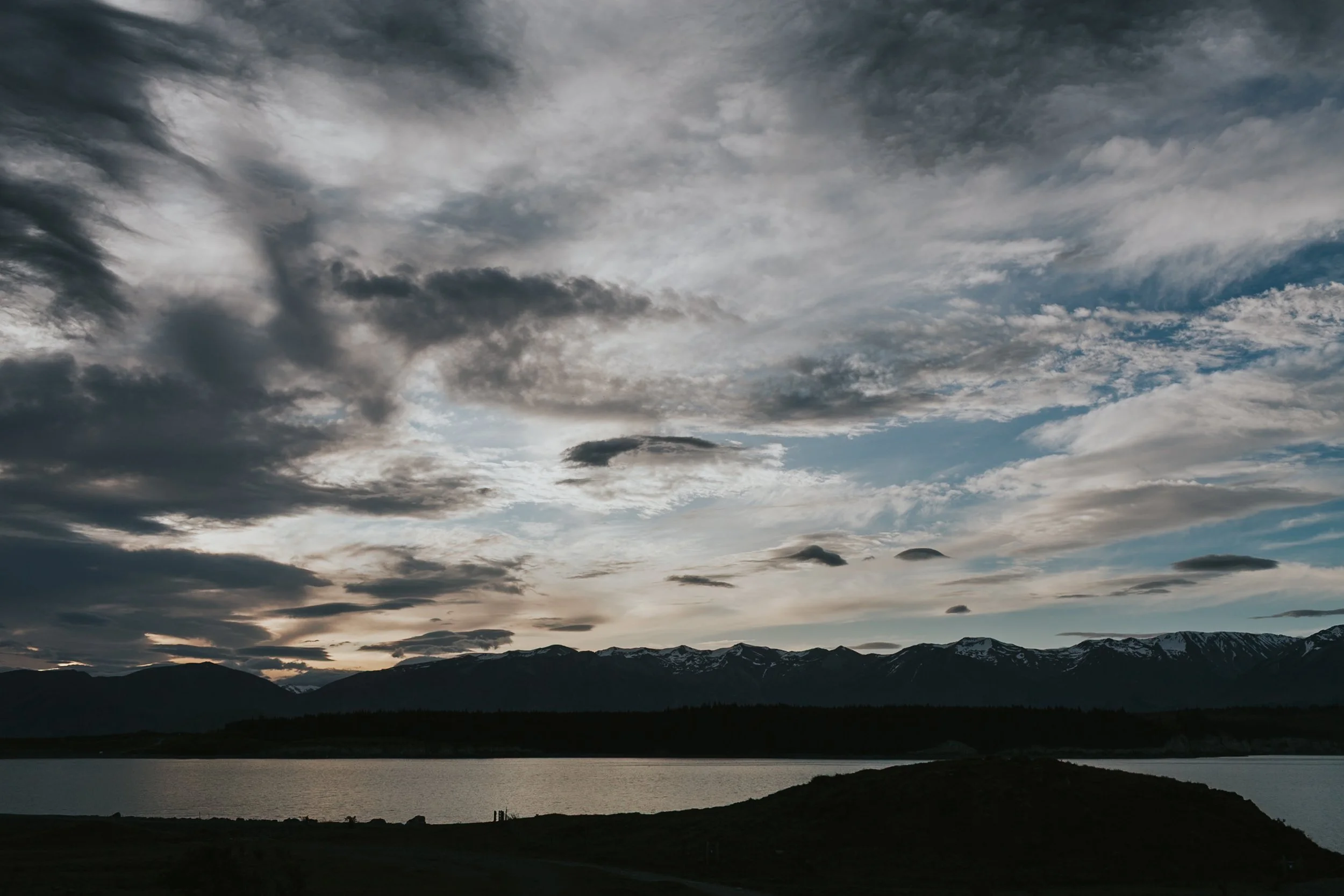
Not every landscape direction is warm and organic. For landscape photographers who want more colour presence than the muted, film accurate direction offers, the Chromatic Archive references Kodachrome slide film, historically the most widely used film for landscape and nature photography precisely because its rendering made natural environments look vivid and present rather than muted. K1 Classic Kodachrome and K3 High Contrast Slide are the most landscape appropriate options in that collection.
For black and white landscape work, the X Archive X1 Dramatic Base and X3 High Key Dramatic provide the strong tonal separation and expressive grain that the black and white landscape tradition requires, referencing the zone system heritage of classic landscape photography.
Seasonal Variation in Landscape Editing
Landscape photography has seasonal editing requirements that most other genres do not share to the same degree. Winter editing needs specific Blue channel management to prevent snow from shifting toward cyan, alongside careful contrast work to add dimension to scenes that naturally have low colour contrast between white foreground and grey sky. Summer editing needs the most aggressive green channel management, since vegetation sits at peak saturation exactly when most landscape photography happens. Autumn editing needs to preserve the orange and yellow tones of foliage without pushing them into the over orange territory that reads as processed rather than photographed.
Why This Differs by Camera Brand
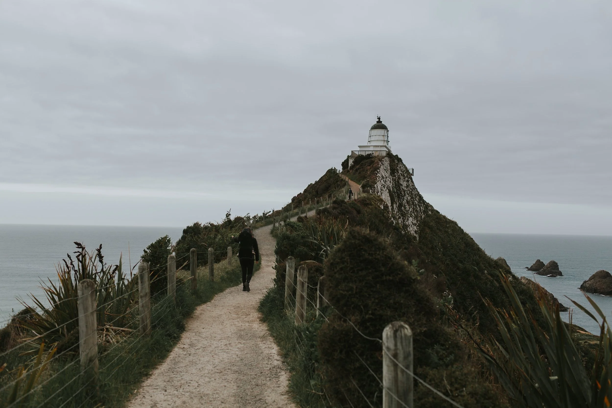
The green correction values above are a reliable starting point, but the exact amount needed varies by camera system. Sony renders outdoor greens with a more blue shifted quality than Canon or Nikon, which means Sony files typically need a more aggressive Green Hue correction toward yellow, sometimes an additional positive 5 beyond the ranges given here. Canon and Nikon greens start closer to organic and need comparatively less correction. How to Get the Film Look on Any Camera covers the per brand calibration differences in full.
The California Archive for Landscapes
The California Archive is the most directly appropriate collection for warm outdoor landscape photography, covering nine presets across the full range from clean daylight through warm golden and bold coastal colour. The warm outdoor calibration handles the highlight protection and colour management that golden hour and desert landscape work specifically requires.
For a complete seasonal and stylistic range beyond warm outdoor work, the Studio Archive at $89 provides the full set needed for landscape photography across every season and lighting condition alongside every other collection.
FAQ
Why do my landscape photos look too green after applying a preset?
Digital cameras oversaturate greens before any preset is even applied. Shift Green Hue toward yellow, positive 10 to positive 15, and reduce Green Saturation, negative 15 to negative 20, in the Color Mix panel after applying the preset.
What is the best preset for golden hour landscape photography?
California C7 Rich Warm or Vesper V5 Golden Velvet. Both are calibrated for warm late day outdoor light with highlight protection built in, which matters because golden hour skies clip faster than the light itself suggests.
Why does my landscape photography look more digital than my portrait photography edited with the same preset?
Landscape photography contains large areas of green and blue that digital cameras render more vividly than film. A preset calibrated primarily for portraits manages the Orange channel for skin but may not reduce Green and Blue specifically enough for outdoor scenes. Add the Green and Blue Saturation reductions described above on top of whatever preset you are using.
Should I use a polarizing filter instead of editing Blue Saturation in post?
A polarizing filter reduces reflections and increases perceived contrast at the point of capture, particularly for skies and water. Post processing Blue Saturation reduction addresses a related but different part of the digital sky problem. Both are useful and worth using together rather than choosing one over the other.
Try the landscape approach on your own outdoor photographs:
Download the free Analog Film preset and apply the Green Hue and Saturation correction described above to see the specific impact of the single most important landscape adjustment.
For a complete warm outdoor landscape system, the California Archive covers nine presets across the full golden hour and coastal range. The Studio Archive at $89 includes it alongside every other collection referenced in this guide.
Related guides:
