Real Film Look Editing Breakdowns
Real Film Look Editing Breakdowns
Understanding film editing in the abstract is useful. Seeing it applied to specific photographs with specific adjustments is more useful. This guide breaks down five editing scenarios — different subjects, different lighting conditions, different starting points — with the exact Lightroom settings that produce the film look in each case.
Each breakdown follows the same structure: starting file conditions, the goal, and the exact adjustments in order. Read through all five to understand how the core principles apply differently depending on the photograph.
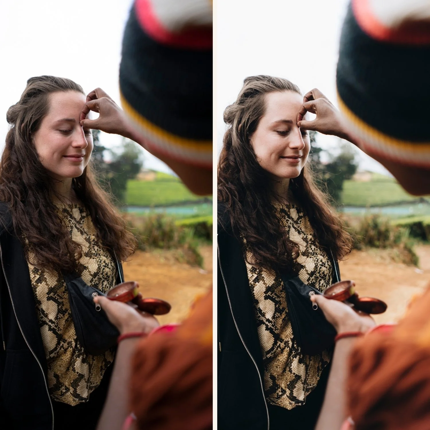
Breakdown 1: Portrait in Warm Afternoon Light
Starting conditions: Portrait photograph in direct afternoon sun, 4:00 PM. Camera RAW file. Exposure correct. Skin reads digital — vivid orange and slightly harsh from the direct sunlight.
Goal: Warm, organic film portrait. Skin should read golden and present rather than orange. Highlights should have soft roll-off. The warmth should feel like the light rather than a filter.
Adjustments in order:
White balance: Temperature 5,300K, Tint +7. The warm afternoon light is already doing the temperature work — the preset is not fighting it, just correcting the Tint toward natural.
Exposure: -0.1. Highlights: -30. Whites: -15. Shadows: -10. Blacks: +8. The Blacks lift creates the shadow floor without lifting shadows generally.
Contrast: -10. Tone Curve: shadow point lifted to output 18, gentle upper-midtone lift at input 190, highlight point pulled to output 230. This is the soft S-curve with protected highlights and lifted shadow floor.
HSL: Green Saturation -20, Green Hue +8 toward yellow. Orange Saturation -15, Orange Luminance +10. Red Saturation -8. Yellow Saturation -10. Blue Saturation -12.
Color Grading: Highlight Hue 45, Saturation 8. Shadow Hue 28, Saturation 4.
Clarity: -8. Grain: Amount 18, Size 26, Roughness 52.
Result: Warm, dimensional portrait with golden highlights, natural skin, and organic film character.
Breakdown 2: Overcast Travel Photography
Starting conditions: Travel street photography in overcast conditions. The image is flat — diffuse lighting with no directional contrast and a cool grey cast. Correctly exposed.
Goal: Warm, considered travel photograph with the timeless travel aesthetic. The flatness needs tonal separation added through the curve. The cool cast needs warm correction.
Adjustments in order:
White balance: Temperature 5,700K, Tint +10. Overcast light is cool and often slightly green. Both sliders needed to reach warm-neutral.
Exposure: +0.2. Highlights: -20. Whites: -10. Shadows: -5. Blacks: +5.
Contrast: -15. Tone Curve: more pronounced curve than the portrait scenario to compensate for the flat ambient. Shadow point at output 15. Lower midtone control point at input 70, output 60. Upper midtone control point at input 185, output 200. Highlight point at output 225.
HSL: Green Saturation -18, Green Hue +6. Orange Saturation -12, Orange Luminance +8. Blue Saturation -15, Blue Hue -5 (slightly away from cyan). Yellow Saturation -8.
Color Grading: Highlight Hue 42, Saturation 10. Shadow Hue 215, Saturation 5.
Clarity: -5. Grain: Amount 20, Size 28, Roughness 55.
Result: Warm, dimensional travel photograph with the considered tonal quality of the timeless travel aesthetic — despite starting from a flat, grey ambient.
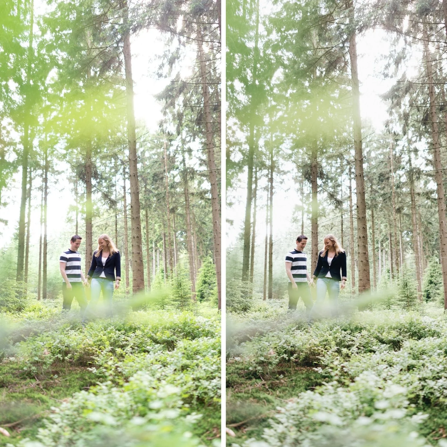
Breakdown 3: Harsh Midday Outdoor Photography
Starting conditions: Outdoor lifestyle photography at noon in direct overhead sun. Heavy shadows under the subject, bright highlights, contrast too harsh for the intended warm lifestyle aesthetic.
Goal: Soft film lifestyle photograph. The harsh overhead shadows need softening. The direct highlights need protection. The overall tonal quality should feel like morning light rather than noon.
Adjustments in order:
White balance: Temperature 5,100K, Tint +5. Midday light is relatively neutral — only slight correction needed.
Exposure: -0.2. Highlights: -45. Whites: -25. Shadows: +20. Blacks: 0. The significant Highlights and Whites reduction protects the bright outdoor areas. Shadow lift softens the harsh underside shadows without lifting globally.
Contrast: -20. Tone Curve: gentler than usual because the aggressive highlight protection has already compressed the upper range. Shadow point at output 20. Very gentle upper midtone lift. Highlight point at output 218.
HSL: Green Saturation -22, Green Hue +10 toward yellow. Orange Saturation -18, Orange Luminance +12. Red Saturation -10. Blue Saturation -18.
Color Grading: Highlight Hue 44, Saturation 7. Keep Shadow very close to neutral at this harsh starting point — Saturation 2-3 only.
Clarity: -12. Grain: Amount 16, Size 24, Roughness 48.
Result: Soft, warm lifestyle photograph with the gentleness of morning light — the harsh overhead quality of the original completely removed.
Breakdown 4: Indoor Warm Ambient Portrait
Starting conditions: Portrait in warm interior light — tungsten bulbs at approximately 3,200K. The image is very warm and orange in its raw state, with shadows that go very dark.
Goal: Warm, intimate portrait with the film quality of indoor warm-ambient photography. Skin should be warm but not orange. The warmth of the environment should be preserved while removing the extreme orange cast of raw tungsten.
Adjustments in order:
White balance: Temperature 3,800K, Tint +8. Do not fully neutralize the tungsten warmth — only reduce it to a warm-but-not-orange starting point.
Exposure: +0.3. Highlights: -15. Shadows: +15. Blacks: +10. The higher Exposure and Shadow adjustments compensate for the darker ambient.
Contrast: -12. Tone Curve: shadow point at output 22 (more lifting than daylight scenarios because indoor light produces darker absolute shadows), gentle midtone curve.
HSL: Orange Saturation -25 (more aggressive than outdoor because the tungsten warmth amplifies orange strongly). Orange Luminance +15. Red Saturation -15. Yellow Saturation -15.
Color Grading: Highlight Hue 38, Saturation 6. Shadow Hue 30, Saturation 5. Both in the warm direction — this is not a warm-cool scenario.
Clarity: -10. Grain: Amount 20, Size 28, Roughness 55. Slightly more grain than outdoor scenarios because indoor photography historically used faster film.
Result: Warm, intimate indoor portrait with golden film quality — the tungsten cast transformed rather than removed.
Breakdown 5: Moody Travel Landscape
Starting conditions: Travel landscape photograph at dusk. The light is transitional — partially warm sunset, partially cool blue hour. The image has potential but feels flat and undecided.
Goal: Atmospheric, cinematic travel landscape with warm-cool dimensional color and film depth.
Adjustments in order:
White balance: Temperature 5,200K, Tint +6. The transitional light needs a centered starting point.
Exposure: -0.1. Highlights: -35. Whites: -20. Shadows: -8. Blacks: +5. Protect the sunset warmth in highlights, preserve shadow depth.
Contrast: -5. Tone Curve: shadow point at output 14, moderate S-curve to add the tonal separation that makes the image feel cinematic. Highlight point at output 220.
HSL: Green Saturation -20. Blue Saturation -12. Orange Saturation -10, Orange Luminance +8. Yellow Saturation -10.
Color Grading: Highlight Hue 48, Saturation 10 — golden sunset quality. Shadow Hue 212, Saturation 7 — the blue hour quality in the shadows.
Clarity: 0. Grain: Amount 22, Size 30, Roughness 58.
Result: Atmospheric travel landscape with warm golden sunset and cool blue hour shadows in dimensional relationship — the transitional quality of dusk expressed as a considered film aesthetic.
FAQ
Do these exact settings work on every photograph? No. These are calibrated starting points for each lighting scenario. Per-photo adjustment of Exposure and White Balance is always needed. The HSL values are the most consistent across photos in the same lighting scenario. The Tone Curve structure remains constant but Highlights reduction varies per exposure.
How do I know which breakdown is closest to my photo? Identify the primary ambient light: warm direct sun, overcast, harsh midday, warm indoor, or transitional. Start with the closest scenario and adjust the White Balance and Highlights reduction to match your specific starting file.
Can I save these as presets? Yes. Create a named preset for each lighting scenario that includes the full set of adjustments. Apply the relevant scenario preset as a starting point, then adjust Exposure and White Balance per photo.
Start with a calibrated base:
Download the free Analog Film preset and compare its settings to the breakdown scenarios above to understand how the calibration works.
For complete preset systems calibrated for each of these scenarios, the Vesper Archive covers warm outdoor and indoor photography, and the Moody Film Archive handles the cinematic and atmospheric scenarios.
