Best Lightroom Presets for Autumn Photography 2026
Best Lightroom Presets for Autumn Photography 2026
Autumn photography has one defining editing challenge: the colors are already extraordinary and it is easy to over-edit them. Deep golden yellows, rich burnt oranges, dark moody shadows — the season does most of the work. The right preset enhances what is already there without pushing autumn color into garish over-saturation.
The autumn editing challenge
Orange and yellow oversaturation. Autumn foliage pushed too far looks artificial. The goal is rich, warm color that feels like genuine late-season light, not an Instagram filter.
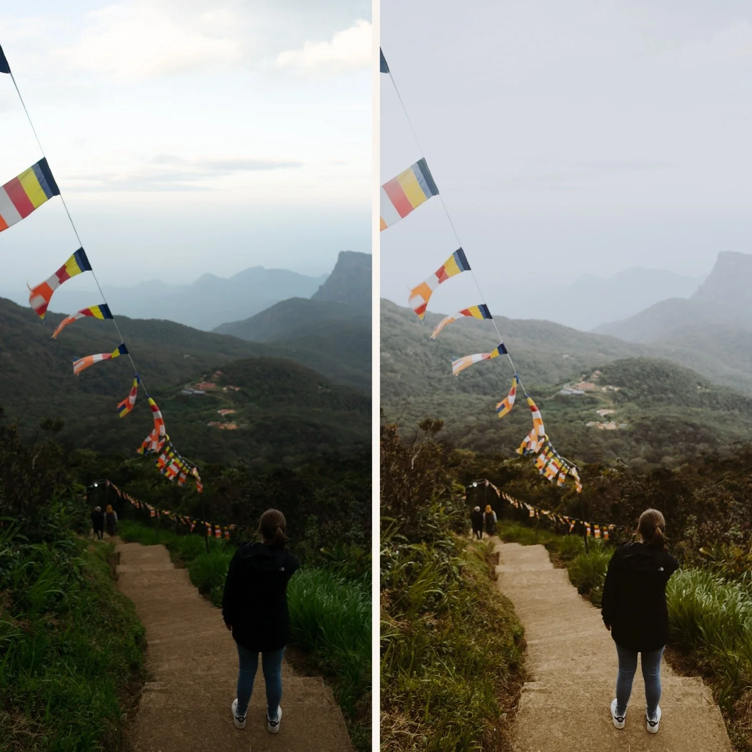
Highlight protection in golden light. Autumn light is low-angle and warm. Highlights clip quickly. Pull Highlights -30 to -45 before applying any preset.
Preserving shadow detail. Autumn forests have deep shadows between trees. Lift Blacks slightly (+10 to +15) to preserve texture in darker areas without losing the depth of autumn shadow.
Best presets by autumn scenario
Golden autumn forests and foliage
California Archive C7 Rich Warm or Vesper V5 Golden Velvet. Both enhance the warm golden quality of autumn light. After applying, reduce Orange Saturation -5 to prevent foliage going too vivid.
Moody autumn — overcast, rain, bare trees
Moody Film Archive M4 or M5. The atmospheric quality suits the melancholy, muted character of grey autumn days. Reduce Orange Saturation -10 to keep autumn color muted.
Autumn portraits
Essence Archive E7 Golden Warm or E2 Rich Warm. Heritage warmth that enhances autumn color while keeping skin tones natural. Orange Luminance +12 to +15 to maintain skin quality against the warm autumn palette.
Autumn landscapes
California Archive C5 Summer Warm transitioning to C7 Rich Warm for later autumn. Golden hour autumn landscapes suit C7's rich warmth. Grey overcast autumn landscapes suit Analog Film Archive A3 Heritage Fade.
Autumn-specific color adjustments
After applying any preset, these three adjustments specifically enhance autumn color.
Orange Hue: toward red (-5 to -10). Shifts autumn oranges toward a deeper, burnt quality rather than vivid yellow-orange.
Yellow Hue: toward orange (-8 to -12). Shifts golden yellows toward warm amber, referencing the specific quality of autumn light.
Red Saturation: +5 to +10 (carefully). Enhances the deep red quality of autumn foliage. Add only if the preset has not already pushed reds.
The California Archive for autumn
C7 Rich Warm and C8 Sun-Drenched work particularly well for the warm, golden light of early-to-mid autumn.
EXPLORE THE CALIFORNIA ARCHIVE — $27
Free autumn preset
FAQ
How do I edit autumn photos without making colors look fake?
Keep Orange Saturation controlled — reduce -5 to -10 after applying any warm preset. Shift Orange and Yellow Hue toward deeper, richer tones rather than boosting saturation. The goal is rich and natural, not vivid.
What is the best Lightroom preset for autumn foliage?
California Archive C7 Rich Warm is the strongest single preset for autumn foliage — calibrated for warm golden light with built-in highlight protection. For moody, overcast autumn days, Moody Film Archive M4 suits the atmospheric flat light better than a warm preset that fights against grey conditions.
How do I keep autumn colors warm without orange skin tones?
The key is separating foliage warmth from skin warmth. After applying your warm preset, check Orange Saturation in Color Mix — keep it at 0 to +5 maximum. Then shift Orange Hue toward yellow (+5 to +8) rather than red. This keeps the golden quality in leaves while keeping skin natural.
Should I use the same preset for all autumn photos?
Use preset variations from the same collection rather than one preset for everything. Golden hour autumn foliage needs a different calibration than overcast grey autumn forest. The California Archive or Moody Film Archive give you the right variation for each condition while keeping the gallery looking consistent.
What settings should I change for autumn portraits specifically?
Orange Luminance +12 to +15 to maintain natural skin brightness against the warm autumn palette. Reduce Orange Saturation by -5 after applying any warm preset to prevent combined warmth creating orange-looking skin. Pull Highlights -30 to protect skin highlights in low-angle autumn light.