Best Lightroom Presets for Food Photography (2026)
Best Lightroom Presets for Food Photography (2026)
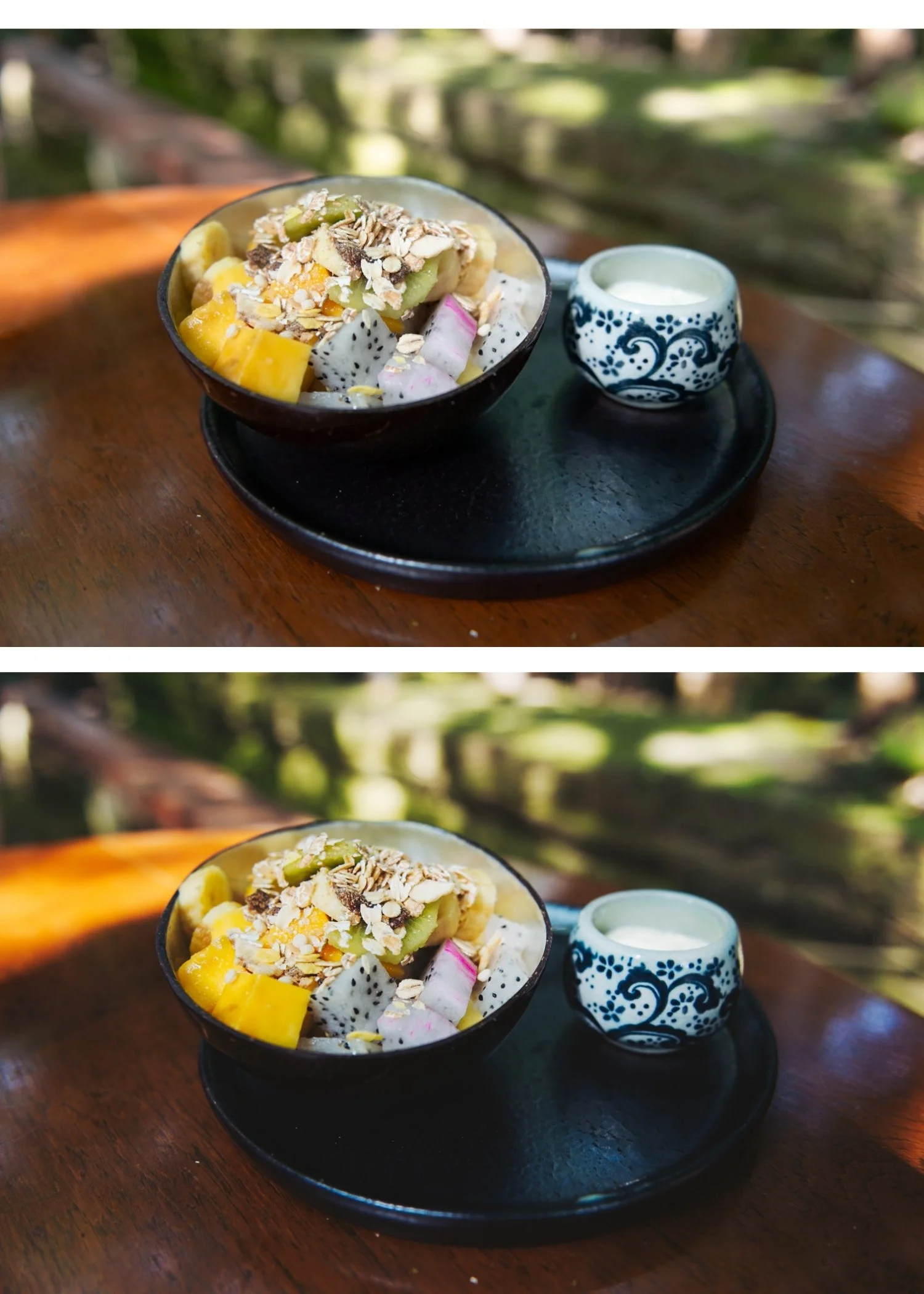
Food photography editing has one priority that overrides everything else: the food must look appetizing. The warm, natural, film-quality look works exceptionally well for food — the analog warmth references the quality of natural light and real ingredients. The wrong presets — too dark, too muted, too cool — make food look unappetizing regardless of how good the photography is.
What food photography editing requires
Warm, natural color. Food looks most appetizing in warm, natural light. The film look's warm analog tones align perfectly with the visual language of quality food photography.
Texture preservation. Unlike portrait photography where Clarity goes negative, food photography benefits from slight positive Clarity (0 to +8) to emphasise the texture of ingredients — the crumb of bread, the surface of chocolate, the grain of wood props.
Highlight detail in food surfaces. Bright areas on food — the gloss on a sauce, the shine on a tart — need to retain detail. Highlight protection is essential.
Clean, warm shadows. Food photography in natural window light has soft, warm shadows. The Shadow Color Grading warmth suits food photography naturally.
Adjustments specific to food photography
Clarity: 0 to +8 (unlike portrait editing, food benefits from slight micro-contrast for texture)
Orange Saturation: +5 to +10 (food benefits from slightly more orange warmth than portraits — golden bread, warm sauce, roasted vegetables)
Yellow Saturation: +5 to +8 (pasta, baked goods, cheese — yellow tones are prominent in food and benefit from slight enhancement)
Red Saturation: +3 to +6 (tomatoes, red peppers, berries — controlled red enhancement)
Highlights: -30 to -40 (protect surface detail on food)
Best presets for food photography
A4 Golden Warmth — the most natural fit for food. The golden warmth amplifies the visual appeal of warm-coloured food without pushing it toward orange. Works for café content, recipe photography, and warm-toned food styling.
C1 Warm Outdoor — for outdoor food photography at farmers markets, picnics, and al fresco dining. Warm with strong highlight protection.
A6 Clean Portrait — for clean, minimal food photography with white backgrounds and neutral props. The balanced warmth suits editorial food work.
E6 Soft Heritage — for moody, atmospheric food photography — dark wooden tables, dramatic window light, restaurant ambience.
Food photography by style
Bright, clean, lifestyle (coffee shop, brunch): A6 at 85%, Clarity +5, Yellow Saturation +5, warm white balance 5,400K.
Warm, rustic, homemade: A4 at 85%, Orange Saturation +8, Yellow Saturation +6, Blacks +15.
Dark and moody restaurant: E6 or M4 at 80%, Clarity +8, Highlights -45, Shadow Color Grading Hue 35 Saturation 16.
Editorial magazine clean: A6 at 90%, Clarity 0, neutral colour, minimal grain.
FAQ
Why does my food look grey after applying a film preset?
The preset is reducing Vibrance and Saturation too aggressively for food photography. Food needs more colour presence than portrait or landscape work. Reduce the preset's Vibrance reduction by adding Vibrance +8 after applying, and bring Orange Saturation to +5 to +10.
Does the same preset work for all food types?
Broadly yes, with minor adjustments per food colour. Very green subjects (salads, matcha) benefit from Green Saturation +5. Very red subjects (tomatoes, strawberries) benefit from Red Saturation +5. The warm base preset handles most food naturally.