Warm Golden Tones in Lightroom — Complete Guide (2026)
Warm Golden Tones in Lightroom — Complete Guide (2026)
Warm golden tones are the most requested editing quality in photography — and the hardest to execute correctly. The difference between a warm photo that looks beautiful and one that looks orange is not the amount of warmth but where the warmth is placed and how it interacts with the specific color channels. This guide covers the exact approach.
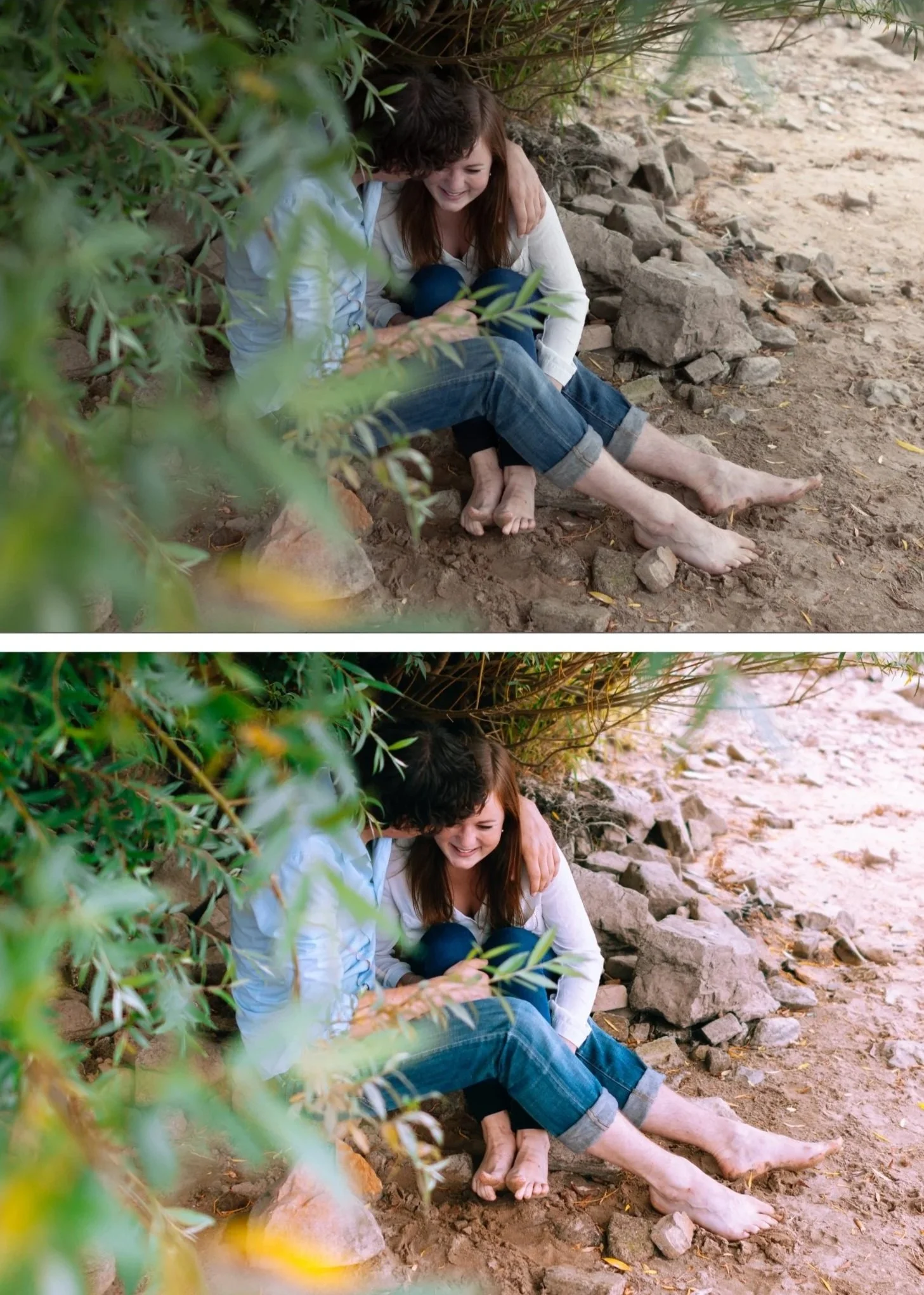
What warm golden tones actually are
The warmth in film photography was not a global warm shift. It came from specific characteristics of the film chemistry: how orange and yellow dye layers responded to warm light, how the shadow base had an amber quality from the film emulsion, how skin was rendered in a specific golden-creamy register that was different from vivid orange.
Digital warmth applied incorrectly is a Temperature slider pushed to the right. Authentic warm golden film quality is the result of specific color channel work — warmth in the shadows, golden shift in the orange channel, and controlled saturation that keeps the warmth feeling rich rather than vivid.
The difference in practice: a photo with Temperature +400 looks orange. A photo with Shadow Color Grading Hue 38 Saturation 14, Orange Hue +6 toward yellow, and Orange Luminance +15 looks golden.
The warm golden tone recipe
Step 1 — White balance foundation
Warm golden tones start with a correct warm-neutral white balance — not a neutral correction and not an aggressive warmth push.
Golden hour subject matter: 5,400-5,600K, Tint +5 to +8. Preserve the existing warm light.
Daylight portrait with warm preset: 5,200-5,400K, Tint +4 to +6. The preset adds warmth — the white balance is the neutral starting point.
Overcast or flat light: 5,600-6,000K, Tint +5 to +8. Add warmth manually to compensate for the cool ambient before applying.
Indoor warm ambient (window light): 5,000-5,400K, Tint +3 to +5.
The rule: warm presets assume a warm-neutral starting point. On a cold white balance, the warmth of the preset reads as orange rather than golden. Fix white balance first, always.
Step 2 — Tonal foundation for warmth
Warmth works best in a tonal environment with specific characteristics. Before any color work:
Blacks: +18 to +25. Lifted shadow floor is essential — warm Color Grading in lifted shadows creates amber depth. Warm Color Grading in crushed shadows disappears.
Highlights: -30 to -45. Protecting highlights keeps warm skin from going orange-blown.
Contrast: -10 to -15. Soft contrast is the environment warmth reads naturally in. High contrast makes warmth look harsh.
Clarity: -8 to -12. Organic edge rendering supports organic warmth.
Step 3 — The Orange channel (most important)
The Orange channel controls how warm tones — specifically skin, warm surfaces, sunset light — render in the photo. This is where authentic warm golden quality is built.
Orange Hue: +5 to +8 toward yellow. This is the golden shift. Moving Orange Hue toward yellow changes warm tones from vivid-orange toward the golden-amber quality of film photography. This is the single most important adjustment for warm golden tones.
Orange Saturation: +3 to +8. Increases the richness of warm tones. Stay below +10 — above this, skin starts reading as orange rather than warm. For portrait work: +3 to +5. For landscape and travel: +5 to +8.
Orange Luminance: +12 to +18. Lifts the brightness of the orange channel. On skin, this creates the luminous golden quality that makes a portrait look flattering. Essential for portrait work.
Step 4 — Yellow channel calibration
Yellow tones appear in warm surfaces, foliage, evening light, and the light areas of warm-toned skin.
Yellow Hue: -3 to -5 toward orange. Shifts yellow slightly toward warm-amber. Makes golden hour light and warm surfaces read richer.
Yellow Saturation: 0 to +5. Slight enhancement for golden hour and autumn. Stay at 0 for spring and summer.
Step 5 — Shadow Color Grading
Shadow Color Grading is where the warm analog quality is built. The specific values matter more than any other Color Grading adjustment.
Hue: 35-42. This is the amber range. Below 35 goes toward red. Above 45 goes toward yellow-green. The 35-42 range is the specific amber of classic film shadow rendering.
Saturation: 10-16. The amount of warmth in the shadows. For clean analog portraits: 10-12. For autumn and golden hour: 14-16. For moody atmospheric: 16-18.
Blending: 40-50. Controls how the shadow warmth blends into the midtones. Lower blending keeps warmth concentrated in shadows. Higher blending spreads it into the midtones.
Step 6 — Highlight Color Grading (optional)
Highlight Color Grading is subtle but adds the final golden quality.
Hue: 40-45. Warm amber.
Saturation: 3-6. Very light — only enough to give the bright areas a warm quality. Above 8-10 highlights start looking yellow.
Warm golden tones per subject matter
Skin tones (portrait): Orange Luminance +15, Orange Hue +6, Orange Saturation +4, Shadow Color Grading Saturation 10-12. The goal is luminous warmth, not vivid orange.
Golden hour landscape: Orange Hue +5, Yellow Hue -4, Yellow Saturation +5, Shadow Color Grading Hue 38 Saturation 14. Enhance the existing warmth rather than add warmth from scratch.
Indoor warm ambient: White balance 5,200-5,500K first. Orange Hue +6, Shadow Color Grading Saturation 14. Indoor warm light benefits from more Shadow Color Grading saturation than outdoor work.
Autumn foliage: Orange Hue -5 toward red (deepens amber tones), Orange Saturation +6, Yellow Saturation +4, Shadow Color Grading Hue 36 Saturation 16. See the full autumn guide for the complete workflow.
Best presets for warm golden tones
A4 Golden Warmth — the most calibrated warm golden preset in the collection. Orange Hue is shifted, Shadow Color Grading is amber, skin luminance is elevated. The most natural starting point for golden hour and portrait work.
V5 Golden Velvet — warmer and richer than A4. More character, less neutral. For photographers who want the warmth to be a deliberate aesthetic statement rather than a natural-looking quality.
A6 Clean Portrait — warm but restrained. The baseline portrait warm quality. For photographers who want warmth as a foundation rather than a dominant characteristic.
M5 Warm Dark — warm with moody depth. For atmospheric, low-light warm photography where the warmth and shadow depth work together.
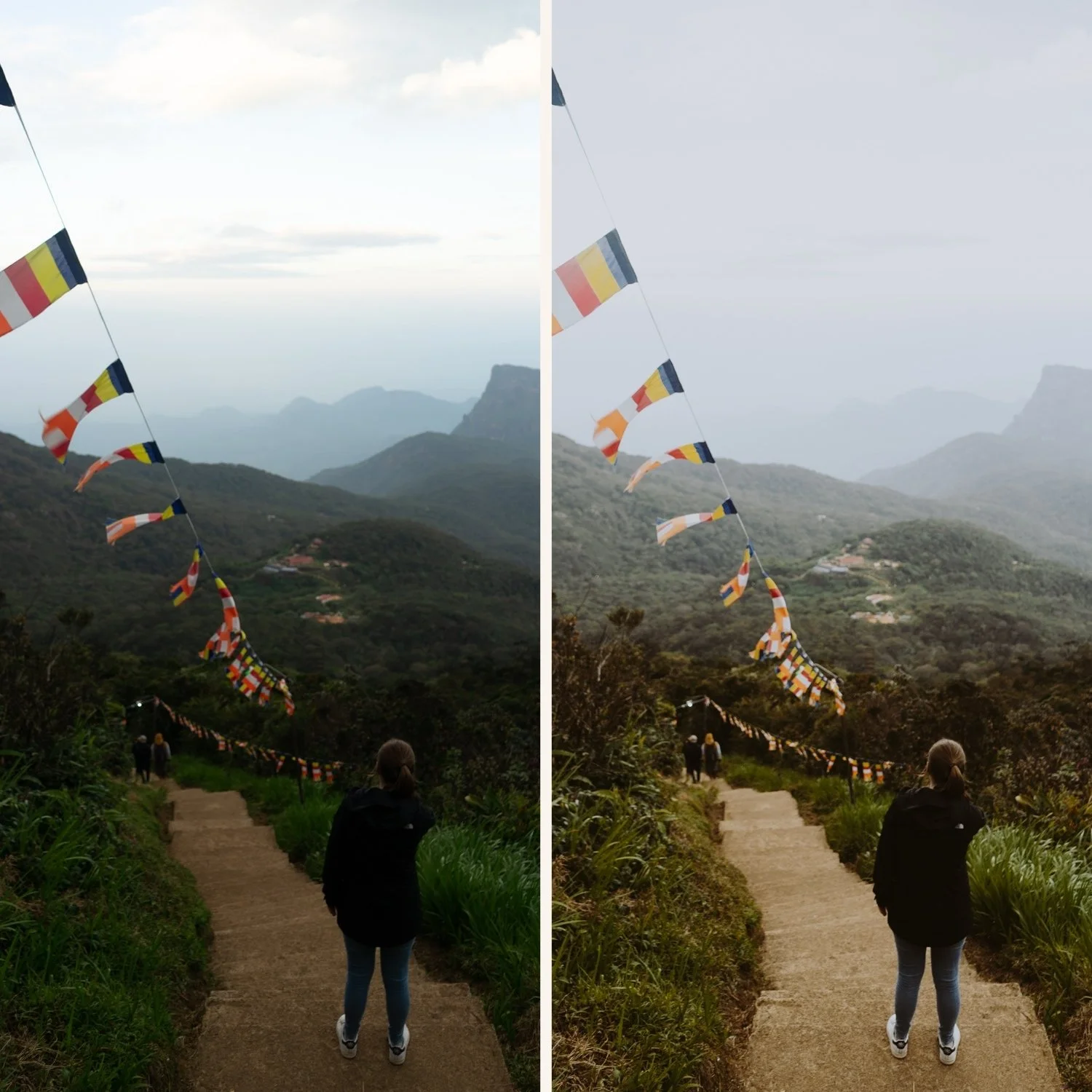
Common warm golden tone mistakes
Pushing Temperature instead of the Orange channel. Temperature makes everything warm — skin, sky, shadows, highlights all equally. The Orange channel approach makes warm tones warmer while leaving neutral areas neutral. The result is layered rather than flat.
Orange Saturation too high. Above +10, skin starts reading as orange rather than warm. The most common mistake in warm editing. Stay at +3 to +8 for portraits.
No Shadow Color Grading. Warmth without shadow Color Grading looks like a filter, not film. Shadow Color Grading provides the depth that makes warmth look dimensional rather than applied.
Warmth on a cold white balance. A warm preset on a 4,800K white balance produces an uncomfortable orange quality. Fix white balance to the warm-neutral values above before applying warm presets.
FAQ
Why do my warm edits look orange instead of golden?
Three likely causes: Temperature pushed too high (above 6,200K before a warm preset), Orange Saturation above +10, or white balance too cold before applying. The Orange channel approach above avoids all three.
Do warm golden tones work on every skin tone?
Yes with adjustments. For deeper skin tones: Orange Luminance +20 to +22 (more lift needed), Red Luminance +8 to +12. For very fair skin: Orange Saturation +2 to +4 maximum (fair skin reaches orange easily).
What is the difference between warm and golden?
Warm is a global quality — higher Temperature, more saturation. Golden is specific — warm in the orange-yellow channel range with controlled saturation. Golden photographs feel rich and dimensional. Warm photographs often feel flat and orange. The Orange channel and Shadow Color Grading approach above produces golden rather than warm.
