Best Lightroom Presets for Spring Photography 2026
Best Lightroom Presets for Spring Photography 2026
Spring photography has a specific challenge — the light is beautiful, the colours are vivid, but digital cameras render spring greens as neon rather than the soft, organic green of new growth. The right preset solves this in one click.
This guide covers the best Lightroom presets for spring photography in 2026 — specific recommendations for cherry blossoms, outdoor portraits, landscape, and lifestyle content.
What spring photography needs from a preset
Aggressive highlight protection. Cherry blossom, magnolia, white petals, bright fabrics — spring subject matter is highlight-heavy. Presets that clip highlights or do not protect the bright range produce harsh, washed-out results.
Lifted, open shadows. Spring's airy quality comes from open shadow rendering. Presets with crushed blacks or dark shadow character fight against the season's natural aesthetic.
Muted but not flat color. Spring pastels are organic and soft. Presets with aggressive Vibrance reduction (below -20) produce flat results. Presets with vivid color push spring into summer territory.
Warm skin without orange push. Spring light is cooler than summer. Skin can go slightly grey in spring shade without proper Orange Luminance lift. Portrait-optimized presets handle this; landscape-focused presets often do not.
Best preset per spring scenario
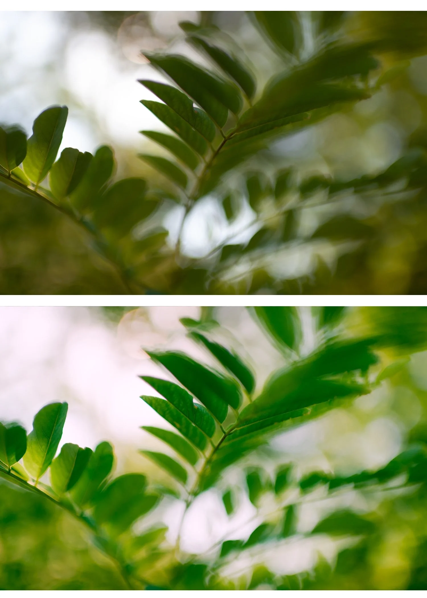
Cherry blossom and magnolia photography
S2 Dreamy Soft from the Bright and Clean Archive.
S2 is the most luminous, highlight-forward preset in the collection — calibrated specifically for the soft, white, highlight-heavy quality of blossom photography. The aggressive highlight protection prevents white petals from clipping while the lifted black point creates the airy spring quality.
Settings after applying:
White balance: 5,200-5,600K, Tint +5
Exposure: +0.2 to +0.4 for the luminous quality
Orange Luminance: +15 if photographing people under blossom
Strength: 85-90%
Why it works: S2 is the only preset in the full shop specifically optimized for bright, highlight-heavy subjects. For cherry blossom work, it outperforms even A6 by a clear margin.
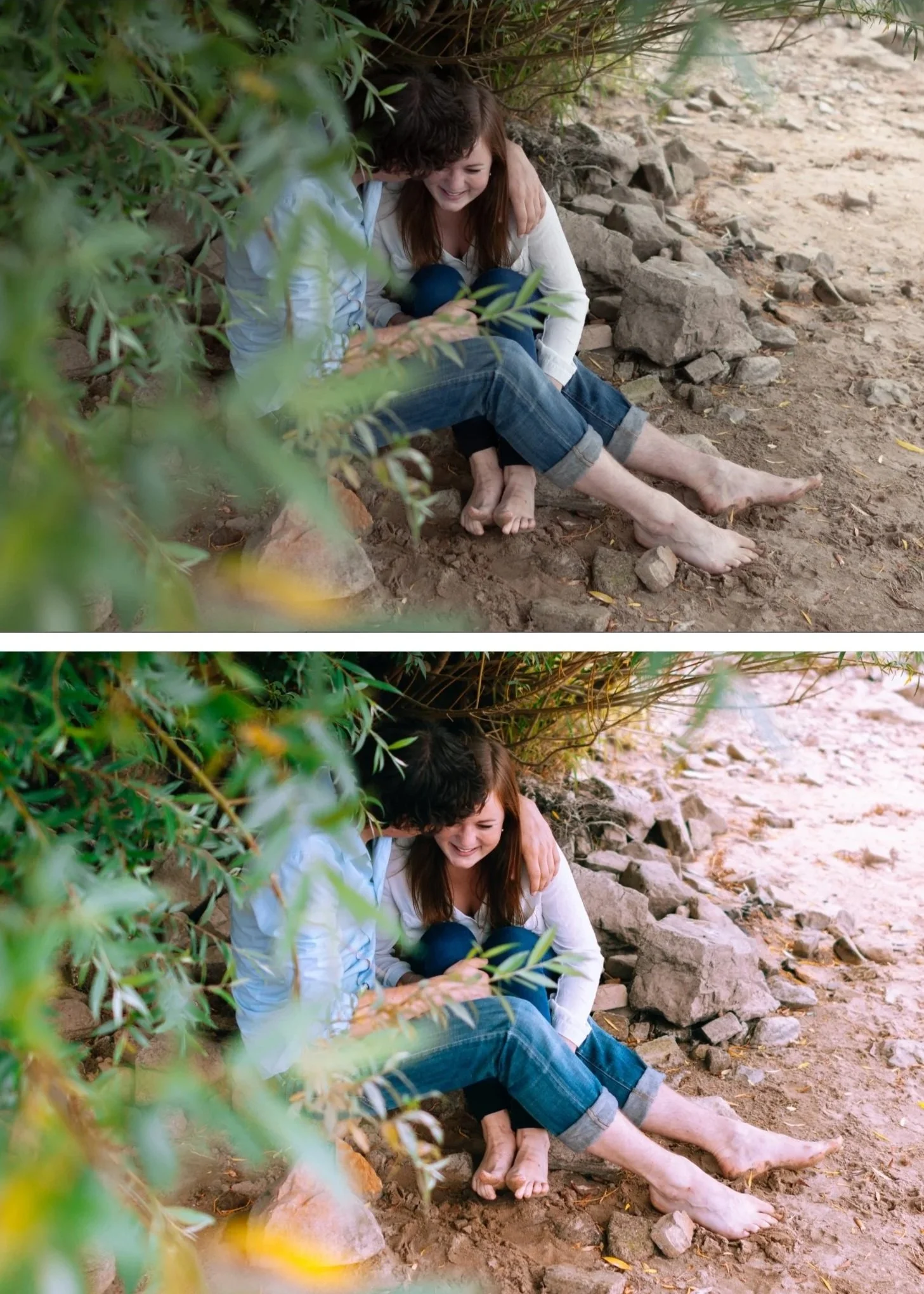
Outdoor spring portraits in direct sun
A6 Clean Portrait from the Analog Film Archive (also available free).
A6 is the most versatile portrait preset. Calibrated for natural skin tones across all lighting conditions, it handles spring direct sun without pushing skin toward orange — a common failure mode with warmer presets.
Settings after applying:
White balance: 5,200-5,400K, Tint +5
Highlights: -45 (spring sun clips skin highlights easily)
Orange Saturation: 0 to +3 (keep controlled)
Strength: 85%
Why it works: A6's restrained Orange Saturation and elevated Orange Luminance combination produces natural warm skin without the orange push that warmer presets create in spring's relatively cool ambient light.
Overcast spring outdoor photography
A6 or A8 Luminous Highlight from the Analog Film Archive.
Overcast spring light is flat and slightly cool — two qualities that fight against the bright pastel aesthetic. A8 is specifically calibrated for this scenario; A6 works with manual white balance warming.
With A6:
White balance: 6,000-6,400K, Tint +5 (warm manually before applying)
Strength: 85-90%
With A8:
White balance: 5,800-6,200K, Tint +4
Strength: 85%
Why they work: A8's luminous highlight character lifts the flat overcast light toward a glowing quality. A6 produces cleaner skin but needs more white balance correction first.
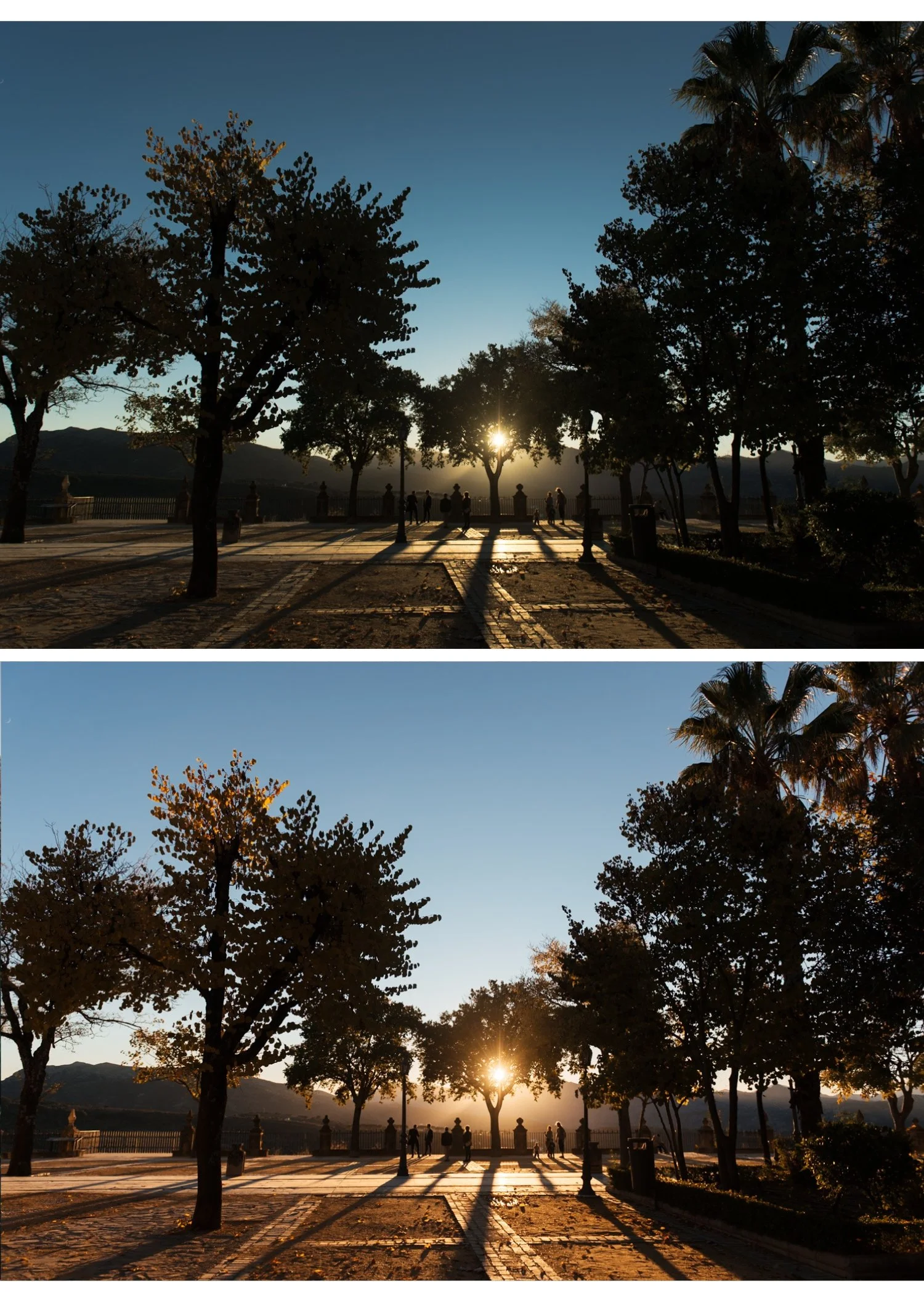
Spring golden hour portraits
A4 Golden Warmth from the Analog Film Archive.
Spring golden hour is slightly different from summer golden hour — cooler, softer, with more muted golden quality. A4 is calibrated for golden hour generally but works especially well in spring where the golden light plays against cool-toned blossom and fresh greens.
Settings after applying:
White balance: 5,400-5,800K, Tint +6 to +8
Orange Saturation: 0 to +5 (preset plus ambient golden can push orange)
Strength: 82-85%
Why it works: A4's golden-shifted warmth enhances the specific quality of spring golden hour rather than neutralizing it. The slight desaturation prevents the warmth from becoming orange.
Spring travel and lifestyle
A2 Bright Minimal from the Analog Film Archive.
A2 is calibrated for effortless bright outdoor photography. Less heavy than A6, more clean than A4 — the preset for casual spring travel, outdoor dining, and everyday lifestyle content.
Settings after applying:
White balance: 5,300-5,500K
Strength: 85%
Why it works: A2's restrained character lets spring subject matter carry the photo rather than the editing. For photographers whose spring content is primarily casual and light, A2 produces the most natural results.
Vintage spring aesthetic
A3 Heritage Fade from the Analog Film Archive.
For photographers who want slightly more character in their spring photography — a subtle fade, soft contrast, more editorial quality. Works particularly for spring street photography, documentary travel, and candid lifestyle content.
Settings after applying:
White balance: 5,400-5,600K, Tint +5
Strength: 85-90%
Why it works: A3's gentle fade aligns with spring's soft ambient quality without adding heavy styling. The result reads as thoughtfully edited rather than obviously filtered.
The universal spring preparation
Apply these adjustments to every spring photo regardless of which preset you use:
Camera Calibration: Camera Neutral (Canon), Camera Standard (Sony/Nikon), matching simulation (Fujifilm)
Sharpening: 22-25 on camera RAW, 15-20 on phone
Clarity: -10 to -12 before applying preset
Vibrance: -8 to -10 (less reduction than moody editing, more than summer)
Bundle recommendation for spring-focused photographers
For photographers whose primary content is spring and bright outdoor photography, the Bright and Clean Archive includes S2 Dreamy Soft plus four other light-forward presets.
The Analog Film Archive is the more versatile choice if you shoot year-round.
The best combination for spring: Analog Film Archive (A2, A3, A4, A6 all useful) plus S2 from the Bright and Clean Archive for blossom-specific work.
Or go for everything: the Studio Archive includes both collections plus all others at $0.68 per preset.
FAQ
What Lightroom preset is best for cherry blossom photography?
Presets with clean highlight handling and controlled pink/magenta tones work best. S2 Bright Clean from the Bright & Clean Archive or A2 Bright Minimal from the Analog Film Archive are the strongest options for cherry blossom photography.
How do I make spring greens look natural in Lightroom?
In the HSL panel: shift Green Hue toward yellow (+10-20), reduce Green Saturation (-15-25), and slightly reduce Green Luminance (-5-10). This moves neon digital greens toward the organic olive-green quality of film photography.
Can I use the same preset year-round?
Yes — good film presets work across seasons. The adjustments for spring are more about fine-tuning Green control and Highlight protection than using a completely different preset.
What's the best preset for spring outdoor portraits?
A6 Clean Portrait handles the varied lighting of spring outdoor portrait sessions — from bright overcast to dappled shade — with consistent skin tone rendering.
Is one preset enough for all spring photography?
A6 Clean Portrait handles approximately 70-80% of spring scenarios well. For cherry blossom specifically, S2 produces noticeably better results. For golden hour, A4 is more calibrated. For overcast light, A8 is the specialist option. A spring-focused photographer benefits from three to four complementary presets rather than one.
Which preset is best for iPhone spring photos?
A6 at 75-80% strength with the phone-specific preparation (Sharpening 20, Clarity -10). For iPhone ProRAW files: A6 at 85% with standard preparation.
What if my spring photos still look flat after applying a preset?
The issue is usually Vibrance reduced too aggressively combined with cool white balance. Check white balance is at 5,400-6,000K and Vibrance is not below -15. Add Shadow Color Grading Hue 40 Saturation 10 for warmth that does not push skin orange.
Should I use different presets for early spring (cool) vs late spring (warm)?
The same presets work across early and late spring with different white balance settings. Early spring: 5,400-5,800K. Late spring: 5,200-5,500K. The preset does not need to change — the white balance preparation does.