How to Create a Natural Film Look in Lightroom (Exact Settings)
How to Create a Natural Film Look in Lightroom (Exact Settings)
The natural film look is one of the most requested aesthetics in photography editing, and one of the most misunderstood. The confusion usually comes from approaching it as a visual style to imitate rather than a set of technical properties to understand. Once you understand what film photography actually does to an image, you can recreate those properties deliberately in Lightroom rather than searching through presets hoping one of them is close enough.
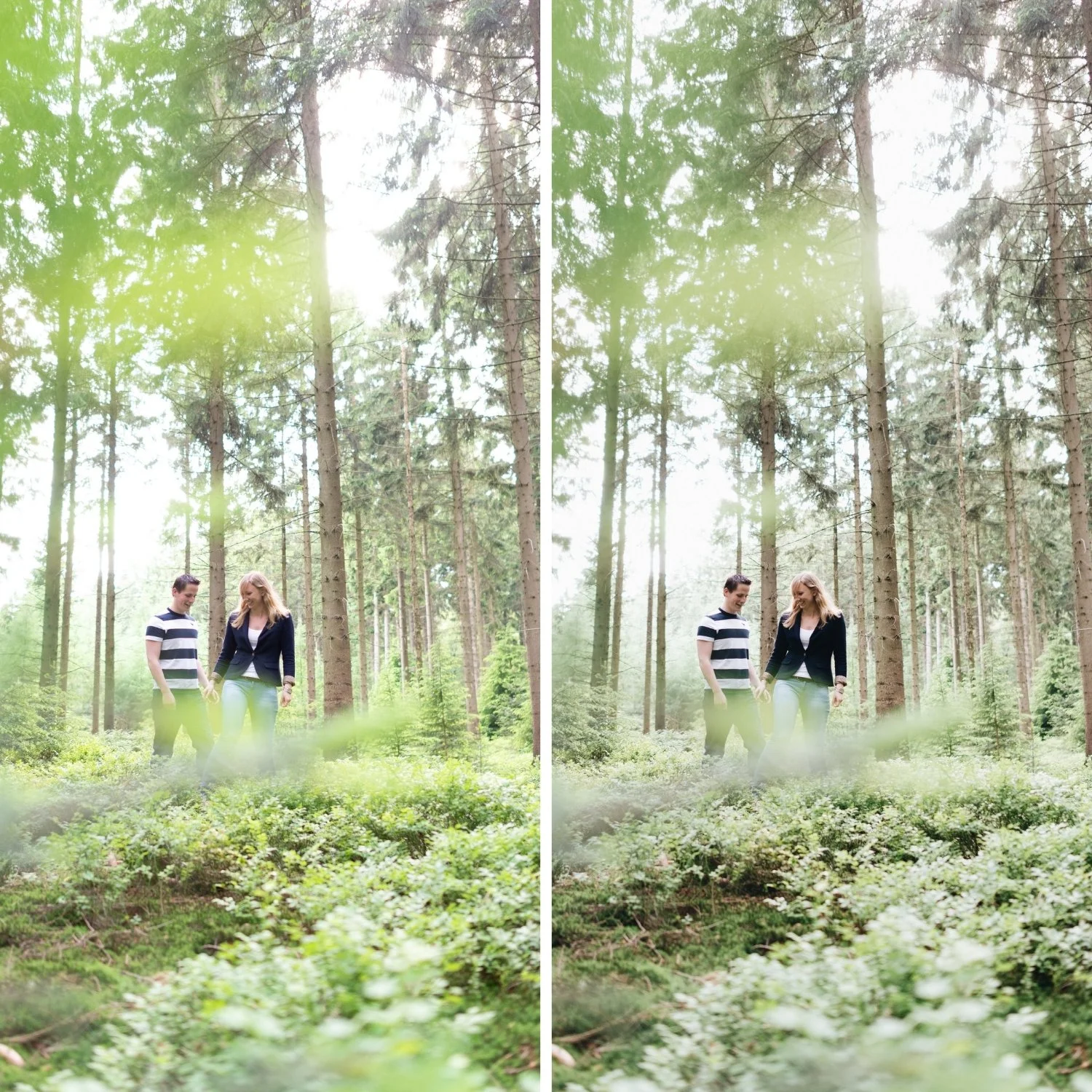
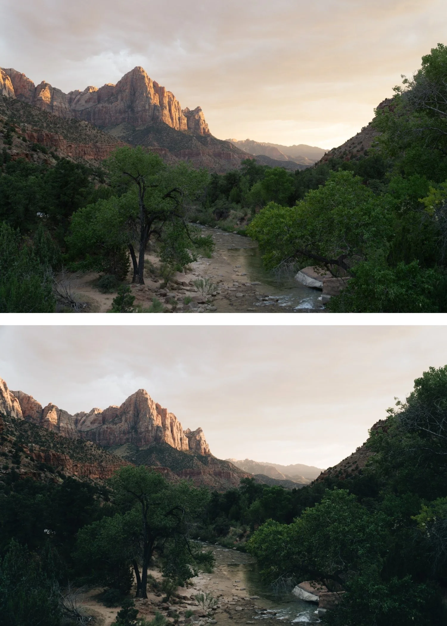
Film's visual character comes from a combination of four properties that digital cameras do not produce naturally: a lifted black point that prevents shadows from going pure black, a soft roll-off in the highlights that prevents bright areas from clipping, muted and slightly organic color rendering across the HSL spectrum, and fine grain structure that adds texture without the randomness of digital noise. Every other quality associated with the film aesthetic is a variation or combination of these four fundamentals.
Step 1: Set Exposure to Give the Image Breathing Room
Before any of the film-specific adjustments, exposure needs to be correct. Film edits fail more often from bad starting exposure than from anything else. A correctly exposed digital image with the right base tonal structure produces clean film results. An underexposed or overexposed starting file fights every adjustment you make after.
For most film aesthetic editing, the target is an exposure that keeps highlights present but protected. Pull the Highlights slider to -15 through -40 depending on how much bright detail the image contains. Reduce Whites by -5 to -20. Keep Shadows in the -5 to -25 range rather than lifting them to recover detail, which tends to produce a flat, muddy quality. The goal is an image that feels breathable and open, not dark and heavy.
Step 2: Lift the Black Point to Create the Film Shadow Floor
The most recognizable technical characteristic of film photography is that it never produces pure black. Even in the darkest parts of a film image, there is a slight lift in the shadow floor from the base density of the film stock. This creates the specific quality of film shadows that feel deep but never absent.
In Lightroom, this is achieved by lifting the Blacks slider slightly into positive territory, typically +5 to +15 depending on the desired character. This is the same shadow floor principle that Balancing Contrast for a Soft Analog Look uses as its starting point. This is different from lifting Shadows, which brings up the darker midtones and tends to produce a flat, over-processed quality. The Blacks adjustment specifically addresses the shadow floor without touching the rest of the tonal range. Paired with a slight lift to the bottom-left point of the Tone Curve, this creates the dimensional shadow quality that distinguishes film from digital.
Step 3: Rebuild Contrast With the Tone Curve
Digital contrast is applied globally through the Contrast slider, which pushes highlights up, pushes shadows down, and compresses midtones all at once. The result is technically higher contrast but visually flat and harsh. Film contrast is different because it results from the specific response of film emulsion to light at different intensities, which is a non-linear relationship that the Tone Curve can approximate.
The practical approach is to lower global Contrast slightly (-5 to -15) to remove the digital aggression, then rebuild separation using a soft S-curve in the Tone Curve. The curve should have a gentle lift in the upper midtones and a gentle compression in the lower midtones, with the highlight point protected rather than pushed. The shadow point should be raised slightly rather than anchored at pure black. This produces contrast that feels dimensional and layered rather than flat and punchy.
Step 4: Reduce Saturation Selectively Across HSL
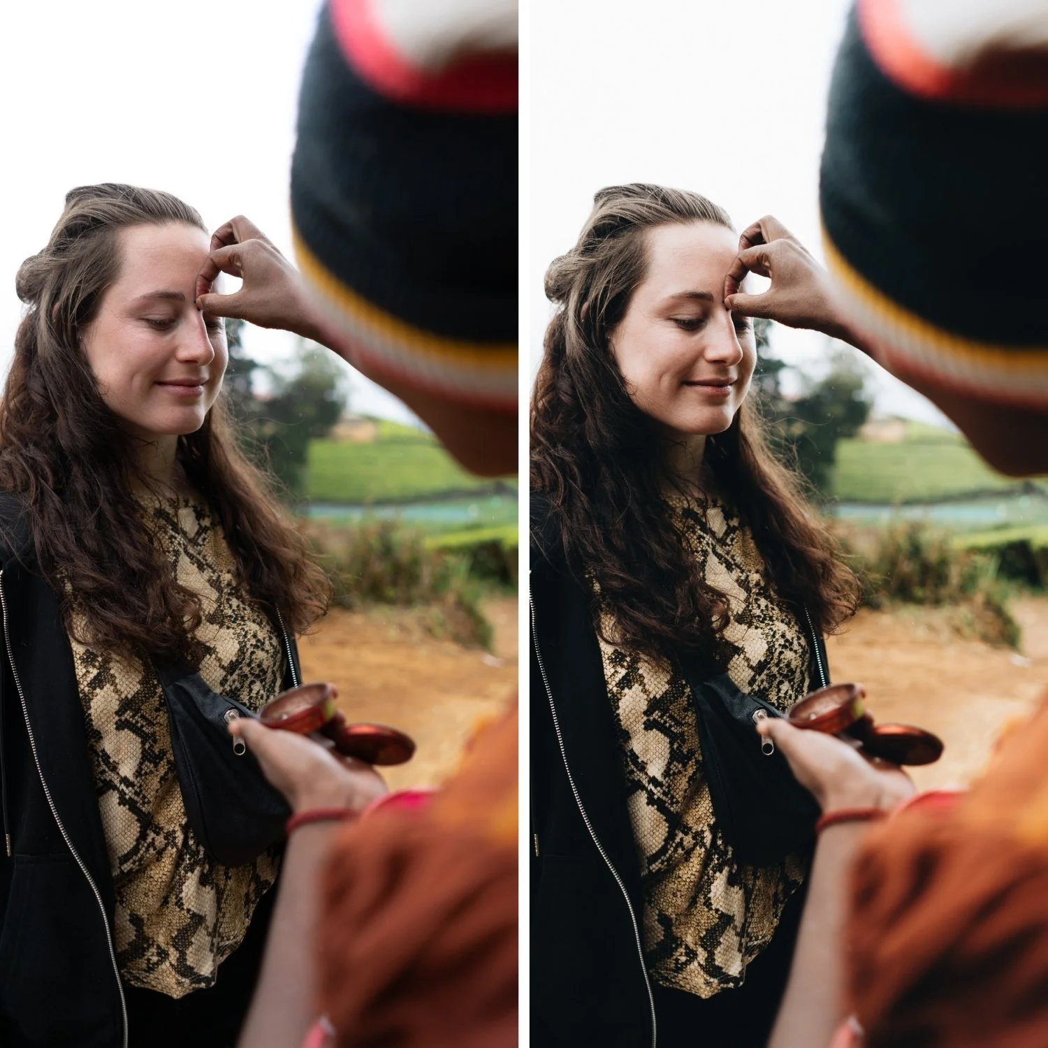
Film color rendering is naturally more restrained than the vivid color that digital sensors produce, particularly in specific channels. Green is the most significant: digital cameras render foliage and outdoor environments with a saturation that does not exist in actual film photography. Reducing Green Saturation by -10 to -30 (depending on how much outdoor greenery is present) and shifting Green Hue slightly toward yellow produces the organic, slightly muted outdoor color that makes film photography look immediately more expensive than digital. This green channel approach is also central to How to Create a Timeless Travel Aesthetic for consistent outdoor photography. This one adjustment has more visual impact than almost any other single change.
Orange requires careful handling rather than simply reducing. Lower Orange Saturation by -10 to -20, but increase Orange Luminance by +5 to +15. This keeps skin tones warm and present without the oversaturated quality that makes portraits look processed. Blue Saturation should be reduced by -5 to -20 to prevent skies from going electric. Yellow Saturation reduction of -5 to -15 prevents warm outdoor scenes from reading as yellow-heavy.
Step 5: Add Subtle Color Grading for Film Depth
Many film stocks have a specific color bias in the shadows and highlights that contributes to their visual character. This can be approximated using the Color Grading panel. Pushing Highlight Hue toward 40-50 with Saturation at 5-12 adds the specific warm quality of film highlights without globally warming the image the way white balance adjustment does. Shadow Saturation should be kept low and the Hue can be pushed slightly toward 200-220 for a very subtle cool depth that adds dimension. The overall Color Grading should be barely perceptible, contributing to the feel of the image rather than being visually identifiable as a color treatment.
Step 6: Reduce Clarity and Add Grain
Film photography has a characteristic softness in the midtone detail structure that digital photography lacks. Clarity increases midtone contrast and edge definition, which produces a crispness that reads as digital even when everything else is correctly calibrated. Reducing Clarity to -5 through -15 removes this quality, particularly for portrait work. Texture at 0 or slightly negative achieves the same effect without the global midtone compression.
Grain is the final step. Film grain has a specific structure: it is fine, organic, and slightly variable in size. Lightroom's grain simulation is reasonable but needs careful calibration. Amount at 15-25, Size at 20-30, and Roughness at 40-60 produces grain that adds textural quality without becoming the dominant visual element. The grain should unify the image and reinforce the film character rather than being visible as an added effect.
Keeping It Consistent Across a Full Gallery
A natural film look that only works on individual photos is a style. A natural film look that works consistently across a full gallery is an identity. The difference is having a fixed tonal philosophy rather than optimizing each image individually. Decide on a white balance direction (warm-neutral, neutral, or slightly cool depending on your subject matter) and apply it consistently. Build your Blacks and Tone Curve settings as a starting template that you apply to every photo before making per-photo adjustments. The per-photo adjustments should be Exposure and White Balance only, with the rest of the structure predetermined.
FAQ
Do I need to shoot RAW for a natural film look?
RAW gives you significantly more latitude for the highlight and shadow adjustments that create the film quality. JPEG is workable if exposure is correct and the adjustments are subtle, but RAW makes the process more reliable and the results cleaner.
Why does my film look still appear digital?
The most common cause is unaddressed digital qualities: either the Contrast slider is still adding punch, Green Saturation is still too high, or Clarity is adding crispness. Work through the HSL panel channels and confirm Clarity is neutral or negative.
Should I always lift the blacks?
For most film aesthetics, yes. The exception is intentionally dark, moody photography where the deep shadows are part of the character. For those scenarios, a slight Blacks lift paired with a much more pronounced shadow lift in Color Grading produces a moody depth rather than a flat matte quality.
Does every film preset use these settings?
Well-calibrated film presets are built on these principles. Presets that simply increase warmth and add a matte effect are imitating the visual appearance rather than the technical behavior of film, which is why they often look dated or unconvincing. For a practical example of how these principles apply to a specific film stock's color science, see Kodak Portra Style Lightroom Presets.
Try a calibrated starting point for the natural film look:
Download the free Analog Film preset to apply these principles in one click and understand how the adjustments work together.
For a complete analog film system built around this philosophy across multiple lighting conditions, explore theAnalog Film Archive.