How to Create a Timeless Travel Aesthetic
How to Create a Timeless Travel Aesthetic in Lightroom
There is a version of travel photography that looks like every other travel feed from 2019: heavy teal shadows, electric blue skies, oversaturated sunsets, and foliage that glows green rather than grows in a garden. And there is a version that looks like it was photographed with intention, in a specific place, by someone who understood what they were looking at. The difference is not equipment or destination. It is editing philosophy.
Timeless travel photography is defined by what it does not do as much as what it does. If you want a complete Lightroom workflow for the outdoor and travel context, How to Create a Natural Film Look in Lightroom gives the technical foundation. It does not chase the visual trends of the moment. It does not exaggerate color beyond what the location actually looked like. It does not apply a single dramatic look to every photograph regardless of lighting conditions. Instead, it uses tonal balance, restrained color, and consistent editing logic to create a body of work that communicates the feel of travel rather than performing the aesthetics of a genre.
The Five Properties of Timeless Travel Color
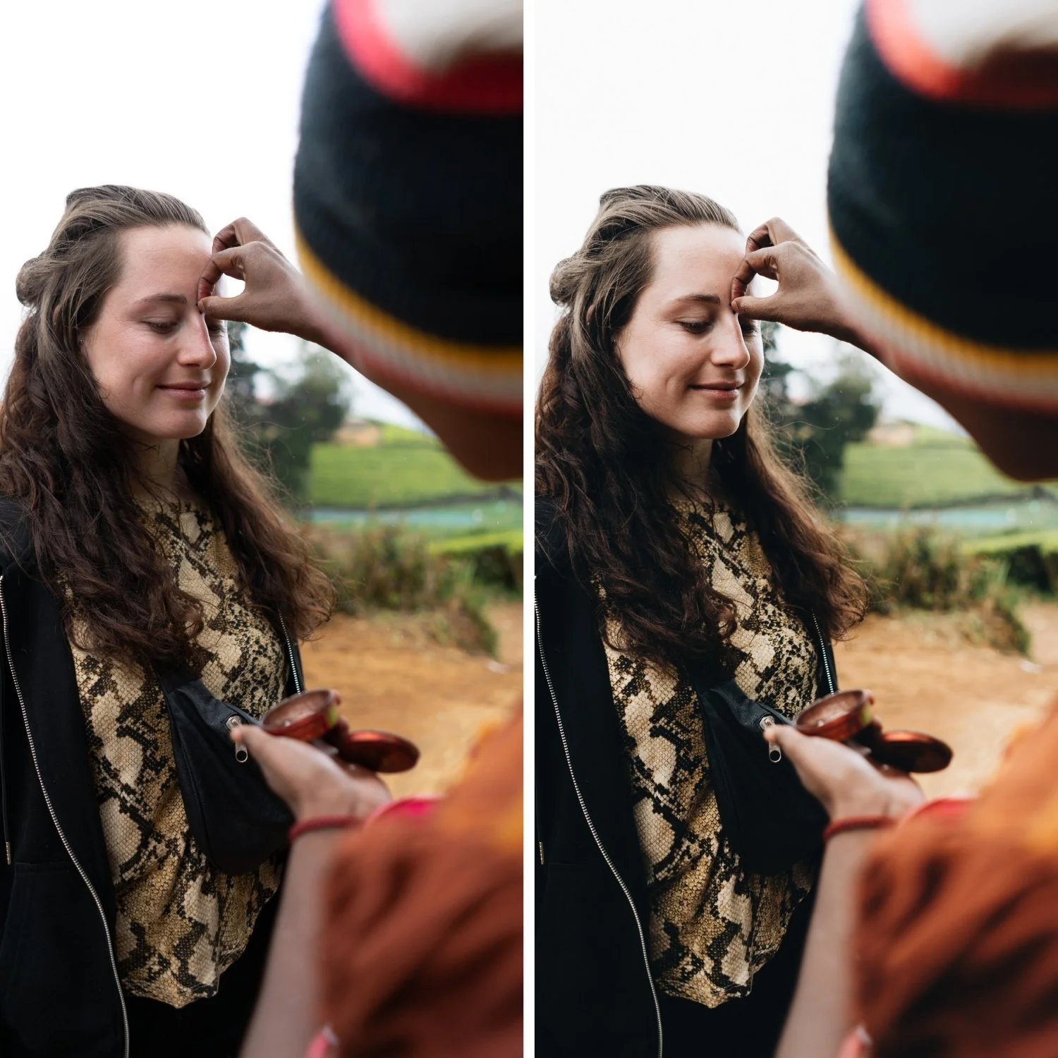
Before approaching any specific Lightroom adjustment, it helps to understand what the target looks like. Timeless travel photography consistently has five qualities. The color is balanced rather than pushed in any dramatic direction. The contrast is present and dimensional without being punchy or harsh. The greens and blues read as natural rather than vivid. Skin tones in travel portraits are warm and present without turning orange. And the editing is consistent across the full range of images from a trip, creating a cohesive body of work rather than a collection of individually processed photographs.
Each of these properties requires a specific approach.
Controlling Green Channels: The Single Biggest Upgrade
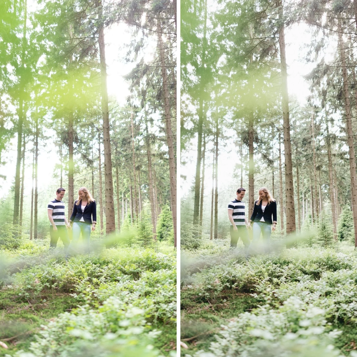
Digital cameras render foliage, grass, tropical vegetation, and mountains with a level of green saturation that does not exist in actual outdoor photography on film. This is not a flaw in digital cameras, it is simply a different color rendering behavior. But it creates a problem for travel photography because neon green vegetation instantly reads as digitally processed rather than naturally captured.
The solution is consistent and significant: reduce Green Saturation in the HSL panel by -15 to -30 for any travel photograph with substantial outdoor vegetation. Make a slight Hue shift toward yellow, which moves the greens from a vivid blue-green toward a more organic, sun-touched quality. A small Luminance adjustment can add to the sun-washed character if needed. This single adjustment changes how expensive and considered travel photography feels more than almost any other change in the workflow.
The same principle applies to Aqua and Teal channels when coastal or water photography is involved. Pulling back saturation in these channels prevents the look from reading as artificially vibrant.
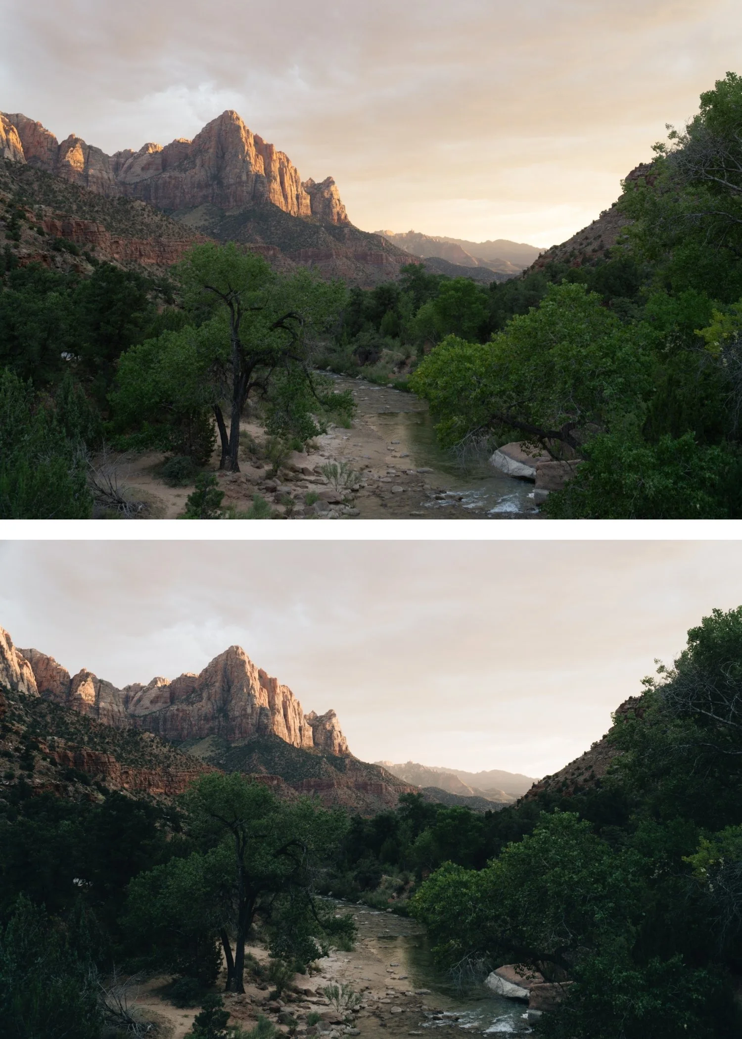
Sky and Water: Calm, Not Electric
Over-saturated blue skies are as identifiable a dated quality as heavy teal shadows. Natural skies, particularly in Mediterranean and tropical light, have a softness that comes from atmospheric haze, humidity, and the specific quality of sunlight at different hours. Pushing Blue Saturation amplifies the digital sensor's response to blue wavelengths and produces skies that look striking in isolation but immediately read as processed.
Reduce Blue Saturation by -5 to -20 depending on how vivid the starting sky is. Avoid shifting Blue Hue toward cyan, which creates the electric quality that makes the dated look recognizable. Subtle Blue Luminance adjustments can add depth to skies without increasing saturation. The goal is a sky that feels like it was photographed in good light, not a sky that looks like a color demonstration.
Contrast Structure for Travel Photography
Travel photography presents a particular contrast challenge because lighting conditions change constantly. Morning light in a narrow street has a very different tonal structure from noon light on an open coastline or golden hour in an olive grove. If you use the same contrast approach for all of these, some will feel over-processed and some will feel flat.
The reliable approach is to use a soft Tone Curve as the primary contrast tool rather than the Contrast slider, and to adjust the curve slightly based on lighting conditions rather than rebuilding from scratch for every image. The Tone Curve method is covered fully in How to Balance Contrast for a Soft Analog Look. For bright midday conditions, pull Highlights more aggressively (-30 to -45) and use a very gentle curve. For golden hour, the curve can be slightly more pronounced but the highlight protection remains important. For overcast and shade conditions, the curve can add more midtone separation to compensate for the flat ambient light. The Contrast slider itself should remain close to 0 or slightly negative in most cases.
Consistency as the Foundation of Travel Identity
Timeless travel photography is not a single image. It is a gallery. The visual identity of a travel portfolio comes from the cumulative effect of consistent tonal and color decisions across many photographs from different conditions, different hours, and different environments. This is where most travel editing breaks down: each photograph is optimized individually, the white balance shifts from warm to cool to neutral across a trip, and the resulting gallery looks like it was edited by different people.
The practical solution is to establish a fixed editing logic before starting a trip rather than developing one during editing. Decide on your color direction (warm-neutral, neutral, or slightly cool), your contrast approach, and your saturation restraint level. Apply these consistently as a base, then make per-image adjustments to Exposure and White Balance only. The color philosophy stays constant even as individual exposure values change.
When the editing logic is consistent, viewers experience the travel photography as a coherent body of work. They feel the place rather than noticing the editing. That is the marker of the timeless travel aesthetic.
Common Mistakes That Date Travel Photography
The patterns that consistently produce dated travel edits are almost always about exaggeration. Over-saturated greens create a theme-park quality. Electric blue skies reference a specific era of Instagram editing. Heavy orange skin suggests warmth was stacked from multiple sources without restraint. Crushed shadows remove the airy quality that travel photography in good light naturally has. And the most damaging mistake: inconsistent color across a trip that breaks the sense of a coherent visual journey.
Every one of these can be addressed without complex workflow changes. Consistent white balance, controlled HSL channel saturation, and a soft Tone Curve as the primary contrast tool will remove most of them.
For the warm nostalgic direction that personal and travel documentary photography often calls for, Warm Nostalgic Photo Editing Style covers how to build that aesthetic from the same travel foundation.
FAQ
Should travel photos always be warm?
Not necessarily. The important quality is consistency rather than warmth specifically. Warm, neutral, and slightly cool can all produce timeless travel photography if applied consistently and with restraint. What creates the dated look is exaggeration in any direction.
How do I stop my travel photos looking inconsistent across a trip?
Fix white balance before applying any other adjustment, and do it consistently. The biggest source of inconsistency in travel galleries is different white balance starting points across different lighting conditions.
Why do my greens always look neon in outdoor photos?
Digital sensors render green saturation differently from film. Consistent Green Saturation reduction in HSL (-15 to -30) and a slight Hue shift toward yellow will resolve this across most outdoor travel photography.
Does timeless travel photography require shooting in specific locations?
No. The timeless quality comes from editing decisions rather than destinations. The same tonal approach applied consistently to photography in any location produces a cohesive, considered body of work.
Start with a calibrated base for outdoor travel photography:
Download the free Analog Film preset and test it across photos from varied travel conditions to understand how consistent tonal logic creates visual coherence.
For a complete outdoor travel preset system calibrated for varied natural light conditions, explore the California Archive.