Warm Nostalgic Photo Editing Style
Warm Nostalgic Photo Editing Style
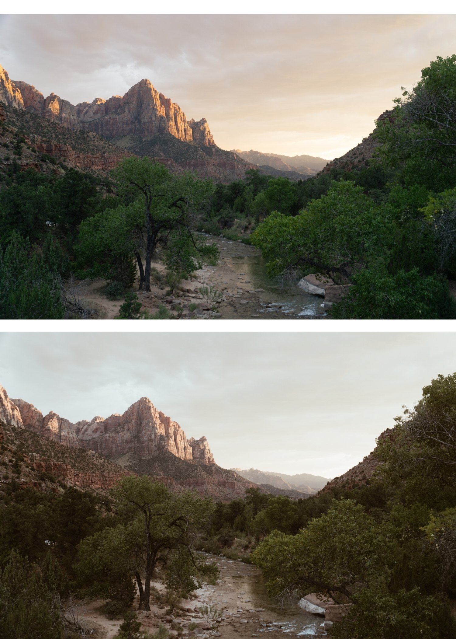
Some photographs feel like documentation. They record what was in front of the camera accurately and completely. Others feel like memory. They have a warmth, a softness, and an organic quality that makes the viewer feel something about the image rather than simply registering its content. The warm nostalgic aesthetic is a specific editing approach that produces the second quality from digital photographs.
It is not achieved by making everything warmer or by adding a heavy matte treatment. Those are shortcuts that produce a surface imitation of the nostalgic look without the tonal depth that makes it convincing. The actual nostalgic aesthetic comes from a specific combination of highlight behavior, contrast structure, color restraint, and the warm bias of late afternoon light, recreated in a way that feels inherent to the photograph rather than applied on top of it.
What the Nostalgic Warmth Actually Is
Nostalgia in photography is not a color temperature. It is a tonal quality. The specific warmth of photographs that feel nostalgic comes from the way film photography rendered warm ambient light: golden in the highlights, warm amber in the midtones, and with shadow floors that lifted slightly rather than going pure black. The result was photographs that felt luminous and warm without the oversaturated quality that modern warm filters produce.
This is why pushing Temperature aggressively and adding a matte black point does not produce the nostalgic look. Temperature increases warm everything globally, including whites, which produces yellow rather than golden. Matte blacks remove shadow depth rather than creating the shadow warmth that makes film photographs feel dimensional. The nostalgic look requires targeted warmth in specific tonal ranges, not a global warm shift applied indiscriminately.
Building the Nostalgic Foundation With Exposure
Nostalgic photographs are generally not dark. They have a luminous quality in the highlights that comes from the warm light conditions in which they were typically taken. The exposure setup for a nostalgic edit should create this breathing room rather than compensating for underexposure in the shadows.
Pull Highlights to -15 through -35 to protect bright areas without removing their luminosity. Reduce Whites by -5 to -15. Keep Shadows in the -5 to -20 range rather than lifting them aggressively, which would remove the shadow depth that gives the image its tonal dimension. Blacks can be lifted slightly (+5 to +10) to create the shadow floor that film photography has naturally, but this is a subtle adjustment rather than a dramatic one. The goal is an image that feels open and warm-toned, not an image that looks flat or processed.
Contrast: The Key Difference Between Nostalgic and Flat
The most common mistake in nostalgic editing is removing contrast in the pursuit of softness. Nostalgic photographs are soft in the sense that they do not have harsh digital punch, but they are not flat. They have genuine tonal depth and shadow density. Removing the Contrast slider and leaving everything soft and undifferentiated produces muddiness rather than warmth.
The correct contrast approach is to replace the global digital contrast with a soft Tone Curve that creates the layered, dimensional quality of film. The complete contrast methodology is explained in How to Balance Contrast for a Soft Analog Look, which gives the step-by-step process for rebuilding film contrast from a flat digital starting point. Lower global Contrast slightly (-5 to -15) to remove the digital aggression, then add a gentle S-curve that lifts upper midtones and compresses lower midtones slightly, while protecting the highlight point. The shadows should have depth rather than being lifted into grey. The midtones should be smooth and warm, not harsh. The highlights should be luminous rather than clipped or compressively grey.
Where to Place the Warmth
Warmth in nostalgic editing is most convincing when it lives in the highlights. This is where warm afternoon and golden hour light actually creates warmth in a scene, and it is where the Color Grading panel can place it specifically without contaminating the midtones and shadows.
Push Highlight Hue toward 40-50 with Saturation at 5-10 in Color Grading. This creates the specific golden quality of warm film photography in bright areas without making whites yellow. Shadow Grading should stay very close to neutral, with at most a very slight warm direction (not cool) at minimal saturation. The nostalgic aesthetic is not built on warm-cool color separation. It is built on warm highlights, warm midtones, and relatively neutral shadows that have depth rather than coolness.
White balance should add slight warmth to the overall image but stay restrained. A Temperature increase of +3 to +8 above neutral is the right range for most photographs. If whites start reading as yellow at any point, the temperature is too high for the available ambient color in the image.
Color Management for the Nostalgic Look
Digital color in outdoor photography tends toward the vivid and aggressive in ways that work against the nostalgic aesthetic. Greens in particular render too vividly and with a slightly blue-green quality rather than the warm, sun-touched organic quality that characterizes the environments where nostalgic photography typically happens.
Reduce Green Saturation by -15 to -30 and shift Green Hue slightly toward yellow. This creates the warm, slightly dusty outdoor color that suits the nostalgic aesthetic. Yellow Saturation can be reduced by -5 to -15 to prevent warm outdoor scenes from reading too vivid. Blue Saturation at -5 to -20 keeps skies natural. Orange should be handled with the standard skin-tone approach: reduce Saturation by -5 to -20, increase Luminance by +5 to +15. This keeps skin warm and dimensional rather than orange.
Grain: Organic, Not Obvious
Grain is the finishing layer that unifies the nostalgic edit and reinforces the film quality. But it needs to be calibrated correctly. Too much grain becomes the dominant visual element and makes the photograph look like a texture effect was applied. Too little grain leaves the image feeling clean and digital despite the tonal work.
The right range for nostalgic grain is Amount at 15-25, Size at 20-30, Roughness at 40-60. At these settings, the grain adds textural quality that the viewer registers as a film-like presence rather than identifying as added grain. The grain should feel like it is part of the image rather than sitting on top of it.
Consistency and the Body of Work
The nostalgic aesthetic is most powerful when it characterizes a body of work rather than appearing in individual photographs. A single well-edited nostalgic photograph is compelling. A gallery of consistently nostalgic photographs creates a visual identity and a sense of perspective that makes viewers understand how the photographer sees the world.
This consistency requires a fixed editing logic rather than optimizing each photograph individually. The warmth placement, the contrast structure, and the color restraint should be constants. Exposure and White Balance are the per-photo variables. This workflow applies the same tonal philosophy to every image while adapting it to the specific conditions of each photograph.
FAQ
Is warm nostalgic the same as orange editing?
No. Orange editing pushes Orange Saturation and Temperature aggressively and produces an obviously filtered result. Warm nostalgic is built on targeted highlight warmth in Color Grading, restrained Temperature adjustment, and reduced Orange Saturation in HSL, producing warmth that feels inherent to the photograph.
Should I lift blacks for the nostalgic look?
Only slightly. A Blacks lift of +5 to +10 creates the shadow floor that film emulsion has naturally. Heavy Blacks lifting (the matte look) removes shadow depth and produces a flat, trendy quality rather than a genuine nostalgic one.
Does grain make an image nostalgic?
Grain at the right level supports the nostalgic quality, but it cannot replace the tonal work. Grain on a flat, incorrectly contrasted image does not produce a nostalgic result. The correct grain calibration approach is covered in the Cinematic but Natural Editing Style Guide. Grain on a flat, incorrectly contrasted, or harshly colored image does not produce a nostalgic result. It produces a grainy digital photograph.
What lighting conditions work best for the nostalgic look?
Backlight, side light, golden hour, and soft window light all support the nostalgic aesthetic. For the summer outdoor version of the nostalgic warmth applied to travel photography, Warm Summer Film Look in Lightroom covers that specific ambient light context. because they produce the warm, directional light quality that the editing is designed to enhance. Harsh midday sun requires more tonal management before the warm editing can work effectively.
Test the warm nostalgic structure on your own photos:
Download the free Analog Film preset as a starting point, then add the Color Grading highlight warmth described in this guide.
For a preset collection built around the warm, nostalgic analog philosophy, explore the Juniper Archive or the Vesper Archive.