How to Get a 2000s Digital Camera Look in Lightroom
How to Get a 2000s Digital Camera Look in Lightroom
The 2000s digital camera look is having a moment, and most attempts at it recreate the surface without the structure. Bright, saturated, sharp: those are the symptoms. The actual look comes from four specific technical limitations that every camera of that era shared, and understanding what each one did makes the difference between a photograph that reads as genuinely of the period and one that reads as a modern photo with a filter.

The Four Limitations That Created the Look
Limited dynamic range. Sensors of that era captured roughly five stops of usable range against fourteen or more today. Bright areas hit pure white immediately and dark areas went to black with very little in between at either end. This is the single most defining characteristic and the hardest to fake convincingly.
Aggressive in camera processing. Small sensors and low resolution meant manufacturers applied heavy sharpening and saturation to compensate. What arrived on the memory card had already been pushed hard, which is why those photographs have a specific crunchy, vivid quality that no amount of tasteful editing produces.
Weak built in flash close to the lens. Fast falloff, flat frontal lighting, and instant clipping on any reflective surface. Almost every indoor photograph from that era carries this signature.
Cool colour rendering against warm ambient. Flash tubes ran cooler than the tungsten lighting most homes and venues used, producing a distinctive split between subject and background that current auto white balance systems specifically correct away.
Recreating Limited Dynamic Range
This is where most attempts go wrong, because it requires deliberately destroying information that your camera worked hard to capture.
Push Highlights and Whites positive, positive 20 to positive 40, until bright areas genuinely clip rather than holding recoverable detail. Then reduce Shadows, negative 5 to negative 20, so dark areas approach black rather than retaining the graduated detail a modern sensor preserves.
The result is a photograph with information at the extremes removed, which is precisely what a 2003 sensor produced. Leaving highlights protected and shadows lifted, which every film editing instinct pushes you toward, produces a photograph that cannot read as period accurate no matter what colour treatment is applied on top. How to Get the Y2K Look in Lightroom covers this reversal in more detail.
Recreating In Camera Processing
Clarity positive 10 to positive 20 and Texture positive 10 to positive 20 recreate the aggressive sharpening. Vibrance positive 15 to positive 25 recreates the saturation push.
Blue Saturation specifically to positive 20 to positive 30, since blue was the channel manufacturers pushed hardest and it is the most identifiable colour marker of the era. Skies and blue clothing from that period have a distinctive electric quality that no other decade of digital photography produced.
Orange Hue negative 5 to negative 10 toward red produces the slightly pink orange skin cast those sensors rendered, which is subtle but contributes significantly to period accuracy.
Camera by Camera: What Different Models Did
The 2000s digital look was not uniform across manufacturers, and knowing the differences helps if you are targeting a specific reference rather than the general era.
Canon PowerShot models rendered warmer than their competitors, with skin that leaned toward orange rather than pink. If your reference is a PowerShot photograph, reduce the Orange Hue shift toward red and let warmth sit higher.
Sony Cyber-shot models were the most aggressively saturated of the era, particularly in blue. Push Blue Saturation toward the top of the positive 20 to positive 30 range for that reference.
Casio Exilim and the ultra compact category produced the harshest results, with the smallest sensors and the most aggressive processing. Push Clarity and Texture to the top of their range for this one.
Nikon Coolpix sat between the extremes, generally cooler than Canon and less saturated than Sony.
These are broad tendencies rather than precise recipes, but they explain why photographs from that era vary noticeably despite sharing the same underlying limitations.
Resolution and Crop
One characteristic that cannot be recreated through colour and tone adjustment alone is resolution. Cameras of that era shot three to five megapixels, and the resulting softness at any meaningful print size is part of how those photographs read.
For content destined for social media at 1080 pixels this is irrelevant, since everything gets downsampled anyway. If you are producing something intended to look genuinely period accurate at larger sizes, exporting at a lower resolution and then upscaling reproduces some of that softness, though it is a niche consideration for most uses.
The aspect ratio is worth more attention. Cameras of that era shot 4:3 rather than the 3:2 that most current cameras default to. Cropping to 4:3 is a small change that contributes meaningfully to the period reading, and it costs nothing.
Recreating the Flash Signature
If your source photograph was shot with flash, most of this is already present. If not, it can be partly approximated.
Increase Exposure until the subject reads bright and front lit. Reduce Shadows so the background falls away. Add a subtle vignette, negative 10 to negative 20, to accelerate the edge darkening.
This works on photographs that already have directional light on the subject. It cannot manufacture the structure on a flat, evenly lit frame, which is why source selection matters more for this aesthetic than for most. How to Edit Flash Photos Like a Digicam covers working with genuine flash frames.
Noise, Not Grain
The texture question separates a convincing 2000s edit from an obviously modern one dressed up.
Those cameras produced digital noise: fine, uniform, sitting differently in shadows than film grain does. Adding film grain to a 2000s digital edit is a medium mismatch that reads immediately as wrong to anyone familiar with either.
Set Grain to zero to eight, minimal, and reduce Noise Reduction to negative 20 to negative 30 to reveal the sensor's own noise instead. On a modern camera at base ISO there may be little to reveal, in which case shooting at higher ISO deliberately produces more authentic texture than any post processing can add.
What This Does and Does Not Suit
It suits indoor social photography, flash lit frames, casual snapshots, and anything with period appropriate styling or subject matter.
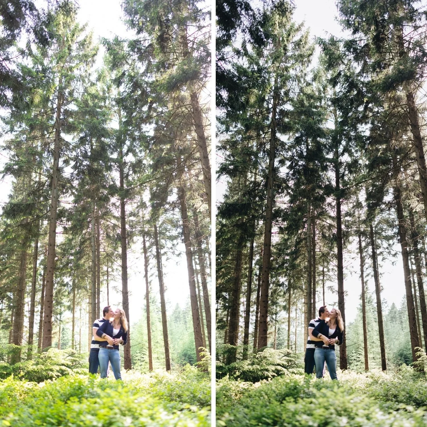
It works against landscape and architectural work, where clipped highlights destroy the detail that is usually the point. It works against formal portraiture, where the harsh clarity and flat flash rendering are unflattering rather than characterful.
Best Digicam Lightroom Presets covers how to evaluate whether a preset is genuinely doing this calibration or simply pushing saturation and calling it retro.
The Calibrated Version
N1 Clean Modern and N2 Warm Modern from the Nostalgic Digicam Set apply this full calibration in one step, with N1 for indoor and flash frames and N2 for outdoor warm light.
FAQ
Is this the same as the 90s film look?
No, close to the opposite. The 90s film look uses lifted blacks, soft highlights, warmth, and visible grain. The 2000s digital look uses clipped highlights, crushed shadows, cool colour, and minimal grain.
Do I need an actual old camera?
No, though secondhand digicams are inexpensive and produce the look natively. Editing a modern file gets close enough for most uses.
Why does my edit look modern despite following the settings?
Usually the dynamic range step was skipped. If highlights still hold recoverable detail and shadows still show graduated tone, the photograph reads as modern regardless of colour treatment.
Try the 2000s digital treatment on your own photographs:
Download the free M5 presetas a base, then apply the dynamic range and colour adjustments described above.
For the calibrated version, the Nostalgic Digicam Set includes N1 and N2 at $6.75 each or $27 for the four preset set. The Studio Archiveat $89 includes it alongside every other collection.
