Snow Film Look Without Blue Tint — Lightroom Guide (2026)
Snow Film Look Without Blue Tint — Lightroom Guide (2026)
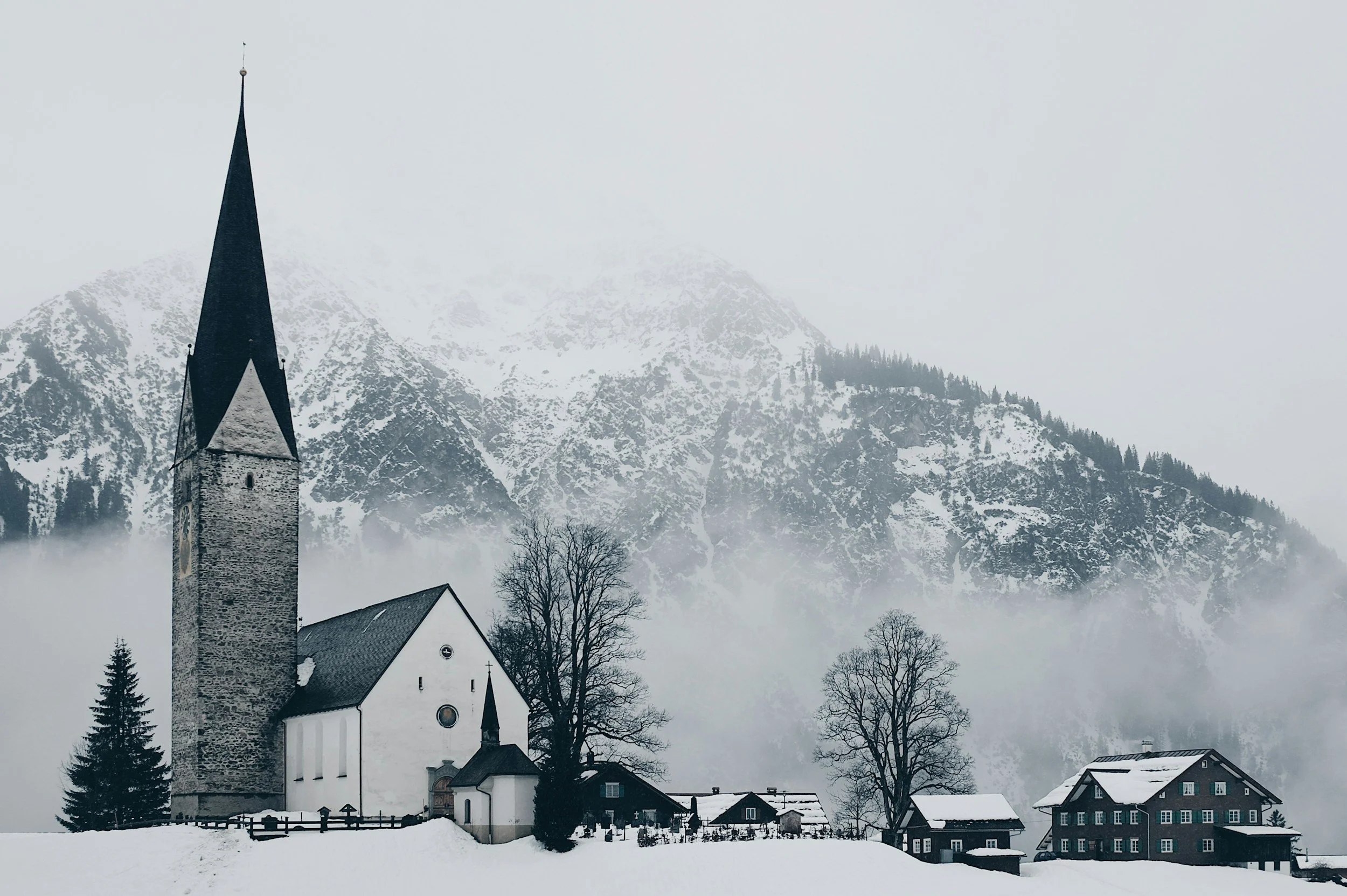
Snow photographs almost always have a blue tint problem. Snow reflects the sky, and sky light is blue — so snow records as blue-white rather than white. Auto white balance tries to correct this but often overcorrects toward orange. The result is either blue snow or orange-tinted snow, and neither looks like the clean, bright, film-quality snow photography you are after.
This guide covers the exact approach to snow photography editing — removing the blue without going orange, and achieving the specific clean-cold quality of winter film photography.
Why snow goes blue in photos
Snow is highly reflective — it reflects the colour of the light that falls on it. On an overcast day, that light is coming from a grey-blue sky. On a clear day, it comes from the blue sky overhead.
The result: snow records as blue-white, not neutral white. The camera's sensor sees this accurately. Auto white balance then tries to neutralise the blue by adding warmth, often too much.
The solution is not to warm snow aggressively but to find the specific correction that makes snow read as clean white-grey without pushing it toward orange.
The white balance fix for snow
Overcast snow: Set Temperature to 6,200-6,800K, Tint +6 to +10.
At this range, snow reads as clean white-grey rather than blue-white, but without the orange push that higher values create.
Clear blue sky and snow: 6,000-6,500K, Tint +5 to +8. Clear-sky snow has more blue than overcast snow because the direct sky reflection is stronger.
Golden hour snow: 5,200-5,600K, Tint +5. Golden hour snow is already warm from the low sun — less correction needed. Keep some warmth.
Blue hour snow: 5,800-6,200K, Tint +4. Blue hour snow is intentionally blue — this is a scenario where keeping some of the blue tint is part of the aesthetic. Only correct partially.
The key: fix white balance so that a sheet of white paper would look neutral white in the scene. Snow is not paper-white — it will always have slight tonal character — but this is the correct calibration target.
The Tint slider for snow
The Tint slider is as important as Temperature for snow. Snow under overcast sky often has a slight green cast in addition to the blue. The +6 to +10 Tint range corrects this. Without Tint correction, corrected snow can look slightly grey-green rather than clean white.
Highlights and clipping in snow
Snow is among the brightest subjects in photography. It clips to pure white very easily — and unlike skin or sky, clipped snow has very obvious consequences because it removes the textural quality of snow surface.
Highlights: -45 to -60 for snow photography. More aggressive than any other subject. This is one of the few scenarios where Whites -20 to -30 is also appropriate on top of Highlights.
Check the histogram after applying. Snow should produce a distribution that reaches the right edge of the histogram but does not clip into the right wall. A small gap between the distribution and the right edge means detail is being preserved.
Color calibration for snow
Blue Saturation: -14 to -20. Reduces the blue cast that persists even after white balance correction. This is the most important single colour adjustment for snow photography.
Blue Hue: +8 to +12 toward purple. Shifts the remaining blue from digital cold-blue toward a more organic blue-grey.
Aqua Saturation: -10 to -14. Snow in shade often has an aqua-blue quality from the sky reflection. Reducing Aqua removes this.
Green Saturation: -15 to -20. Winter landscapes have minimal vivid green, but any remaining foliage tends toward vivid digital quality — reduce.
Shadow Color Grading for winter
The shadow character in snow photography determines whether the edit feels warm-and-inviting or cold-and-atmospheric.
Warm cozy snow quality: Shadow Color Grading: Hue 38, Saturation 14-16. The amber warmth contrasts beautifully with the blue-white quality of snow.
Cool cinematic snow quality: Shadow Color Grading: Hue 200-210, Saturation 6-8. Very subtle cool shadow quality that references the ambient blue sky light.
Best presets for snow photography
A6 Clean Portrait — for snow portrait sessions. The balanced warmth and highlight protection handle snow-lit subjects well.
A2 Bright Minimal — for clean, minimal snow landscape photography. The restrained warmth keeps snow feeling bright rather than overly warm.
B5 Cool Tone (B-Series black and white) — for snow converted to B&W. The cool toning references the blue-grey quality of winter light in monochrome.
FAQ
My snow still looks blue after increasing Temperature. What is wrong?
The Blue Saturation reduction has not been applied. White balance correction addresses the overall colour temperature but specific Blue Saturation reduction is needed to remove the persistent blue cast in the snow range. Apply Blue Saturation -16 to -20 after white balance correction.
How do I prevent people's faces from looking blue in snow portraits?
Add a Radial Gradient over the face with Temperature +200, Tint +3. This locally warms the face while keeping the snow at the corrected cool temperature.
Should snow look pure white in the final edit?
No. Pure white snow means clipped highlights. Well-edited snow should look bright white-grey with visible surface texture. If you look at the photo and can see the crystalline quality of snow, the highlights are correctly preserved.
