Cozy Winter Color Grading in Lightroom (2026)
Cozy Winter Color Grading in Lightroom (2026)
Cozy winter photography has a specific visual character: the warmth of interior light against cold outside, the amber quality of candlelight in a dim room, the particular comfort of winter scenes that feel enclosed and intimate rather than cold and bleak. Getting this quality requires more than adding warmth — it requires a specific balance between warm foreground and cool ambient that creates the cozy contrast.
What makes cozy winter editing different
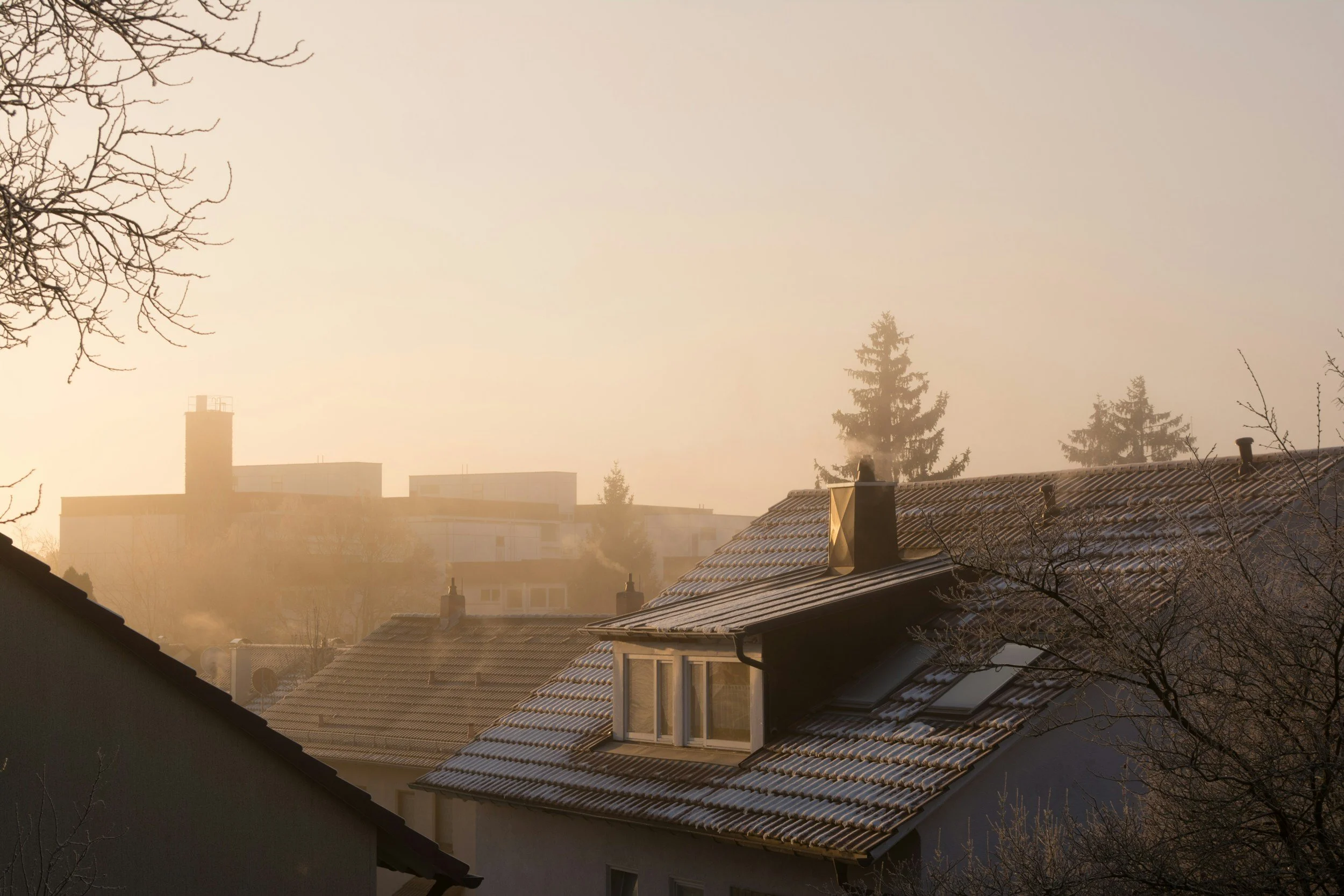
The cozy winter aesthetic is built on a specific colour contrast: warm amber in the foreground and interior, with a sense of the cool winter outside. The edit should amplify this contrast rather than homogenise it.
Practically: warm highlights and midtones, deep warm shadows, with any exterior visible through windows staying cool and blue. The contrast between the warm interior and the cool exterior is what makes the scene feel cozy — correction that removes this contrast removes the cozy quality.
This is the opposite of how most photographers approach white balance. The instinct is to correct the white balance to neutral and then add warmth with Color Grading. For cozy winter, the approach is to keep the warm ambient and only correct the excess — leaving the warm-cold contrast intact.
White balance for cozy winter
Indoor candles only: 3,000-3,500K in Lightroom. The camera's Auto white balance may have set this lower — pulling Temperature up to 3,200-3,800K preserves the warm amber quality while removing the worst of the orange cast.
Fireplace and warm interior light: 3,500-4,200K. Slightly warmer than candles. The specific orange-red quality of firelight is part of the aesthetic — do not fully neutralise it.
Indoor Christmas lights and lamp combination: 3,800-4,500K. The mixture of warm sources averages out to a slightly less extreme warm.
Indoor with window showing cold exterior: the key is calibrating white balance for the interior subject (3,500-4,500K depending on light sources) and letting the window view stay blue-cool. Do not try to correct both at once — the warm-cold window contrast is the cozy quality.
Outdoor winter cozy scenes (cabin, Christmas market, exterior at dusk): 5,200-5,600K, Tint +5 to +8. Keep the warm artificial lights while the cool ambient provides the winter character.
Tonal foundation for cozy winter
Exposure: -0.1 to -0.3. Cozy photography is slightly darker than neutral — the intimacy of dim indoor light is part of what makes it feel cozy. Not underexposed, but intentionally below neutral brightness.
Highlights: -40 to -55. Candles, fairy lights, and Christmas tree lights all clip easily. Aggressive highlight protection is essential.
Blacks: +15 to +20. Less shadow lift than spring or summer — winter cozy has deliberate shadow depth that contributes to the intimate quality.
Shadows: +8 to +14.
Contrast: -10 to -12.
Clarity: -10 to -12. Soft edge rendering suits interior cozy photography. The warmth and intimacy of the scene should not have digital sharpness.
The Color Grading — most important for cozy
This is where the specific cozy character is built. The Color Grading for cozy winter uses the most saturated shadow warmth of any editing direction.
Shadow Color Grading: Hue 35-38, Saturation 18-24.
This is significantly more saturation than standard film look editing (10-16). The deep amber in the shadows creates the enclosed, intimate quality — warmth pooling in the corners and dark areas of the scene, references firelight and candlelight that lit interiors before electricity.
Highlight Color Grading: Hue 40-45, Saturation 6-10.
Warm amber in the highlights reinforces the artificial light quality. More highlight Color Grading than standard film look editing.
Midtone Color Grading: Hue 38, Saturation 8-10.
The overall warmth through the midtone range ties the shadows and highlights together.
The Blending slider: set to 40-48. This concentrates the shadow warmth in the shadow range rather than spreading too far into the midtones — the warmth should feel like it comes from the shadow areas, not from a global warm cast.
HSL colour adjustments for cozy
Orange Hue: -5 to -8 toward red. Deepens the amber quality of candles and warm interior light toward a richer, more amber-red rather than vivid orange.
Orange Saturation: +6 to +12. More orange presence than any other season. Winter interior scenes benefit from more saturated warmth.
Yellow Saturation: +4 to +8. Warm surfaces, wood tones, amber highlights from artificial light.
Blue Saturation: -10 to -16. Any window view or exterior blue reduced but not eliminated — keeping some blue in the exterior reinforces the warm-cold contrast.
Grain for cozy winter
Amount: 24-30. Size: 26-32. Roughness: 48-56.
More grain and slightly larger than spring or summer work. The intimate, enclosed quality of indoor winter photography carries grain naturally — it reinforces the organic, film quality of the aesthetic.
For high-ISO indoor photos in dim light: apply AI Denoise first, then add grain at these values. The clean denoised base plus calibrated grain produces better film quality than sensor noise plus additional grain.
Best presets for cozy winter
M5 Warm Dark — the most suited preset for cozy interior winter photography. Deep shadow warmth, controlled highlights, and the specific amber quality built into the Shadow Color Grading.
M4 Moody Classic — for a slightly less warm, more cinematic winter quality. Atmospheric interiors and blue hour exterior winter scenes.
A4 Golden Warmth — for brighter interior scenes where there is more light and the golden quality is the dominant characteristic rather than the shadow depth.
FAQ
Why does my cozy winter edit look orange instead of warm amber?
White balance was not corrected to the indoor ambient before applying. Candle scenes need Temperature at 3,000-3,500K in Lightroom — at Auto white balance or higher values, a warm preset pushes into orange territory. Also check Orange Saturation is not above +12 — above this it tends toward orange rather than amber.
How do I keep the cool blue of the window visible while making the interior warm?
Calibrate white balance for the interior subject and do not correct for the window. The window retains the cool blue of the sky outside — this contrast is the cozy quality. If you equalise the temperature across interior and exterior, the cozy feeling disappears because the warm-cold contrast is removed.
Which is better for cozy winter — M5 or A4?
M5 for darker, more intimate interior scenes with deep shadow warmth and low ambient light. A4 for brighter scenes where there is more light and the golden quality is more prominent than the shadow depth. If the scene is a dim candlelit room: M5. If the scene is a well-lit golden kitchen: A4.
Does the cozy winter look work for outdoor photography?
Yes for outdoor scenes with warm artificial lights (Christmas markets, cafe windows, cabin exteriors at dusk). The warm lights against cool winter ambient creates the same warm-cold contrast as interior photography. Use White Balance 5,200-5,600K to keep the cool ambient while the artificial lights provide the warm quality.
