Warm Summer Film Look in Lightroom
Warm Summer Film Look in Lightroom
Summer photography presents a specific editing challenge. For the broader travel aesthetic framework that summer photography lives within, How to Create a Timeless Travel Aesthetic covers the consistent editing philosophy across a full trip. The ambient light is intense, the color palette is saturated, and the warmth that makes summer photographs feel alive can easily tip into the orange, washed-out, over-filtered quality that makes them feel cheap. The warm summer film look is a specific aesthetic that navigates this challenge: golden highlights rather than yellow mids, calm blues rather than electric skies, organic greens rather than neon foliage, and skin that reads as sun-kissed rather than scorched.
Getting this right requires understanding what the look actually is at a technical level rather than simply making things warmer. Warmth without structure produces orange. Structure without warmth produces a cold clean aesthetic. The specific combination is what creates the Mediterranean summer film quality.
What the Look Actually Consists Of
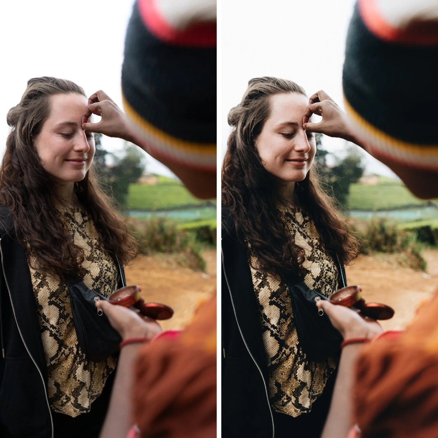
The warm summer film look has five defining properties. Golden highlights are the most immediately recognizable: bright areas have a warm, creamy quality rather than the neutral-to-cool quality that digital sensors produce by default. Soft contrast provides tonal depth without the punchy, contrasty quality of digital processing. Blues are restrained, which keeps sea and sky looking natural in outdoor conditions rather than electric and oversaturated. Greens read as warm, dry, and sun-touched rather than vivid and neon. And skin has a warm, dimensional quality that refers to sunlit warmth rather than orange processing.
Each of these requires a specific and separate adjustment. They cannot all be achieved by pushing Temperature higher.
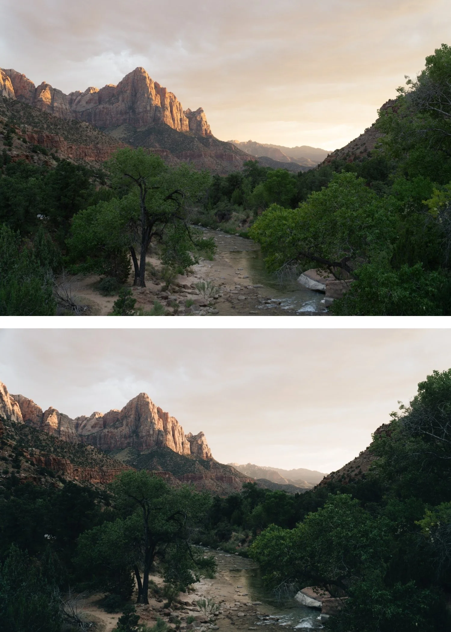
Starting With Breathing Room
Summer light is strong. The first problem most photographers encounter when editing bright outdoor photography is that the bright areas are already at or close to clipping before any adjustments are made. Pushing warmth into a file with clipped highlights produces yellow, washed-out results rather than golden warmth.
The solution is to create tonal space first. Pull Highlights significantly, typically -20 to -45 depending on how bright the scene is. Reduce Whites by -5 to -20. Keep Shadows in the -5 to -25 range, which maintains shadow depth rather than lifting everything into a flat grey quality. The goal at this stage is an image where the bright areas have room and the shadows have depth, before any warmth or color adjustments.
White Balance: The Most Common Mistake
Most photographers who try to build a warm summer look push Temperature aggressively and immediately. The problem is that global Temperature increases warm everything simultaneously, including whites. When whites read as yellow rather than creamy, the look crosses from golden warmth into over-processed territory and becomes immediately recognizable as a heavy filter rather than a film quality.
The correct approach is to neutralize obvious color casts first, then add warmth gradually. A Temperature increase of +3 to +10 above neutral is typically the right range, depending on the ambient light temperature of the specific scene. Tint should remain close to neutral and not be pushed toward magenta. If the whites in the image are starting to look yellow at any point, the temperature has been pushed too far.
Building the Summer Warmth in the Right Place
The warmth that makes summer photography feel golden rather than orange lives specifically in the highlights. This is where the warm light of afternoon and golden hour actually manifests in a photograph. Using Color Grading to push Highlight Hue toward 40-55 with Saturation at 5-12 places the warmth in the highlight range specifically. This same Color Grading approach is central to the Warm Nostalgic Photo Editing Style, which applies similar highlight warmth to personal and candid photography., which creates a golden luminosity in bright areas without contaminating the midtones and shadows with unwanted warmth.
Shadow grading should be kept very close to neutral or slightly cool (Hue 200-220, Saturation 3-8) to add depth without the obvious teal that references the dated teal-and-orange aesthetic.
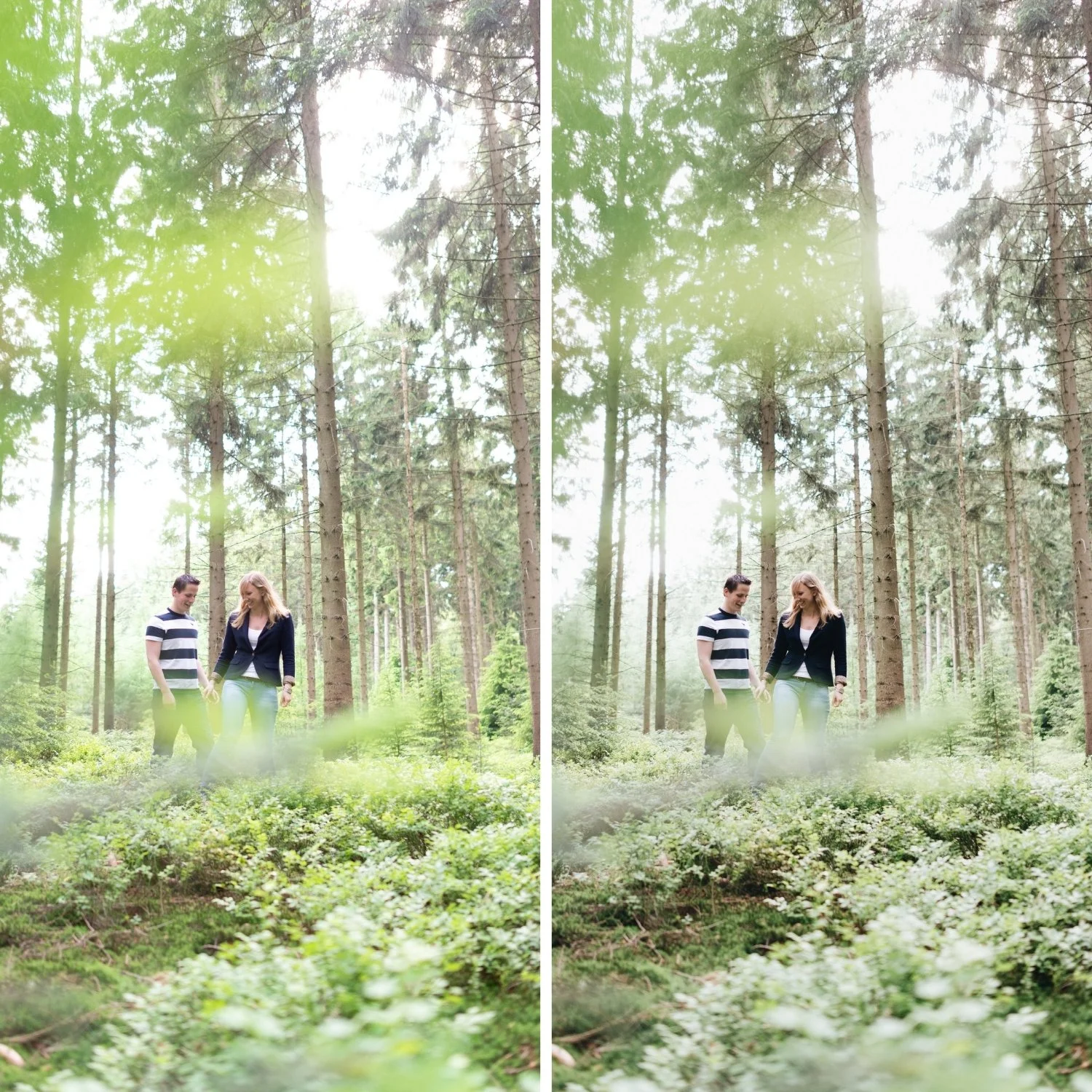
Greens: The Indicator of an Expensive Edit
The difference between travel photography that looks carefully edited and travel photography that looks cheaply processed is often entirely in the green channel. Digital camera greens in outdoor photography render with a vivid, slightly blue-green quality that does not exist in equivalent film photography or in the actual visual quality of sunlit Mediterranean environments. Olive groves, terraced gardens, mountain vegetation, and palms all have a warm, slightly dusty, sun-washed quality in person. Digitally, they render neon.
Reduce Green Saturation by -15 to -30 in HSL and shift Green Hue slightly toward yellow. This adjustment and its effect on outdoor photography is also explained in How to Create a Natural Film Look in Lightroomas part of the complete film color approach. This moves outdoor greens from digitally vivid to organically warm. A small Green Luminance reduction adds the slightly bleached, sun-touched quality that summer locations have in the strongest light of the day. This adjustment consistently makes travel photography feel more expensive and considered.
Blues: Calm, Not Electric
Mediterranean summer photography is blue-heavy. Sea, sky, shade, architecture in bright sunlight. The challenge is that digital sensors amplify the saturation of blue wavelengths in high-light conditions, and the natural blue cast that gives the Mediterranean its specific visual character can easily become an electric, oversaturated quality that removes all sense of calm.
Reduce Blue Saturation by -5 to -20. Avoid pushing Blue Hue toward cyan, which creates the synthetic quality that immediately reads as over-processed. Natural Mediterranean blues have a softness from atmospheric conditions that digital cameras do not capture but that careful saturation restraint can approximate.
Skin in Summer Light
Warm outdoor photography is where skin tone management matters most, because the combination of warm ambient light, warm white balance, and warm Color Grading can easily stack into skin tones that read as orange rather than sun-kissed.
Reduce Orange Saturation by -5 to -20 in HSL and increase Orange Luminance by +5 to +15. This combination produces warm, dimensional skin without the burnt quality of over-saturated orange. Reducing Red Saturation by -5 to -15 helps control the redness in cheeks and lips that can become prominent in warm outdoor conditions. The skin should read as warmed by the sun rather than filtered.
Keeping the Summer Look Consistent Across a Trip
Summer travel photography presents the consistency challenge in its most demanding form because the light changes constantly and dramatically: harsh midday sun on white architecture, soft golden hour on coastal water, shade under market awnings, interiors in varying ambient temperatures. If each of these is edited individually and optimized for its specific conditions, the resulting gallery looks like it was edited by multiple people with different aesthetics.
The reliable approach is to choose one tonal direction and apply it as a fixed system, then make per-image adjustments to Exposure and White Balance only. The Color Grading warmth, the HSL restraint, and the Tone Curve structure stay constant across every image. Per-image adjustments adapt the fixed system to each specific exposure without breaking the visual identity.
If you are editing summer portraits specifically, Kodak Portra Style Lightroom Presets covers the skin-first approach to warm outdoor photography in detail.
FAQ
Why does my warm summer edit look orange instead of golden?
The most common cause is Temperature pushed too far combined with Orange Saturation at 0 or above. Reduce Orange Saturation to -10 through -20 and confirm that the Temperature increase is +3 to +10 rather than a large push.
Should summer photos always have high exposure?
Summer photos should have breathing room in the highlights, which often means a slightly higher base exposure than the camera would meter automatically. But overexposure produces the washed-out, airy quality that reads as sloppy rather than bright and warm.
Why do my greens always look neon in summer outdoor photography?
Digital green rendering in bright conditions is consistently too vivid and slightly blue-green. Consistent Green Saturation reduction in HSL resolves this across most outdoor photography.
Does the warm summer look work in winter or overcast conditions?
The warm summer aesthetic is calibrated for strong outdoor light and warm ambient temperatures. Applying it to cold or overcast conditions produces a warmth that fights the ambient rather than complementing it. For overcast photography, a warmer starting white balance before applying the same adjustments can bridge some of the difference.
Try the warm summer film base on your own photos:
Download the free Analog Film preset and test it on travel photos with the green and blue channel adjustments described in this guide.
For a preset system calibrated specifically for polychrome summer outdoor conditions, explore the Summer Archive.