Why Your Travel Photos Look Inconsistent — And How to Fix It (2026)
Why Your Travel Photos Look Inconsistent — And How to Fix It (2026)
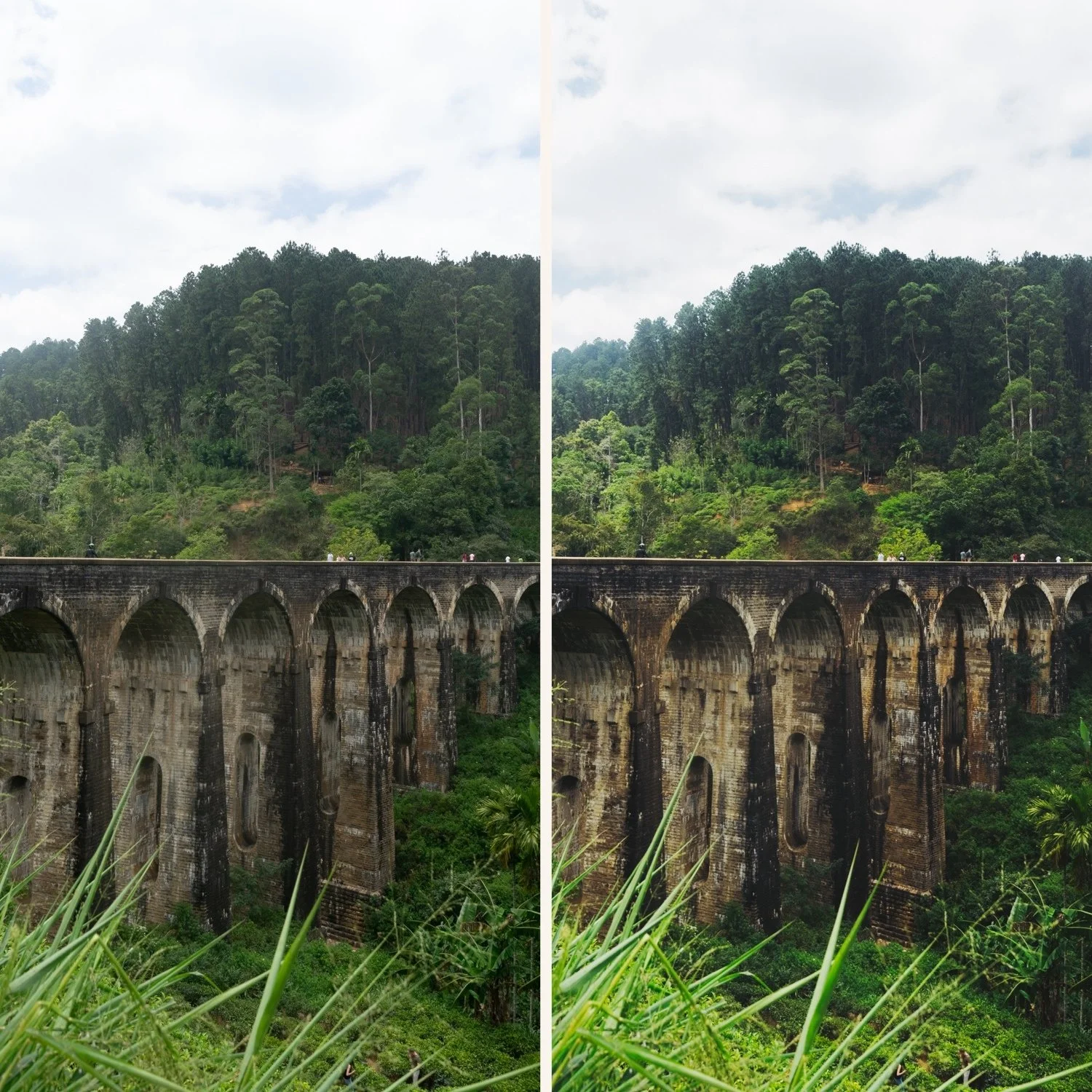
Travel photography inconsistency has one root cause: the light changes completely across a trip and the editing does not respond to it. Morning light in Paris is different from midday light in Rome is different from golden hour in Santorini. Apply the same preset the same way to all three and they look like they were edited by three different people.
The fix is a system, not a different preset.
The four causes of inconsistent travel galleries
Switching presets randomly. Using a different preset for each photo based on which looks best individually creates visual chaos across the gallery. Each photo is individually decent — together they look like a random collection.
Not correcting white balance per lighting condition. Indoor restaurant photos have warm white balance. Outdoor overcast photos have cool white balance. Apply the same preset to both without white balance correction and one looks orange, the other grey.
Inconsistent exposure treatment. Some photos exposed for the sky, others for the subject. The same preset applied to inconsistent exposures looks different on each photo.
Different lighting conditions treated identically. Morning light, midday sun, golden hour, and indoor evening light are fundamentally different. One preset variant cannot handle all four with the same settings.
The fix: edit by group, not by photo
This is the most important workflow change for travel consistency.
Step 1 — Sort photos by lighting condition after the trip.
Not chronologically — by light. All bright outdoor daylight together. All overcast together. All golden hour together. All indoor together.
Step 2 — Edit one reference photo per group.
Choose the strongest photo from each group. Fix exposure and white balance. Apply the correct preset variant for that lighting condition. Fine-tune.
Step 3 — Batch paste to the group.
Copy all settings from the reference photo. Select all other photos in the same group. Paste settings.
Step 4 — Individual fine-tune.
Open each photo and adjust only Exposure and White Balance if needed. Everything else carries across consistently.
This workflow produces gallery-wide consistency because all photos in the same lighting condition share identical color and tonal foundations.
Full workflow: How to Edit Travel Photos in Lightroom
The preset system for travel consistency
One preset creates one lighting scenario's consistency. A system of 3-5 presets on the same color philosophy covers the full range of travel light.
Bright outdoor daylight: A6 or C1
Overcast and neutral: A6 with Temperature +150 or E4
Golden hour: V5 or C7
Indoor: M4 or E4
Low light: M5 or V6
All from the same collection on the same color philosophy. Switch between them as the light changes — your gallery stays visually consistent because all presets share the same warm film foundation.
The white balance key
White balance inconsistency is the fastest way to destroy travel gallery consistency. The same preset reads completely differently at 5,500K versus 3,200K.
Fix white balance manually per photo before applying any preset. For each lighting group:
Outdoor daylight: 5,200-5,500K
Overcast: 6,000-6,500K
Indoor warm: 3,000-3,500K
Indoor neutral LED: 4,000-4,500K
Consistent white balance per group means the preset applies to a consistent foundation — the resulting color stays predictable.
FAQ
How do I make photos from different countries in the same trip look consistent?
Same approach as different lighting conditions within one day. Sort by light quality, not geography. Morning light in Japan and morning light in Italy are closer to each other than morning and evening light in the same city.
Should I use the same preset for all travel photos?
One preset family with variations, not one identical preset for everything. The color philosophy should be consistent — the calibration adapts to the light.