Best Lightroom Mobile Settings for a Natural Look
Best Lightroom Mobile Settings for a Natural Look
Natural editing is harder than dramatic editing because there is no visual effect to hide behind. A heavily stylised photograph can carry a technical flaw because the style distracts from it. A naturally edited photograph is judged entirely on whether the light, colour, and tone feel like they genuinely belong to the scene.
The goal is that a viewer notices the photograph rather than the editing. This guide covers the specific Lightroom Mobile settings that produce that result on phone photographs, which behave differently from camera RAW files and need different values.
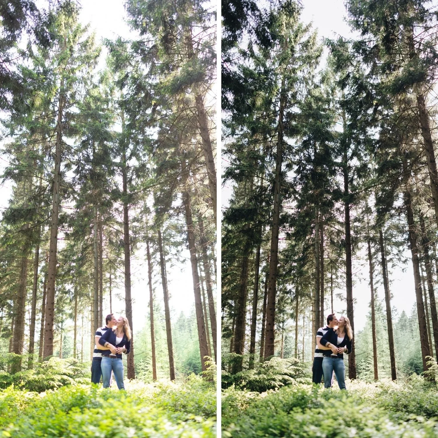
What Natural Actually Means Technically
Natural editing has four measurable properties. Colour that reads as plausible for the lighting conditions rather than pushed toward a stylistic direction. Contrast that has dimension without punch. Highlights that hold detail rather than clipping to featureless white. And skin that looks like skin rather than orange or grey.
None of these require dramatic adjustments. Most require restraint and knowing which controls to leave alone entirely.
Start by Turning Things Off
Before adding anything, check what is already applied to your file. Lightroom Mobile applies a default camera profile that varies by device manufacturer. On many phones this profile already adds contrast and saturation before you touch a single slider.
Set the Profile to Adobe Neutral or Adobe Standard rather than the device default. This gives you a flatter, more honest starting point from which natural adjustments read correctly. Adobe Landscape and Adobe Vivid both push saturation in ways that work directly against natural editing.
Set Clarity to 0. Set Texture to 0. Set Dehaze to 0. Phone cameras apply sharpening in camera as part of their processing pipeline, and adding any of these three on top produces the crisp, over processed quality that reads immediately as edited.
Exposure and Tonal Settings
Exposure: adjust until the photograph reads correctly bright. For most phone photographs this falls between negative 0.2 and positive 0.4.
Highlights: negative 15 to negative 35. Phone HDR processing frequently leaves bright areas closer to clipping than the preview suggests. This range recovers genuine detail without producing the flat grey quality that overly aggressive recovery creates in bright areas.
Shadows: negative 5 to positive 15. Resist lifting shadows heavily. Deep shadows are natural and give the photograph dimension. Heavily lifted shadows read as processed regardless of how good everything else is.
Whites: negative 5 to negative 15.
Blacks: positive 3 to positive 10. A small lift creates the film shadow floor without flattening the image. Larger lifts produce the matte quality, which is a deliberate style rather than a natural look.
Contrast: 0 to negative 10. Natural contrast comes from tonal structure rather than from the global slider. The distinction between structural contrast and slider contrast is covered in How to Balance Contrast for a Soft Analog Look.
Colour Settings for Natural Results
The Green channel is where most natural edits succeed or fail. Phone cameras render outdoor vegetation with a vivid, slightly blue green quality that does not match how the scene appeared to your eye.
Green Saturation: negative 12 to negative 25. Green Hue: positive 5 to positive 10 toward yellow. This combination moves foliage from digital vivid to organic, and it is the single most impactful colour adjustment for natural outdoor photography. The full reasoning behind why digital and film render greens so differently is covered in How to Create a Natural Film Look in Lightroom.
Orange Saturation: negative 8 to negative 18. Orange Luminance: positive 5 to positive 12. This pairing is what keeps skin natural. Reducing saturation alone leaves skin looking flat or slightly olive. Increasing luminance alongside the reduction keeps it present and warm. How to Edit Natural Skin Tones covers the four variables that together determine skin rendering.
Blue Saturation: negative 5 to negative 15. Phone skies are consistently more saturated than they appeared in person.
Yellow Saturation: negative 5 to negative 12.
Global Saturation and Vibrance: leave both at 0. Channel level control produces natural results. Global saturation adjustment moves every colour simultaneously and cannot produce a natural outcome.
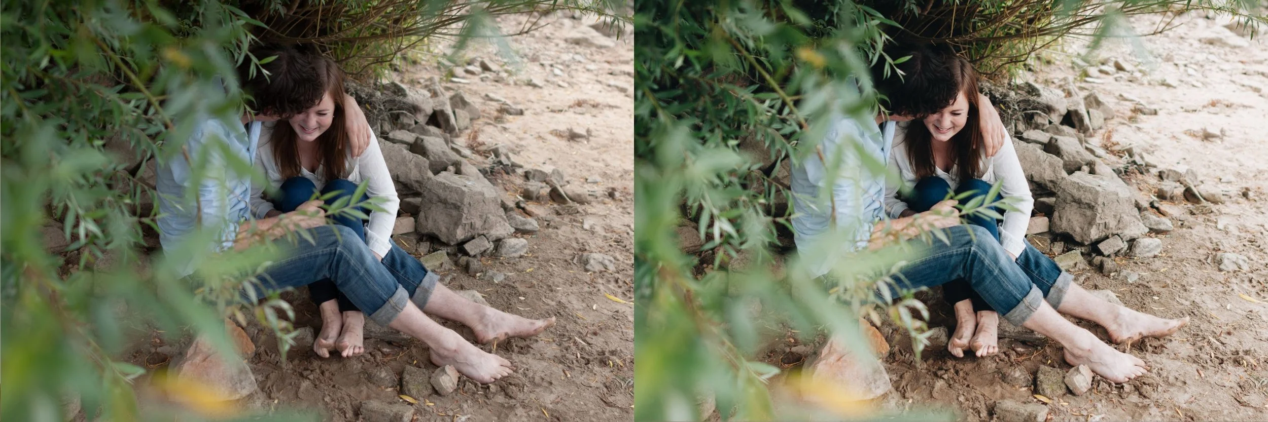
White Balance
Set Temperature to match the ambient light rather than pushing toward a stylistic direction. Outdoor daylight 5,200 to 5,500K. Overcast 5,500 to 6,200K. Indoor warm ambient 3,800 to 4,500K.
Set Tint to positive 4 to positive 10. A slight magenta push counteracts the green cast common in outdoor diffuse light and improves skin rendering noticeably, particularly on Android devices where the default rendering often carries a green bias.
Colour Grading
For natural results, keep Colour Grading minimal. Highlight Hue 40 to 50 at Saturation 3 to 6 adds a subtle warmth that reads as light rather than as applied grading. Shadow and Midtone wheels at Saturation 0 to 3.
Anything above Saturation 8 in any wheel begins to read as a deliberate stylistic choice rather than as natural colour, which may be what you want in other contexts but not here.
Grain
Grain at Amount 8 to 14 with Size 18 to 24 on phone files. Lower than for camera RAW because phone noise reduction produces a smoother base texture that makes added grain more visible than the same values would be on an unprocessed RAW file. Enough to remove the clinical digital smoothness, not enough to read as an applied film effect.
Where This Differs From Desktop
Phone files need less aggressive adjustment across the board because the camera has already applied processing. If you also edit camera RAW files from a mirrorless or DSLR camera, the same natural approach requires stronger settings on those files to reach an equivalent result.
For photographers working across both platforms, Why Presets Look Different on Mobile covers the reasons the same settings produce different results across devices and file formats, including screen calibration and unsupported controls.
FAQ
Should I use a preset or adjust manually for a natural look?
A well calibrated film preset applies these adjustments in one step and more precisely than most photographers achieve manually. Adjusting manually teaches you what each control does. Both are valid depending on whether your priority is speed or learning.
Why does my natural edit still look processed?
Most commonly Clarity above 0, global Saturation adjustment instead of channel level control, or Shadows lifted too far. Check those three before anything else.
Does natural editing work for all subjects?
Yes as a foundation. Specific subjects benefit from adjustments beyond the natural baseline, but starting natural and adding character produces better results than starting stylised and trying to pull back.
Try a naturally calibrated preset:
Download the free Analog Film preset and apply it at 82 percent strength. Compare the settings it applies with the values described above.
For a complete collection built on natural calibration, the Analog Film Archive covers ten calibrated looks. The Studio Archive at $89 includes every collection.
