Black and White Film Lightroom Preset — Complete Guide (2026)
Black and White Film Lightroom Preset — Complete Guide (2026)
Black and white film photography has a tonal quality that colour photography rarely achieves. Rich midtone depth. Fine grain structure. Creamy highlights with a quality that feels tactile rather than digital. Deep shadows that retain texture and separation.
The difference between a great black and white edit and a mediocre one is not the conversion from colour — it's understanding how to use the tonal tools that give B&W film its distinctive quality. Desaturating a colour photo produces grey. Working with the B&W Mix, tone curve, and grain produces black and white film.
This guide covers the exact technique for authentic black and white film editing in Lightroom, how to use the B&W Mix panel to its full potential, and which presets deliver the most consistent results.
What makes black and white film look different from desaturated colour?
This is the most important question in B&W photography editing. The answer is in how colours are converted to tones.
When you desaturate a colour photo, every colour converts to grey based purely on its luminance value — how bright it is. Red and green of similar brightness become the same grey. Blue sky and white cloud separate only if they have different brightness values. The result is flat, grey, and lacks the tonal depth of film.
Black and white film converts colours to tones based on its specific chemical sensitivity to different wavelengths of light. Older orthochromatic films were insensitive to red — making red objects appear very dark. Modern panchromatic film is sensitive to all colours but with varying degrees that create the characteristic tonal relationships.
In Lightroom, the Black and White Mix panel replicates this. It lets you control how each colour converts to grey independently — darkening blues to make skies dramatic, brightening oranges to make skin glow, deepening greens for contrast against bright subjects.
This is why B&W film presets look completely different from a simple desaturation — they use the B&W Mix to recreate the tonal relationships of specific film stocks.
The B&W Mix panel — the most important tool
Before covering settings, it's worth understanding what the B&W Mix does for common subjects:
Sky — blue sky converts to mid-grey by default. Darkening Blue (-25 to -40) makes sky dramatically dark, increasing contrast with white clouds. This is the classic "stormy sky" quality of B&W film.
Foliage — green converts to mid-grey. Darkening Green (-20 to -35) makes foliage dark and dramatic. In landscape photography this creates strong contrast between dark trees and bright sky.
Skin — skin is primarily orange and yellow. Brightening Orange (+15-25) makes skin glow and appear healthy. This is why portrait film B&W looks so different from snapshots — the skin luminance is specifically brightened.
Architecture/concrete — urban grey converts to grey — not much to do here. Focus on the contrast between grey surfaces and darker sky or shadows.
Red subjects — red objects (clothing, flowers, warning signs) can be made dramatically dark (reduce Red) or highlighted (increase Red) depending on the compositional intent.
Exact Lightroom settings for black and white film
Basic panel:
Exposure: 0 to +0.3
Contrast: +10 to +20 (B&W needs some contrast — flat B&W looks like a mistake)
Highlights: -20 to -35 (protect highlight detail — B&W film has creamy, detailed highlights)
Shadows: +10 to +20 (lift shadows slightly — visible shadow detail is important)
Whites: -10 to -20
Blacks: -5 to +10 (depends on style — slightly lifted for classic film look, darker for high contrast)
Convert to Black and White: In the HSL panel, click "Black & White" at the top to convert. This activates the B&W Mix.
Black and White Mix — the key adjustments:
Red: 0 to +15 (depends on subjects)
Orange: +15 to +25 (brightens skin — almost always increase this)
Yellow: +10 to +15
Green: -15 to -30 (darkens foliage for drama)
Aqua: -10 to -20
Blue: -20 to -35 (darkens sky — increase this for dramatic sky contrast)
Purple: -5 to +5
Magenta: 0 to +5
Start with Orange +20, Blue -25, Green -20 as a baseline and adjust from there based on your specific image.
Tone Curve:
Gentle S-curve — lifts highlights slightly, deepens shadows slightly
Lift the black point slightly (bottom-left anchor up 5-10 units) for the classic film fade quality
The curve creates depth that the basic sliders alone can't achieve
Color Grading (toning — optional but recommended): B&W film is rarely truly neutral — it has a slight tonal quality from the chemical process.
For silver gelatin look (most natural):
Shadows: very slight warm amber (hue 30-40, saturation 10-15)
Highlights: neutral or very slightly warm
For selenium tone look (cooler, more dramatic):
Shadows: cool blue-grey (hue 200-220, saturation 10-15)
Highlights: neutral
For split tone look (classic darkroom technique):
Shadows: cool (hue 200-230, saturation 15-20)
Highlights: warm (hue 30-50, saturation 10-15)
Effects:
Grain Amount: 25-40 (B&W grain should be more visible than colour film grain)
Size: 30-40
Roughness: 50-60 (higher roughness adds the irregular quality of authentic film grain)
B&W film styles and when to use them
Black and white film is not one look — different film stocks produced different tonal relationships and grain structures. Understanding the main styles helps you choose the right approach.
Classic silver (Kodak Tri-X inspired) The most iconic B&W film look — medium contrast, moderate grain, natural tonal relationships. Works across all subjects. The Monochromatic Archive B1 sits in this territory.
Settings: Contrast +10-15, B&W Mix standard with Orange +20, Blue -25, Grain Amount 25-30.
High contrast documentary (pushed Tri-X) Tri-X pushed to 1600 or 3200 ISO created a high-contrast, grainy look associated with photojournalism. Deep blacks, bright highlights, prominent grain.
Settings: Contrast +25-35, Blacks -10 to -20, Blue -35-40, Grain Amount 40-50, Roughness 60-70.
Fine grain portrait (Kodak T-Max 400) T-Max had finer grain and smoother tonal transitions than Tri-X — better for portrait work where grain competes with skin texture.
Settings: Contrast +10-15, Orange +25, Blue -20, Grain Amount 15-20, Size 20-25, Roughness 35-45.
Infrared effect Infrared film made foliage appear white and sky appear very dark — a dramatic, otherworldly look.
Settings: B&W Mix — Green +80 to +100, Blue -60 to -80. Dramatic and immediately recognizable.
Common B&W film mistakes
Flat grey result — the most common problem. Usually caused by insufficient contrast or not using the B&W Mix. Add contrast (+10-20), darken Blues (-25-35) and Greens (-20-30) in the B&W Mix, and add a tone curve S-curve.
Noise instead of grain — digital noise from high ISO or heavy shadow recovery looks completely different from film grain. Reduce noise first (Noise Reduction 20-30), then add grain on top. Adding grain to a noisy image looks terrible.
No tonal separation — if highlights and shadows look similar in tone, the B&W Mix isn't working hard enough. Darken Blues and Greens more aggressively and brighten Oranges and Yellows.
Wrong grain for the subject — fine grain for landscape and architecture, moderate for portraits, heavy grain for documentary and street. Matching grain character to subject is the difference between intentional and accidental.
Flat highlights — B&W film has creamy, detailed highlights. Pull Highlights to -20 to -35 and use the tone curve to soften the highlight rolloff. Blown highlights in B&W look digital.
B&W for specific photography types
Portrait B&W — focus on skin rendering. Orange +20-25, Green -15-20 (darkens background foliage), warm toning in shadows and highlights. Use fine grain (Amount 15-20) so it doesn't compete with skin texture. Reduce Clarity slightly (-5-10) for skin softness.
Street photography B&W — higher contrast, more grain, more aggressive B&W Mix. Blue -30-40 for dramatic sky. Green -25-35. Contrast +20-30. Grain Amount 35-45 with high Roughness (55-65). The raw, gritty quality suits the genre.
Landscape B&W — sky drama is paramount. Blue -35-45 for maximum sky contrast with clouds. Green -25-35 for dark foliage. Strong contrast (+20-25). Moderate grain. Vignette -15-20 to draw attention to the center.
Architecture B&W — focus on tonal separation between surfaces. Moderate contrast, strong B&W Mix adjustments based on the specific colours in the scene. Fine to moderate grain.
The Monochromatic Archive — complete B&W film system
The Monochromatic Archive (B-Series) is a complete black and white film system — six presets covering the full range of B&W film aesthetics.
B1 — Classic Silver The baseline black and white film look. Balanced tonal range, silver midtones, natural skin rendering, moderate grain. Works across all subjects and lighting conditions. The most versatile starting point.
B2 — Soft Silver Softer and more luminous than B1. Lifted highlights, slightly open shadows. Best for portraits and lifestyle photography where the flattering quality of the B&W is more important than dramatic contrast.
B3 — High Contrast Strong tonal separation and deeper blacks. Documentary and street photography quality. More aggressive B&W Mix adjustments that create immediate visual impact.
B4 — Warm Tone Warm silver gelatin tone with a slight amber quality in highlights and midtones. Closest to the look of a traditional darkroom print on warm-tone paper. Best for portraits and fine art.
B5 — Cool Tone Cool, slightly blue-shifted tones. Modern and editorial. Best for architecture, urban photography, and contemporary editorial work.
B6 — Matte Film Flat, matte quality with lifted blacks. Deliberately faded feel that references older B&W prints. Best for vintage and artistic work where you want the aged quality of early photography.
→ Get the Monochromatic Archive — $27
For more dramatic, high-contrast B&W:
Or get both plus every other collection:
FAQ
What makes black and white film presets different from just desaturating?
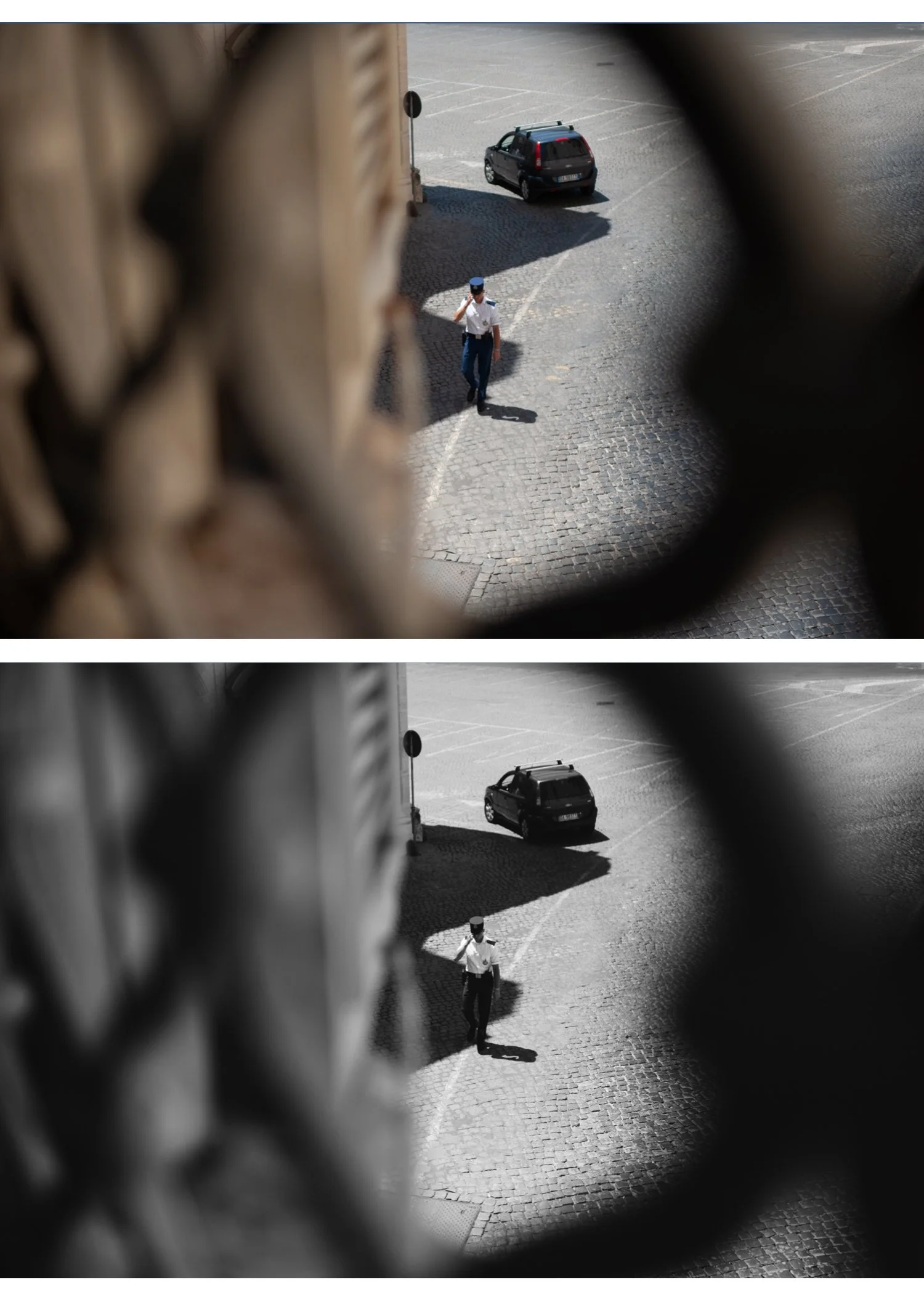
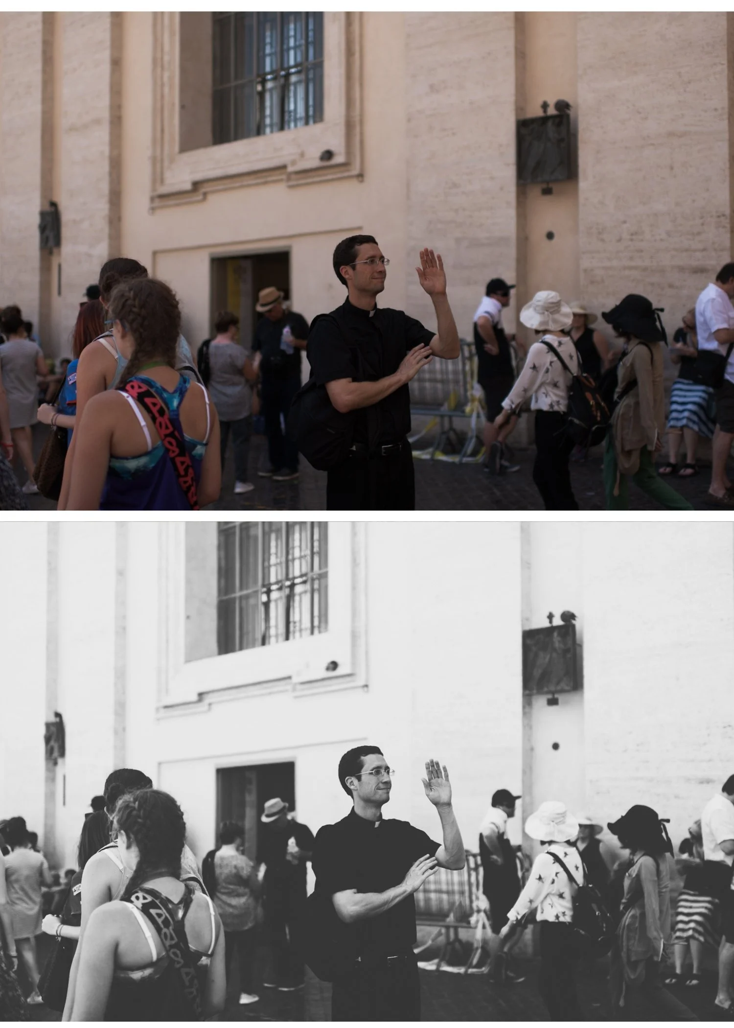
A B&W film preset uses the Black and White Mix panel to convert colours to grey tones independently — darkening skies, brightening skin, deepening foliage. Desaturation treats all colours equally and produces flat, grey results without tonal depth. The B&W Mix is the single most important difference between a great B&W preset and a simple desaturation.
How do I get deep, dramatic sky contrast in B&W?
Darken the Blue channel in the B&W Mix to -30 to -40. This makes blue sky appear very dark, dramatically increasing the contrast with white clouds. Darken Aqua slightly too. The resulting sky contrast is one of the most recognizable characteristics of classic B&W film photography.
How do I make skin look glowing in B&W portraits?
Increase Orange luminance in the B&W Mix to +20-25 and Yellow to +10-15. This brightens warm skin tones specifically, making skin appear healthy and luminous against the rest of the image. Reduce Clarity slightly (-5-10) for additional softness.
Can I use B&W film presets on colour photos without converting to B&W?
B&W film presets convert your photo to black and white as part of the process. If you want to keep colour, a B&W preset is not the right choice.
What's the best B&W film for portrait photography?
The Monochromatic Archive B2 (Soft Silver) and B4 (Warm Tone) are the most flattering for portraits — soft tonal range, warm silver quality, fine grain that doesn't compete with skin texture.
How do I add film grain that looks authentic rather than digital?
Use Grain Amount 25-35, Size 30-40, and Roughness 50-60. Higher Roughness creates more irregular, film-like grain rather than the uniform digital grain that appears at low Roughness values. Apply noise reduction first if your base image has digital noise — adding grain on top of noise looks terrible.