Fine Art Lightroom Preset — Complete Guide (2026)
Fine Art Lightroom Preset — Complete Guide (2026)
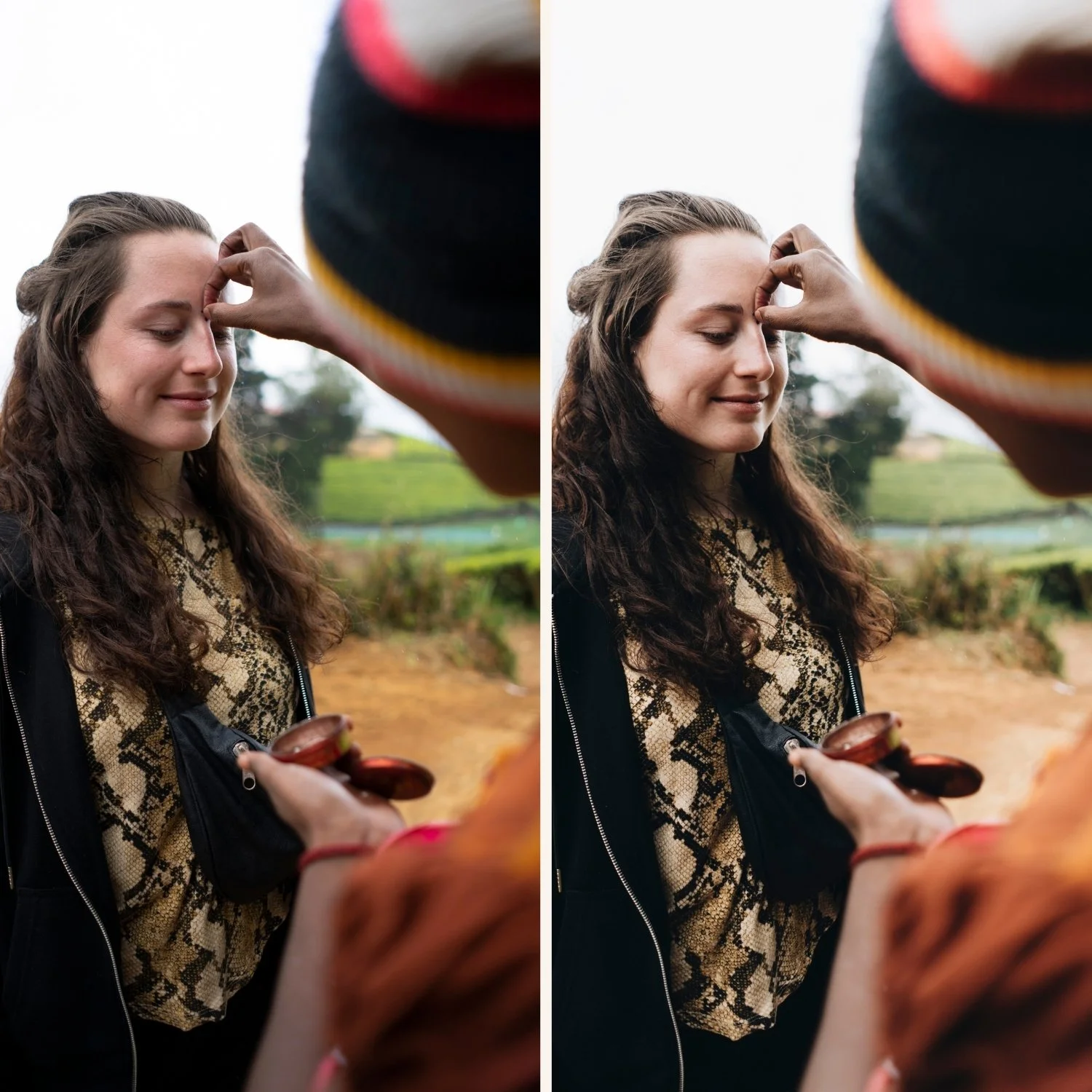
Fine art photography editing has a quality that is immediately recognizable but difficult to define. It is not bright and airy. It is not film. It is not moody. It is something quieter — a stillness and refinement that makes images feel like they were made deliberately rather than captured spontaneously.
The fine art look in Lightroom comes from restraint. Removing the harshness of digital processing. Adding the organic softness of film without the warm nostalgia of analog color. Creating tonal depth without drama. The result feels artistic rather than edited.
This guide covers exactly how to achieve the fine art look in Lightroom and which presets deliver the most consistent results.
What defines the fine art look?
Six characteristics separate genuine fine art editing from other soft aesthetics.
Ethereal tonal quality. Fine art editing has a specific lightness that is different from bright and airy. It is not high-key. It is luminous — a quality that comes from lifted shadows, protected highlights, and smooth tonal transitions rather than simply increasing exposure.
Gentle, reduced contrast. No harsh shadows, no punchy contrast. The tonal transitions are gradual and smooth. This is one of the most important characteristics — contrast adds drama, and fine art editing specifically avoids drama.
Slightly muted color. Not desaturated like muted luxury. Not vivid like golden hour. Fine art color sits in a refined middle — colors are present and natural but quieter than digital rendering. The saturation feels considered rather than processed.
Soft, organic skin rendering. Fine art portrait editing is specifically kind to skin. Negative clarity removes micro-contrast. Lifted orange luminance adds a gentle glow. The result is skin that feels smooth and luminous rather than textured and sharp.
Refined stillness. The overall feeling of fine art editing is calm. Nothing competes for attention. No vivid color, no heavy editing, no obvious preset quality. The image feels like it exists in its own quiet space.
Minimal grain. Fine art uses very subtle grain or none at all. Unlike film presets that use grain for character, fine art grain is barely visible — just enough to add tactile texture without obvious film quality.
Exact Lightroom settings for fine art
Basic panel:
Exposure: +0.2 to +0.4
Contrast: -20 to -30
Highlights: -25 to -40
Shadows: +15 to +30
Whites: -15 to -25
Blacks: +15 to +25
Presence:
Texture: -5 to -10
Clarity: -10 to -20 (important — negative clarity is the foundation of the fine art soft quality)
Vibrance: -10 to -15
Saturation: -5 to -10
Tone Curve:
Very gentle S-curve — flatter than almost any other preset style
Significantly lifted black point (bottom-left anchor up 15-20 units)
Softened highlights (top-right anchor gently pulled down)
The curve should feel almost flat with just enough structure to prevent it looking lifeless
HSL — Saturation:
Green: -10 to -15
Blue: -10 to -15
All others: -5 to -10
HSL — Luminance:
Orange: +10 to +15 (lifts skin naturally)
Yellow: +5 to +10
Color Grading:
Shadows: very slight warm or neutral (saturation 5-8 maximum)
Highlights: neutral to very slight warm
Keep everything subtle — fine art color grading should be invisible
Effects:
Grain Amount: 8-15 (barely visible)
Size: 18-22
Roughness: 30-40
Fine art vs related aesthetics
Fine art vs light and airy. Light and airy is explicitly brighter and more luminous. Fine art is softer and more restrained in brightness. Light and airy feels effortless. Fine art feels still. For light and airy: Light and Airy Lightroom Presets Guide
Fine art vs muted luxury. Muted luxury is specifically cool and desaturated with an expensive editorial quality. Fine art is warmer and softer — more about organic stillness than sophisticated restraint. Fine art feels intimate. Muted luxury feels exclusive.
Fine art vs film/analog. Analog film has grain, lifted blacks, and warm organic color. Fine art is softer and more refined — less analog character, more deliberate stillness. Analog feels like film. Fine art feels like art.
Fine art vs clean girl. Clean girl is bright and modern. Fine art is soft and timeless. Clean girl feels current. Fine art feels enduring.
Fine art editing by subject
Fine art portrait photography. The most common application. Negative clarity (-10 to -20) removes skin texture. Orange Luminance (+10-15) creates a gentle glow. Keep grain minimal. The F2 Warm Ethereal and F1 Ethereal Base presets are specifically calibrated for portrait work.
Boudoir photography. The soft, intimate quality of fine art editing suits boudoir photography naturally. The muted, refined tones create an atmosphere of quiet intimacy rather than bold drama. All three F-series presets work for boudoir depending on the lighting direction.
Wedding photography. Fine art wedding photography is one of the most popular and enduring niches. The soft, timeless quality suits the emotional weight of wedding photography. Works particularly well for getting-ready shots, detail photography, and intimate portrait moments.
Floral and botanical photography. The soft color rendering and gentle contrast enhance the delicate quality of flowers and botanical subjects. Fine art editing makes petals look soft and luminous rather than vivid and sharp.
Still life and product photography. For brands and products that want a soft, artisanal quality — handmade goods, artisan food, lifestyle products — fine art editing creates a refined, considered aesthetic.
Fine art on Lightroom Mobile
Before applying a fine art preset on iPhone photos, two adjustments are essential:
Reduce Sharpening from 40 to 15-20. iPhone cameras add aggressive sharpening that completely works against the soft quality of fine art editing.
Set Clarity to -15 before applying if the preset does not already do this.
These two adjustments remove the digital harshness that makes fine art editing look wrong on mobile photos.
Install guide:How to Install Lightroom Presets on iPhone and How to Install Lightroom Presets on Android
The Fine Art Archive
The Fine Art Archive (F-Series) is built around the soft, ethereal quality of fine art film photography. Three presets covering different expressions of the same refined philosophy.
F1 — Ethereal Base: The most subtle preset. Clean, lightly desaturated, gentle film character. The best starting point for photographers new to fine art editing.
F2 — Warm Ethereal: Warmer than F1 with a soft fade quality. Best for portrait work in warm natural light.
F3 — Muted Fine Art: The most characterful preset. More desaturated and refined. Best for editorial portraiture and fine art work where deliberate understatement is the goal.
$6.66 per preset.
EXPLORE THE FINE ART ARCHIVE — $19.99
Free fine art starting point
The free A6 preset is clean and minimal — a good foundation for fine art editing. After applying, reduce Clarity to -15, reduce Vibrance to -12, and lift Shadows to +25. That moves it into fine art territory without a dedicated fine art preset.
FAQ
What is fine art Lightroom editing?
Fine art editing creates soft, ethereal tones with gentle contrast, reduced saturation, and a refined stillness that makes images feel deliberately artistic. The key technical characteristics are negative clarity, slightly lifted blacks, reduced overall saturation, and minimal grain.
Is fine art the same as light and airy?
No. Light and airy is explicitly bright and luminous with high-key brightness. Fine art is softer and more restrained in brightness — not dark, but not obviously bright either. Fine art feels still. Light and airy feels effortless. For light and airy: Light and Airy Lightroom Presets Guide
Does fine art editing work for wedding photography?
Yes — fine art wedding photography is one of the most popular and sought-after niches. The soft, timeless quality is exactly what many wedding couples want for photos they will keep for decades.
What is the most important adjustment for fine art editing?
Negative Clarity (-10 to -20). This single adjustment removes the digital harshness that separates digital photos from fine art quality more than any other slider. Combined with lifted shadows and reduced saturation, it creates the core fine art quality.
Can fine art presets work on iPhone photos?
Yes but requires preparation. Reduce Sharpening to 15-20 and Clarity to -15 before applying. iPhone processing adds aggressive sharpening that works directly against the soft quality of fine art editing.