How to Get the Vintage Look in Lightroom — Step by Step (2026)
How to Get the Vintage Look in Lightroom — Step by Step (2026)
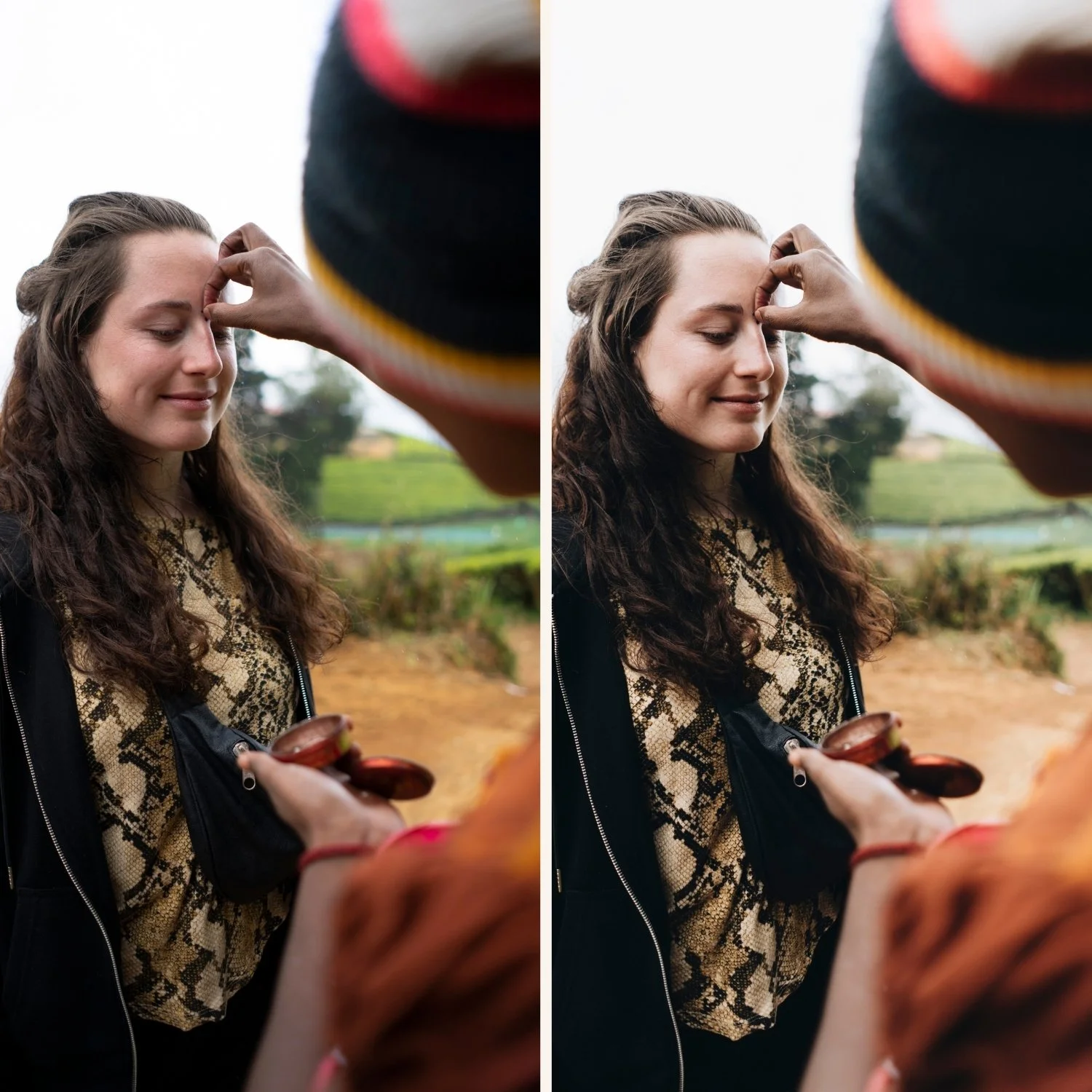
The vintage look in Lightroom is built on a small set of specific adjustments that reference the characteristics of aged analog photography. Lifted blacks that prevent pure dark. Warm, slightly faded color. Organic grain. Soft, gentle contrast.
This guide covers exactly how to create the vintage look manually in Lightroom, without relying on a specific preset. Understanding the manual technique means you can apply the vintage quality to any photo in any lighting condition.
What creates the vintage look technically
The vintage aesthetic references aged film prints. Over time, film prints fade and shift in specific ways. Understanding what actually happens to aged film is the key to recreating it accurately.
Blacks lift and fade. Aged prints never go to pure black. The darkest shadows have a warm, slightly grey quality. In Lightroom: Blacks +25 to +40 is the single most important vintage adjustment.
Highlights cool slightly. Old prints often have a slight cool quality in the brightest areas as dye layers fade at different rates. In Lightroom: slight cool Color Grading in highlights (hue 190-210, saturation 5-8).
Shadows go warm. The opposite of highlights — aged prints develop warm, slightly yellow shadows. In Lightroom: warm Color Grading in shadows (hue 30-50, saturation 15-20).
Overall color fades and warms. Saturation reduces overall and color shifts toward warm yellow-orange. In Lightroom: Vibrance -15 to -25 and Saturation -10 to -15.
Grain becomes coarser. Film grain is more visible in aged prints. In Lightroom: Amount 25-40, Size 30-40, Roughness 50-60.
Step by step — the manual vintage technique
Step 1 — Lift the blacks
This is the most important single adjustment for the vintage look.
Go to the Basic panel. Lift Blacks to +25 to +40. The exact amount depends on how faded you want the look. More lift equals more aged, more faded. Less lift is more subtle.
At the same time, lift Shadows to +20 to +30. The combination of lifted Blacks and Shadows creates the warm, open quality of aged film shadows.
Step 2 — Soften the contrast
Vintage photos have soft, reduced contrast. Set Contrast to -20 to -30.
Then in the Tone Curve, create a gentle fade:
Drag the bottom-left anchor point up 15-20 units (lifts the shadow floor)
Drag the top-right anchor point down 5-10 units (softens the highlight ceiling)
The result is a compressed tonal range that reads as faded and aged
Step 3 — Warm the overall color
Increase Temperature by +100 to +300 toward warm yellow. The vintage warmth comes from yellow, not orange. Keep Tint at 0 to +5.
Then in Color Mix:
Orange Hue: shift toward yellow (+8 to +12) — vintage warmth comes from yellow-orange, not vivid orange
Green Hue: shift toward yellow (+10 to +15) — aged prints have warm, slightly yellow greens
Green Saturation: -15 to -20 — muted, organic green quality
Step 4 — Add the split tone color grading
The split tone quality is what distinguishes vintage from simply warm film.
Open Color Grading:
Shadows: warm amber (hue 35-45, saturation 15-20)
Highlights: very slight cool (hue 195-210, saturation 5-8)
Midtones: neutral
The warm shadows and slightly cool highlights create the specific color separation of aged photographic prints.
Step 5 — Reduce overall saturation
Vintage photos are not vivid. Set Vibrance to -15 to -20 and Saturation to -10 to -15.
In Color Mix, reduce all Saturation channels by -5 to -10, keeping Orange slightly higher (0 to -5) to maintain skin warmth.
Step 6 — Add vintage grain
Vintage grain is more pronounced than modern film grain.
Effects panel:
Amount: 25-40 (more visible than standard film)
Size: 30-40 (slightly larger particles)
Roughness: 50-60 (irregular, organic quality)
Step 7 — Save as a preset
Once you have the vintage look you want, save it as a preset. In Lightroom Mobile: three dots, Create Preset, name it, save.
Exclude White Balance and Exposure from the preset so it applies correctly to photos with different exposures and lighting conditions.
For the full preset creation guide: How to Create Your Own Lightroom Preset
The Juniper Archive — vintage warm presets
The Juniper Archive (J-Series) is built around warm vintage film tones — six presets from subtle everyday warmth to pronounced vintage fade quality.
J3 Soft Fade is the most directly vintage of the collection.
FAQ
What is the most important adjustment for the vintage look in Lightroom?
Lifting Blacks (+25 to +40) is the single most important adjustment. Aged film prints never go to pure black. This one adjustment creates more vintage character than any other setting.
What is the difference between vintage and film in Lightroom?
Film editing references the clean, modern quality of analog photography. Vintage specifically references aged, faded analog prints with warm color shifts, lifted shadows, and more pronounced grain. Vintage is a subset of film editing with specific aging characteristics.
Can I get the vintage look on iPhone photos?
Yes. Reduce Sharpening to 20 and add the manual adjustments above. iPhone processing adds contrast and saturation that fights slightly against vintage quality, but the technique still works effectively.